SQL cell
NotebooksLearn about notebooks vs. projectsObservable's SQL cell type enables easy exploration of databases. You can connect a SQL cell to a database, view the schema of the database, write a SQL query directly in the cell, and view the results of that query as a table.
To use a SQL cell, you first need a database, which can either be an external database, a SQLite file, or a custom database client. External databases are only allowed in private notebooks, but SQLite files and custom database clients can work in both public and private notebooks.
Once you have your database, create a SQL cell by inserting a new cell and selecting Database query in the cell menu. You'll then see a selector in the cell that allows you to select a database. You can select either an external database that you've set up on your workspace, a SQLite file attachment, or a DatabaseClient you've defined in another JavaScript cell.
With your database selected, you're ready to enter a query!
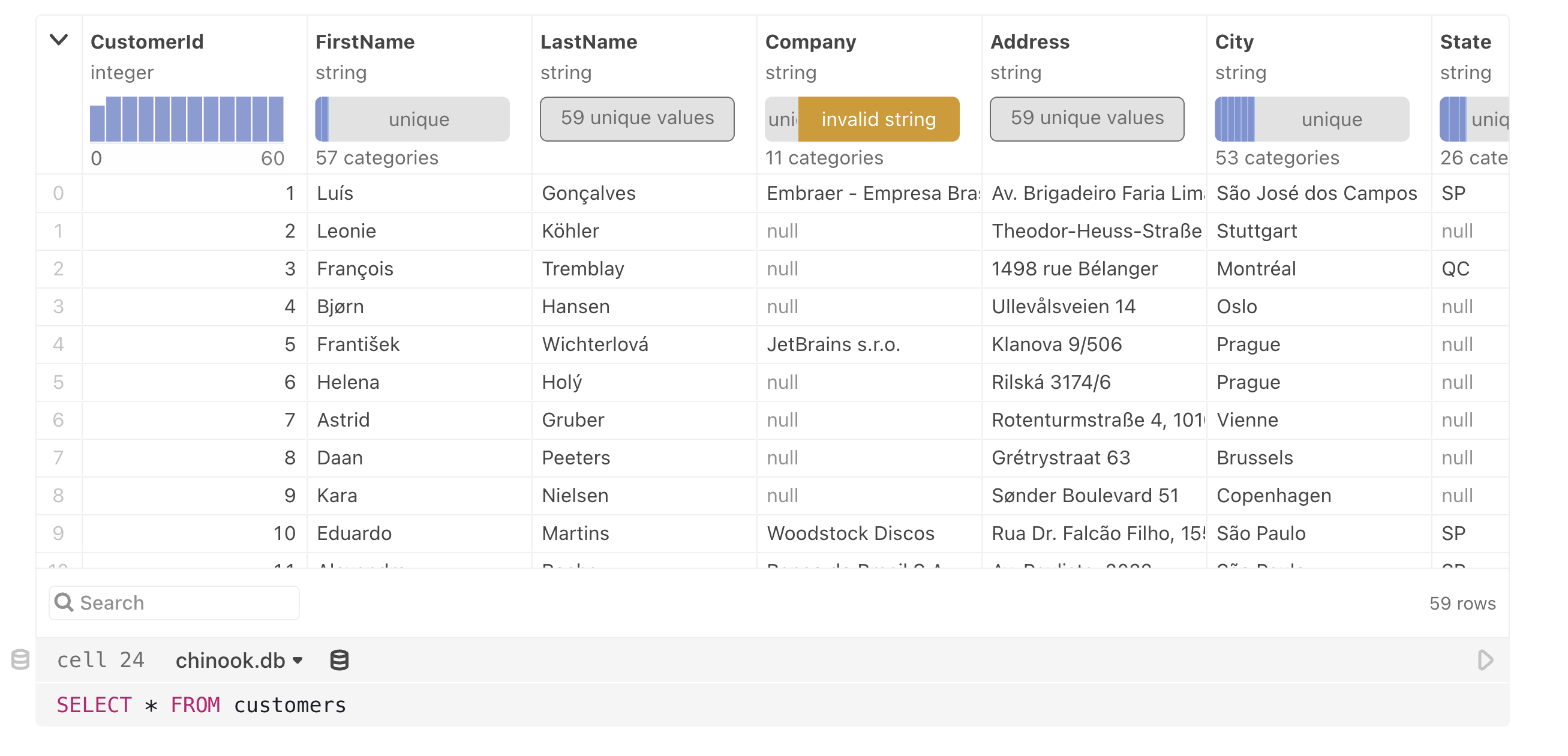
Below, we show what's possible with SQL cells using a sample SQLite database client. The examples below use the Chinook sample database, which represents a set of music-related data.
Example SQL queries
To query a database, write SQL into the editor and then click the play button to run the query. You can also use the Shift-Enter shortcut to commit and run your query.
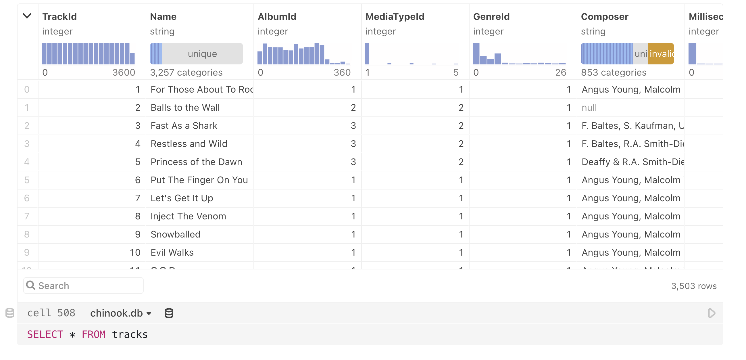
To reference the results of a query from another cell, click on the cell name input in the toolbar. The cell above is unnamed, and so shows cell 508; the cell below has been named longTracks.
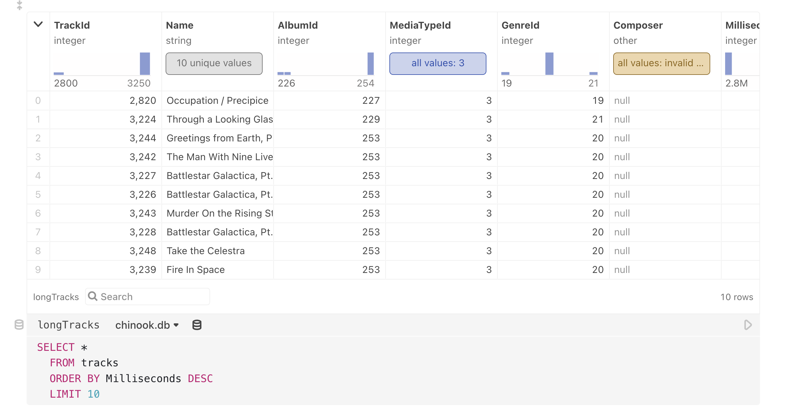
longTracks.The value of a SQL cell is an array of objects representing the query results:
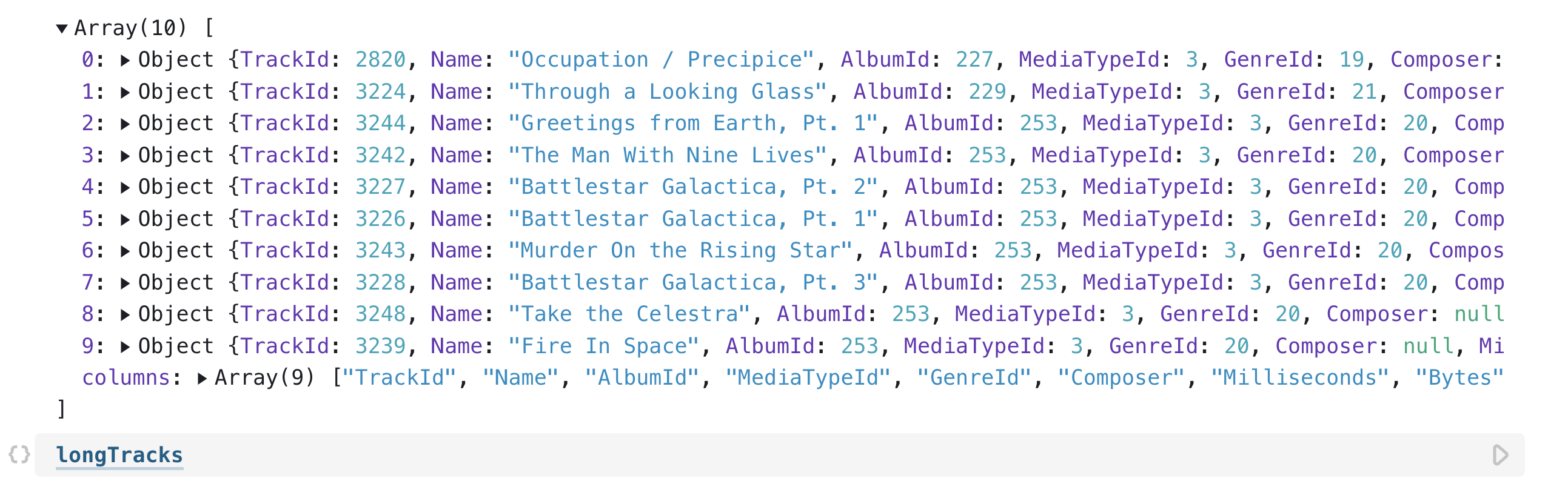
longtracks from another cell renders the value as an array of JavaScript objects.Most database clients also expose some schema information alongside query results. For example, the SQLite databases expose a columns property including the names of the selected columns in the order they were selected.

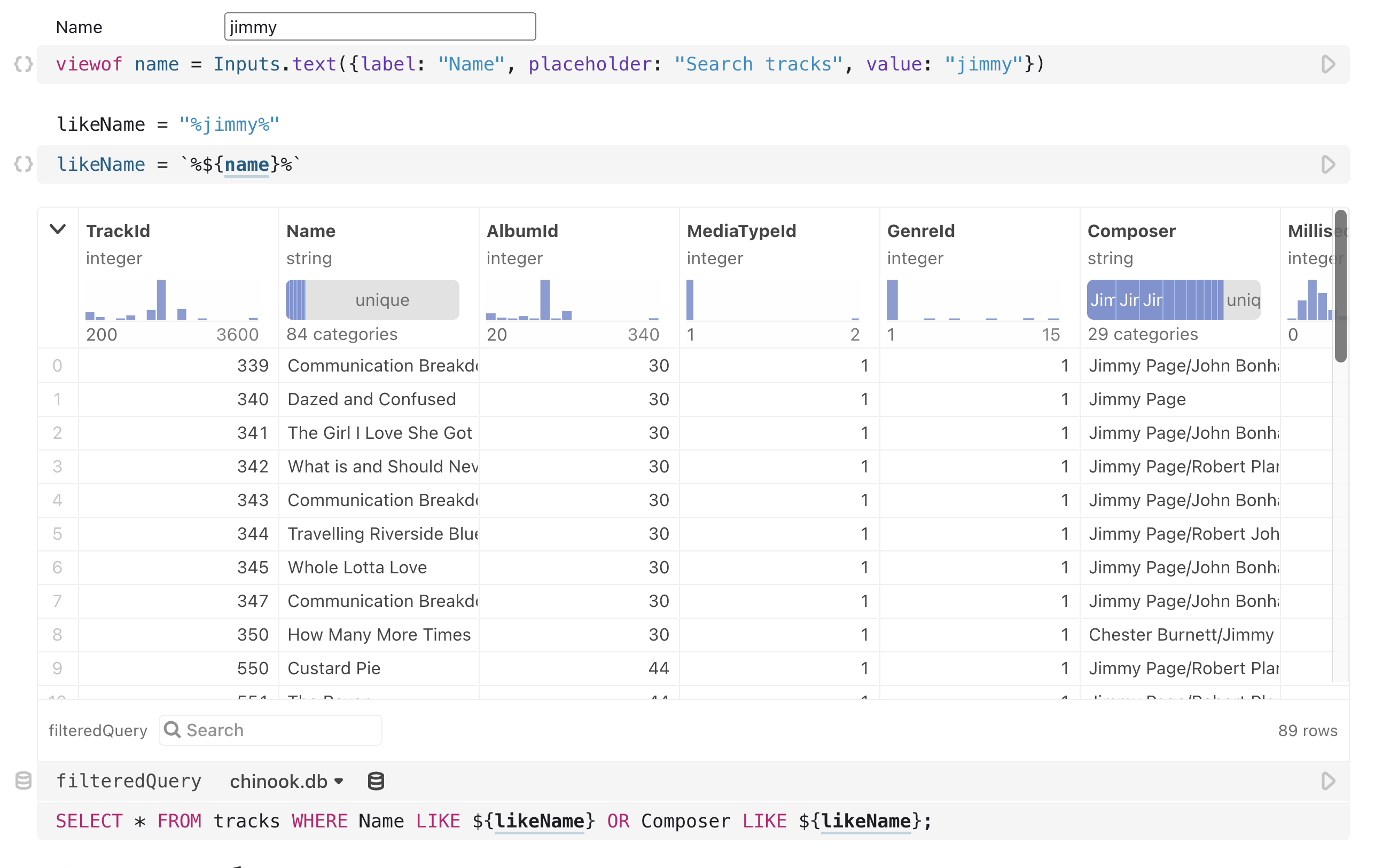
We can also make a query dynamic by adding parameters. SQL cells function exactly the same way as the DatabaseClient sql tagged template literal: we can interpolate parameters into the query by wrapping them in ${…}.
For example, here we use a text input to query a table interactively.
Summary charts
The small graphics at the top of each column provide a quick summary of key data characteristics for each column below:
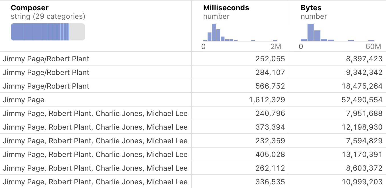
Summary charts are interactive: when you hover over a summary, you can get more detailed information. By moving your mouse along the displayed values, you can see individual values for each histogram or bar chart segment. Compare the following figure with the previous one:
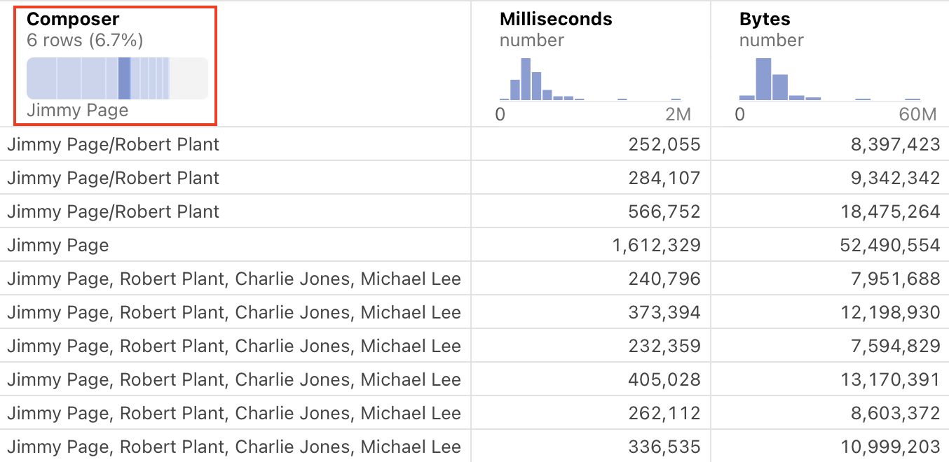
By hovering over the dark bar in the highlighted chart above, we now see additional information:
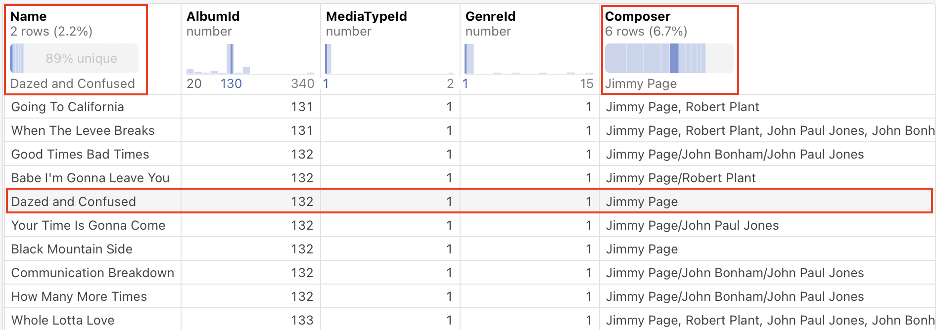
- The bar represents 6 rows of the total, or 6.7%.
- The composer selected is "Jimmy Page".
Here is another example, this time a histogram. Before hovering over an individual vertical bar:
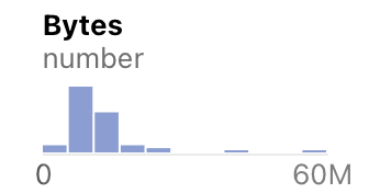
Here is the same histogram, after the pointer is hovered over one of the vertical bars:
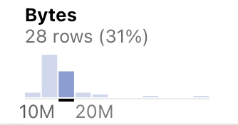
We now see additional information:
- The bar represents 28 rows of the total, or 31%.
- The values in that column range from 10M bytes to 20M bytes.
If the column contains values that are best represented by text only, the summary charts display a descriptive message:
The types of columns available in summary charts are:
- Continuous columns display a histogram showing the distribution of values.
- Categorical columns display a stacked bar chart of the frequency of each value.
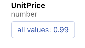
Special cases use text to clarify uniform or unique values:
- All values are the same (for a continuous or categorical column).
- All values are unique (for a categorical column).
In addition to interacting with the columns in the summary charts, you can interact with the rows of data. Hovering over a row of data causes individual marks in the summary chart to highlight.
In the following example, the pointer is hovered over the row with "Dazed and Confused". This results in the vertical bars for "Dazed and Confused" and "Jimmy Page" (the composer) to be highlighted. (Values in the other columns are also highlighted, but are harder to see in the example.)
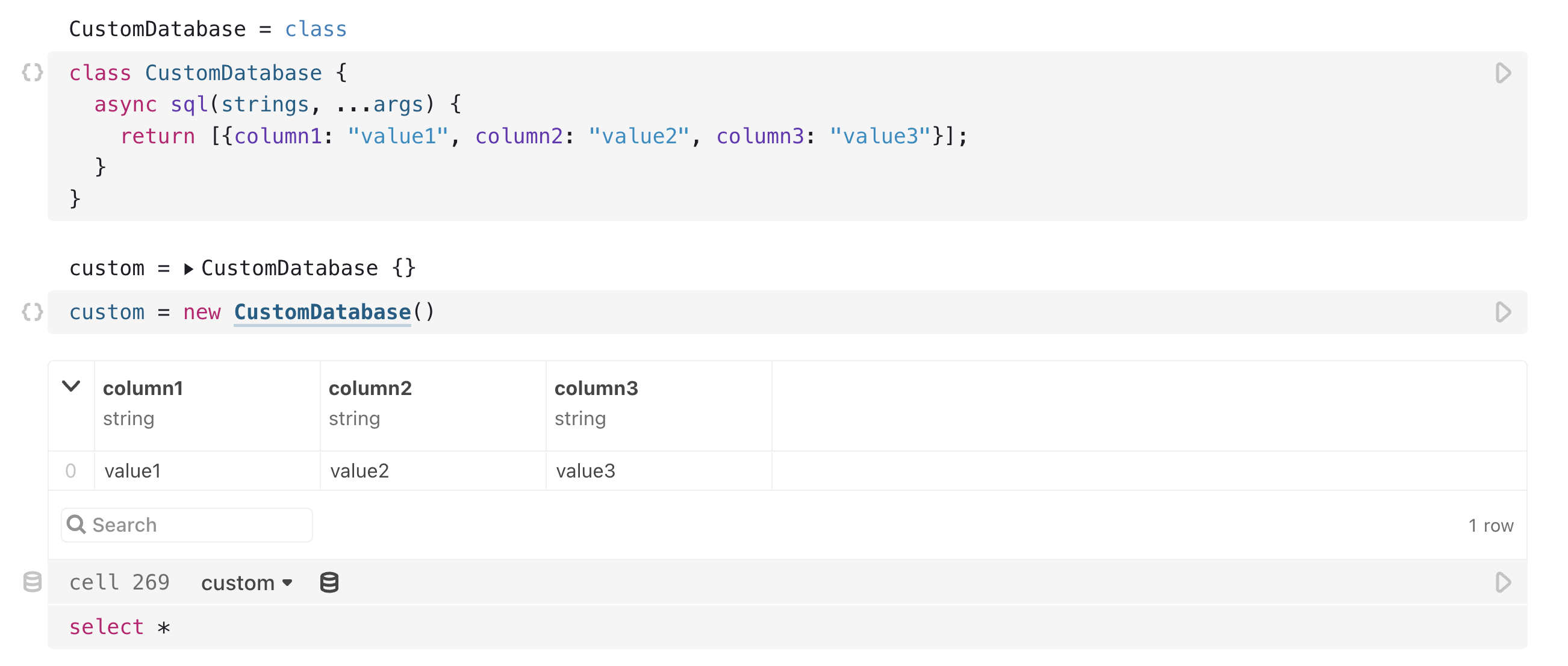
Custom database clients
We can also use a custom database client as a data source for a SQL cell. In order for a database client to be recognized as a valid data source, it must satisfy the requirements outlined in DatabaseClient Specification.
Here's an oversimplified example where any query returns the same static value. You can extend this example to return data from any source. See the DuckDB Client for Observable for a fully-fledged example of this.