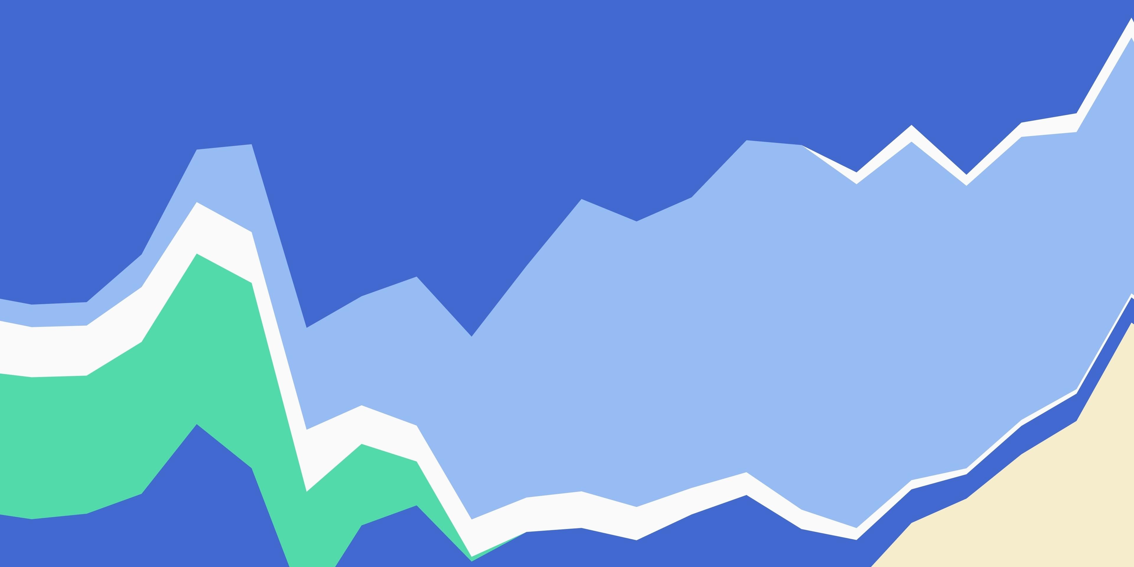
Color is a cornerstone of nearly every dashboard. Used effectively, color reinforces a dashboard’s story, explaining data and expressing a tone or brand.
However, when incorrectly used, color can muddle your communication or dilute your brand. When the same shade of blue means “Eastern region” in one chart and “service interruptions” in another, viewers need to work harder to read the dashboard, or they might simply misinterpret the data. And when that blue is the same generic blue that’s in every chart, that’s a lost chance for creating connection.
Given the important role that color plays in communicating effectively with data, we want Observable Plot’s default categorical colors to create rich displays of data. The Observable 10 palette helps speed creation of effective, rich data displays by offering a breadth of colors. It’s the new default scheme for categorical color in Observable Plot, our open-source JavaScript library for exploratory data visualization.

Previously, Plot used Tableau 10 as the default categorical palette. Tableau 10 is beautiful and effective, but we wanted to lead with a contemporary color scheme that matched the creative spirit of our open source, expressive framework. The new Observable 10 palette accomplishes this goal and better expresses our brand.
In that open and creative spirit, we’re sharing some of our process and thinking behind creating Observable 10. We love all that it can do, but we also know you will have your own ideas for color, so hopefully our journey can inspire yours.
When we set out to make a new color scheme, we first identified some universal principles. We wanted a palette that:
Offers as many colors as possible to support the creation of rich, multidimensional data displays. One chart might not need ten colors, but dashboards and other collections will.
Connects to an established color palette. For Observable 10, we wanted to express the creativity and connection embodied in our products and, by extension, our brand identity.
Supports differentiation among the colors even in small or thin marks. Big, adjacent blocks of color are easy to distinguish; it is important that two small dots on the opposite sides of a scatter plot would read clearly, too.
Offers reasonable differentiation for people with color vision deficiency. It’s hard to create a ten-color scheme that works for all people, but how close could we get?
Uses colors that easily map into common names like “blue” and “orange.” Conversations around data displays work better when there is clear shared terminology instead of questions like, “Are you talking about the blue-green dot or the green-blue one?”
Works on both light and dark backgrounds. As an exploratory and expressive platform, Observable’s default colors should work regardless of your vibe.
As with any creative endeavor, the path to the Observable 10 was one of iteration. There was also more than a little trial and error!
The first principle — offer as many colors as possible — pushed us to have lots of colors in the finished palette, but that isn’t much of a starting place. For that, we turned to our brand guidelines, which have these seven core colors.

It’s easy to see that Faint Blue and Washed Yellow would not work on light backgrounds, so we tossed those out. To see how the remaining 5 colors would work together, we followed in the footsteps of Maureen Stone and Cristy Miller when they developed the Tableau 10. We built an Observable notebook that let us see the colors in two side-by-side plots as well as in text and common mark shapes.

These plots show the colors in CIELAB (or sometimes just “LAB”) color space. Unlike RGB or HSV, LAB covers the entire gamut of human visual perception, and it does it along three dimensions: a* (pronounced “a-star”), b*, and L*. a* is a spectrum between green and red, while b* runs along blue and yellow. L*, for lightness, goes from black (0%) at one end to white (100%) at the other. Here’s what the a*-b* scatter looks like with a fixed lightness of 70%.
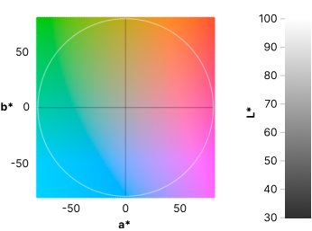
In this scatter plot you might notice that saturation is lowest at the center where it is gray and highest at the periphery. Hue — the shade of color — varies with the angle. This demonstrates how LAB mirrors typical human perception, which sees many different shades of green and blue from 6 o’clock to 10 o’clock, while we can differentiate very few different shades of yellow around 12 o’clock.
Looking at our starting palette in the visualization above, we can see that the 5 colors vary significantly with their angles, so it’s a promising start. However, Mint Chip and Goldenrod are very close to each other on the L* lightness scale, and we’ll want to keep an eye on that.
To fulfill our primary goal, we needed a scheme with more than five colors, so we added five more. We kept the blue, purple, and red (formerly Coral) as they were. We dropped Mint Chip in favor of two colors: a cyan a little closer to blue (3) and a true green (8). Orange (1) became a little less saturated and lighter. We also added a cool gray (9) right near the center of the scatter, pink (5), and brown (6). The final addition in this draft of the palette was light blue (7).

While LAB is great for reviewing the colors in a palette, finding nearby colors can be challenging. RGB is not much help either. To identify candidate colors, it helps to work in a color space like OKLCH, where LCH stands for lightness, chroma, and hue. These three dimensions map more naturally to how we think about color, and the OKLCH color picker makes it easy to move along them.
Our fourth goal was to create a palette that could work reasonably well for people with color vision deficiency (CVD). The most common CVD is deuteranopia, a lack of red-green differentiation that affects about 4% of people.
Using a tool like Color Oracle, we can simulate what the palette looks like for people with this form of CVD. Among 10 colors, most of them are distinguishable, but the cyan (3) and pink (5) are very close. While the two colors have very different a* values, they are similar on both b* and L*, which is why they are problematic for people with deuteranopia.

However, moving either of those colors along b* moves them too close to other hues, creating another differentiation problem. We left the cyan and pink where they were.
Visual accessibility can also be improved by encoding data in other ways, either redundantly with color or as a replacement. Other choices include labeling with text, using different shapes for different categories, adding hover labels with tips, varying thickness or dash patterns in lines, or even changing to using bars or another positional mapping.
The final pass over the Observable 10 palette was to review against dark and light backgrounds. To do this, we applied the palette against a test suite of dozens of charts built with Observable Plot. We noticed two particular issues — on light backgrounds the orange (1) was not dark enough, and on dark backgrounds the green (8) was too vibrant, almost like it was buzzing.
To address these problems, we experimented with other nearby colors. Ultimately, we chose a more saturated orange, moving it farther away from the center, and a darker green farther down on the L* plot.

With all the colors in place, the last piece of the puzzle was choosing their order since we want charts with fewer than ten colors to look and feel great, too.
The first two colors in the scheme are blue and orange. Their high difference in both a* and L* make them easily discriminable for viewers with both typical vision and most forms of color vision deficiency.
The next two colors, red and cyan, are also good for discrimination, filling in points between the first two colors along a*. For the rest of the color scheme, we alternate between bolder and milder colors so the colors feel more balanced overall. We also considered the order of colors in our previous default to minimize the impact on existing charts that used the default colors in Plot.
With Observable 10 included in Observable Plot and D3, we’ve incrementally improved our contributions to the world of color in visualizations. We already have thoughts about how to make it better, like giving pink and cyan more differentiation in CVD cases. We’re also investigating opportunities to contribute new continuous color ramps.
If you have suggestions for how we can help you use color better, drop us a line!