If you’ve ever used a traditional BI tool, you’ve run into its limitations. There are only so many charts you can make in low-code tools before you need custom calculations. The kinds of analysis you’re able to perform in these tools is limited to what the tool gives you, the layouts are often inflexible, and styling never quite looks right.
Building dashboards using code lets you make your own choices and gives you the freedom to do almost anything you want. Here is a look at the kinds of things you can do with code, including processing and data modeling, pixel-perfect and flexible layouts, reusable components that save you time and effort, and the exciting world of unusual and custom visualizations. To see more examples of what is possible when you build dashboards with code, you might also want to check out our Explore page.
There are countless tutorials about how to do certain analyses using traditional BI tools. They usually consist of many unintuitive steps to end up with a cohort analysis, market basket analysis, or similar. You might get the analysis the tutorial lays out, but you won’t be able to adapt it to your needs, and next time you’ll have to do it all over again.
These are complex procedures with many variations and nuances, which can’t easily be pre-packaged into a GUI tool. In a programming environment like Python or R, there are usually existing implementations that you can use, or modify if they don’t do exactly what you need.
In addition, you can build entirely custom analyses or models using code. You might build them from scratch entirely, like you’d do in Excel, or you can use existing code components. R, for example, offers a plethora of statistical tools that is unmatched even in dedicated statistics packages (and certainly any BI tool), and Python has powerful data processing and manipulation tools as well.
As a simple example, we have Observable Framework data loaders that compute clusters using k-means clustering in R, or logistic regression on a dataset in Python, each with just a few lines of code. You can build anything here, including financial models, sophisticated machine learning processes like market-basket analysis, and more. In Observable Framework projects, data loaders run at build time, so even complex and time-consuming operations on large datasets will not make the dashboard load any slower.
Discover a better way to build data apps
Discover a better way to build data apps
Create and deploy faster, richer data apps with Observable
A common complaint with traditional BI tools is that it’s impossible to get the exact look you want. This is true both in terms of where elements are placed on the dashboard (“pixel-perfect layout”) and the entire design, such as color or branding. In traditional BI tools you may also end up with elements on your dashboard that you can’t change or remove. Making changes across elements (such as a subtle gradient across a section of the page) can also be close to impossible, instead having to change each one separately. You also usually can’t reuse your layouts and styles, which wastes times.
Code, in the form of cascading style sheets (CSS), makes all of these things possible and often much easier than having to click through countless individual controls. CSS is hierarchical, so colors, spacings like margins or gutters, and typography can be set once and apply to the entire page. Specific elements can then be styled individually where they are different from the default. Perhaps some charts or big numbers need their own special backgrounds or a larger size for their titles. All that can be controlled very precisely.
The layout of all of your dashboards’ elements is also under your full control, so of course your layout is pixel-perfect! And not only that, you can set it up so that it adapts to the size of the window or device you’re using. Elements can resize in different ways, perhaps charts scale more than filters or big numbers make way for other elements. The entire layout can change, so instead of a horizontal layout on a large screen you end up with a vertical stack in a narrow window or on a mobile device. Less important items can also collapse into little hamburger menus to make space.
Mobile layouts for dashboards are still difficult and tedious in most traditional BI tools, but are built into the fabric of the web. They do require a certain level of setup and code to make use of, but once that is done they can be reused.
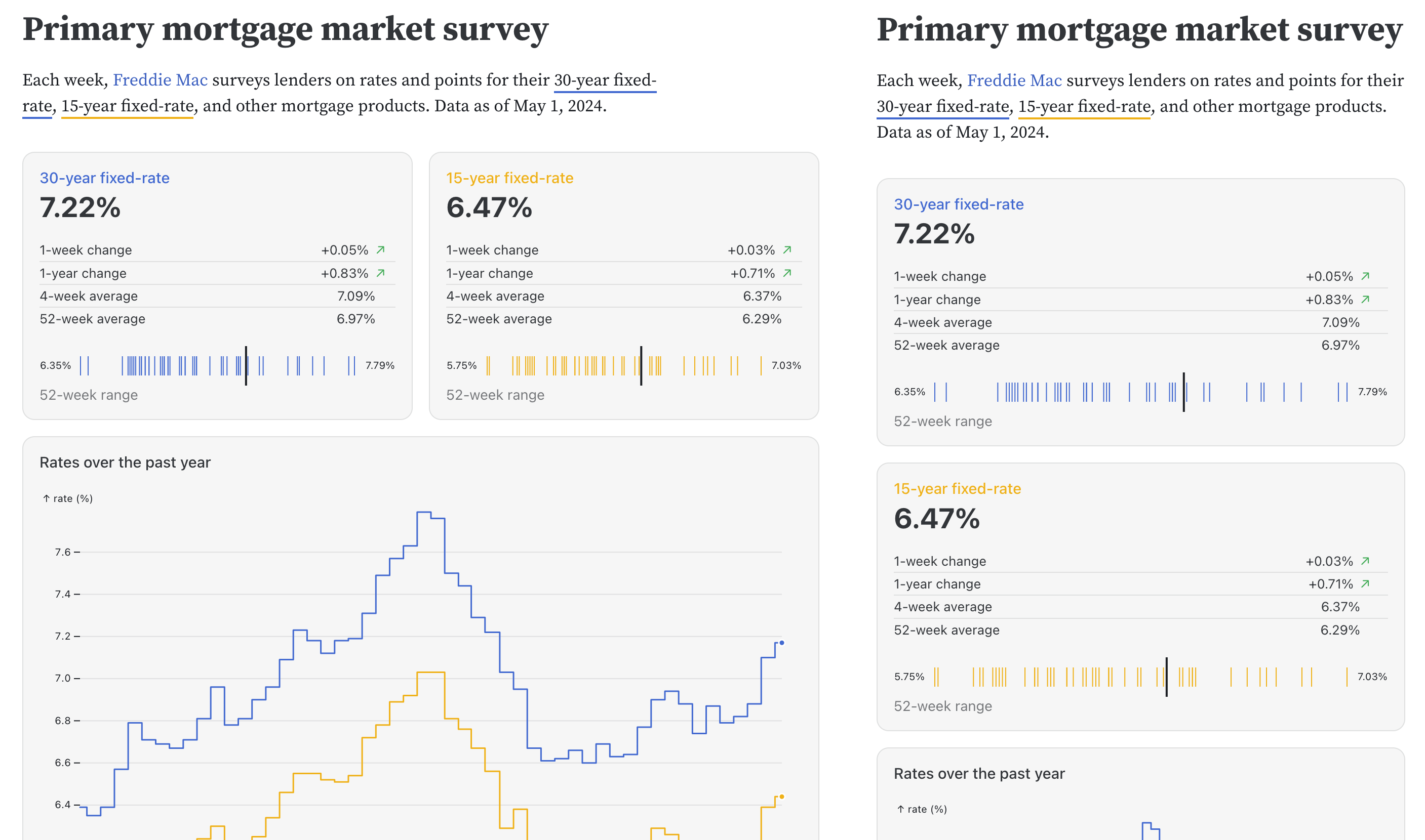
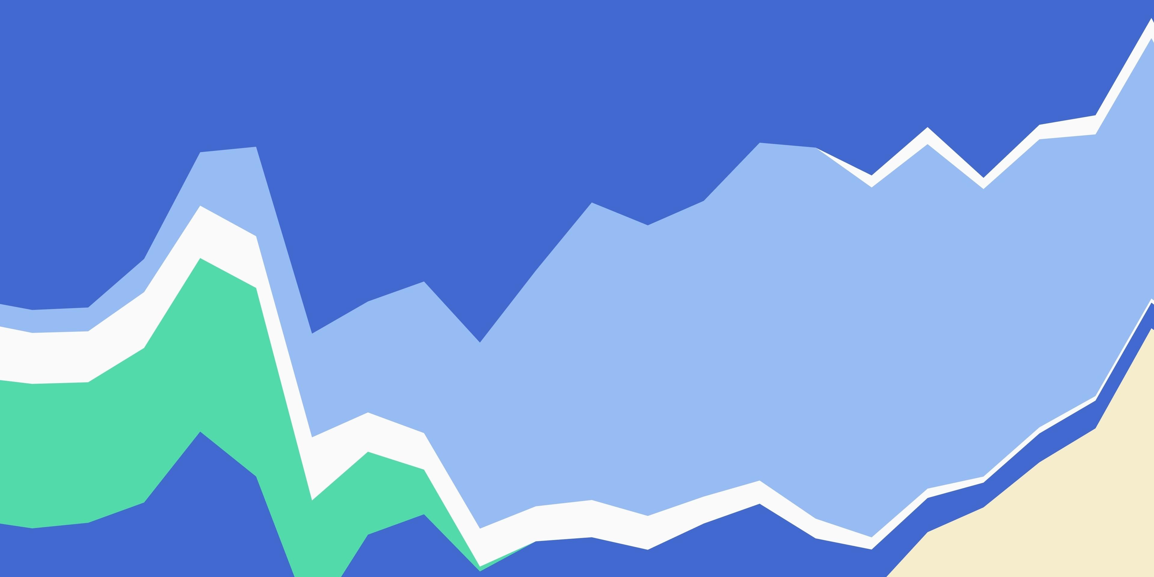
Dashboards built with code can adapt to the size of the window or display not just by scaling, but also by changing their layout. Here are two views of Observable Framework's mortgage rates example dashboard, with a third one further down. Note the different stacking of the cards between all three!
Dashboards and data apps often share items such as charts, data, as well as processing and modeling, etc. You certainly tend to want them to be built in a consistent way and follow the same style guides. And yet, with legacy BI tools, you need to build each new dashboard by hand, with little or no reuse of items.
By building dashboards with code, you save time and effort by reusing existing components like charts, themes, or big number boxes from existing libraries or that you’ve built yourself. The plethora of statistics and analysis tools in R and Python mentioned earlier are widely used and vetted, which allows you to build useful analyses quickly, and with fewer sources for errors.
Even within the same dashboard, you might be using the same kind of chart, or the same kind of analysis, for different data. With a code component, you can just call a function that performs the same task, such as producing the same big number with a chart and explanatory text created from the numbers.
This is also true for layouts and all sorts of stylings that are usually reused for consistent branding. Code (in the form CSS definitions) lets you create the look and change it in a consistent way, without having to worry about missing an item somewhere. Maintaining consistent styling and layout both within and between dashboards with the simple inclusion of a stylesheet saves time and effort.
Building your own components and stylesheets is a great investment into your workflow. The up-front effort pays huge dividends whenever a new dashboard can just reuse it and show the familiar processing of the data while staying on brand.
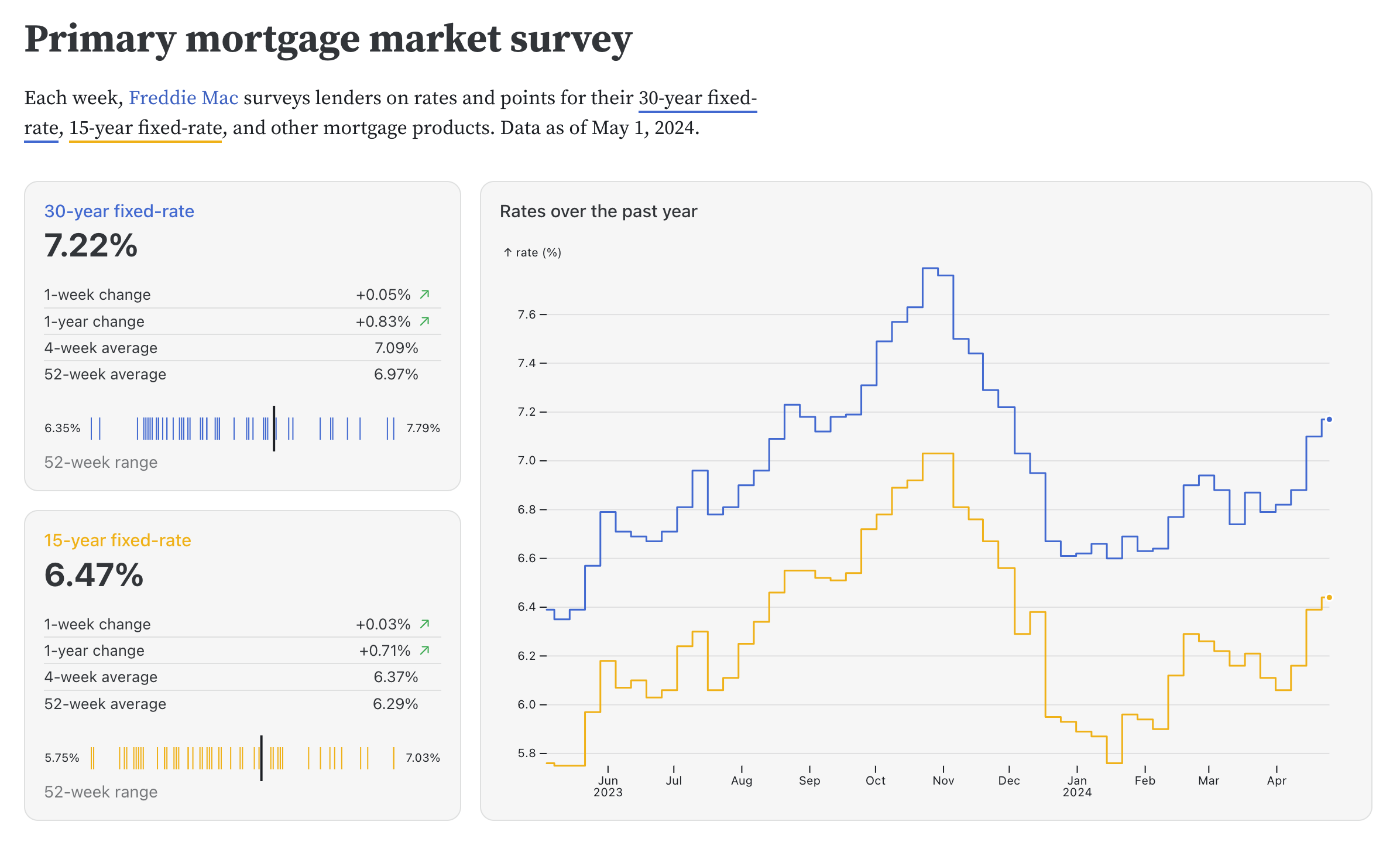
The two cards on this mortgage rates dashboard are created by the same function, which gets invoked twice for different data series. Note also the different layout compared to the earlier image, with the chart next to the boxes in the wider view.
Traditional BI tools are great for quickly putting together common chart types, but making truly custom charts and dashboards quickly becomes tedious. You might be able to coax a BI tool into showing you an unusual chart, such as a Sankey diagram, but it will require a lot of work. Or you might be able to pick it from a chart gallery or marketplace, but you'll only be able to make limited changes.
When you create data apps and dashboards using code, you can make use of the huge number of charting and visualization libraries, including those oriented towards exploration, like Observable Plot and those suited for bespoke interactive visualizations, like D3. This means that you can just reuse existing code examples to make more visualizations, including Marimekko charts, Sankey diagrams, dense yet interactive dot plots, node-link diagrams for graphs, custom maps, and more. Because it’s all code, the charts can be customized further to best display your data, and perhaps even come up with an entirely new way to show your data!
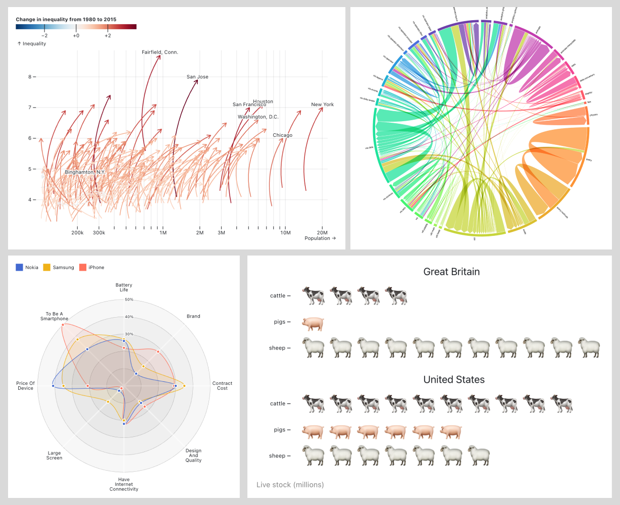
Swoopy arrows, chord diagram, radar plot, ISOTYPE chart? These and many more uncommon chart types are available when building a data app or dashboard using code.
Code allows you to decide what to build. Code gives you control over your dashboards, both in terms of functionality and styling. Code makes it possible to reuse and transfer work, and make use of the vast number of libraries and code snippets out there.
The best dashboards are built with code.