arrrrrmin
Public collections
Showing all 2 collections
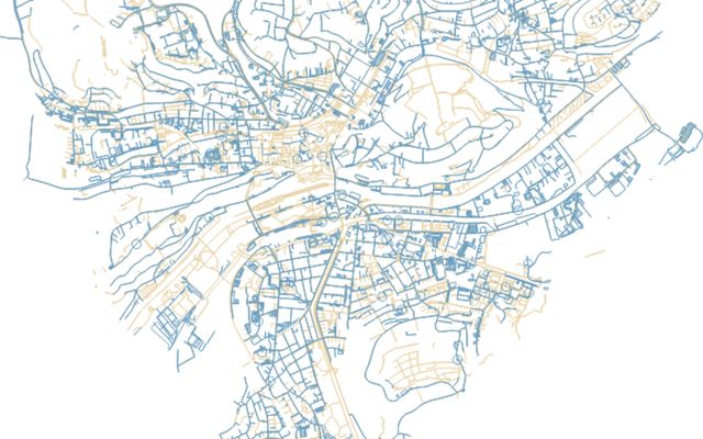
An experiment on urban space distribution using Tübingen as example. Tübingen is a town of around 90k citizens and is known for its green touch and cyclist friendliness. But maybe we can actually compare this against other types of mobility?