Webinar: How data journalists turn data into stories that stick

The modern data visualization platform

Discover the all-in-one platform for data analysis, visualization, and cross-functional collaboration.

Introducing the collaborative data canvas
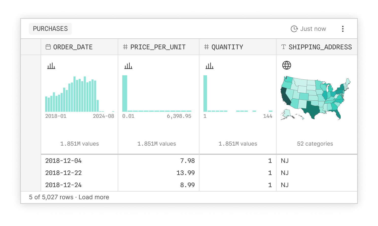
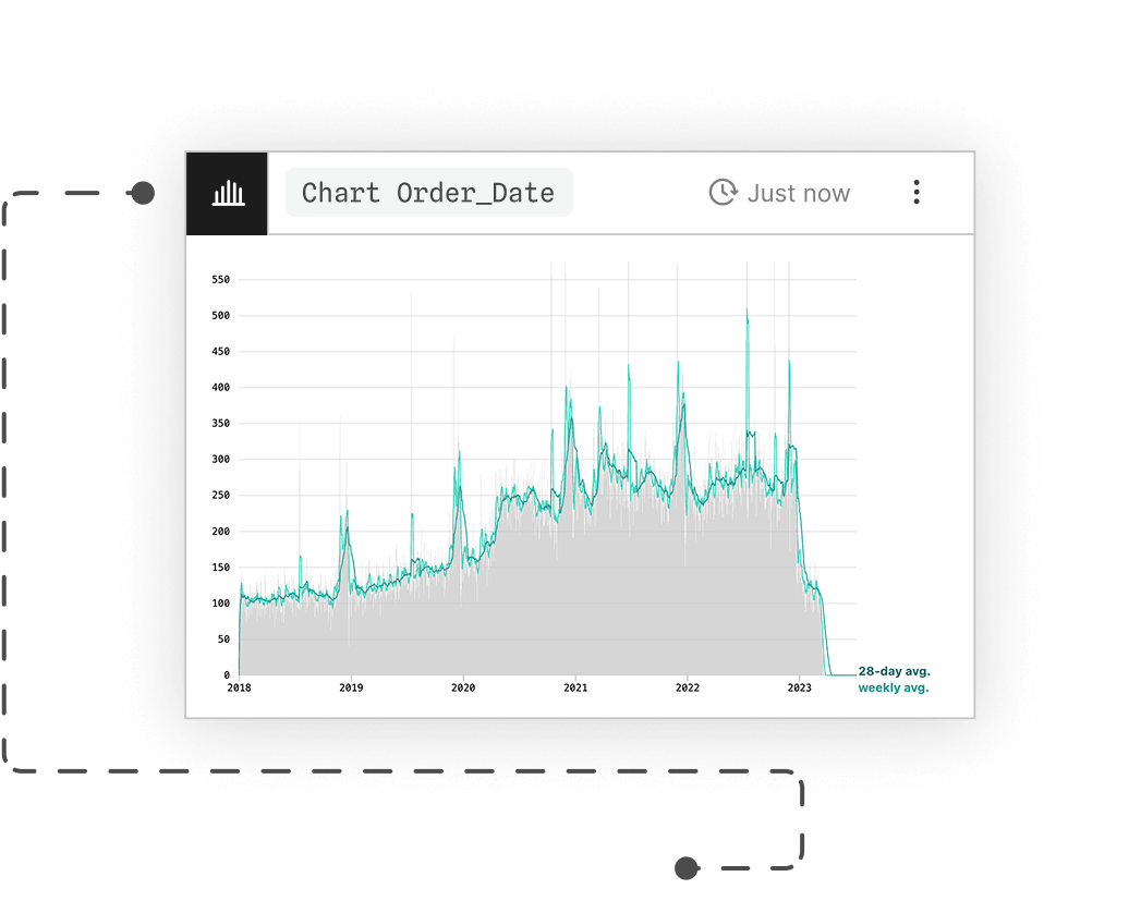
Go faster together. Bring cross-functional stakeholders into the data workflow by exploring together in real-time. Increase data literacy, discover different perspectives, and uncover insights as a team.
Analyze

Explore and visualize data

Query, filter, join, group, derive, and visualize data without hopping between tools. Discover and share insights faster than ever.
Accelerate

Supercharge your workflow with AI

Discover more insights while maintaining confidence in the results. AI is interpretable, transparent, and seamlessly integrated.
Refine

Make analysis crystal clear

Fearlessly explore and refine analysis on a spatial canvas. Add annotations as notes to self or others. Evolve ad hoc sketches into powerful interactive visualizations.
Extend

Code if you want to

Point-and-click, AI, or SQL? It's your choice. Peruse queries with summary tables. Use AI to draft new SQL queries or Plot code that you can modify as needed.
Share

Show off your work

Create and share polished, stakeholder-friendly dashboards in just a few clicks. Embed charts in internal apps to get your team on the same page.
FEATURES

Build dashboards

Combine visualizations into a stakeholder-friendly dashboard.

Share

Embed into a host app, send a URL, or export to PNG.

Interact with data

Filter and brush on the canvas, in embeds, or on dashboards.

Connect to your database

Supports Snowflake, BigQuery, DuckDB, Postgres, and Databricks.

Build with AI

Explore, analyze, and create charts with inspectable AI.

Write code

Use SQL and build custom charts with code.

Customize your workspace

Create bespoke components for your team.

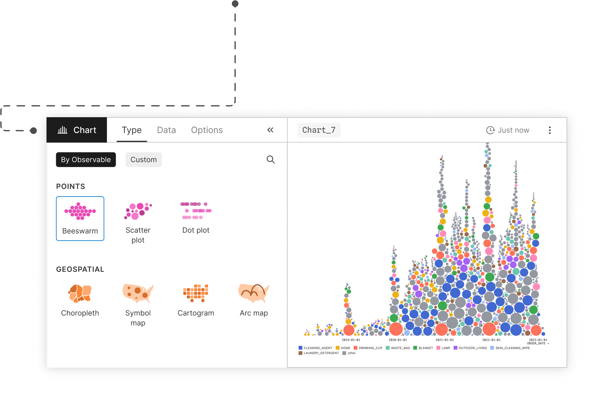
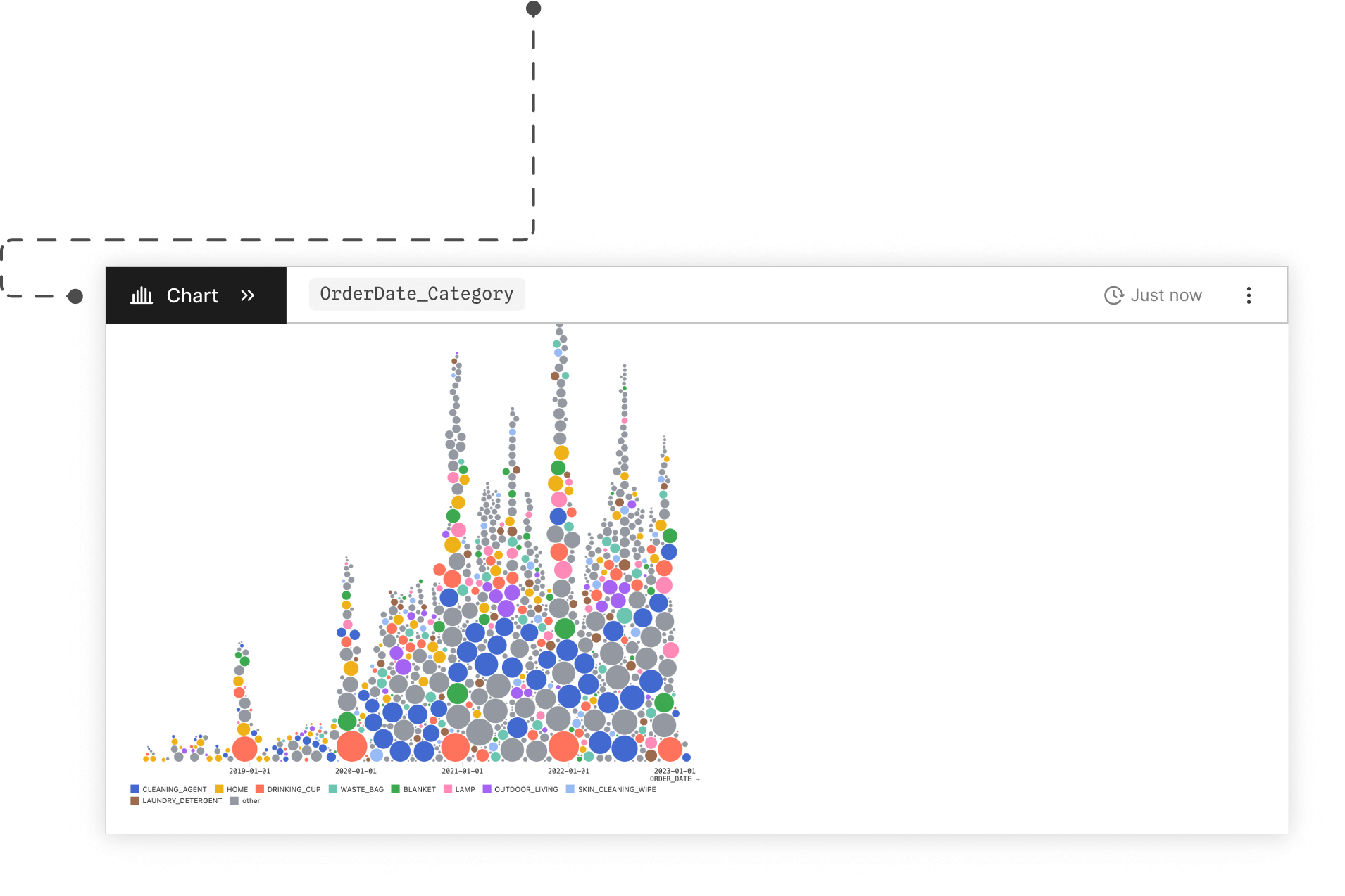
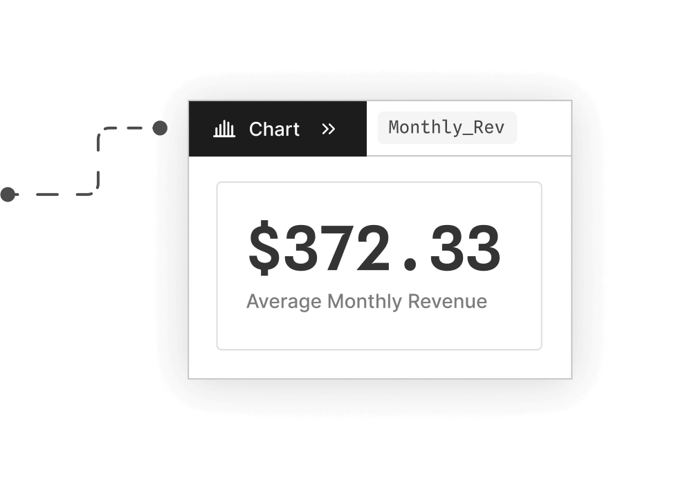
Create better charts

Sankeys, beeswarms, bar charts, maps, histograms, (and more!) are built-in!

Observable opened up a new realm of possibilities for what we could do and offer. We created dynamic, interactive experiences that let users visualize and use climate change data in ways that we couldn’t easily support before.

Kaitlyn Trudeau

Senior Research Associate at Climate Central

Kaitlyn Trudeau

AI is critical during all aspects of the discovery process from designing the right graph to tweaking the graph that you need, to getting the right insights for what the user needs.

Gabriel COCH

Founder, Agropatterns

Gabriel COCH

It's been such an eye opening and exciting process because we're often quite used to spreadsheeting for internal purposes and manually visualizing data. But canvases really help us optimize our analysis and visualization process and saves us time.

Clarence Kitt

Senior Service Designer, InWithForward

Clarence Kitt

Community hub

Events

ThuDec 4

Storytelling with graphics: From raw data to reader impact
Register now

WedDec 10

Live demo: Updates to canvases
Register

Connect with us

New in Notebooks

Newsletter signup

Videos

Art + science: Blending creativity and analysis in data visualization
Watch now

Data viz fact

Treemaps were created in 1990 as a way to show who was using how much space on a shared 80MB hard disk by subdividing space to reflect the relative sizes of files and directories.
Learn more

Spotlight

Making science visible
Dr. Philip Bogden walks through his process of bringing data visualization to cancer research.
Read the interview

Get started today

Get started