Observable Canvases are collaborative whiteboards for fluid data exploration, analysis, and visualization. Across the infinite canvas, charts and data transformations can be freely arranged for flexible exploration that isn’t constrained by traditional linear workflows. This makes it lightweight for data teams and stakeholders to branch off into new analysis paths, and to display findings side-by-side for easy testing and comparison.
Clearly representing data flow in such a flexible system is critical. It allows users to track how data is processed, so that findings can be responsibly considered and interpreted. And, it empowers users to confidently update data inputs and outputs so they can compare different slices of the data.
But representing data flow isn’t as simple as drawing arrows between nodes. Here, we take you behind the scenes of Observable Canvases to highlight how we’ve designed connectors that clearly visualize data flow, and make it nicer to control.
Representing data flow in Observable Canvases
Connectors are visual representations of data flow across a canvas, indicating where data is coming from, and where it’s going to.
Internally, we often refer to connectors as edges, which comes from language describing directed acyclic graphs, or DAGs. DAGs represent a topological process order, like steps in a sequence. They are composed of nodes (or vertices) representing a state or event, and edges representing paths between them, as shown below.
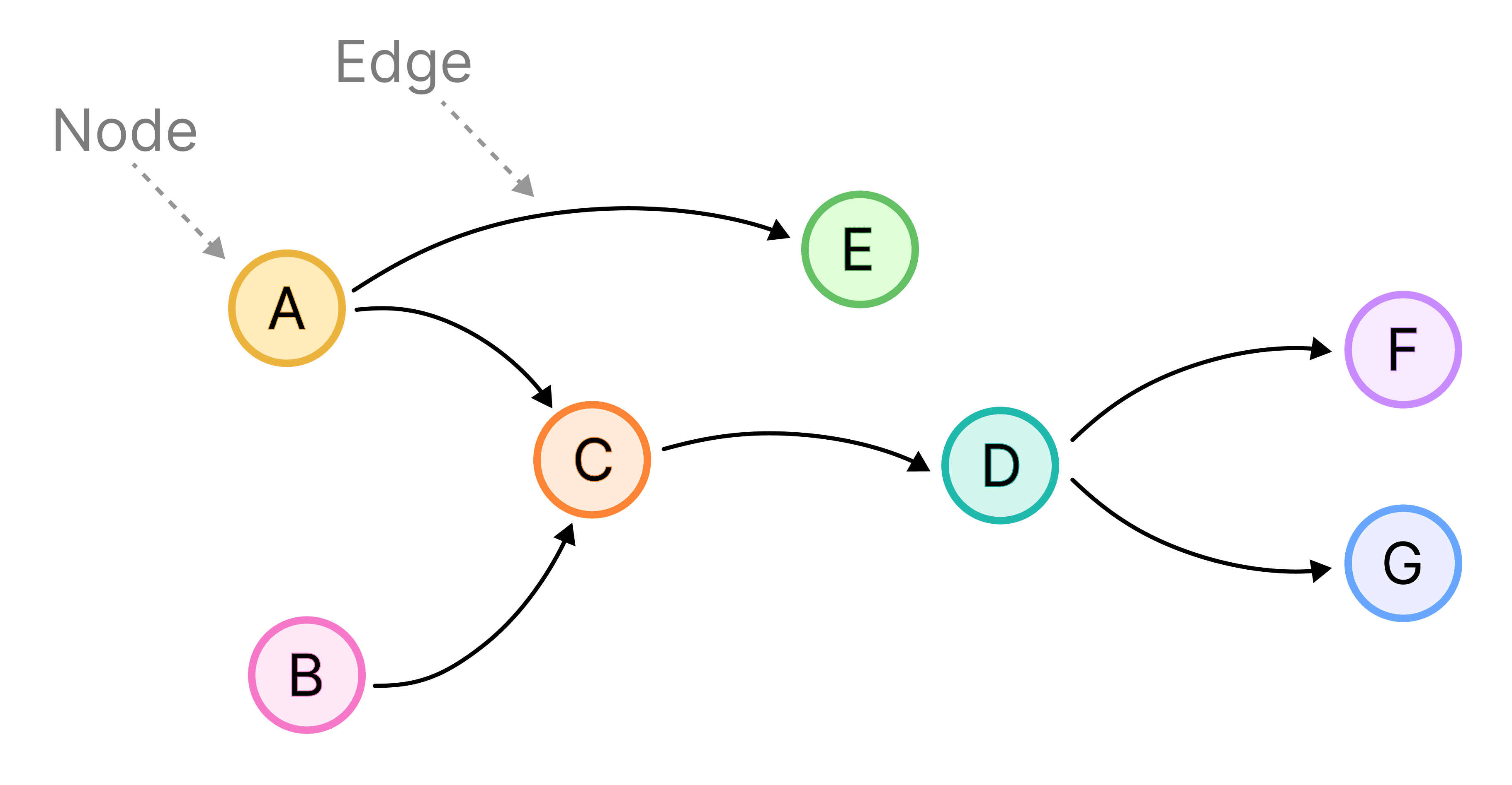
Canvases are DAGs composed of nodes (which can be a Table, Chart, SQL, JS, or Control node) and edges, which are the connectors representing data flow between them. Canvases are both “directed” and “acyclic”: directed, because data is passed from upstream nodes to downstream nodes, and acyclic because data flow can never loop from a downstream node back to a node upstream from it.
Below is a canvas with content that maps to the DAG shown above. Connectors are the dashed lines between nodes, with black circles (which we call “ports”) as endpoints.

In canvases, connectors are both a visual cue indicating data flow, and an interactive way for users to manually control data inputs and outputs. By dragging connectors, users can rewire data flow to hop between different exploration paths.
Designing clear connectors amidst complexity
Canvases are built for unconstrained, branching data exploration and analysis. This intentional flexibility means that nodes and connectors can interweave and overlap. Users can freely add or remove content, and easily update data flow.
In a poorly designed system, that flexibility could result in a tangled web of content with hard-to-track data flows. But not in canvases! We’ve designed custom connectors to clarify data flow, and make it easier to control.
Here are some decisions we made along the way:
Defined ports for clear, predictable data flow
One way we simplify data flow in canvases is with defined ports. Ports are the black circles indicating where data is passed to or from for any node.
There are two ways that we define ports: by location, and by the number of inputs allowed. In terms of location, we restrict where a connector can “attach” to a node. Data inputs always enter on the left side of a node, and outputs exit from the right. We also restrict the number of ports for each node. Currently, the Join node is the only node type with two input ports, since it expects two data sources, as shown below:
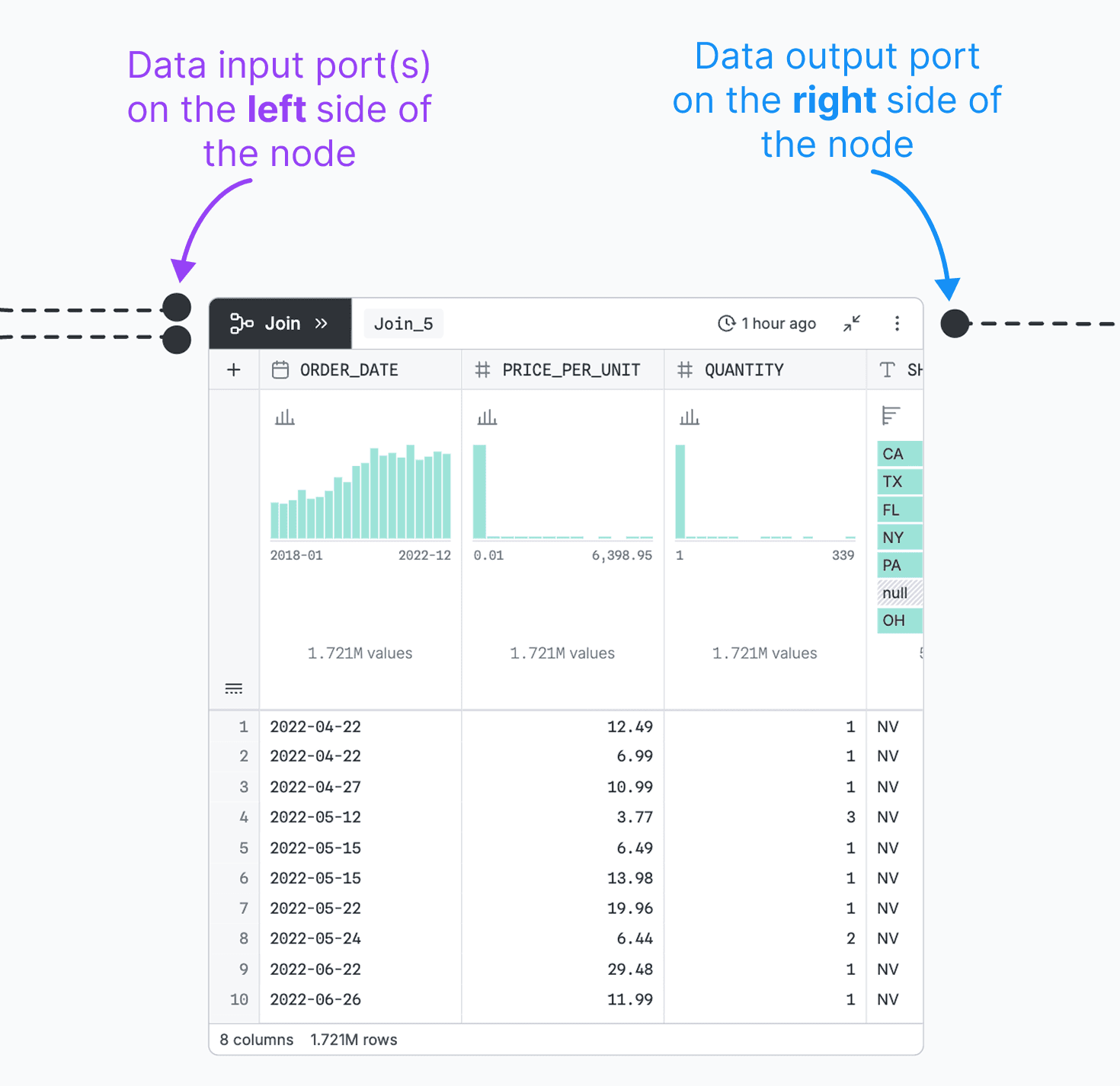
Defined ports make data flow predictable: users know exactly where to look for a node’s data source and output, and how many inputs are expected. The constraints we placed on ports to simplify data flow are also helpful in avoiding UI conflicts, like overlapping toolbars and connectors that cause user friction.
Observable Software Engineer Alex Baldwin explains:
An earlier version of canvases used arrows that could connect anywhere on a node. But while designing other parts of the UI (like the node toolbar), we realized that we didn't have a good way to prevent connectors from colliding with that UI. Having designated input and output ports gives us more control over our UI, and they also make it easier to quickly understand data flow without having to think about arrow directions.
Alex Baldwin
Guardrails that set you up for success
We aim to make canvases flexible but hard to break. In addition to the visual constraints described above, we’ve put guardrails in place to help users stick to valid data flows, and avoid time wasted on query errors. When it comes to connectors, we do that with smart snapping and restrictions on data flow to avoid loops.
Smart snapping is both a convenience feature and a data flow helper. As a user drags a connector near a valid port, it will automatically snap into place as long as it’s an allowed connection (i.e., from an output port, to an input port). Additionally, a connector will turn red, and will not snap into place, if the resulting data flow would create a loop.
Below, notice how the connector snaps to nearby output ports, but does not snap to an input port along the way:
Zoom handling for a nice UI at any scale
Building an infinitely scalable UI comes with its challenges. We first saw this when ensuring a node’s ports remain well-sized and correctly positioned as a user zooms in and out. Will Chase, an Observable designer who worked on this UI, describes how we address this in canvases:
In an infinite canvas, there's always the question of whether an element should scale with your zoom level, so it appears the same size as you zoom in and out, or whether it should remain a fixed size. For ports, we take a hybrid approach: they scale a subtle amount at intermediate zoom levels, but we clamp the scaling beyond that range so that ports do not appear comically large when zoomed out, or too small when zoomed in.
Will Chase
The resulting ports scale smoothly as a user zooms in and out, keeping connectors visible from a distance, and manageable close up.

Custom repositioning and scaling keeps ports in the right place relative to the node, and big enough to see when zoomed out (left) but not distractingly large when zoomed in (right).
Explore the leading edge of data analysis
In Observable Canvases, data exploration and analysis isn’t constrained by linear workflows. With this added flexibility, clearly representing data flow is both more challenging, and more critical.
Our clear and predictable connectors help users to direct and track data as it transforms in branching analyses across the canvas. Defined ports, helpful guardrails, and refined connector behavior during scrolling and zooming make it easier for users to track and define data flow — and harder to make mistakes.
Want to test out Observable Canvases yourself? Request a demo, and get started with a free pilot.