The qualities that make for the most engaging and valuable data visualizations are often the hardest to implement from scratch. Features like interactive filtering, responsiveness to adjust for different screen sizes, extreme value handling, and optimized performance can have a huge impact on how stakeholders experience your charts and dashboards. At the same time, adding these advanced chart features can be a big lift, making the last 5% of dashboard development take up 95% of your effort.
Unfortunately, this often means that exceptional visualizations and dashboards are only possible for advanced developers with the skills (and time!) to code them up. Everyone else is left filing requests with their organization’s data visualization developer (if that position exists), or settling for shallow, underwhelming dashboards that end up rotting away.
We want to change that.
In Observable Canvases — our new collaborative whiteboards for data exploration, analysis, and visualization — we’re democratizing interactive, advanced charts. Read on to learn about some of the expert-level chart features that users get for free in canvases.
An expanding chart library from expert developers
Our growing chart library already includes state-of-the-art advanced charts like Sankey diagrams, treemaps, beeswarm charts, streamgraphs, and grid cartograms — all possible to build in just a few clicks.
All charts in the library are developed and tested by Observable data visualization engineers. With meticulously designed out-of-the-box charts, you avoid time spent tweaking chart details to get your visuals presentation-ready.
For each chart, UI options let you quickly define color and size channels, update time series intervals (e.g., daily, weekly, or monthly aggregation), switch between interpolation algorithms, and more.
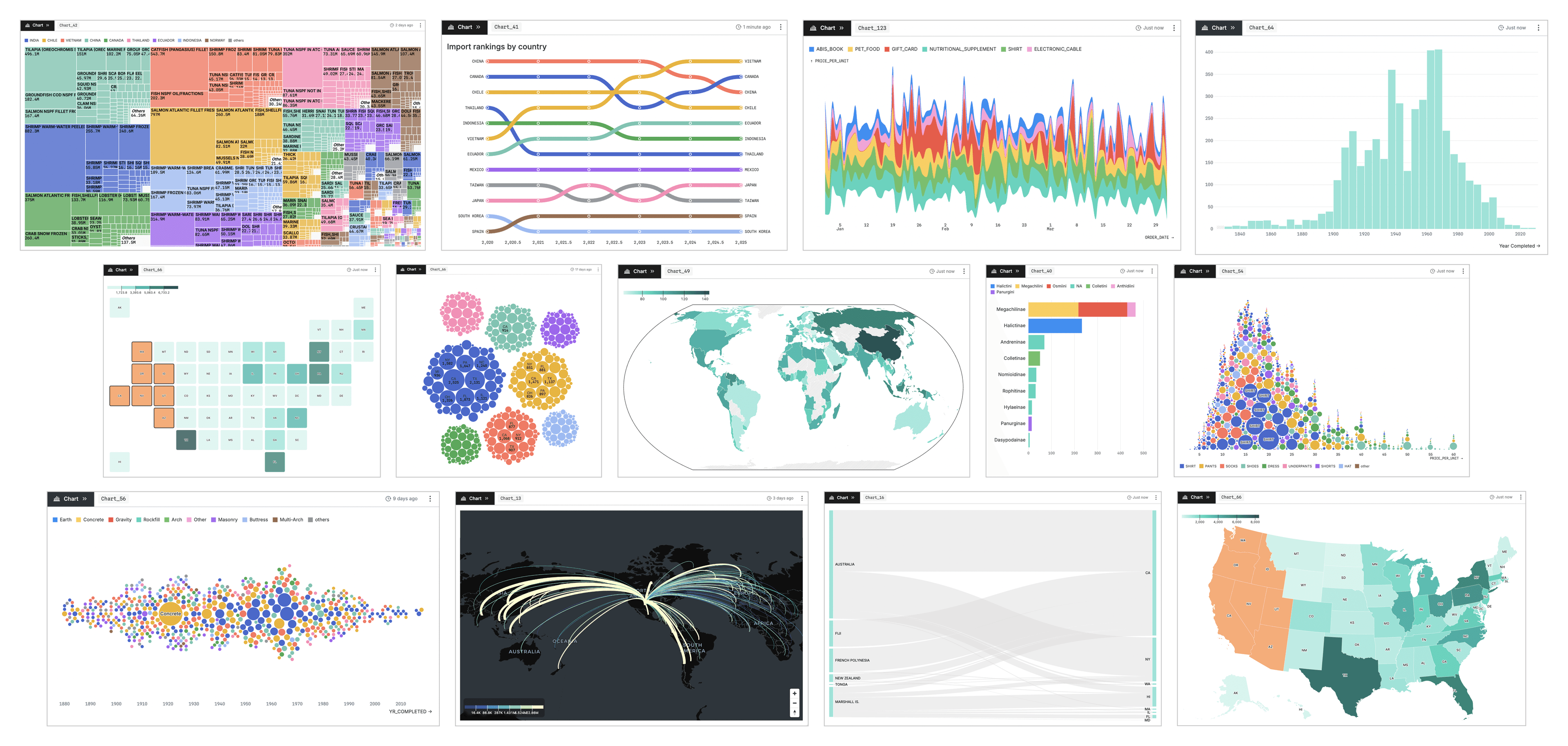
Selected charts in the Observable Canvases chart library.
Built-in visual filtering
Visual filtering allows a viewer to explore different subsets of data across views by interacting directly with a chart or table (as opposed to creating new subsets with code). When a group or segment of data is selected in an upstream chart — usually by brushing over continuous values, or selecting discrete categories — downstream charts automatically update to reflect the same subset. This makes visual filtering a useful, lightweight way to test and explore relationships for different slices of the data. Unfortunately, it is also notoriously challenging to implement from scratch.
In canvases, visual filtering is available in table nodes and in many of our large charts including density charts, scatterplots, bar charts, choropleths, and grid cartograms. When you brush or select a subset of data in an upstream node, downstream charts are automatically updated to reflect the added filter.
For example, when a user brushes over the density chart below (left), the downstream bar chart is automatically filtered to the selected subset of data records:
Similarly, you can select or deselect multiple categories to filter by discrete groups using the following shortcuts (swap Ctrl for Cmd in Windows):
Cmd-click: select individual categories
Option-click: deselect individual categories
Click-shift-hold: select contiguous categories
Option-click-shift-hold: deselect contiguous categories
In the horizontal bar chart below, a user selects (purple) or excludes (orange) a set of product categories to limit records included in the downstream beeswarm chart:
Responsiveness makes charts a good fit for any screen
Have you ever made an exquisitely formatted chart, only to find it’s unreadably small or horribly distorted when viewed by collaborators on another device? Yeah, us too — and it’s a hassle to fix after-the-fact.
All charts in the canvas library are responsive by default. As the chart area changes, charts adjust automatically to maintain readability and polished styling on any device, as shown for the activity timeline below:
Some charts even have responsive resolution, meaning the level of aggregation changes to show more detail when space allows. For example, the histogram bin width adjusts automatically as the chart width updates:
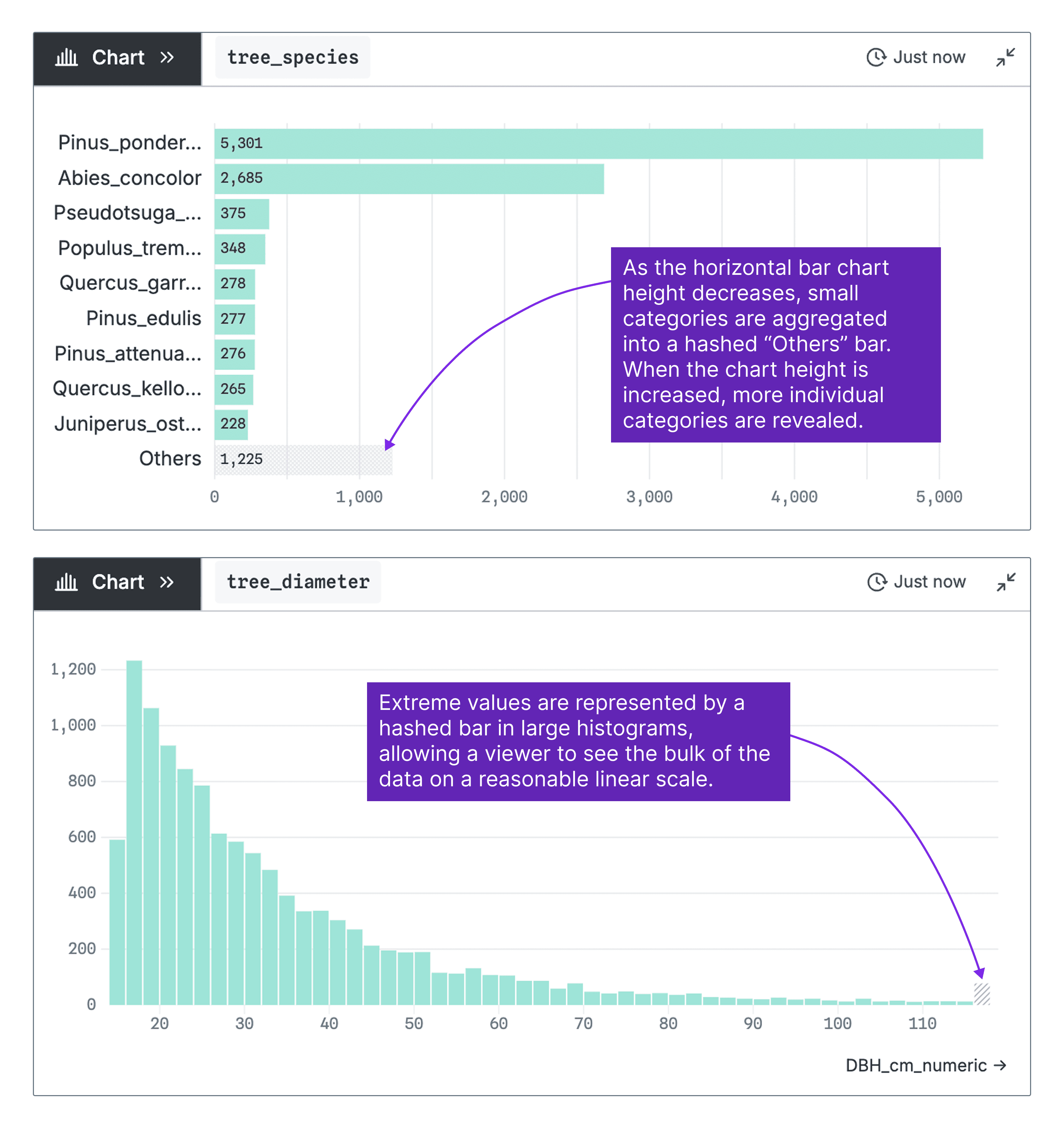
Extreme value and “others” handling
There’s no single right way to handle extreme values and small categories in data visualization. In some cases, those may be the most important data points to dig into. More often, the effect of including “out there” observations is to extend chart axes far beyond the bulk of your data, which then gets compressed into a small corner of your chart. Options like log transformation can help, but can also make interpretation challenging for many viewers.
In canvases, we’ve built smart outlier and “others” category handling into large charts. Our strategy helps you focus on a clear view of the vast majority of your data, while keeping extreme values or unseen categories visible so you can dig in further when you need to.
Examples of our implementation are shown below for a horizontal bar chart and histogram are shown below:
Performant charts, no matter the size of your data
Companies are collecting increasingly large volumes of data that, in the right analysts’ hands, has the potential to unlock valuable business insights. But trying to visualize millions of records (or sometimes, far fewer) can slow charts and dashboards to a crawl in traditional BI tools, making them all but unusable. At the same time, plotting millions of individual data points is rarely useful: too many marks leads to noisy, overwhelming visuals that make it hard to focus on the most important signals.
To keep charts fast and clear in Observable Canvases — even when you’re working with huge datasets — we run optimized queries that return a smaller, pre-aggregated version of your data that is still at high-enough resolution to produce rich charts.
Learn why charts built on big datasets tend to be slow, and how our approach delivers rich and performant charts, in our recent blog post.
Follow along as we expand the premier chart library for business intelligence
Data analysts shouldn’t be limited to static, shallow visualizations and basic chart types. In canvases, we’re making advanced features like interactive visual filtering, responsiveness, extreme value handling, and performance available for everyone — not just seasoned developers.
Learn more about how Observable Canvases can help your team explore and visualize data here. To stay up to date as we add new charts and features, sign up for our monthly newsletter and bookmark or subscribe to our release notes!