Today we’re excited to announce a breakthrough in data collaboration: Observable Canvases.
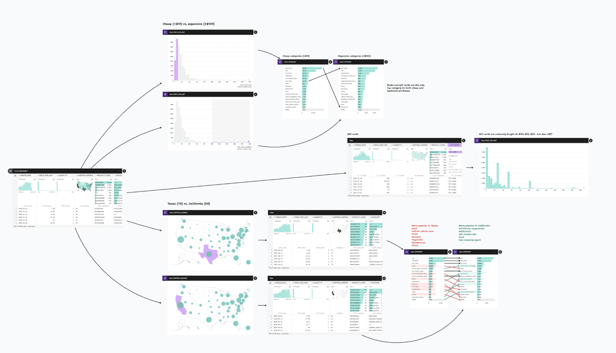
Data analysis involves branching paths that transform and summarize tables in different ways.
Canvases are computational whiteboards for exploring, visualizing, and analyzing data. By combining queries, tables, charts, freehand sketches, highlights, notes, and more — augmented with contextual AI that’s designed to be more interpretable and fluid — canvases capture and communicate context and help everyone on your team to engage with analysis.
Why canvases
Data analysis requires constantly looking at data to make sure we’re on the right track. We peek at the first few rows of a table, check the extent of a column, or count missing values. Spot checking is essential to catch surprises and avoid bogus results (or: garbage in, garbage out). Like wiring up a circuit on a breadboard, we test components and connections as we go.
And like any creative activity, analysis is not a straight line from question to answer. It is exploration, experimentation, and iteration. Vague and underspecified questions require us to establish precise, quantitative definitions — of product activity, sign-up funnel, top customers, and the like. We try one approach and then another, advancing and retreating, pursuing serendipitous discoveries.
Our quarry is not merely a private insight but something that can be shared — then inspected, tested, poked, validated — with our stakeholders. To help an organization operate intelligently, we must externalize assumed context, annotating charts and numbers so they can speak for themselves.
But how well do our tools actually support this process?
Too often, today’s tools don’t proactively surface visual summaries, instead requiring the analyst to spot check manually. Too often, tools force a linear workflow that penalizes experimentation and flattens thinking. And too often, tools don’t capture the messy context and thinking around analysis, leading to results that don’t communicate.
We want to fix that.
A better medium for observing data
Canvases let you arrange analysis spatially. Starting from a table in your data warehouse, you can add downstream nodes to filter or group rows, to join tables, or to show charts or summary metrics.
Having two dimensions to organize your work increases flexibility. It’s easier to keep track of what you’re doing, and for others to see it at a glance: just zoom out to see the big picture. And it gives you space to try out ideas without disruption, whether you’re working alone or together. Simply option-drag, Command-D, or copy-paste to duplicate nodes.
Canvases use summary tables to help you perceive data throughout analysis. These visual overviews help you notice anomalies and interpret insights. To accelerate data exploration, canvases encourage direct manipulation — just click on data in a table or chart to filter, exclude, derive, sort, and the like. Nodes can be constructed either visually, by pointing and clicking, or by writing code.
Canvases work performantly with large data by pushing compute to the underlying data source. Instead of materializing the full results of queries, canvases compute fast column summaries, say, to bin quantitative values for a histogram or to group the top categorical values for a bar chart. Any node on the canvas can be an implicit common table expression (or CTE) in a SQL query. (It’s query pushdowns all the way down.) And canvases capture query snapshots as you work, so everyone will see the same results — whether today, tomorrow, next week, or next year.
While it may seem counterintuitive, we want canvases to feel a bit messy — because analysis itself is messy. Canvases support freeform whiteboarding powered by tldraw. See something interesting in a chart? Simply draw on it, highlight it, or slap an arrow and label on it. By annotating as you go, you capture context and your work communicates better by default. Your stakeholders can ask questions and engage directly on the canvas for faster, deeper feedback. With realtime multiplayer editing, cursor chat, following, and more, the canvas instantly becomes a living, shared screen.
And of course, AI. We’re excited about the potential of the canvas to make AI a stronger, more reliable partner for analysis. LLMs are powerful yet unpredictable and prone to mistakes — not something you want when making critical business decisions. By integrating AI directly into the canvas, by using spatial layout and visual summaries, we seek to make AI-driven analysis more interpretable, inspectable, and steerable. We want AI to participate in a fashion similar to a human collaborator, leveraging context, annotating results, and even using multimodal AI to “see” charts. AI is no substitute for humans, but it can make us more efficient, creative, and autonomous.
A space for cross-functional collaboration
For years, business users have dreamed of “self-serve” analytics where they can answer their own questions with just a few clicks; but too often, business users are relegated to specialized “self-serve” tools that isolate them from data practitioners and offer only limited capabilities. This results in inconsistent and incorrect results, questionable interpretations, missed insights, and ultimately a loss of trust in data.
Isolating roles is counterproductive; we should instead bring people together more efficiently. Analysis can be presented visually, spatially, and contextually on the canvas to aid interpretation. And stakeholders can engage directly, increasing agency and removing ambiguity when providing feedback. Data analysis becomes more fluid and efficient when people work together.
Early access starting today
We’re excited to announce our early access program for Observable Canvases today. If your data team is interested in participating, or you’d like to receive development updates, please let us know. We’d love your feedback. Canvases will be generally available later this year.
Update: Canvases is now in general availability. Get started here.