Between the Observable Plot and D3 galleries, and thousands of public Observable Notebooks shared by community creators, there’s an expansive collection of stunning, interactive, and openly shared data visualizations waiting to be reused.
If your data is already in the same format used in the data visualization you’re interested in, then you might be able to simply drop in your data, update some variable names, and see your own version of the chart appear. But often, that’s not the case, and you’ll need to do some data wrangling to get your data into the expected format.
In this post, we describe data formats expected by Observable Plot and D3. We start by explaining tidy data — the most common data format used by Plot charts — and showing how to get data from wide or nested structures to tidy format. Then, we cover several data shapes that appear frequently in D3 examples, including aggregated values and nested arrays. For each, we share examples in a companion notebook with code that you can explore and reuse to transform your own data into the expected shape.
For Observable Plot: keep things tidy
Observable Plot is our open source JavaScript library for data visualization, which follows the grammar of graphics style to build and customize charts layer by layer. Whether you’re building from scratch in Plot or reusing existing examples, you’ll generally want your data in tidy data format.
Tidy data is a specific way to organize data where each variable is a column, each observation is a row, and each cell contains a single value. Organizing data in this way helps you write more efficient code to generate visualizations, while letting Plot handle operations for things like grouping, aggregation, and faceting. That’s more efficient than layering separate marks for each series or group, for example, to create a multi-series line chart from values spread across multiple columns. And, a consistent and predictable tidy data format makes it easier to switch between data sources and chart types.
Most often in Observable, you’ll see tidy data stored as an array of objects. For example, when you read in a CSV file using FileAttachment, you get an array of objects where each record is contained within an object, with key-value pairs indicating the field and corresponding value.
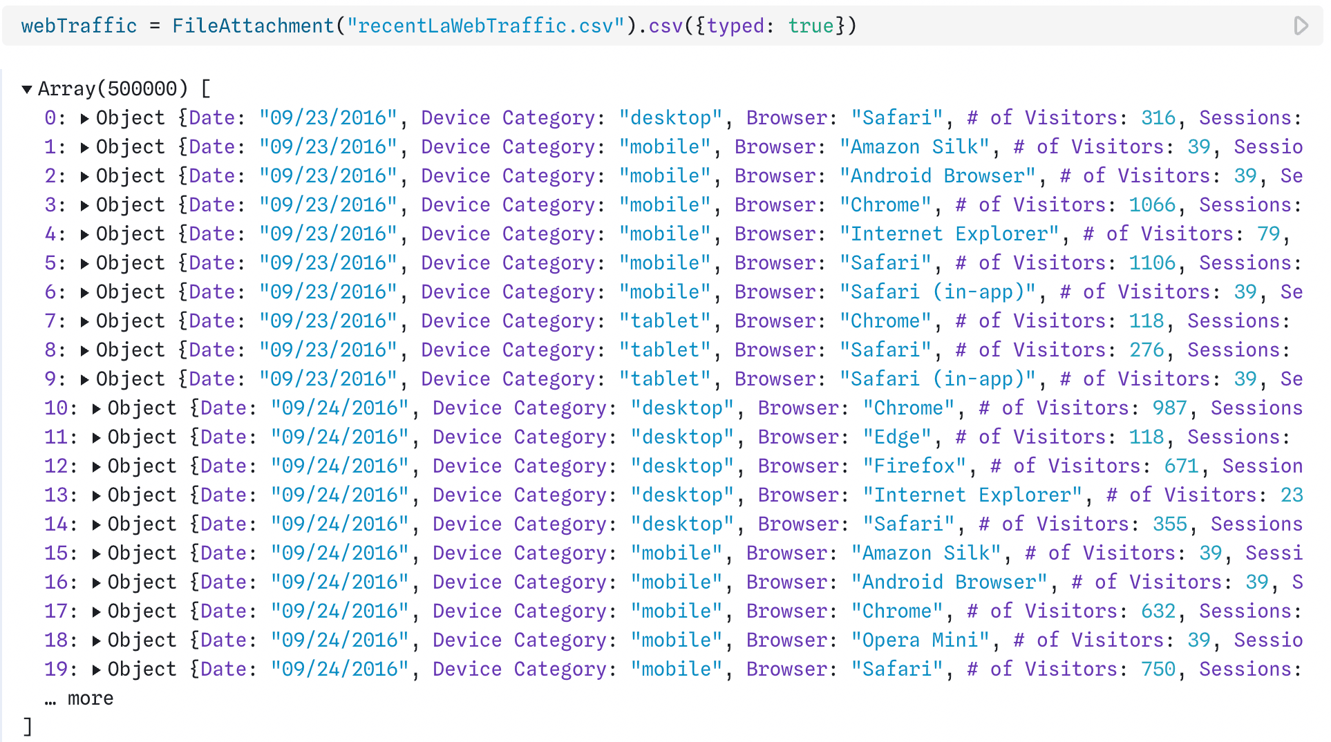
In JavaScript, data is commonly read in as arrays of objects with key-value pairs indicating the variable name and value for each record as shown above for web Los Angeles city web traffic. Data: LAcity.org website data.
Plot also supports columnar data formats, like Apache Arrow and Parquet. While these often look similar to data stored in rows, for example in a CSV file, they are actually quite different under the hood. In Arrow and Parquet formats, values for any field are stored together in columns. This, along with efficient compression, helps keep data access and transformation fast because you can retrieve just the variables you need for your visualization or analysis.
In Plot, variables from columnar data can be used directly as channels with the column name encoded as a string. In contrast, when referencing variables from row-based data, Plot uses an accessor function to return an array of objects containing the data. Thus, while row-based data are the more common data format in JavaScript, columnar data formats are more performant and actually require less transformation in Plot behind the scenes.
Getting data into tidy format
There are many different ways data can be uniquely untidy (as Hadley Wickham says: “Like families, tidy datasets are all alike but every messy dataset is messy in its own way”). Wrangling untidy data to get it into tidy format can be similarly bespoke. Here, we’ll highlight one common data transformation: pivoting data from wide to long format.
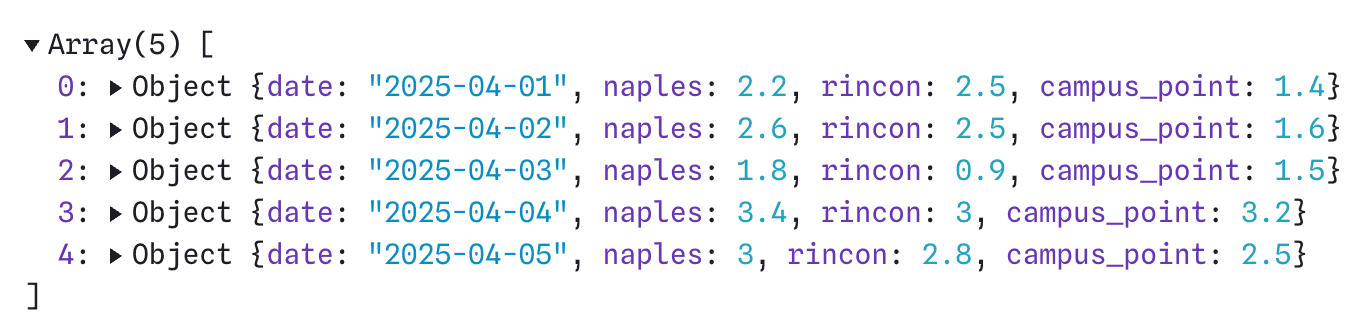
For our example, we’ll use the sample data below called waveHeight, which contains mock maximum wave heights at three locations on various days. This data is untidy because wave heights are spread out over three columns instead of occupying one, and the key names (“naples,” “rincon,” and “campus_point”) are actually values of the location variable.
We want to pivot the data so that location and wave height each occupy their own column. There are a number of ways to do this JavaScript, for example using the pivotLonger function in tidy.js. Or, we could use the code below to transform waveHeight into tidy format in JavaScript:
  const waveHeightLong = [];
  for (const row of waveHeight) {
    for (const location of ["naples", "rincon", "campus_point"]) {
      waveHeightLong.push({
        date: row.date,
        location,
        height: row[location]
      });
    }
  }
The output from the code above is a new array of objects where each variable (date, location, and wave height) is a single ‘column’:

Explore the live code to do the wide-to-long pivot shown above. Want an even simpler option? Mike Bostock recently shared a longerY function that can do the transformation right within your Observable Plot code!
A unique case: a simple array of values
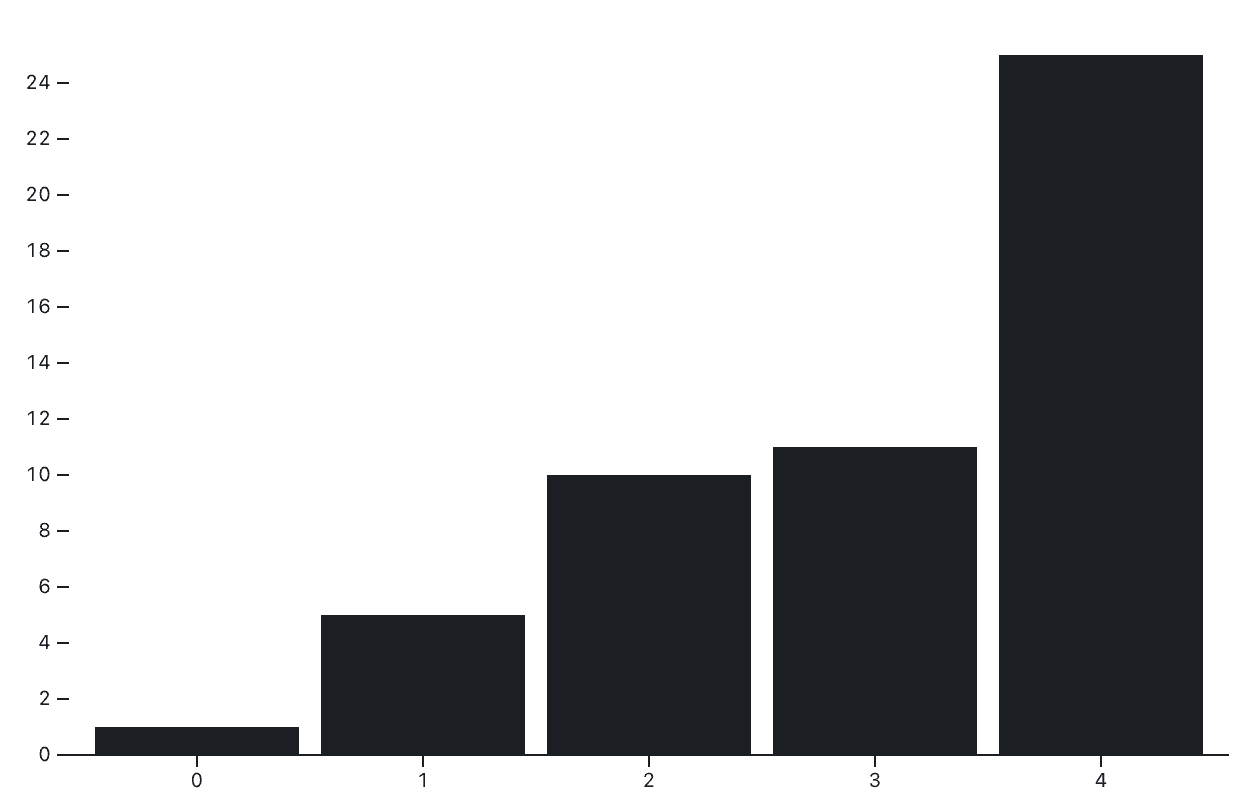
Sometimes, you may just have an array of values that you want to visualize, which is basically tidy data with a single variable.
Both Plot and D3 happily accept arrays of values as a chart data source. For example, if the array [1, 5, 10, 11, 25] is stored as simpleArray, we can make a bar chart in Plot as follows:
Plot.plot({
  marks: [
    Plot.barY(simpleArray),
    Plot.ruleY([0])
  ]
})
The code above produces the bar chart shown below, where index is shown on the x-axis, and corresponding values are represented by the bar height:
See how to similarly create a bar chart from an array of values in D3 and explore the live code used to create the charts above.
From nested data to flat tables
What if your data starts off in a nested structure, but you want to create a data visualization using Observable Plot? Plot can generate charts that represent a nested hierarchy, for example in the tidy tree and cluster diagrams, but still expects flat rectangular data.
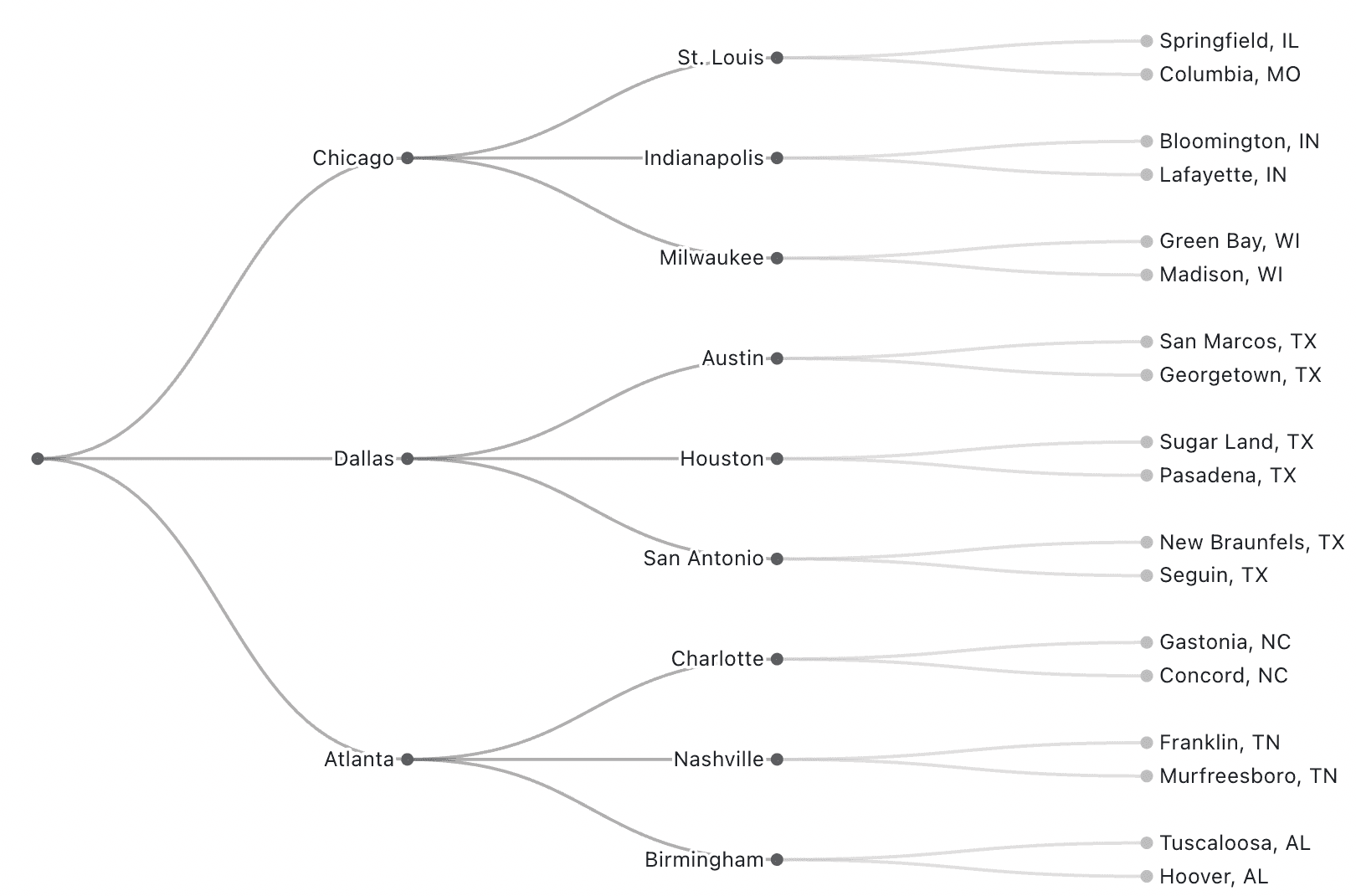
We can use flatMap in JavaScript to flatten nested information and return tabular data that still captures the hierarchy. For example, here are the first entries in a small nested dataset representing package distributions from large hub cities, to intermediate distribution centers and then to final destination towns:
shippingNetwork = [
  {
    hub: "Chicago",
    distributors: [
      {
        city: "St. Louis",
        towns: [
          { name: "Springfield, IL", packages: 120 },
          { name: "Columbia, MO", packages: 95 }
        ]
      },
      {
        city: "Indianapolis",
        towns: [
          { name: "Bloomington, IN", packages: 110 },
          { name: "Lafayette, IN", packages: 90 }
        ]
      }, …
We want to get this nested data into a flat table with two columns: one, which we’ll call location, representing the distribution path from hub to city to town in a single string, separated by a delimiter (we’ll use a dash), and a second called packages with the package count by town.
The code below transforms the data using flatMap:
flatShippingData = shippingNetwork.flatMap(hubEntry =>
  hubEntry.distributors.flatMap(distributor =>
    distributor.towns.map(town => ({
      location: `${hubEntry.hub}-${distributor.city}-${town.name}`,
      packages: town.packages
    }))
  )
);
This produces the following table (only the first 6 lines shown):

With our nested data represented in a flat table, we can use the Plot.tree mark, specifying the variable containing the path along with the delimiter to create a nice tree diagram:
Plot.plot({
  axis: null,
  margin: 10,
  marginRight: 100,
  marks: [
    Plot.tree(flatShippingData, {path: "location", delimiter: "-"})
  ]
})
The format above works with the Plot.tree mark. But you might be thinking: that’s flat, but not exactly tidy. Which is true, since multiple values (hub, city, town) for a single record are actually combined into one cell (e.g. “Chicago-Milwaukee-Madison, WI”), breaking the tidy principle of “one value per cell.”
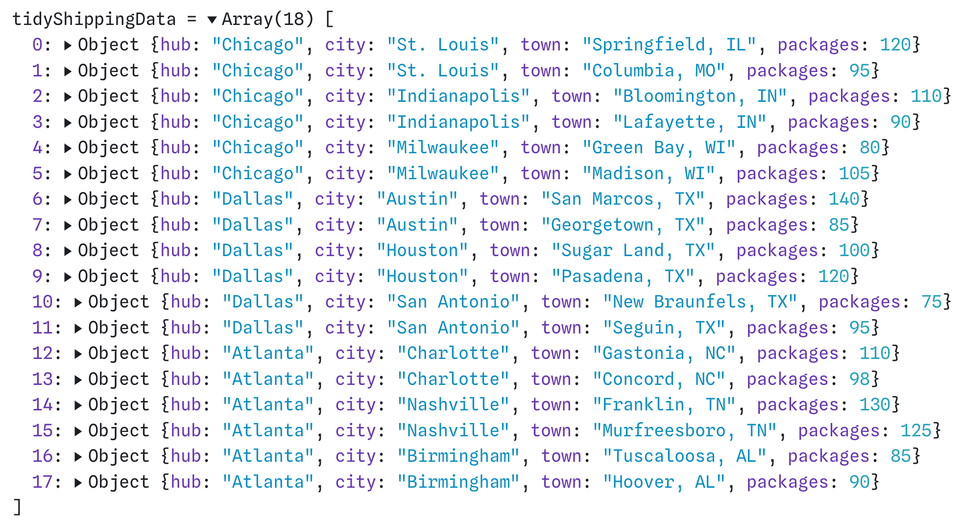
If you do want to make the above data textbook tidy, you can access the individual hubs, cities, and towns as separate fields, instead of pasting them together as we did above:
tidyShippingData = shippingNetwork.flatMap(hubEntry =>
  hubEntry.distributors.flatMap(distributor =>
    distributor.towns.map(town => ({
      hub: hubEntry.hub,
      city: distributor.city,
      town: town.name,
      packages: town.packages
    }))
  )
);
Which returns the tidy data below:
Explore the code we used to transform nested data into flat tables.
For D3: know the usual suspects
Plot’s concise API helps you build charts with fewer lines of code, but also places a bit more constraint on data inputs. D3, in contrast, gives you total flexibility in terms of both what you build, and the structure of data you use. That’s a bit of a double-edged sword, since more flexibility can lead to more variation in D3 examples, compared to the predictable tidy data format seen almost exclusively in Plot examples.
Still, there are several data structures used repeatedly as D3 inputs. Here, we highlight a few of the most common.
First things first: yes, tidy data still works with D3
D3, like Observable Plot, can happily ingest tidy data from flat tables. For example, the scatterplot with shapes chart in the D3 gallery uses the classic irises dataset in tidy format to visualize flower dimensions, with color and symbol distinguishing between three iris species. Complex visualizations like the Marimekko, radial sunburst, and parallel coordinates charts also use tidy data.
But many D3 examples don’t start with tidy data. Examples might use aggregated values by group, or nested data structures to capture hierarchies. Even for the same chart type, you might see alternative data structures as inputs. For example, compare these two very similar slope graphs, one which uses tidy data as an input, and one that ingests data in wide format. A common task when using D3 examples is to analyze the shape of the data they expect, which is often different from what you currently have. Here’s how to get from tidy data to other formats commonly seen in D3 visualizations.
Aggregated values by group
Let’s say you’ve read in some nice tidy data, with a row for each observation. When inspecting an example chart in the D3 graph gallery, you find that the data input isn’t the original raw values; it’s been aggregated by group. For example, the horizontal bar chart example uses pre-aggregated letter frequencies as the data input, and the donut chart uses total counts by age group in the United States.
If you need to get from raw records to aggregated values by group, d3.rollup makes it straightforward to do so in JavaScript.
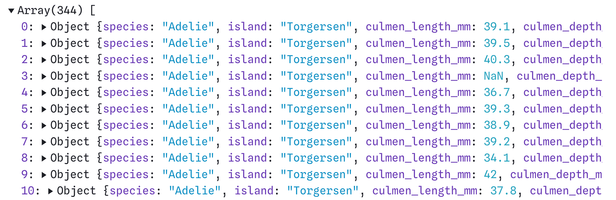
Let’s find summary values using the penguins dataset, which contains size measurements for 344 individual penguins of three species (Adélie, chinstrap, and gentoo). A subset of the penguins data is shown below:
We can use d3.rollup to find the total number of penguins by species as follows:
penguinCounts = d3.rollup(penguins, (v) => v.length, (d) => d.species)Which returns counts by species, as a Map object:

To get from a Map to the more commonly expected array of objects, we can use the Array.from method as shown below:
Array.from(penguinCounts, ([species, count]) => ({ species, count }))Which returns the following:

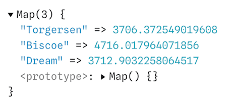
And, rollups aren’t confined to counts. You can use them to find the sum, mean, maximum, or any other custom metric by group. For example, the code below returns the mean penguin body mass by island:
d3.rollup(penguins, (v) => d3.mean(v, d => d.body_mass_g), (d) => d.island)Which produces:
Want to aggregate values using SQL instead? Use a GROUP BY clause to find summary values by group.
Nested structures for hierarchical charts
Earlier in this post, we showed how to get from nested arrays to flat tables with paths representing nodes in a hierarchy, so that we could produce a simple dendrogram in Plot. Now we’ll consider the reverse: what if you have data in flat, tidy tables, but the D3 example you want to use is expecting a nested array?
This is quite common in the D3 gallery. For example, the zoomable circle packing, zoomable sunburst, and treemap charts each use nested data as the input.
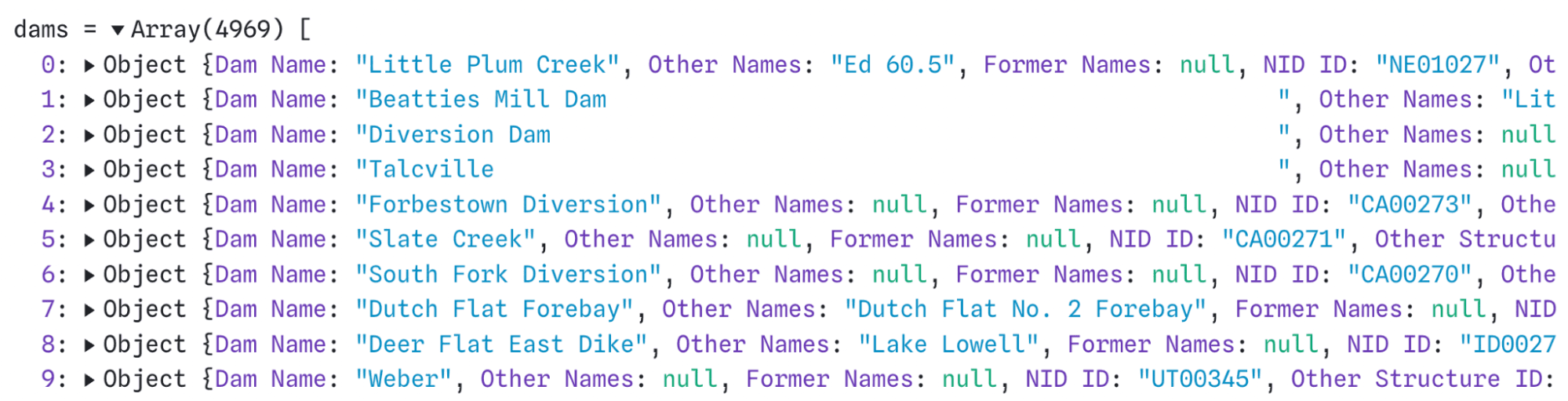
In this example, we’ll start with tidy data on dam characteristics, capacity, condition, and jurisdiction in the United States from the National Inventory of Dams. The first several lines of the data are previewed below, and stored as dams:
Below, we use d3.groups, with some additional wrangling, to return nested data for nodes based on the following variables: Primary Purpose, Primary Dam Type, Primary Owner Assessment, Condition Assessment, and Hazard Potential Classification:
hierarchicalDams = {
  function group(data, [name, ...path]) {
    return d3.groups(data, (d) => d[name])
      .map(([value, rows]) => path.length
          ? { name: value, children: group(rows, path) }
          : { name: value, value: rows.length }
          );
  }
  return {
    name: "damsHierarchy",
    children: group(dams, [
      "Primary Purpose",
      "Primary Dam Type",
      "Primary Owner Type",
      "Condition Assessment",
      "Hazard Potential Classification"
    ])
  };
}
The output of the code above is nested data, an expanded portion of which is shown below:

This is in the same format used in the zoomable icicle chart in the D3 gallery. By simply replacing data in that example with hierarchicalDams created above, we can produce an interactive icicle chart for quick exploration of dam purpose, type, and condition:
Explore the live code used to transform data and create the chart above.
Get your data into shape
Whether you’re using Observable Plot, D3, or another data visualization library, you’ll need to do some data cleaning and transformation to get it into the expected shape. In Plot, that most often means wrangling data to get it into tidy format. D3 examples consume a wider variety of data formats including tidy tables, aggregated summaries, and nested structures representing hierarchies.
Knowing some of the most common data formats and transformation methods will help you quickly reuse and build on the thousands of existing examples made with Plot and D3.
Visit our Plot and D3 resources to find inspiration for your next data visualization:
If you’re new to Observable, explore our suite of tools for fluid, collaborative data analysis and visualization at observablehq.com.