There’s a lot of interest in (and frankly, hype around) AI right now. In particular, large language models (LLMs) are getting a lot of attention, for reasons both good and bad. They can be incredibly useful, but they also sometimes hallucinate information, and it’s not always obvious what is true and what isn’t.
One area where I have found AI assistants to be quite useful and capable is in writing code. Coding seems to be particularly well covered in most mainstream LLMs’ training data, and it’s relatively easy to verify that the code does what it’s supposed to do — at least on a basic level. There are many caveats here, and for code in production use there would need to be extensive testing. There’s also a clear danger in using code without fully understanding it.
But for our purposes of writing code to generate charts and data visualizations, AI seems well-suited for this task. So I decided to try asking Anthropic’s Claude Sonnet 3.7 to help me create some basic charts and data visualizations in D3.
Making a simple line chart with AI
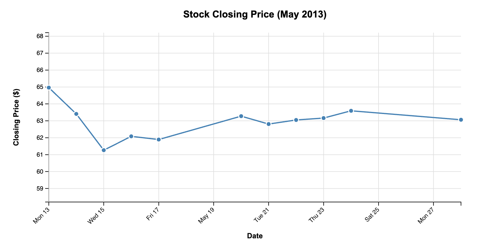
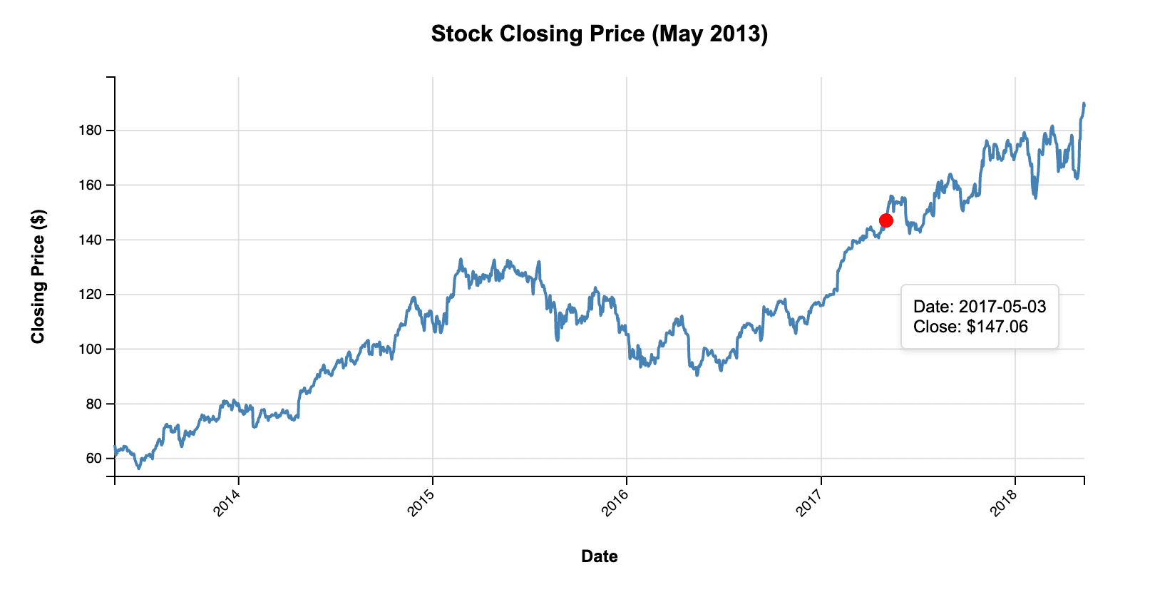
First, I attached a CSV file with a dozen lines of data from our Apple stock price demo dataset. It contains data about Apple’s stock price from 2013 to 2018, in the form of opening and closing prices, volume, etc.
I then gave Claude this prompt:
write d3 code that plots the closing price from the attached csv file over time as a line chart
It produced a complete HTML file that loaded D3 (though a slightly older version, 7.8.5, despite 7.9.0 having been out for almost exactly a year at this point), included my demo data, and generated all the code to produce this chart:
It’s a fair amount of code, so instead of showing it all here, I’ve added it to a github repo. But it’s perfectly reasonable, well-structured JavaScript code calling D3 functions, the way you’d write it yourself in a plain HTML file. If I had given it more context about wanting it inside a React or Observable Framework app, it would probably have produced the appropriate code.
It’s interesting that it has made some assumptions here about the size of the dataset (since I didn’t say that it was a sample) and has included dots for each data point. It has also recognized that the data is all from a single month and put that in the title.
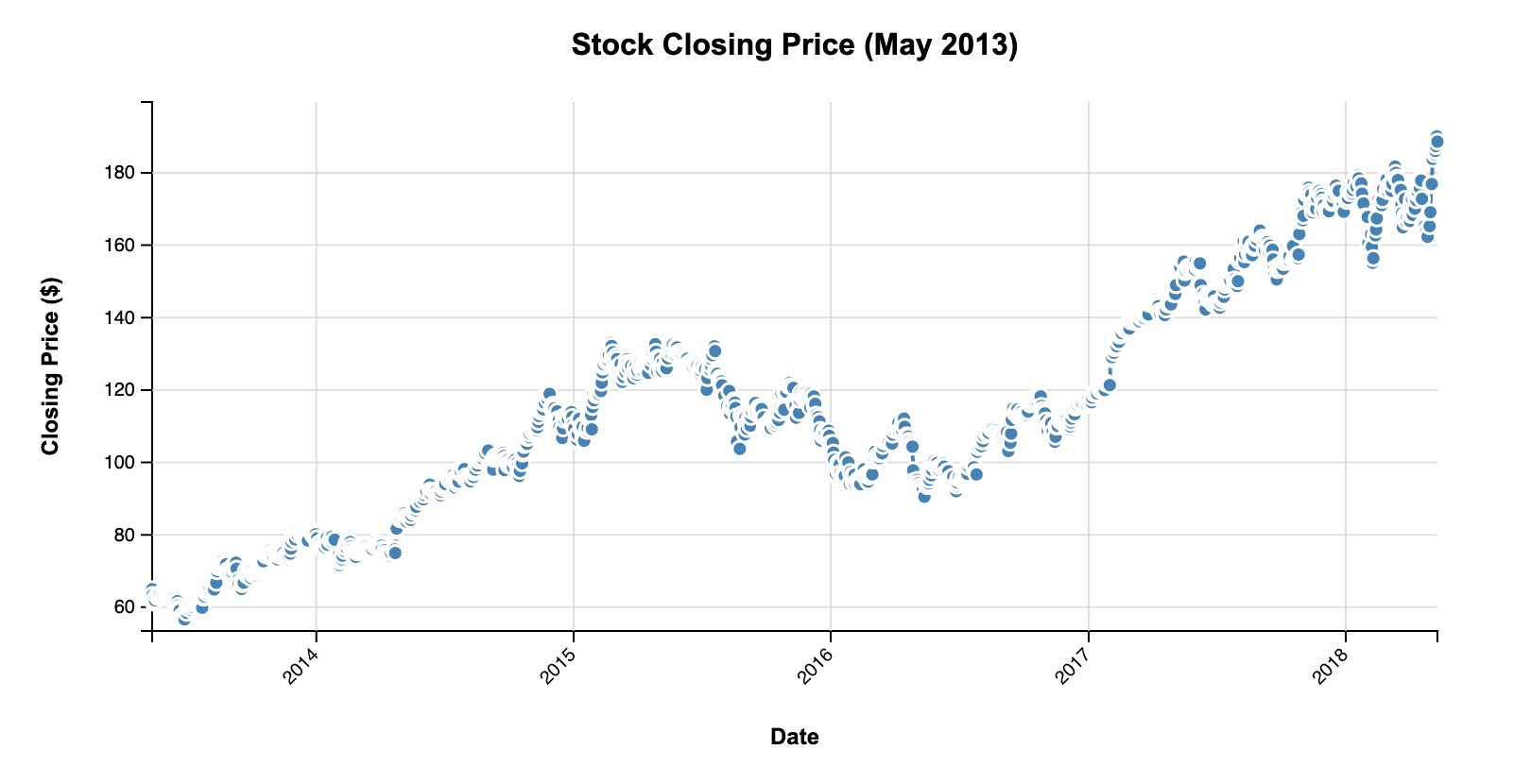
If we add in all the data from our dataset, this gets a little messy:
It’s easy enough to manually remove the points with a small adjustment to the code, to get this very acceptable line chart:
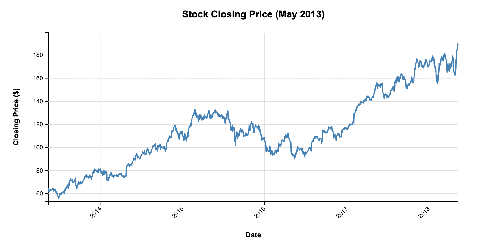
I just removed the circle marks here, which also means losing the mouse-over tooltip. I later prompted Claude to do it for me, but I’ll come back to that at the end.
Adding quarterly averages
A single line chart in D3 consists of a fair amount of boilerplate code (the entire file for the chart above was around 300 lines), but it’s all quite straightforward. What if we wanted to get something a little bit more interesting, for example by adding quarterly prices? This is what I asked Claude:
now group the prices by quarter
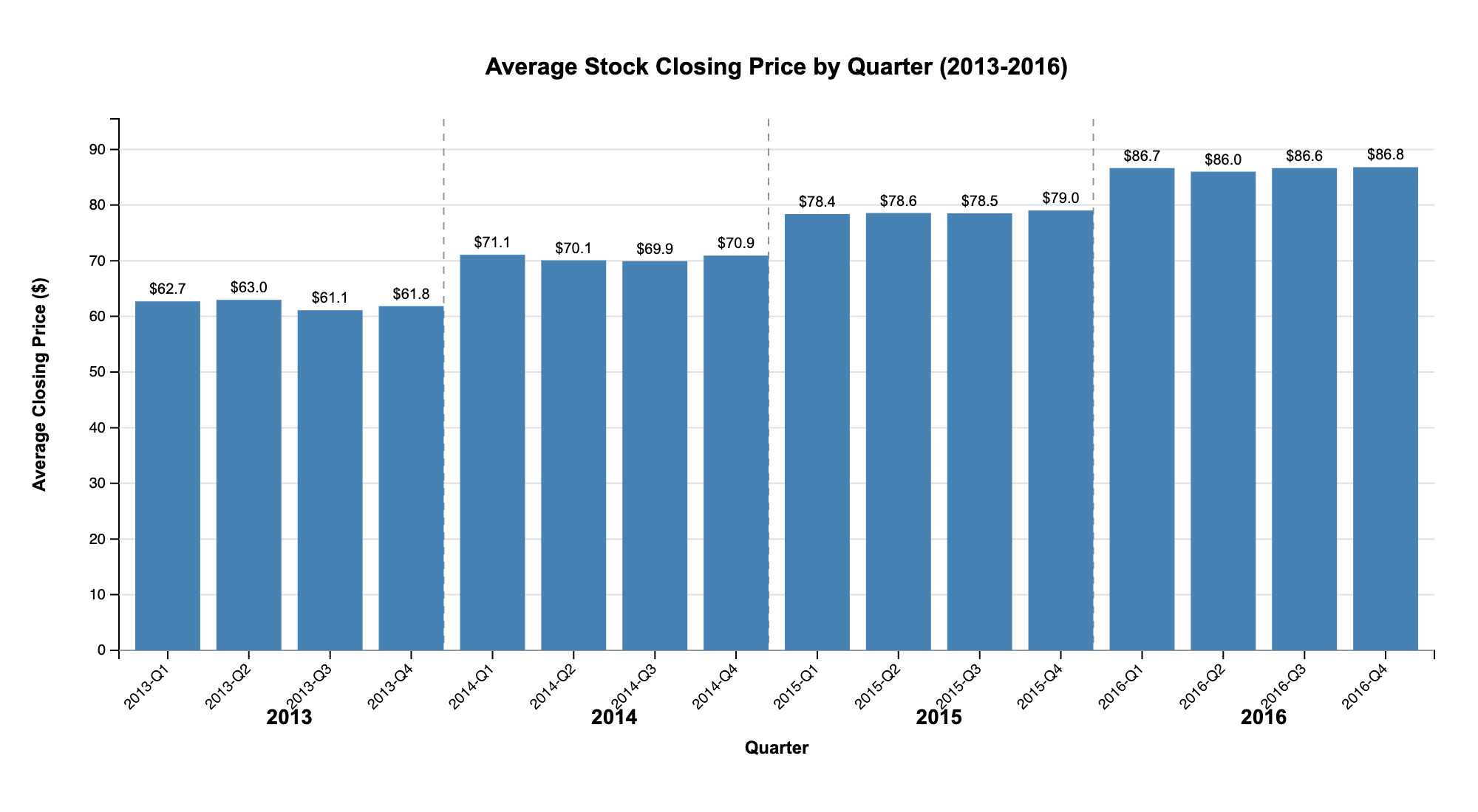
And this is the chart Claude generated:
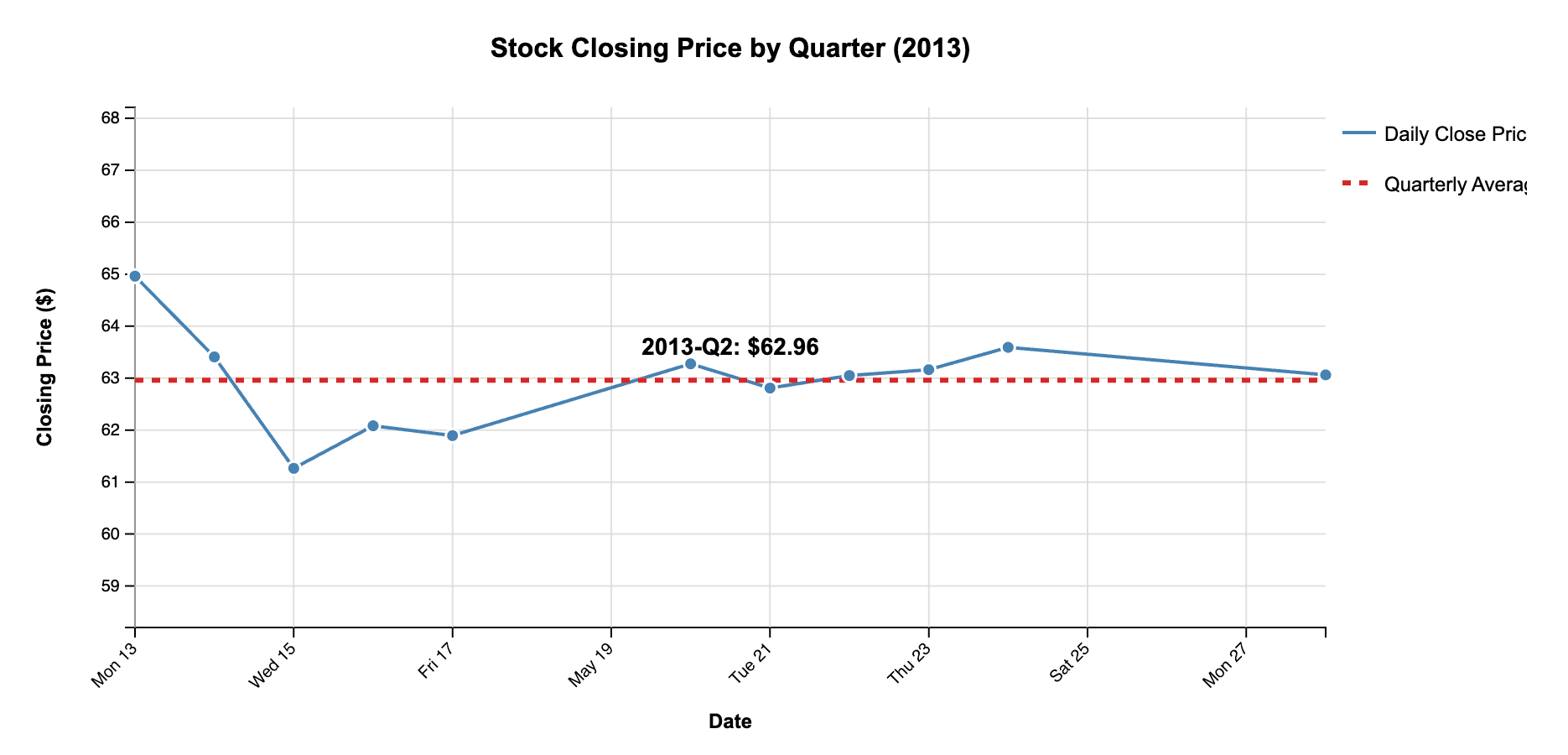
It’s not very impressive with the small amount of data, but it works in principle. If I add in the rest of the data, and then remove the points and the quarterly text labels (which overlap and get messy), we end up with a decent chart:
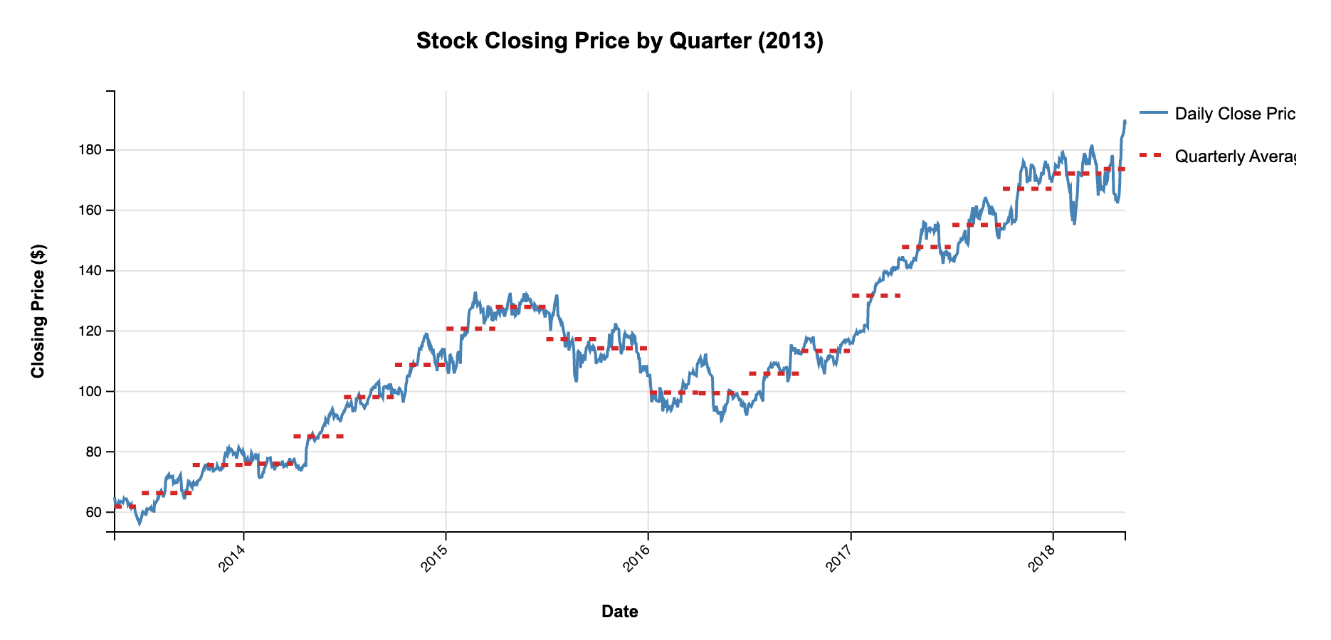
It’s not actually what I wanted (I had imagined it would create bars), but we’ll get to that. The code is otherwise unremarkable, but in a good way. I question the choice of a dotted line for the quarterly averages, but that’s aesthetics.
The only thing that stands out in the code is this rather elaborate way of computing the quarter from the month using a series of if statements.
let quarter;

if (month >= 0 && month <= 2) quarter = 1;
else if (month >= 3 && month <= 5) quarter = 2;
else if (month >= 6 && month <= 8) quarter = 3;
else quarter = 4;
Since the month in JavaScript is zero-based, there’s a much faster way to do it with a little bit of math:
const quarter = Math.floor(month/3) + 1;Not really a big deal, but I’m curious where this comes from.
I haven’t mentioned yet that Claude doesn’t just produce code, but gives fairly extensive explanations about what the code is doing and what assumptions it’s making. They’re quite interesting and help put the code into context. Claude also adds comments directly into the code.
Make it a bar chart!
These line charts are nice and all, but I really wanted a bar chart. Switching chart types is more work in D3 than, say, Observable Plot, and a good use for some help from AI. So I asked Claude help me switch the line chart to a bar chart:
turn it into a quarterly bar chart. Assume that there are several years of data, not just what's included here.
And here is the chart the AI assistant produced:
Amusingly, Claude added code to generate more data in response to being told to assume that there’s more data. It even does it by quarter, generating 3-5 data points for each, which it appends to the original data I supplied, and then averages over everything by quarter. It doesn’t seem to know how many data points there should be in a quarter, but on the other hand it also doesn’t really matter since we’re only looking at the averages in the end.
It’s also interesting that it doesn’t just generate random numbers, but adds in an upward trend. Here’s the relevant piece of code, including the comment it generated.
// Base the random close value on the original data range (60-65)
// but add some yearly trend and variance
const yearFactor = (year - 2013) * 8;
const randomClose = (60 + Math.random() * 5 + yearFactor).toFixed(6);
We can replace the generated data with the real data, and get a serviceable bar chart. It could use a bit more space at the bottom, and the chart title doesn’t respond to the actual date range. But everything else works.
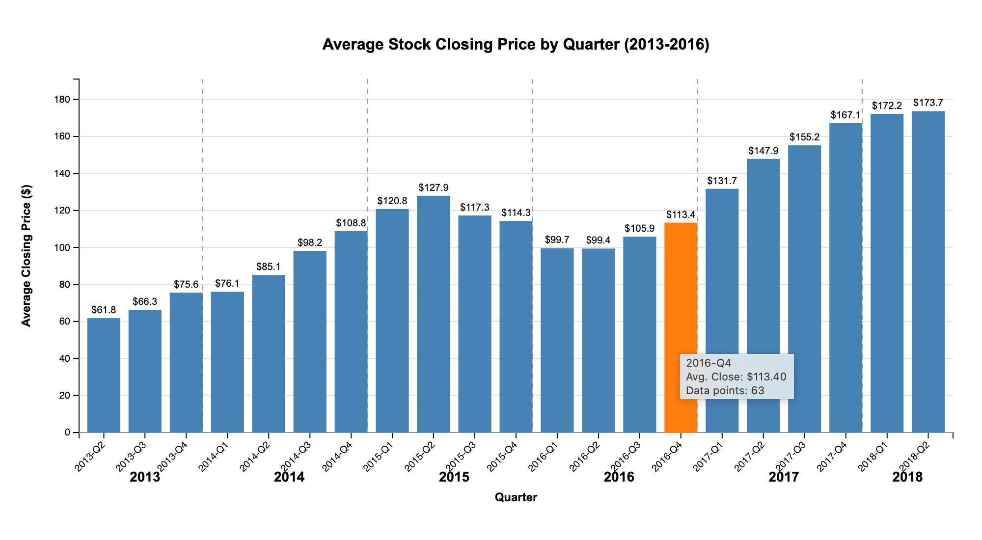
This also shows the tooltip Claude has created. It’s interesting that it felt the need to include the number of data points, which usually wouldn’t be of interest (though they will differ slightly between quarters).
Redoing the line chart with a path
While I prefer the bar chart, it did bug me that I had to fix the first line chart myself. So I decided to test how well it can deal with references to earlier work and asked it to do the work for me instead:
remove the dots from the first chart
Here’s the result:
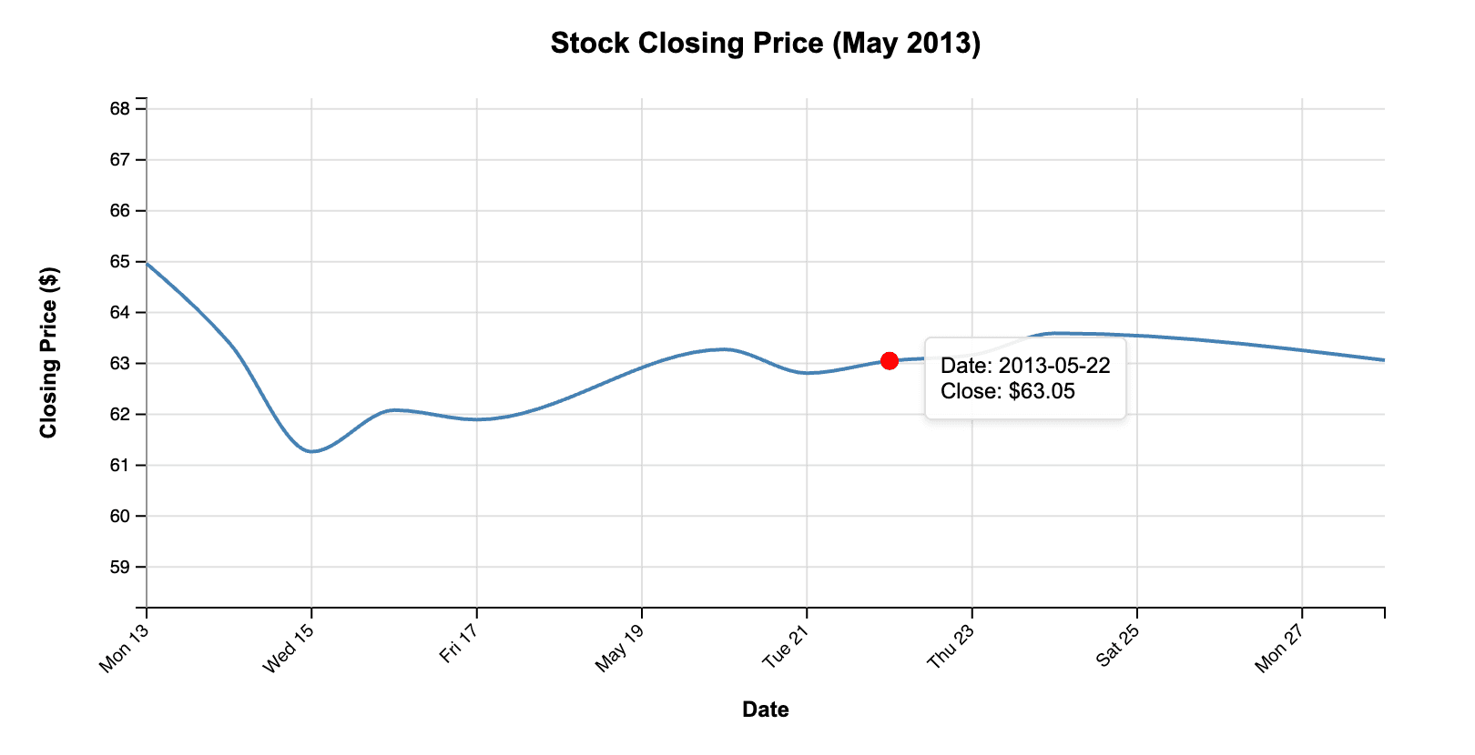
Interestingly, it decided to smooth the line this time. If we add in all the data again, we end up with another perfectly fine line chart.
It’s worth noting here that the way the x axis adapts is due to D3’s labeling functions, not the code generated by Claude. It would also be pretty easy to make the title respond to the date range covered by the data. A more elaborate prompt, or a follow-up, should get the LLM to create the relevant code.
Conclusion: AI is useful for writing D3 code
This is a very simple example, but it shows how LLMs can write a fair amount of D3 code that does what it’s supposed to do. Each of these resulting files is around 300 lines long, and they all worked without modification. It’s also interesting that it immediately understood what I meant by “d3 code” and produced an entire HTML file. This is undoubtedly due to the large amount of training data for D3 charts out there.
There are some unusual choices, like the way quarters are computed, but they work just fine. Some of Claude’s other choices (like the inclusion of dots on the line chart) are probably due to the small data sample I provided. They’re easily changed, though.
My prompts have also been quite short and not very specific. For example, the second chart could have easily been a bar chart if I had asked for it. There are also a number of prompting techniques that could help get the LLM to produce what I want, such as chain-of-thought prompting.
LLMs and AI tools for coding have already proven themselves to be very useful and can save software engineers a lot of time. AI tools won’t do your data analysis for you, but they can help speed up repetitive tasks and code that is heavy on boilerplate – like writing D3 code for common chart types.