Recently, we looked at how bar charts work, why they work well for categorical data, and what histograms are useful for. We also briefly touched on line charts, and why they aren’t a good choice for categorical data. And yet, while they are vastly different, they are sometimes used for the same data: time series.
In this post, we dig into that “why” a little more closely, compare bar and line charts directly, and discuss when bar charts or line charts are the right choice for temporal data.
Bar charts vs. line charts
Bar charts are commonly used for categorical domains such as products, countries, or languages. These are distinct values that can be reordered based on a value (such as population or GDP, in the case of countries). They’re also discrete values, with nothing between them.
Line charts, on the other hand, work well for continuous domains, especially time. Of course bar charts are used for time too, and we’ll get to that in the next section. But the opposite doesn’t work: lines can’t be used for categorical data. Here is an example dataset of letter frequencies in English (which you may remember from the previous post), shown as a bar chart and also as an ill-advised line chart.
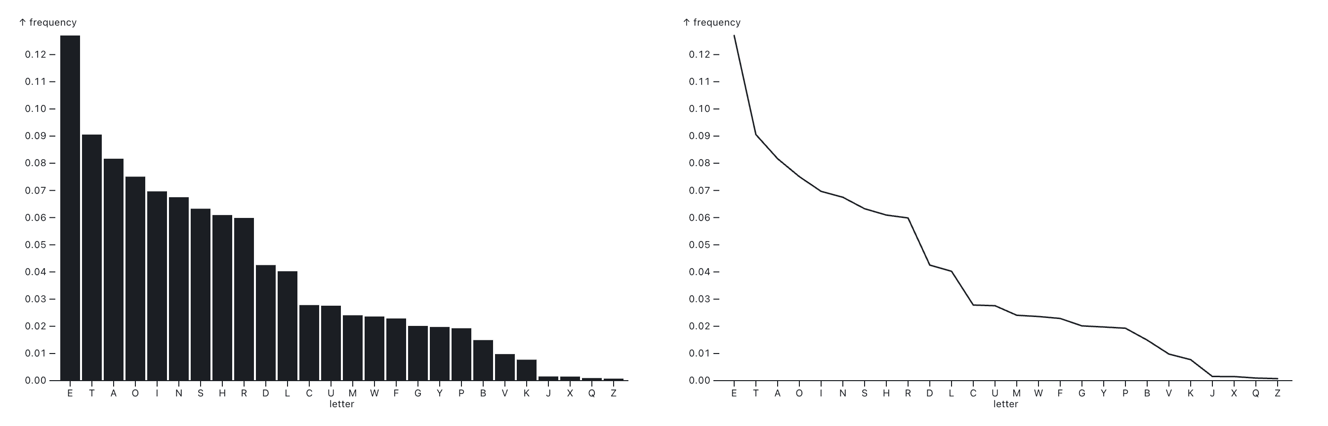
This doesn’t look terrible as a line chart. Since the values are sorted by frequency, we get a smooth line. But let’s see what happens when we reorder the values:
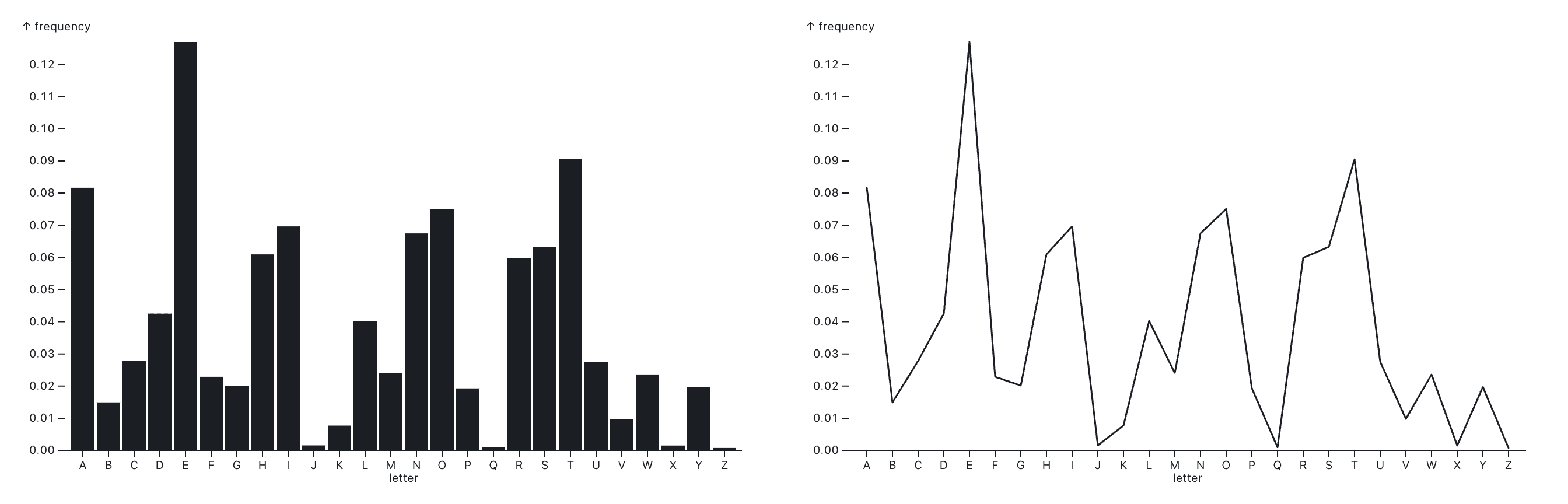
These jagged lines imply a dramatic change, when all we did was reorder the points. The bar chart looks different too, of course, but we can still read the individual bars, and figure out which bar corresponds to which letter. The line chart always creates a continuous shape, which makes no sense on a categorical axis because it implies that you can interpolate between the discrete data values. Its jagged shape means nothing, because only the points actually exist as values, the lines between them are completely arbitrary.
This example illustrates why using line charts for categorical data is a really bad idea, and many applications and libraries make it difficult to do for a reason. The line chart is mostly visual noise, is hard to read, and doesn’t fit the data type. A bar chart is a much better choice.
When to use bar charts for time series data
Time and time series data are a little more complicated. Technically, a chart showing data over time should use a line chart, since time is continuous — except when it isn’t.
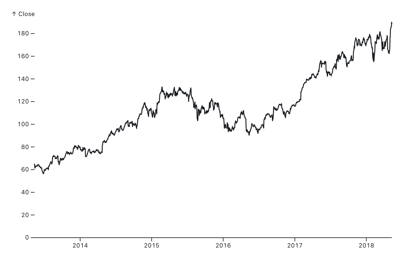
When we look at many data points over time, a line chart is the obvious choice. Consider this example of Apple’s closing stock price over several years. This chart shows every single business day over more than four years, which is a lot of records (1,260 data points, to be precise). While this isn’t continuous data per se (the closing price doesn’t smoothly vary over time, there’s only one per day), when the number of data points is so large relative to the space they’re shown in, they might as well be continuous.
If we were to aggregate this data, however, the chart would look different. Here I’ve computed the average closing price of the stock for each year. This is much less interesting to look at. But more importantly, we’re no longer looking at truly continuous data since we have reduced our data to only one value (mean closing price) per year.
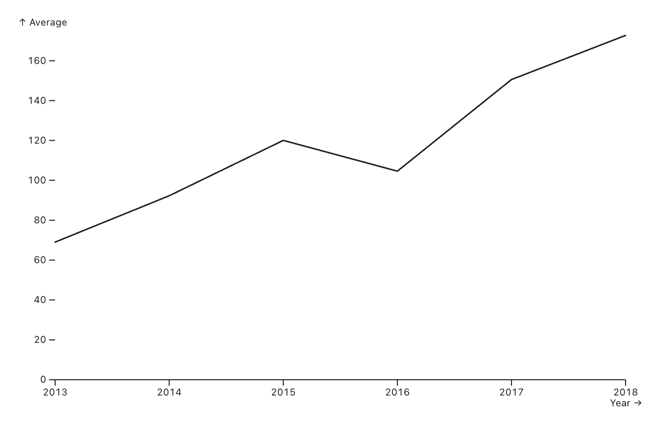
The bar representation seems a lot more apt here, and also makes the chart easier to read.
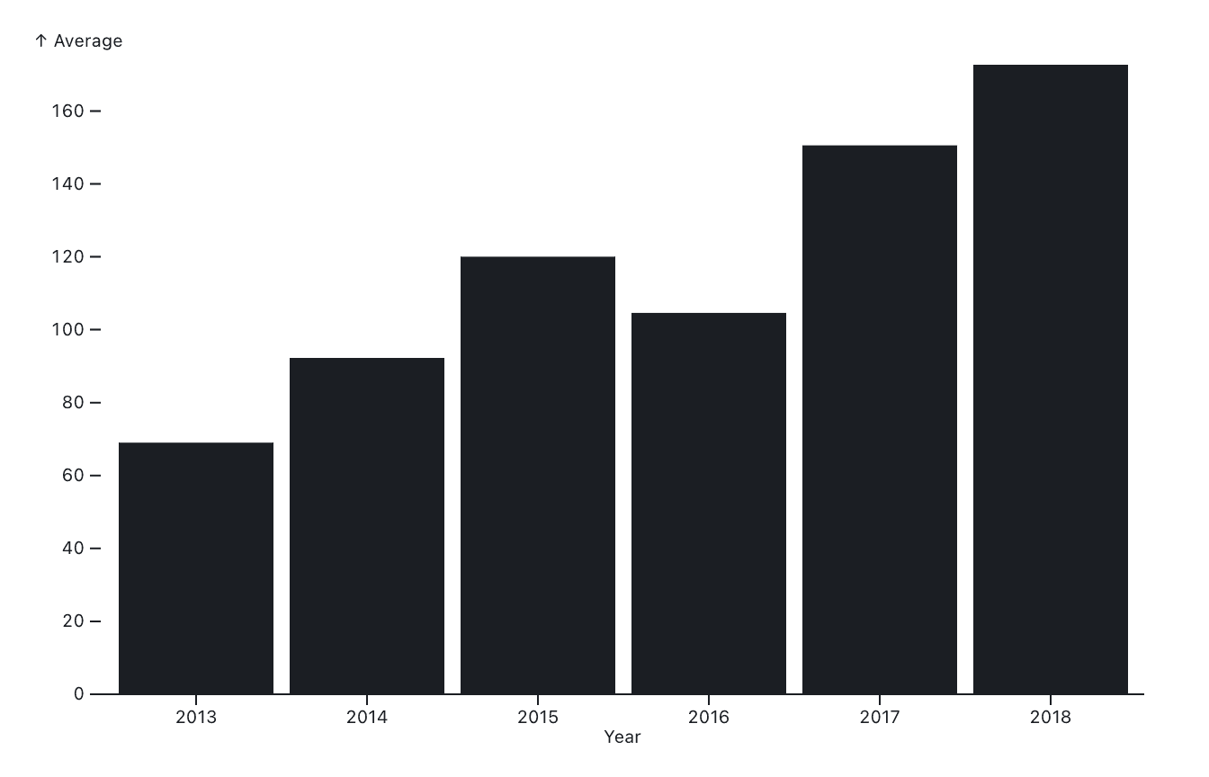
Since there’s now only one data point per year, the notion of continuous change no longer applies. Natural phenomena, such as temperature or a person’s weight over time, change in a continuous way. When the temperature is 60 degrees Fahrenheit at 7am and 65 degrees at 8am, it passes through all the values in between these two measurements. We’ve only observed these two data points, but we know that the temperature existed at all times between the two points, and that it passed through 62 degrees, 63 degrees, and 64.879331 degrees at some point.
That is not the case for a company’s total sales month-to-month, or the yearly average of a stock price. When aggregating data over time, the resulting data is no longer smooth and continuous, and so it makes sense to show the values as bars instead of lines. This is sometimes done for aesthetic reasons as well, because it improves legibility for charts when there are only a few values.
When to use stacked bar charts
While bars can be read and compared with great precision when they’re next to each other, this isn’t the case when they’re stacked. I touched on this in our blog post on pie charts, since pie charts are really more comparable to stacked bar charts than regular ones.
Consider this stacked bar chart of population by age group in all U.S. states and territories. It’s a perfectly fine bar chart if you’re looking at the total population in each state. But if you wanted to compare a specific age group, like say the 40-49-year-olds in yellow, things would get trickier. The yellow bars don’t sit on a common baseline, so they’re much harder to compare. Also, finding out the fraction of this age group of the total population wouldn’t be any more accurate than if it were shown in a pie chart (and probably a lot less precise in the shorter bars).
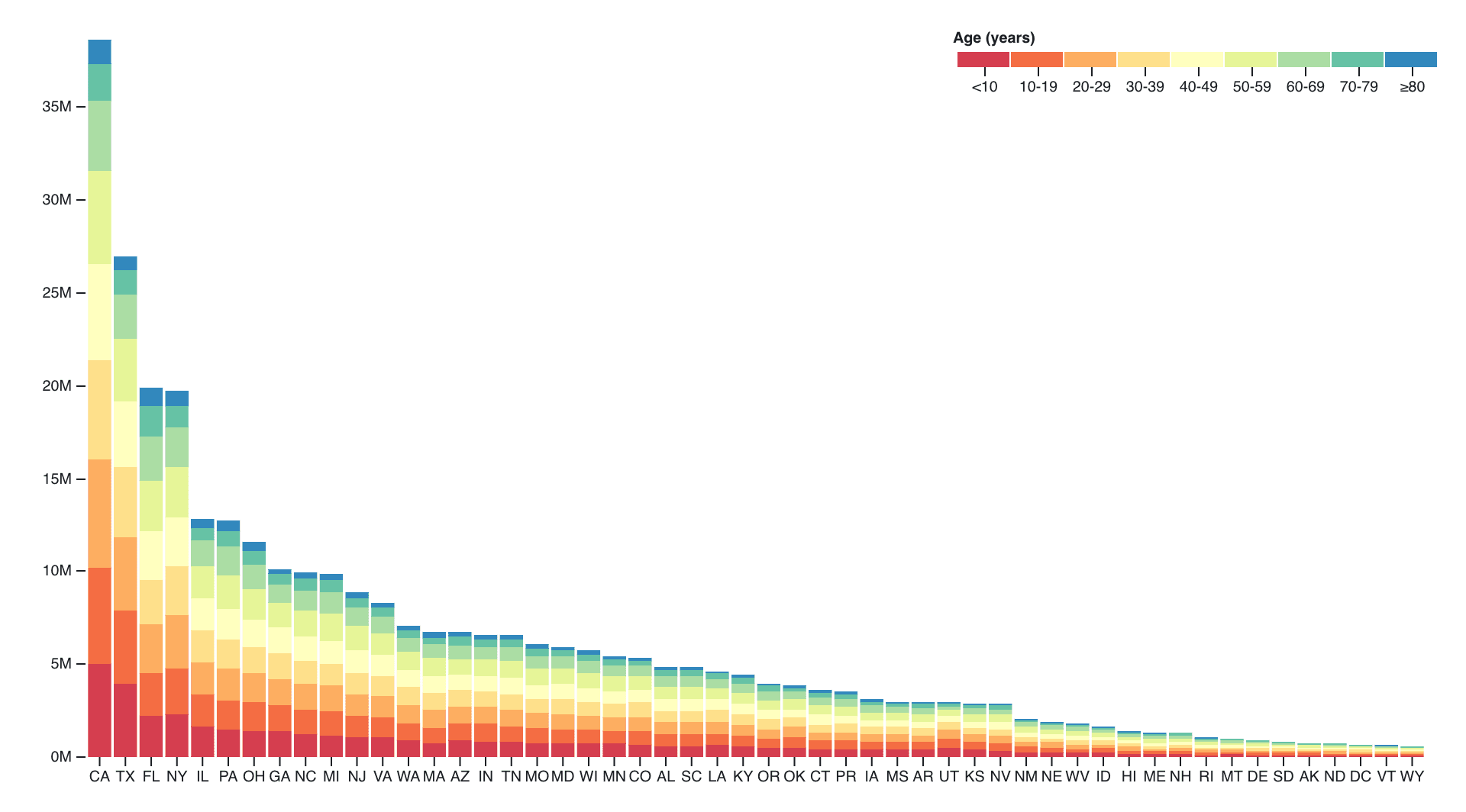
That stacked bar charts are hard to read has been known for a while, in fact a famous study published by Cleveland and McGill in 1984 already reported this. It was later expanded upon in a paper of bar chart experiments in 2014.
Stacked bar charts are popular because they show more data in the same space. But this can also overload them with information (and color!), and much of the added information is very difficult to read. There are better options for visualizing and comparing subsets of datasets, such as faceted plots that put each bar chart on its own base line — or, if the focus is on part to whole comparisons, even pie charts!
Building a line series chart with Observable Plot
You can quickly build a time series line chart with a few short lines of code using Observable Plot. Simply copy the below example snippet into a JavaScript cell in an Observable Notebook, or select “Line chart” from the searchable new cell menu. Connect your data, and update the data and variable names to match what’s in your data. Plot will automatically handle scales, axes, and tooltips, helping you quickly generate a time series line chart:
Plot.plot({
  marks: [
    Plot.ruleY([0]),
    Plot.lineY(aapl, { x: "Date", y: "Close", tip: true })
  ]
})
Conclusion: Bar charts are usually the best fit for categorical data
Beyond the obvious use for categorical data and histograms, bar charts are sometimes the right option, and other times there are better ways to visualize data. While it would be nice to think that they’re always the better choice, it’s often a matter of taste and judgment where they work best. It’s even possible to simply overload them with information, such as in many stacked bar charts.
Where bar charts are the undisputed king, however, is when showing categorical data. The way we can easily and accurately read and compare them, and the fact that they can be ordered in different ways, makes them the obvious (and really only) choice in that case. That one use case aside, there are always nuances and judgment calls.
Knowing the rules, and when to break or ignore them, is what makes visualization so fascinating. Learn more about bar charts from our previous post on the topic, and explore more chart types we’ve covered on this blog, like pie charts!