“Dashboards are dead!”
If your work involves data analysis and reporting, you’ve probably seen this headline pop up in your social media feed. Unfortunately, the claim hits close to home for many BI analysts and stakeholders. Many dashboards rot into obscurity because they fail to deliver on their promise to improve data exploration and business decision-making.
Why? Shallow insights, static data visualizations, and unclear takeaways lead to dwindling user value and engagement. Charts break, and dashboard content becomes outdated or unusable. Upkeep gets put on the backburner as new tasks take priority. As a result, analysts’ hard-earned dashboards end up decaying in a crowded data app graveyard.
But dashboards aren’t doomed to fail. When done right, they serve as the go-to place where teams explore data and track essential metrics. Successful dashboards can be a hub for data-driven business discussions and decisions.
In Observable Canvases, we’re addressing the most common causes of dashboard rot — and we’re moving fast. We recently rolled out major updates to canvases including a new dashboard viewer experience, new control nodes that make it lightweight to add custom interactions to your dashboards and embeds, and a dashboard builder for streamlined development. Read on to learn how canvases:
Keep data exploration, analysis, and dashboarding in one place for lightweight development and upkeep
Consolidate collaboration for precise, in-product discussions that minimize crossed wires and back-and-forths
Put expressive, interactive charts at your fingertips, plus the option to build with code for full customization
Data exploration, analysis, and dashboard development in one place
In canvases, dashboards are a natural extension of your data exploration and analysis, rather than the output of a separate, additional workflow. Our all-in-one approach keeps every step of the data analysis process — from database access, to data exploration and analysis, to dashboard development — in the same place. This avoids costly tool switching, limits redundant work, and makes it easier to keep dashboards fresh as your team tunes and expands your analysis.
Key to streamlined development is our new dashboard builder, which lets you quickly create a polished dashboard directly from existing canvas content. Just choose which nodes (charts, tables, controls, big numbers, etc.) you want to include in the dashboard. Those components are aligned to a grid, and responsively resized, for an organized view that’s immediately ready to share with teammates and stakeholders.
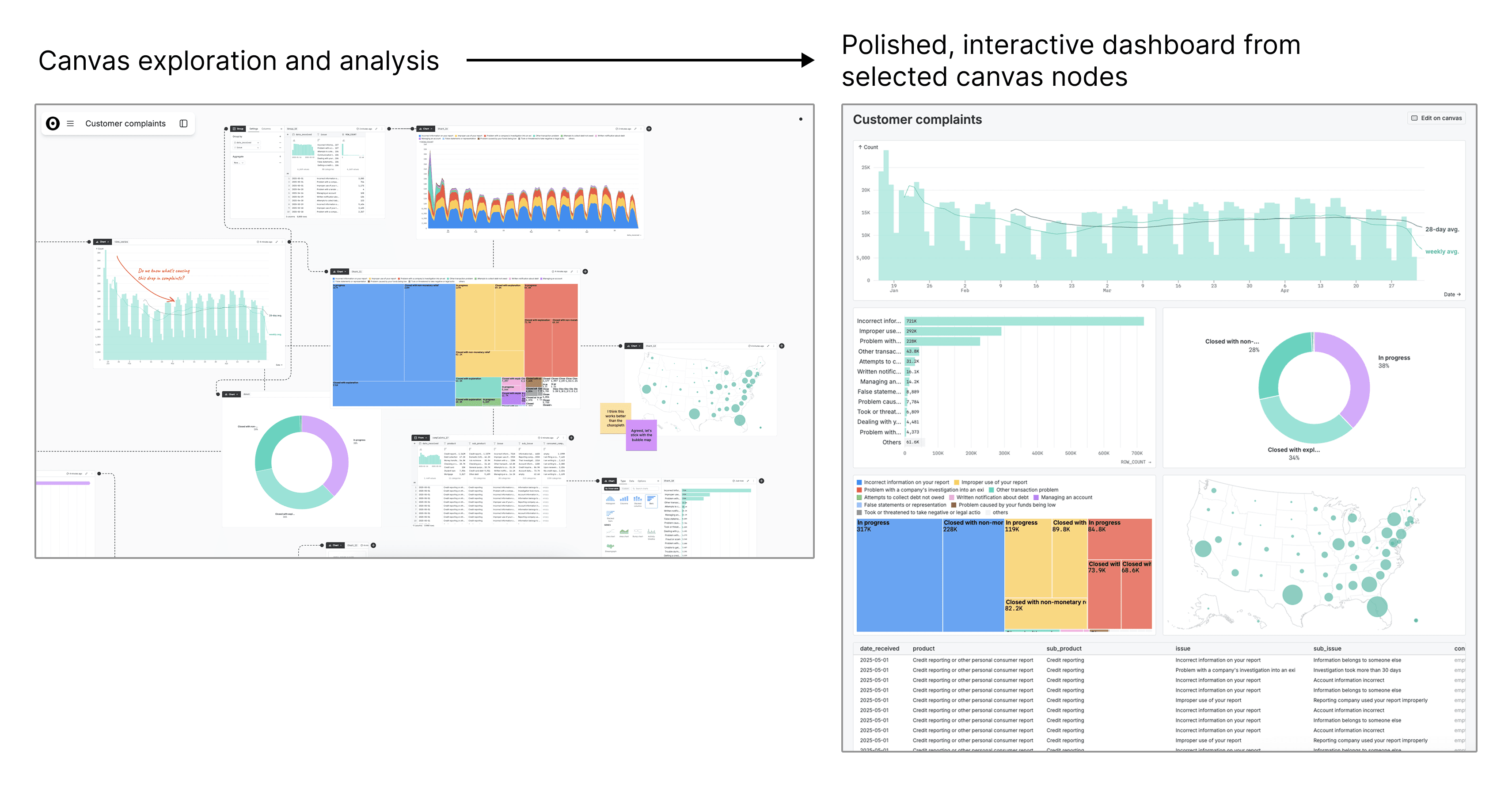
In Observable Canvases you can create a ready-to-share, interactive dashboards directly from selected nodes.
When data updates, or when you make edits to charts or analysis in the canvas, the dashboard refreshes automatically to ensure that your users are always seeing up-to-date information.
Modern collaboration meets BI
Cross-functional collaboration is key to successful dashboard development and sustained use. Stakeholder input helps analysts know what’s most useful for end users, and keeps dashboards relevant as business questions and priorities change.
With legacy BI tools, collaboration can be disjointed. Analysts and stakeholders often resort to communicating across different channels, like Slack or email, at a distance from the actual dashboard they’re discussing. This makes it difficult for users to pinpoint feedback on a specific part of an analysis, resulting in excessive back-and-forths and crossed wires. And, when users aren’t directly engaged in analysis and dashboard development, there’s less buy-in and trust in the final product.
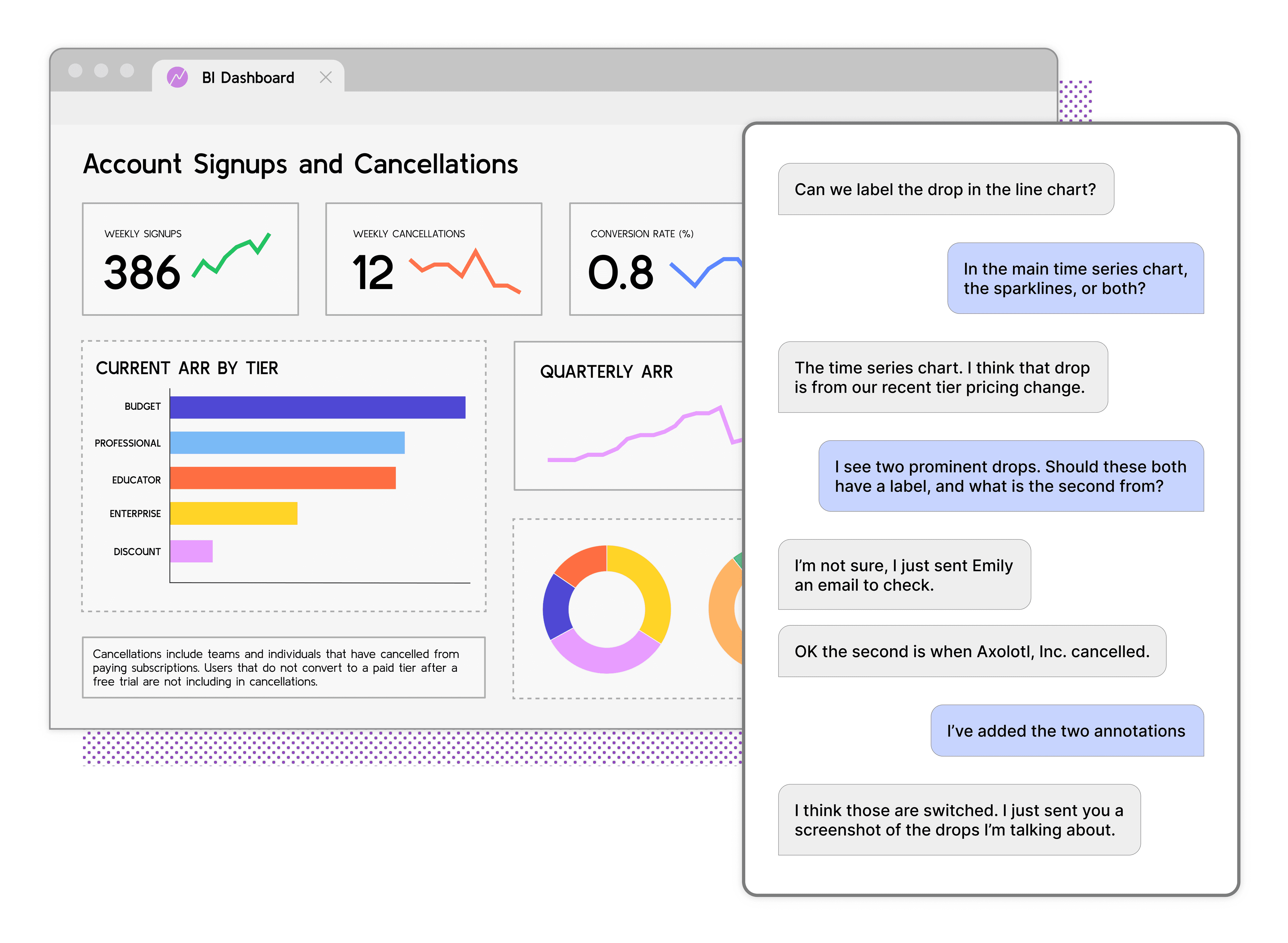
Collaborating across tools and at a distance from dashboard development leads to more back-and-forths and crossed wires between data analysts and stakeholders, which wastes time and stifles momentum.
Observable Canvases are collaborative whiteboards that bring data analysts and stakeholders together to participate in analysis and dashboard development in the same place. Stakeholders can join analysts directly in a canvas, using built-in tools like text annotations, highlighting, manual illustration, and sticky notes to leave unambiguous feedback directly on drafted charts and dashboard content.
This avoids dropping a complete dashboard draft into a stakeholder’s lap for review, which can leave them feeling less invested in the process, less empowered to suggest big changes late in the game, and less confident in their interpretation of dashboard content since they’ve been detached from the analysis and discussions along the way.
Canvases are built for collaborative analytics, allowing data analysts and stakeholders to meaningfully work together from ideation to publication for greater dashboard value, understanding, and user buy-in.
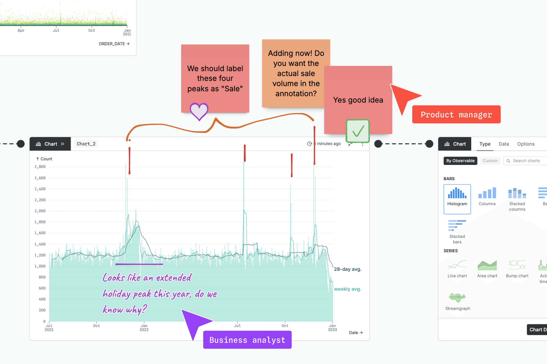
Collaboration happens directly within a canvas alongside your analysis and dashboard development. Whiteboarding tools help stakeholders engage directly, using highlighting, text, sticky notes, and drawing for fast, clear discussions.
Build expressive, interactive charts with UI or code
Some legacy BI tools force data analysts to choose between fast, UI-based chart development and rich, interactive visualizations. Constraints on chart types and customization frustrate dashboard developers, and result in generic displays that can’t capture the richness or nuance in complex business data.
In canvases, we aim to deliver the best of both worlds: the quickest way to generate state-of-the-art, interactive charts with our no-code UI, plus the option to build fully custom visuals in JavaScript.
Expressive charts at your fingertips
Our built-in chart library lets you build expressive charts with just a few clicks. From essentials like line and bar charts, to advanced visualizations like Sankey diagrams, arc maps, and beeswarms, you can create and toggle between different views of your data in minutes.
Every chart in canvases is optimized for performance and clarity. Smart queries return speedy visuals even when you’re working with huge data, and are designed to ensure that outliers and noise don’t drown out meaningful patterns. All charts are designed to be presentation-ready out of the box, and we’re continuously adding more layout and styling options for quick customization.
When it comes to interactivity, our charts are shipped “batteries included.” Chart interactions (like brushing, tooltips, multi-select, and deselect) are included by default and persist once the chart is added to a dashboard, allowing viewers to explore different slices of the data with no additional development needed.
If you’re looking for custom interactions beyond what comes with our built-in charts, we’ve got you covered! Our new control nodes give you a low-lift way to add interactive widgets like radio buttons, value sliders, and date ranges for even more versatile exploration in dashboards and embeds.
And don’t worry — while updates you make in the canvas are reflected in the dashboard, it’s not a two-way street. User interactions with charts or control nodes on the dashboard don’t affect your canvas, so your work and visualizations stay intact behind the scenes.
Or, build custom charts with code
If our chart library doesn’t have exactly what you need, you can build custom visualizations with code in JavaScript nodes. Then, add your creation to the dashboard right alongside our built-in charts and tables.
The option to work interchangeably between UI, AI, and code across the canvas means you’re not constrained to our built-in charts. And, you don’t have to deal with tedious tool switching and integration issues in order to build exactly the visualization you want for your dashboard.
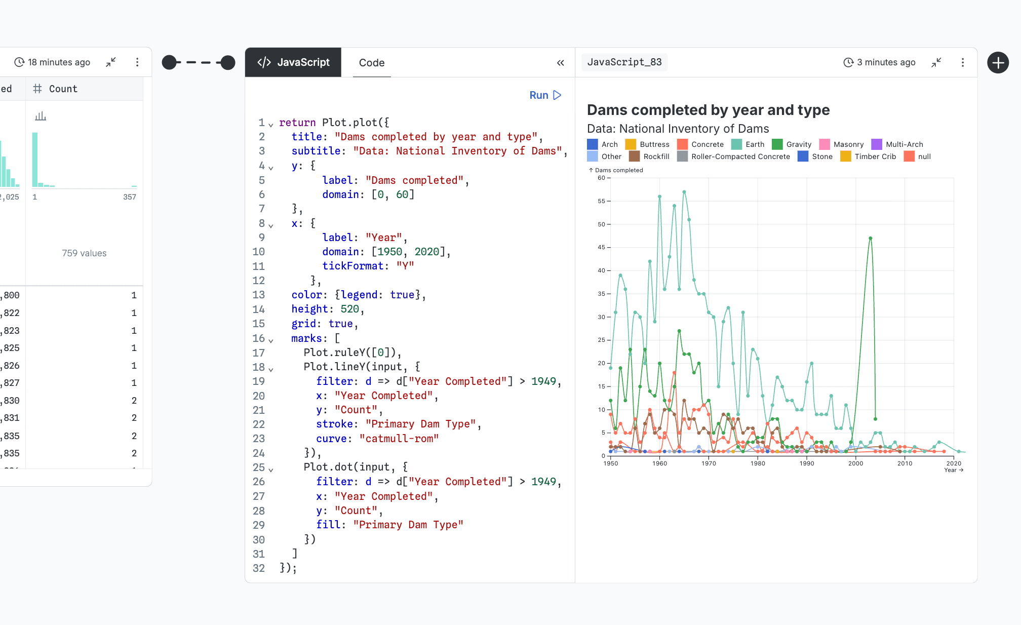
You’re not limited to our built-in chart options in canvases. You can choose between using code, UI, and AI at any point, including to create custom data visualizations in JavaScript nodes.
Dashboards are alive and well in Observable Canvases
With Observable Canvases, we’re addressing the most common dashboarding pain points for creators and viewers. New features including our improved viewer experience, UI dashboard builder, and control nodes, alongside our growing library of interactive charts, give analysts a faster path from messy data exploration to presentation-ready display in one place. Our recent updates also improve the viewer experience, providing more ways to interact with and explore visualizations while keeping data fresh. We have exciting plans for more dashboarding features and management options just around the corner, and will keep you posted as they roll out over the next month.
Want to see how canvases streamline data analysis and dashboarding in a single workflow, consolidate collaboration, and deliver expressive charts to your users? Observable Canvases are now in general availability. To learn more, and to test it out yourself in a free pilot, request a demo today.