Our biggest release yet for Observable Canvases is here.
Observable Canvases helps teams make their data observable so they can turn that data into insights and action faster. We do this by reimagining the data workflow and bringing queries, tables, charts, freehand sketches, highlights, notes, and more into a computational whiteboard for data.
In this release, we now offer dozens of charts that you can ship in just a few clicks. Plus, new ways to share those visualizations through dashboards and embeds. And, don’t miss the workspace management features that make managing your team in Observable even easier.
Here’s everything new in Observable Canvases.
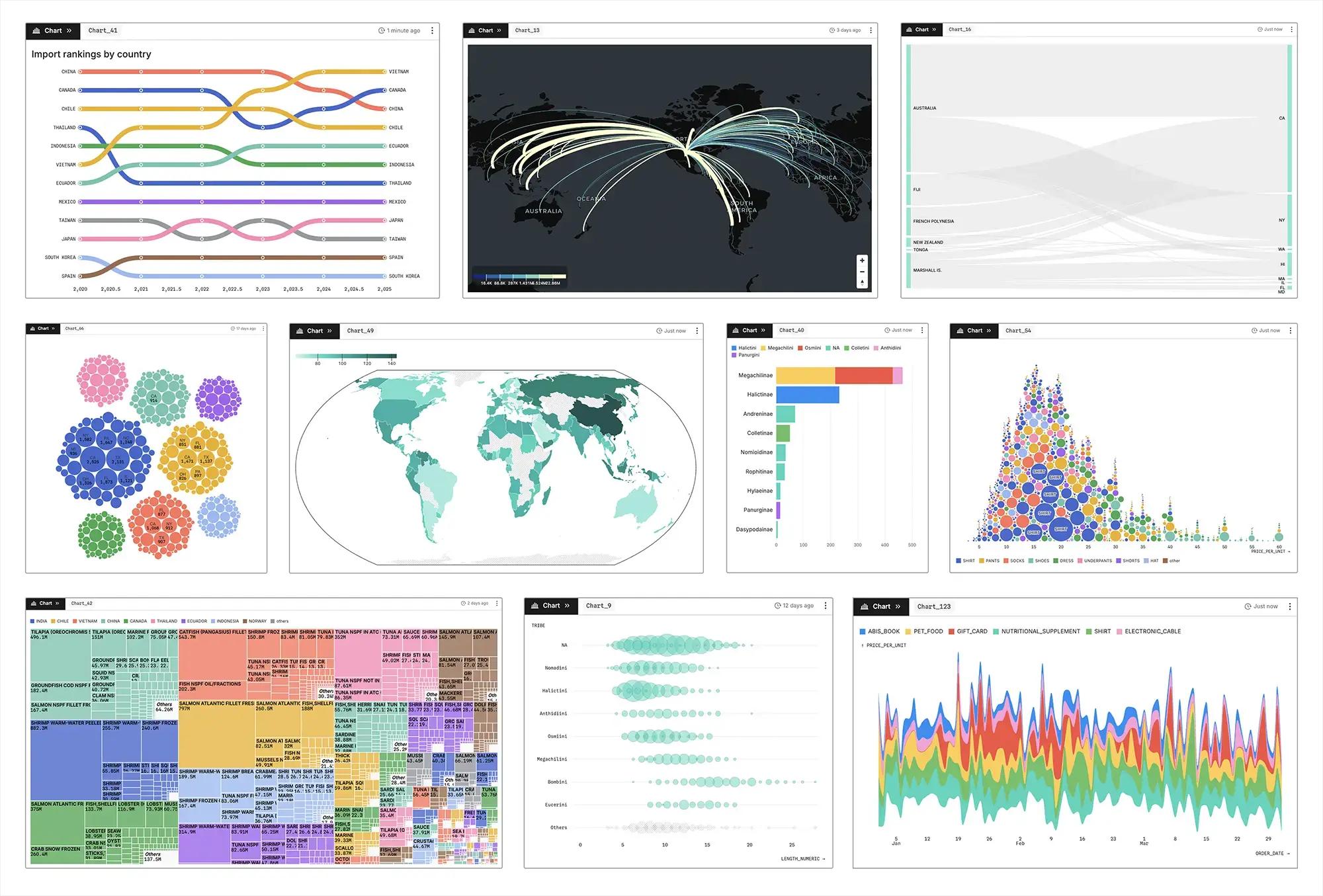
Canvases now offer more chart types out-of-the-box
Create advanced charts, like Sankey diagrams, circle packing charts, arc maps, and more, in seconds.
With support for dozens of charts, canvases give you the flexibility to choose between basic charts, like histograms and bar charts, and more advanced visualizations — without any code required. We’ve also added a new chart browser, to make it easier to select from the available options.
Canvases help you create charts faster so you can generate insights faster. With the ability to quickly test different displays of data, you might recognize a trend or discover an anomaly that you otherwise would have missed. Because canvases lower the cost of chart creation, it empowers you to use visualizations to think with data.
At Observable we’ve always believed that code is a prerequisite for truly custom, stunning visualizations. But not everyone has the expertise or time to build bespoke data visualizations. Plus, code-based workflows aren’t practical for the many ad hoc requests, last minute pings, and small data side quests that data analysts or data teams face.
D3, for instance, is extremely powerful, but also complex, making it a big lift to learn and therefore inaccessible to many data practitioners. AI can reduce the effort required to create custom data visualizations with code, but it’s still a potentially time-consuming endeavor that should be balanced with the impact of the visualization.
Legacy self-serve analytics tools, on the other hand, provide too many constraints that make it difficult to generate meaningful, aesthetically pleasing charts displaying the right data.
With our expanding chart options, we're building a better way: a flexible, all-in-one place to build visualizations that doesn't make you trade abstraction for quality. We’re working to unify our offerings so you can choose the right tool for the job at hand — whether that’s a custom visualization created in an Observable Notebook or an off-the-shelf chart built in the canvas.
Canvases now support more sharing options
If a visualization is created but no stakeholder sees it, does the chart make an impact?
Canvases shine as an exploratory data analysis tool; a key step when communicating with data is sharing the insights that are discovered along the way. Data collaboration is powerful for getting the whole team on the same page and reducing back-and-forths, but it isn’t always appropriate or helpful to bring stakeholders into a messy canvas.
This is why we’ve built new ways to share more polished presentations of data with stakeholders and decision makers.
Dashboards
We want to transform how businesses make their data visible and consumable. Enter the beleaguered dashboard. There are lots of problems with the BI industry’s current approach to dashboarding, as evidenced by the dashboards rotting away in most BI tools.
Dashboard rot is a symptom of brittle data workflows that make it hard for data teams to keep dashboards up-to-date, and that exclude stakeholders from feeling ownership and investment in the final product. Better dashboards are born from streamlined workflows and end-to-end collaborative data practices, including visual data analysis, that bring stakeholders into the fold. Data is best explored together, with shared context and conversations needed to uncover deeper insights and ensure that dashboards are useful and clear for the intended audience.
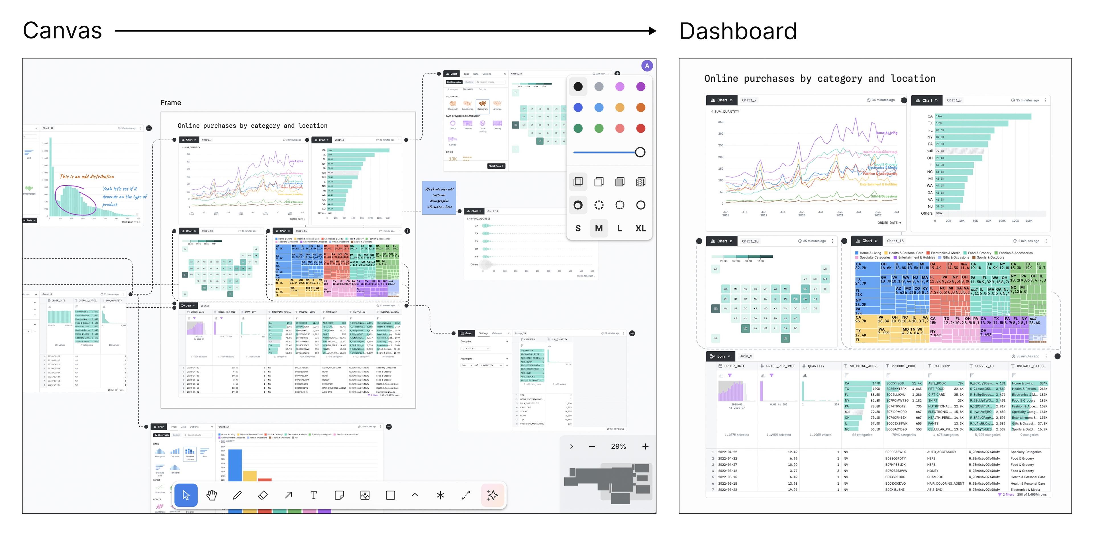
Our approach to dashboards is grounded in the canvas, whereby dashboards are a natural extension of your analysis rather than an additional step and subsequent workflow. Within the data workflow, the emphasis should be on analysis — getting answers, finding value, discovering insights — with less work required to build a polished output in an entirely separate tool.
Instead of selecting charts to export to another view, you simply draw a frame around the charts and tables you want to display and create a presentation link. This polished view is hosted at a separate URL without the distraction of the tool bar or nearby analysis paths on the canvas so stakeholders can stay focused on what matters most. Dashboards maintain the interactivity of the original chart, allowing viewers to quickly explore different slices of the data with built-in filtering.
Embedded analytics
With embedded analytics, you can get your insights from canvases to decision makers without requiring them to bookmark a new URL.
Embed individual charts, or a group of charts, into your internal applications that support HTML iframe embedding. Embeds maintain the interactivity of the original charts, so embed viewers can brush and interact with existing nodes.
Canvases give you the tools you need to ensure that the data displayed in your embed is up-to-date. When an embedded node is updated in the canvas, it also updates in your app.
New data sources
In addition to Snowflake and file upload using DuckDB-Wasm, we now support Postgres and Databricks. We will continue to expand the data sources we support, so if you’re interested in canvases and use a different data source, please let us know.
Workspace management features
Viewer and editor seats
We’re building a permissions system with viewer and editor roles to support both data teams and business users as they pursue collaborative analytics together. Set by owners at the workspace level, canvas editors can modify data in the canvas, share presentation links, interact with AI, and lock/unlock nodes and shapes. Viewers cannot make changes to the canvas, which means they cannot change data, move nodes, add text, or use AI. They can share presentation links with others who have access.
You can lock one node, many nodes, or even the entire canvas to ensure no changes are made to your work.
Version control
Users need to be able to see what changes have happened to a canvas and any associated artifacts. This must include a history of changes and the ability to revert to earlier versions. With version control, you can now see and restore prior versions of a canvas to revisit past analysis paths and explorations.
Conclusion
Observable Canvases are now available to pilot. To stay up-to-date on all our new releases, sign up for our newsletter list. Even better — give canvases a try for yourself by reaching out to our sales team here.