When building out the data visualization library in Observable Canvases, we started with essential chart types like bar charts, histograms, line charts, and scatter plots. We also knew we wanted to add more advanced chart types that feel out of reach for many data analysts because they are difficult and time consuming to build from scratch.
Over the past several months, we’ve been designing and building out our suite of advanced charts in canvases. These chart additions make it possible for users to generate interactive visualizations like Sankey diagrams, circle packing charts, streamgraphs, and arc maps in just a few clicks.
In this post, we highlight six of our newest interactive charts in Observable Canvases. Read on for a look at each new chart type, see how they are created in a canvas, and learn about useful customization options.
Bump charts
Bump charts show changes in rankings by group, usually over time. For example, a bump chart might visualize shifts in product rankings by annual volume sold, or changes in how survey participants rate the importance of issues (like economy, environment, education, healthcare, or foreign policy) when considering political candidates.
In canvases, bump charts expect a categorical variable for the series and a number for the value that rankings are based on. Below, a user creates a bump chart of U.S. seafood imports by country.
Data: NOAA US Trade in Fishery Products
Beeswarm charts
Beeswarm charts visualize observations for a single quantitative variable, with jitter to avoid overlapping marks. As shown in the beeswarm chart below, encodings for color and size can represent additional variables in the chart.
Here, a user creates a responsive beeswarm chart to visualize the distribution of product prices, with a different color for each overall product category.
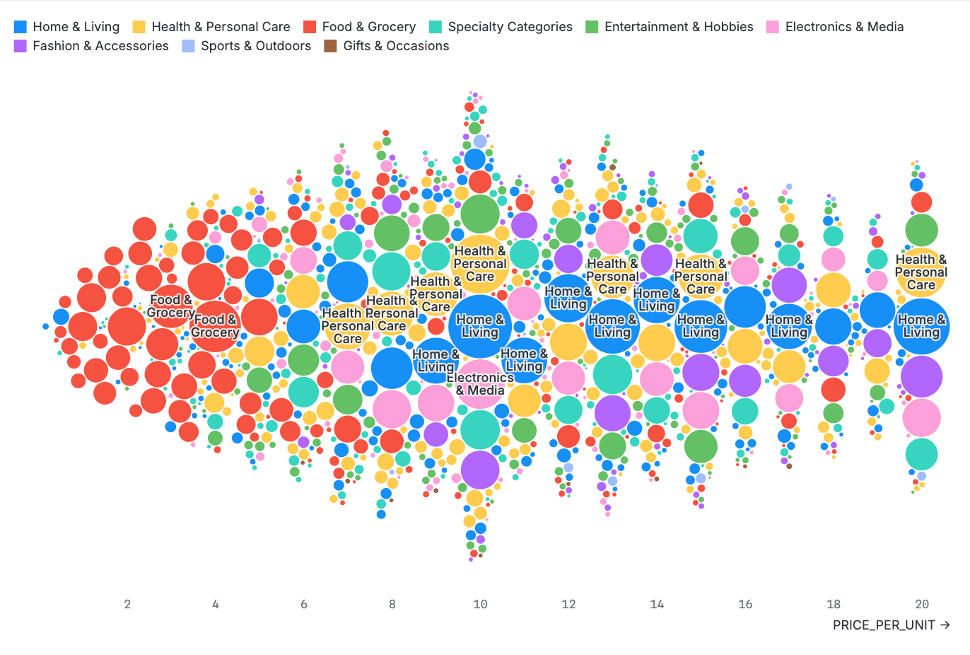
Data: Amazon e-commerce data
Beeswarm charts are a useful and visually interesting alternative to other charts that show a distribution of values, like histograms or box plots. With easy options to control dot sizes, text labels, padding, and more, you can quickly customize the look of beeswarms in canvases.
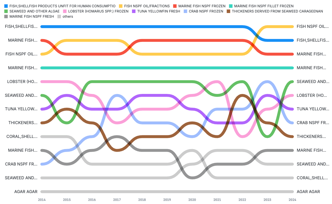
Sankey diagrams
Sankey diagrams show flows of quantities between different stages, locations, or groups. In a Sankey diagram, flow amounts are represented by the width of a band moving from one stage to the next.
In a canvas, quickly create a Sankey diagram by selecting “Source” and “Target” variables. The default band size is based on counts of rows shared between each combination of endpoints. Update the “Size” field to visualize flow amounts based on a different quantitative variable in the dataset.
Below, a Sankey diagram is built in a canvas to visualize flows of fresh yellowfin tuna imported from Asian countries to the United States in 2024. The source is the country where the tuna originates; the target is the state through which the import is processed. Size is based on the volume imported in kilograms.
You can further customize the look and layout of the Sankey using built-in options to adjust padding, alignment, and the order of source categories (e.g., in alphanumeric order, or by decreasing size).
Circle packing charts
Circle packing charts represent hierarchical data, with circle size usually based on a quantitative value by group (like a count or sum). They can be an alternative to other visualizations showing hierarchical data or parts of a whole, such as treemaps or pie charts.
Canvases make it easy to switch between different chart types with compatible data inputs. Below, a treemap is rendered on a canvas showing the breakdown of consumer complaints by issue and response status. For a different view, the user updates the type to a circle packing chart; the variable selections are automatically ported over to the new chart type for a fast alternative display.
Streamgraphs
Streamgraphs show changes in counts or values over time by group, usually applying some smoothing interpolation between values to produce a fluid or wave-like appearance (hence “stream” in the name). They are an alternative to stacked temporal histograms or area charts.
Create a streamgraph in a canvas by selecting a data variable for X, a numeric value for Y, and a categorical variable for color to show smoothed changes by group over time. In the example below, a streamgraph reveals an overall increase in online orders across categories around the start of the COVID-19 pandemic. Notice in particular the expanding band size for essential items in the Home and living (red), Health and personal care (yellow), and Food and grocery (purple) categories.
Streamgraph options include a dropdown for different date intervals (day, week, month, or year) and several different interpolation methods (catmull-rom, basis, linear, or step).
Arc maps
Arc maps show flows or connections between locations. We’ve recently added arc maps in canvases, currently supporting global (by country) and U.S. state connections.
To make an arc map in your canvas, first select valid columns with source and target names to generate the arcs. Use the Value option to update arc thickness based on a quantitative variable. Use built-in options to change the default zoom level, choose the map center with a specific latitude and longitude, and tweak the pitch to adjust the view angle.
In the example below, an arc map visualizes seafood imports to the United States in 2024, with arc thickness and color dependent on import volume from each exporting country (in kilograms).
We’re busy building new charts in canvases
With built-in options for interactive Sankey diagrams, streamgraphs, beeswarm charts, and more, Observable Canvases help you create and share hard-to-build-from-scratch data visualizations in just minutes.
Moving forward, we plan to bring the richness and variety of charts seen in the Observable Plot and D3 galleries to your fingertips in canvases. As we develop more chart types, we’ll keep sharing the newest additions and options to keep you up to date.
Read our recent posts to learn how we’re designing and building fast, interactive charts in canvases:
Want to learn more about getting your data on the fast track from database, to business insights, to interactive state-of-the-art visualizations? Request a demo of Observable Canvases.