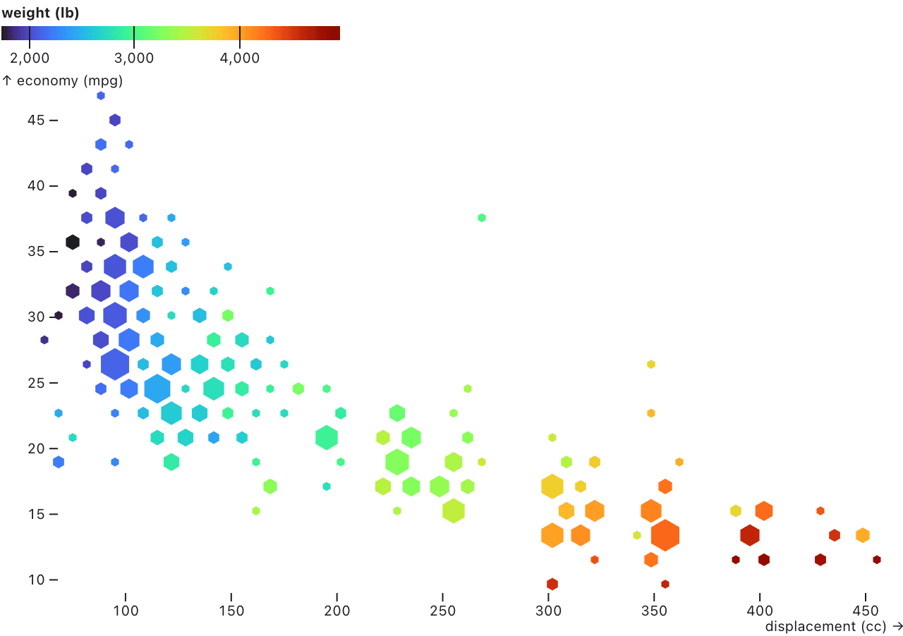
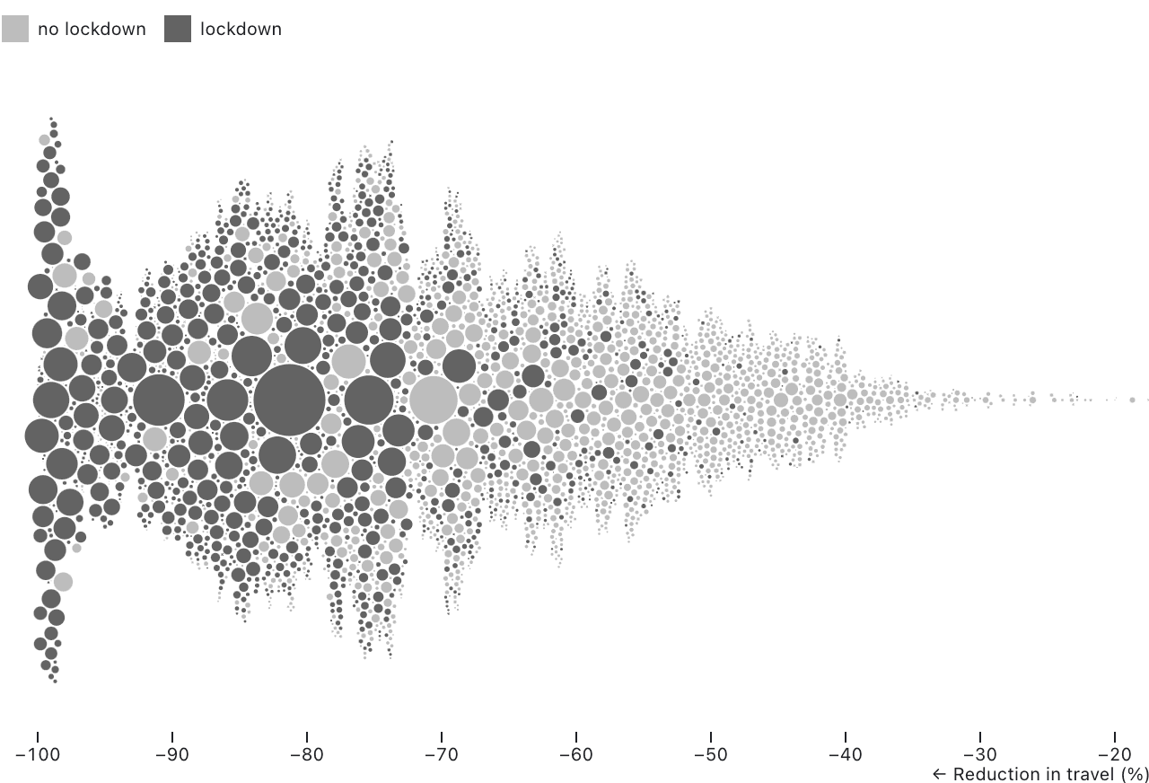
We are delighted to introduce Observable Plot 0.5, which supports more chart types, including hexbins, beeswarms, and more. These new features allow you to be more expressive and articulate in your data work. See the release notes for more details, and the new documentation notebooks for the dodge and the hexbin transforms.
Among other changes, Plot 0.5 now sorts dots by descending radius to reduce occlusion—no more custom sorting necessary to bring up the smaller dots to the front and make them more visible. Also, when you specify a diverging color scheme, Plot now defaults to a diverging scale around a central pivot, saving you time in the most common situations.The result: more expressive charts with even less code!
Observable Plot
Since May 2021, our amazing community has been using Observable Plot to create beautiful and insightful charts. This collection highlights Observable Plot best practices, as well as real use cases.
Observable Plot is a simple, expressive charting tool that allows you to quickly pull together analytics dashboards that entire teams can multiplayer edit in real time. Whether you are a data analyst, data scientist, web developer, or decision maker, simpler code means more stakeholders are involved in crucial, exploratory data analysis used to uncover insights and make better business decisions.
Plot Twist is a newsletter about Observable Plot. Every month or so, we highlight the inspiring work being done in Observable Plot by creators from our growing user community. We also provide development updates, showcase new features, and share examples and best practices.
Like a handful of words forming unlimited sentences, Observable Plot embraces a “grammar of graphics” that gives you a rich vocabulary for visualization. You can combine various marks and layers to form entirely new chart types in minutes and since it’s all JavaScript, it works great with lodash, simple-statistics, Arquero and many other libraries.
New features to explore in Observable Plot 0.5
Observable Plot now supports mark initializers via the initializer option. Initializers can transform data, channels, and indexes. Unlike data transforms which operate in abstract data space, initializers can operate in screen space such as pixel coordinates and colors.
The new hexbin transform aggregates 2D points into hexagonal bins—you can then apply reducers (sum, count, mean, mode) to set visual properties like size and color.
The new dodge transform takes a position channel and computes the opposite position channel, which allows for densely packed dots without overlap. (In other words, fast and accurate beeswarms!)
Like other Observable Plot transforms, the hexbin and dodge transforms work with several mark types, so you can do creative things like dodge text.
The dodge transform works with Observable Plot’s sort transform to control the order in which dots are placed and the resulting layout.
When you use a diverging color scheme such as PiYG, Observable Plot now defaults to a diverging (vs. linear) color scale, ensuring that color is visually symmetric around the pivot.
By default, dots now sort by descending radius to reduce occlusion; this means that small dots are less likely to be covered by big ones.
Plot Cheat Sheets, Plot Happy Hours, and More
If you are just getting started with Observable Plot, be sure to check out these helpful Observable Plot Cheatsheets that our team created.
Our most recent Observable Plot Happy Hour focused on using Observable Plot to analyze each of the games from the 2022 NBA Finals. Learn about our next Plot Happy Hour by joining our Meetup group.
Lastly, if you’d like to hear about our latest product and community updates, subscribe here.


