Time series data analysis is essential for understanding trends, forecasting, and making informed decisions. This blog post explores how to analyze time series data effectively, using real-world examples and data visualization techniques.
Many of us work with charts and dashboards that visualize time series data, tracking fluctuations by hour, day, week, month, etc. We need to know what caused a spike or dip, learn why the actuals diverged from the forecast, characterize typical daily, weekly, and seasonal patterns, or see how the correlation between two metrics depends on time.
In this post, we take a look at some key examples of time series data analysis using a “mountain of data” about energy production in the United States and the signals we've found. While most data visualization professionals don't dig into time series data about energy each day, our goal is to answer common questions that data teams must answer: “what changed?”, “what happened?”, “was that normal?”, “what is typical?”, and “did things go as expected?” By the end of this post, we hope that this will spark insight into how you’re analyzing time series data and building data visualizations that enable you to uncover patterns over time.
If you've done this type of data analysis work, you know that it's often difficult to uncover patterns or separate signal from noise. In the crucial moment of discovery you’re more likely to say “hmm... that looks funny” than “Eureka!” These tips are designed to help you explore data, and generate more of those "hmm..." moments. Looking at our data in a way that gives us a chance to notice, a chance to ask the next question, and the next, until we can understand and tell a story through the data.
Best practices for analyzing time-series data to forecast performance
It’s not enough for an important feature of the data to be visible. It needs to be noticeable.
Perceived difference: When we try to compare two lines in a line chart, we often perceive the difference as the shortest distance between the lines.
Actual difference: But, the actual difference at a specific horizontal position is the vertical difference between two lines.
Draw the difference: Instead of relying on our eyes to fill the space, we can draw the vertical marks to make the actual difference explicit.
Common baseline: Furthermore, by putting the vertical marks on a common baseline, the differences become easier to compare over time.
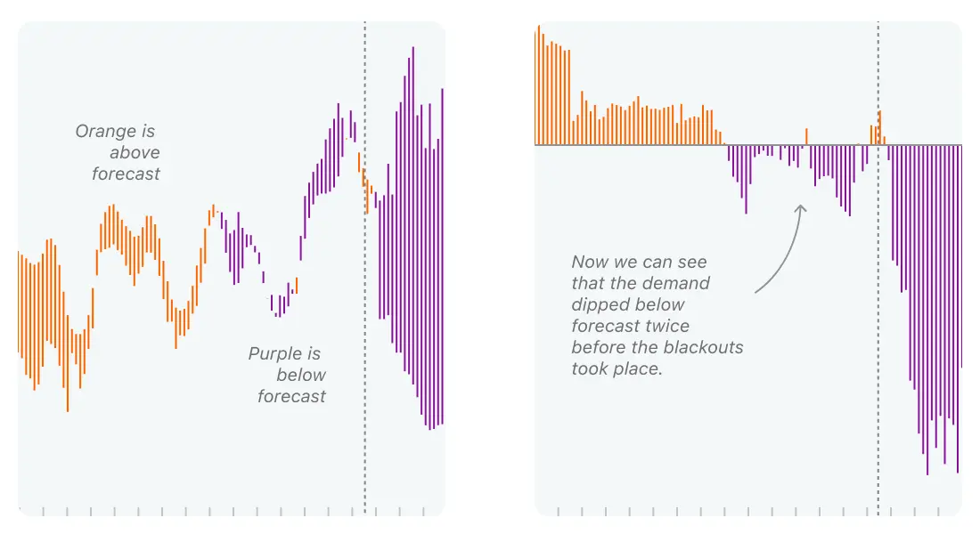
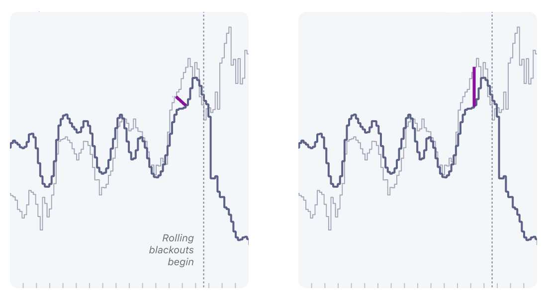
Make a mark for the data you're interested in
When you compare two metrics over time, standard practice is to draw both lines and look for the gaps. But, if the difference is most important, visualize the difference to make it clear for end users.
In this notebook, we share an example to highlight how changing the visual marks exposes a subtle signal of the 2021 Texas Energy crisis.
Data visualization plays a central role in data analysis
When diving deeper into a dataset, being able to quickly generate different perspectives with data visualizations can make a big difference. How does data visualization fit into your analysis workflow?
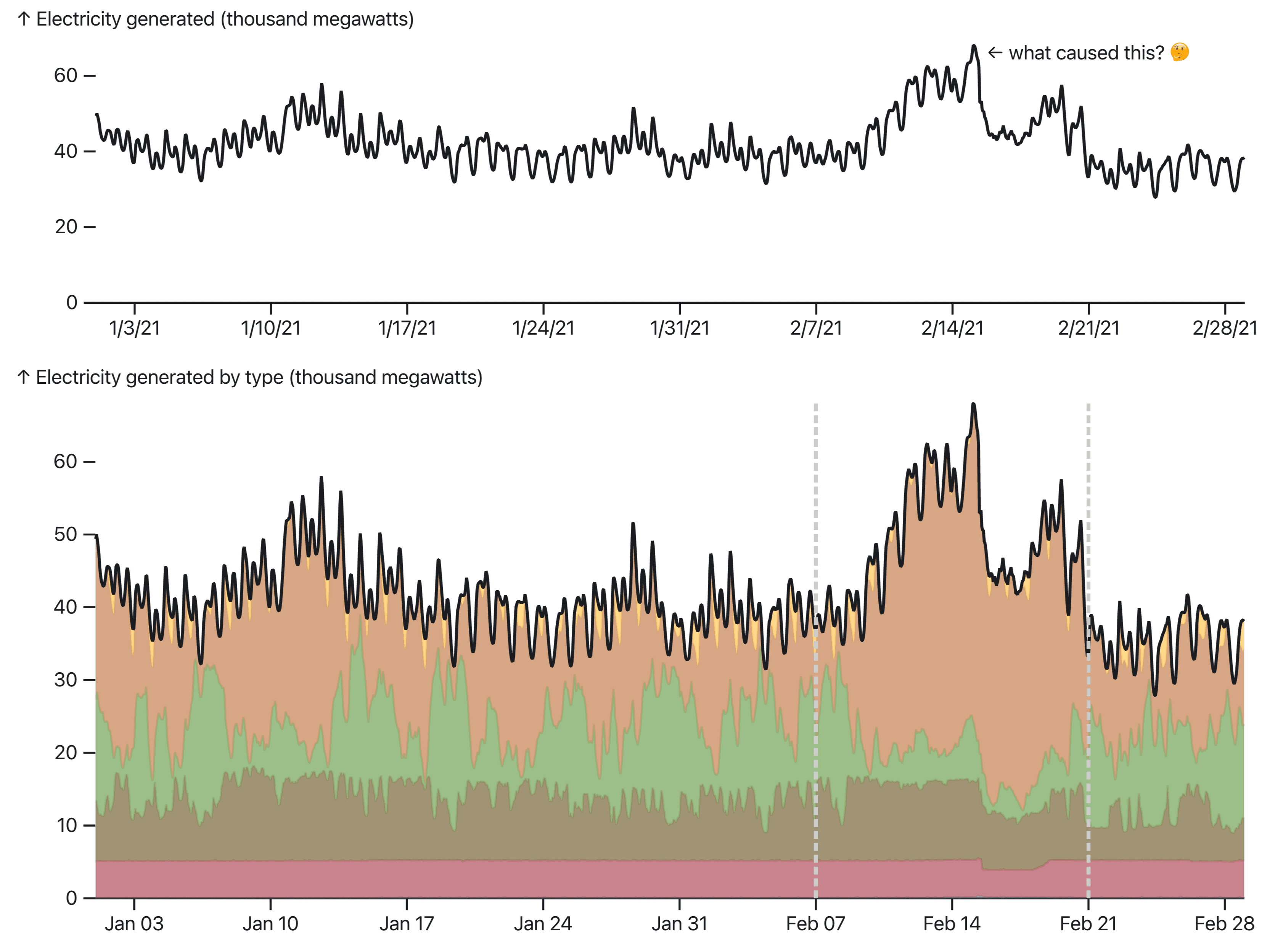
In this notebook we showcase the thought process and best practices of an analyst using Observable Plot to uncover hidden patterns behind an unusual spike in energy generation in Texas.
Visualization plays a central role in data analysis
When diving deeper into a dataset, being able to quickly generate different perspectives with visualizations can make a big difference. How does data visualization fit into your analysis workflow?
In this notebook we showcase the thought process and best practices of an analyst using Observable Plot to uncover hidden patterns behind an unusual spike in energy generation in Texas.
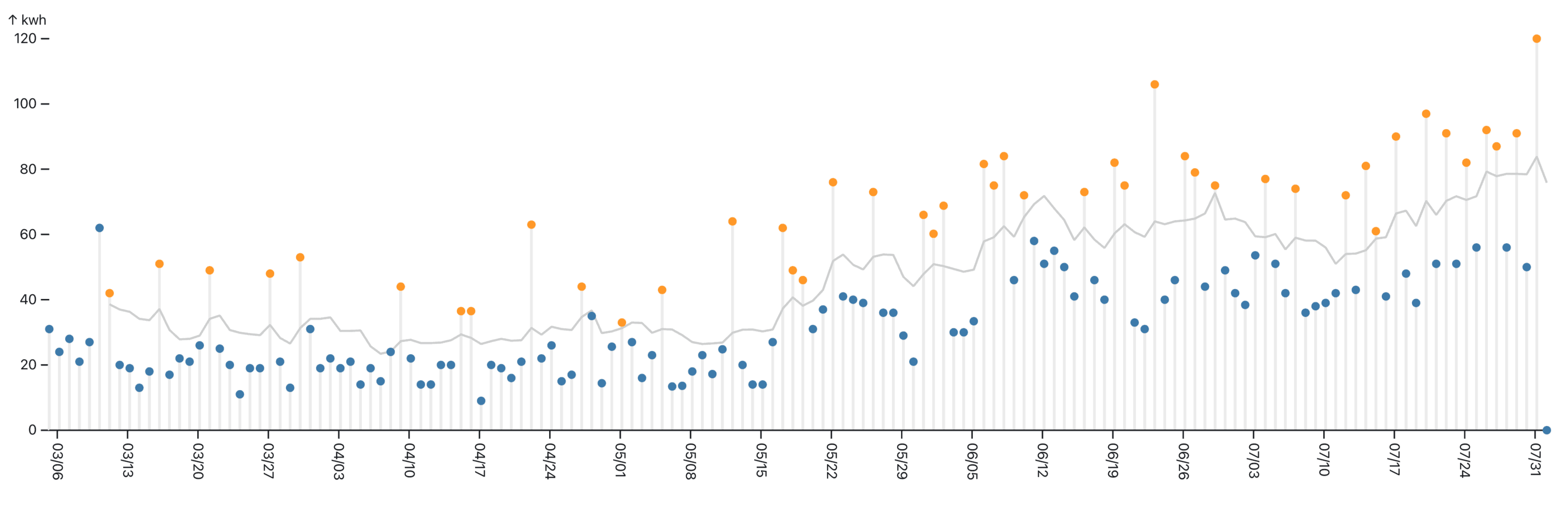
Contextualizing data using timestamps
Encapsulated in each timestamp is rich information about when something happened — the day of the week, month of the year, etc. Yet, when buried in our data, it's easy to overlook obvious questions, like did this happen on a weekend?
In this notebook, we augment our dataset with relevant time features to explore fluctuations in energy demand in California.
Just because it’s time series data, it doesn’t have to be a line chart
Which chart is “best” depends on the data. Different marks, or types of charts, reveal different aspects of the data. Everybody knows that line charts are the best way to look at one metric over time — or are they? In this notebook, we look at 6 simple charts that all show exactly the same data in almost the same way. We highlight how each chart's effectiveness is influenced by the characteristics of the data itself, and how a series of small tweaks transforms a basic chart into one that clearly reveals the most important aspects of our data. There are many different chart types out there, but by looking to the data, you can identify the best chart type to use for your time series data analysis.
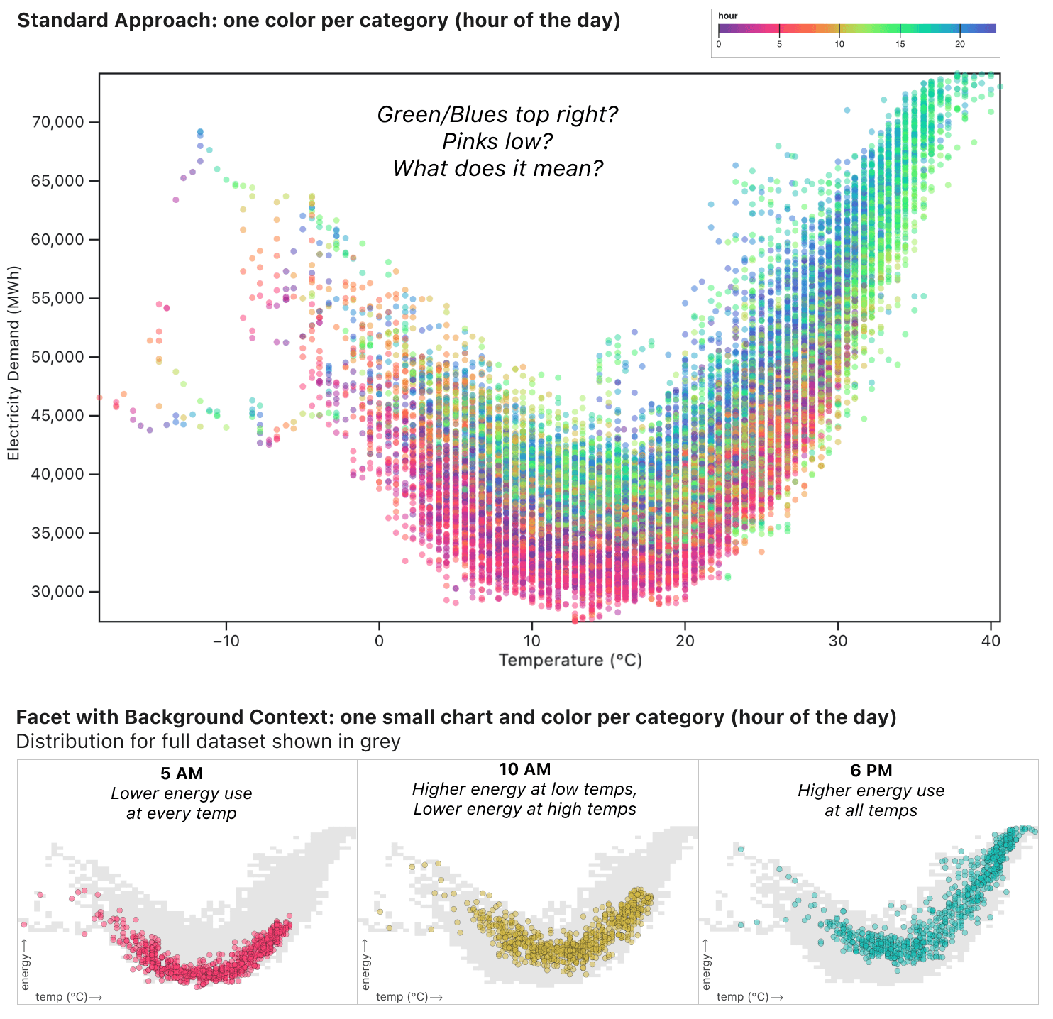
Analyzing and visualizing correlation and change over time
How can you assess the relationship between two variables over time? There are many approaches for analyzing correlation and for visualization changes over time in a data set. But, what about when you need to understand both time and correlation at once: to see how the correlation between two metrics varies over different time periods?
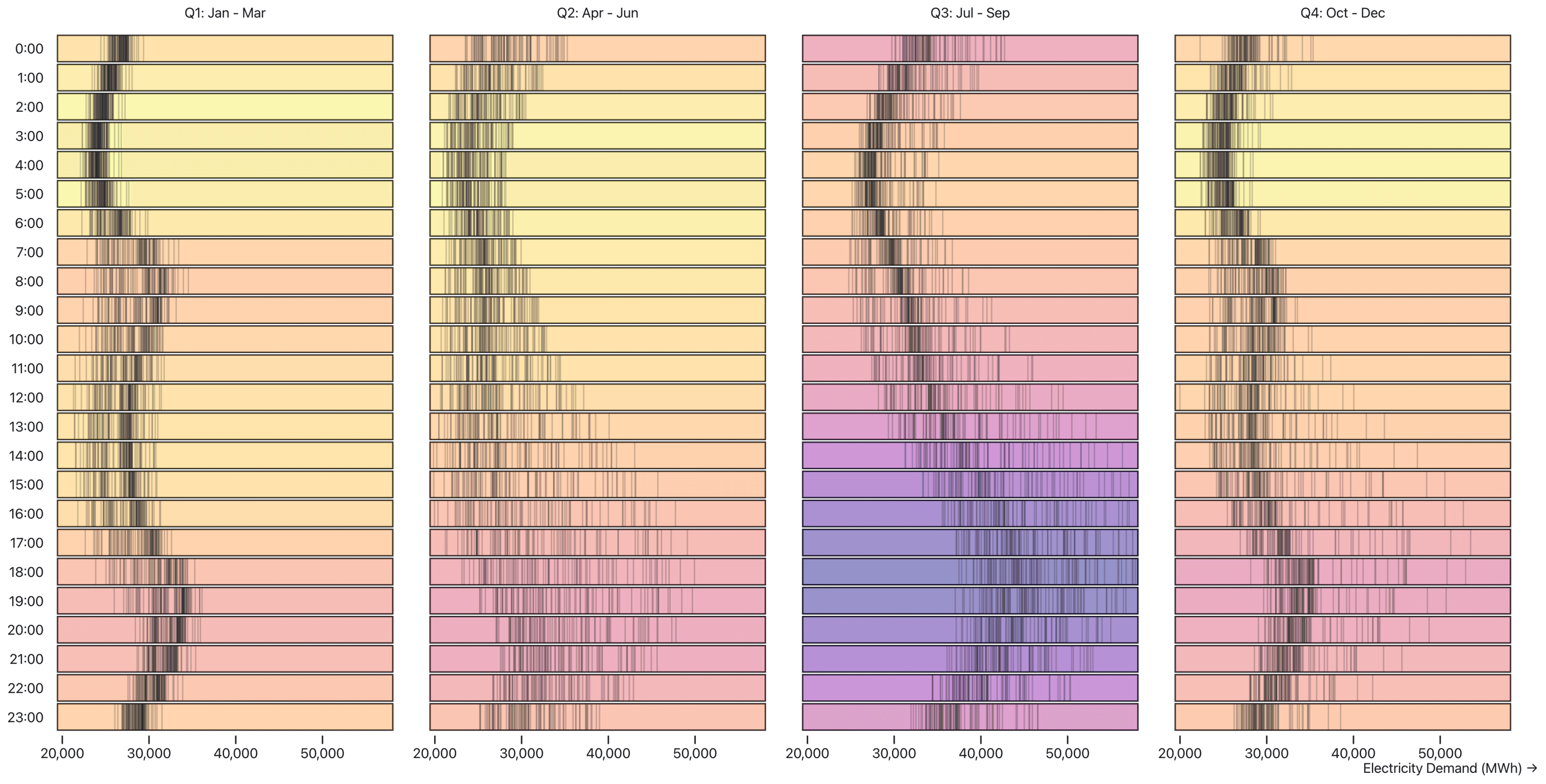
Or, how often have you stared at a sea of colorful dots on a scatterplot and felt like it was just an overwhelming mess?
In this notebook, we switch from using only colors to mark the categories in a scatterplot to faceting by category. The resulting mini-charts, one for each time period, reveal nuanced time-based distribution patterns that were literally impossible to see in the standard approach.
Put your data visualization and analysis skills to the test with public data sets
The above stories are driven by two rich public datasets that showcase real-world patterns. In the process of developing the stories we built the following two interfaces for making it easier to access the data in visualization-ready form:
EIA OpenData: Real-Time Hourly Electricity Data: An interface for exploring a large, complex and powerful public dataset.
NOAA Historical Hourly Weather Data by U.S. City: An interface for quickly downloading historical weather data from NOAA.
Watch a video workshop on how to perform time series data analysis, and learn more about exploring data and creating expressive data visualizations with Observable Plot.