What is data visualization?
You might not realize it, but data visualizations are all around us — from charts in a fitness app to diagrams in a news article. Data visualization is the graphical display of information and data. Data visualization is useful because it helps people more deeply understand information, trends, outliers, and patterns. Common types of data visualization include bar charts, line charts, pie charts, scatter plots, as well as bespoke, expressive visualizations.
Why is data visualization important?
Data visualization helps people better understand their data. When used for business intelligence purposes, data visualizations help stakeholders gain deeper insights more quickly.
The display of data helps stakeholders:
Identify patterns and trends: Visual representations make it easier to spot trends and outliers that may be difficult to identify in raw data.
Communicate insights: Charts and graphs are often more digestible than spreadsheets, tables, or other ways of presenting data.
Make informed decisions: Data visualization helps audiences incorporate data into decisions by making it more actionable and approachable.
Engage audiences: Successful visualizations can make data more engaging and compelling.
What are some ways to improve my data visualization?
Data visualizations can range in complexity – from simple bar charts to interactive heatmaps. However, regardless of expressiveness, data visualizations are only valuable when they are used.
Dashboard rot is a common phenomenon that occurs when dashboards decay from a lack of engagement and stale data. The best way to prevent dashboard rot is to ensure that you’ve built a dashboard that meets your stakeholders’ needs by displaying the right data and insights.
There are other ways you can improve your data visualizations that can drive ongoing engagement and adoption.
Add interactivity
Interactive dashboards are more engaging than static dashboards and less likely to rot because users can more easily access the information they need. Common types of interactivity include filters that allow users to drill into a specific subset of the data, and mouse-overs that display additional information on charts. You can also add brushing to allow users to explore patterns or anomalies while maintaining the simplicity of individual charts.
To quickly add interactivity to dashboards, Observable provides a library of inputs including drop-downs and radio buttons for categorical data selections, rangle sliders to change continuous values, toggles, and more.
Use annotations
Annotations enhance charts by adding context and highlighting key data points. They can be static for narrative support (e.g., marking outliers) or interactive for user exploration (e.g., tooltips with details, or crosshairs to indicate position). Annotations can also apply across multiple data series (like in time series) or facets (in small multiples) for comparisons. Here are five techniques you can use to improve your annotations.
Engage users with animation
Animation can highlight relationships and trends, and increase viewer engagement with data visualizations. Animation's role can range from subtle enhancement to being the central element of the visualization, but it should be used thoughtfully. Learn more about effective ways to use animation or discover examples of animated data visualizations.
Customize your charts
Even minor design decisions in data visualization can greatly influence an audience's perception and comprehension of the data presented. Detailed chart customization, while beneficial, can be very time-consuming. To help data analysts and developers more easily customize charts, some open-source data visualization libraries, such as Observable Plot, include options to add extra polish to charts.
Here are some underused options to customize charts you may want to incorporate in your next data visualization or BI dashboard.
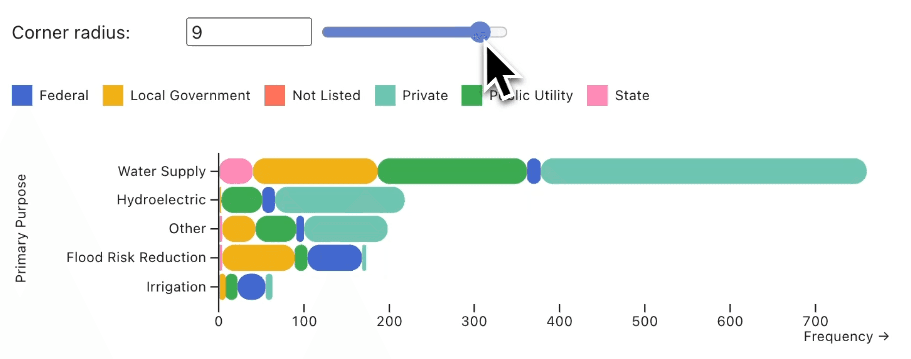
One way to customize your charts is by rounding corners on your bar chart in Observable Plot.
What are best practices for creating data visualizations?
Know your audience
Data analysts often field requests from stakeholders. When creating a visualization in response to those requests, it’s important to consider the audience by tailoring the data visualization to their interests, use case, and level of data literacy. Adopting a collaborative analytics approach makes it easier to work with stakeholders and helps ensure you’re creating the right data visualization for your audience.
Choose the right chart
The type of chart you choose impacts the story that your data tells. To create better data visualizations, make sure you’re selecting the correct chart type for your data. For example, pie charts are controversial in data visualization circles because they are often misused for direct comparison, when they are best suited for part-to-whole comparisons. Treemaps are another chart type that can be selected to show the proportions of a value as part of the whole. The Observable Plot gallery has a wide range of chart types you may want to explore.
Incorporate visualizations throughout your analysis process
Data visualizations can play an important role in the data analysis process, too! Visual data analysis can help you better explore your data and answer questions about complex data by incorporating data visualizations throughout the analysis process.
Use clear labels, titles, and annotations
Make sure the visualization is easy to understand by providing additional context for your user. Labels, titles, and annotations help you more effectively communicate insights and takeaways with your audience. Here are five techniques you can use to improve your data visualization annotations.
Create dashboards thoughtfully
If you’re creating data visualizations for business intelligence purposes, you likely are being asked to build dashboards as well. While dashboards can be very useful, they aren’t always the right solution for a data question. For instance, dashboards are more suitable for ongoing data of broader interest, whereas simpler solutions like database queries or scripts might be better for single, short-term inquiries. Here are some additional recommendations to consider when building business intelligence dashboards.
Tell a story: Data storytelling doesn’t need to just be the domain of journalists. Even business intelligence teams can use data visualization to convey a clear and compelling narrative. Learn more about ways to approach data storytelling or discover unique visualizations to use by visiting the Observable community.
Conclusion
Data visualization is a powerful way to understand and communicate with data. By using visual representations of data, you can unlock insights, foster better decisions, and engage your audience in meaningful ways.