Imagine a typical dashboard, built either for customers or for tracking your organization’s internal metrics. What types of charts come to mind? Chances are you’ve envisioned some usual suspects — bar charts, donut or pie charts, line charts, a basic map, and big number boxes. While these are extremely common and useful chart types, in some cases their simplicity can leave data insights, and user engagement, on the table.
Here, we describe five chart types that squeeze more juice from your data to create richer and more engaging dashboards.
Horizon charts save space and highlight trends
A horizon chart provides a compact way to show patterns for a quantitative variable, usually over time. You might be thinking “Wait, can’t I do that with a simple line or area chart?” Technically, yes. But sometimes, you need an option that still clearly shows trends over time, but minimizes the space needed to show them.
In a horizon chart, the range of values is split into equal bands. The bands are layered atop one another, using color or opacity to distinguish between them, as shown in the animation below. This band layering makes the most of limited vertical space, while clarifying trends and adding visual interest.
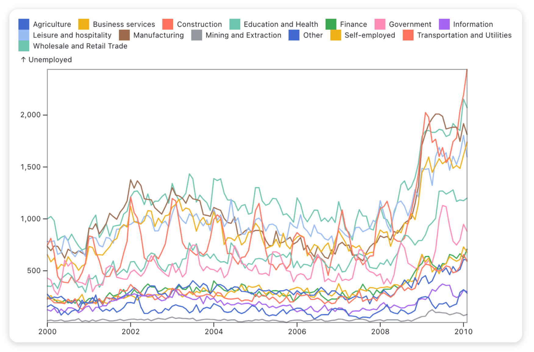
Usually, horizon charts are faceted to compactly show trends across multiple groups. For example, the chart below visualizes trends in unemployment by industry using data from the U.S. Bureau of Labor Statistics:
See the Observable Plot code used to create this horizon chart.
In the chart above, color is used to differentiate between the layered bands, with darker greens and blues punctuating periods of higher unemployment within an industry. This highlights patterns in unemployment over time. For example, we can clearly see seasonal cycles in unemployment for Construction and Government industries, but these cycles are offset by about six months. And, we can see similar unemployment patterns over time for Wholesale and Retail Trade, Manufacturing, Leisure and Hospitality, and Business Services, each having a moderate increase from about 2002 to 2006, followed by a decline that leads into a sharp uptick in unemployment near the start of 2009.
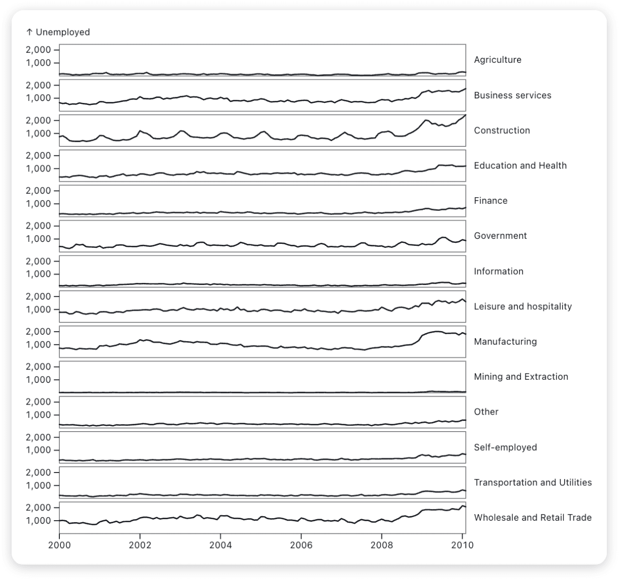
For comparison, a standard line chart showing the same unemployment data is shown below. The number of overlapping lines makes it a bit overwhelming to track patterns for any one industry, or to compare seasonal or longer term patterns between industries with unemployment numbers on very different scales.
Given the spaghetti-esque nature of the line chart above, one might consider faceting by industry, as shown below. But this faceted version of the chart — when sized reasonably for viewers to fit in the same window — compresses unemployment fluctuations onto a short vertical scale for each industry, making it difficult to interpret all but the most obvious changes.
The horizon chart we started with solves both problems seen in line chart alternatives: you can still use faceting to clarify trends by group, and the layered bands accentuate trends, even when presented in compressed vertical space.
One thing to keep in mind when building a horizon chart is that viewers are unlikely to have a deep understanding of band layering, so it may not be the best option if you want them to correctly interpret the exact values shown in the chart. But, if the aim is to help your users see overall patterns and if you have multiple groups and limited space, a horizon chart can be a great option.
Beeswarm charts
Beeswarm charts are used to visualize the distribution of observations along a single axis, using a dodge transform to closely pack the points while avoiding any overlap between them. Beeswarm charts are useful when you want to represent unique points, while making it easy for viewers to distinguish between them.
For example, the beeswarm chart of FDIC-reported bank failures below — which also maps bank size to dot radius — clearly captures the massive number of bank failures (across bank sizes) starting in 2008, and the much different spike from several very large bank failures in 2022. Conditional text labels make it easy to identify major bank failures, while interactive tooltips let a user dig into the smaller bank failures without cluttering the entire chart with text.
You can represent additional quantitative or qualitative values for each point in a beeswarm chart by mapping them to things like color, size, or opacity. For example, the Washington Post recently compared ethnicities of federal judges appointed by Trump and Biden, using fill color to represent ethnicity, image backgrounds to highlight Supreme Court justices, text annotation to highlight appointments of interest, and with court type mapped to dot size:
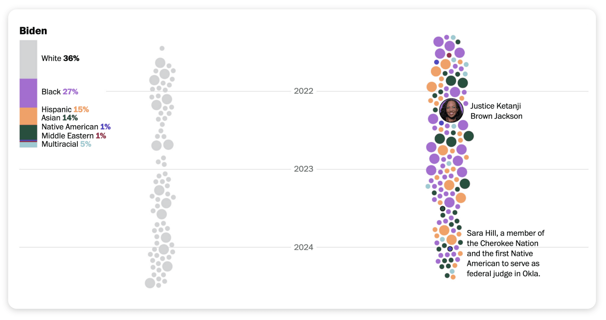
Beeswarm chart representing ethnicities of federal judges appointed by President Joe Biden. Source: Nick Mourtoupalas. “Biden has installed the most non-White judges of any president.” The Washington Post. May 22, 2024.
As the chart above illustrates, mapping variable values to visual properties makes it possible to create clear, engaging beeswarm charts that are rich with information, helping viewers to learn more about distributions than might be possible from histograms or density plots.
But beware: beeswarm charts can fail if you have too many points, which (in order to keep dots from overlapping) can send the distribution skyrocketing beyond your chart area. And, keep in mind that the dodge transform to avoid overlap means that beeswarm charts should not be used to infer exact values along the axis.
Combine maps, marks, and interactivity
As open-source, code-based data visualization libraries like Observable Plot increasingly add support for spatial data visualization, you can design custom maps to go beyond what’s possible with many point-and-click GIS tools. You’re no longer confined to bubble maps and univariate choropleths (which are still great options). If you’re looking to mix things up, here are a few map variants to consider.
For an alternative to a bubble map to show variable values at different locations, consider a spike map. The spike map below is created by combining the geo and vector marks with a spike shape to visualize 2016 U.S. population by county, using data from the American Community Survey.
A spike map can be preferable to a bubble map if you want to avoid largely overlapping dots. And, spike length can be easier for viewers to interpret and compare across locations, compared to dot radius.
What if you want to represent trends or changes in spatial data? Three options are to add interactivity, show map snapshots as small multiples, and use an arrow mark to represent a direction and magnitude of change.
For example, the interactive choropleth below reveals the increase in broadband access by county across the U.S. from 2000 to 2018. Follow along with our tutorial to create this interactive chart on your own using Observable Plot and Observable Inputs.
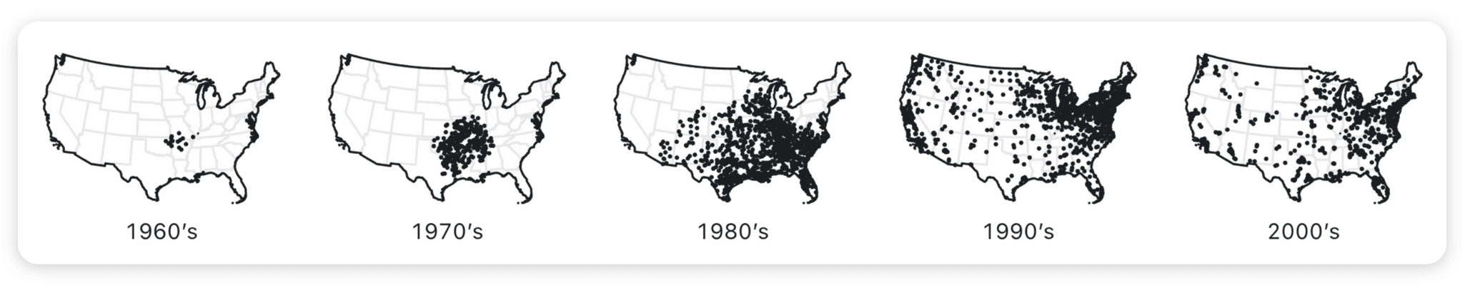
For a static alternative, consider showing maps as small multiples (here, showing new Walmart stores added by decade):
Or, use an arrow mark to indicate a magnitude and direction of change by location. The chart below uses an arrow mark to visualize the margin by which each presidential candidate (Joe Biden = blue, Donald Trump = red) won for each U.S. county in the 2020 election.
See the code to create this election wind map with Plot.
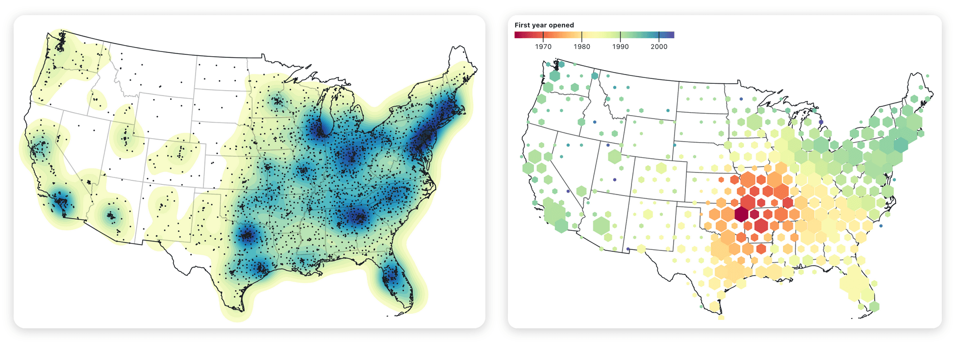
As a final example of building better custom maps with code, let’s consider a case where you want to aggregate or simplify how you visualize spatial data. The two maps below summarize spatial data on Walmart store locations, but in different ways. In the left chart, a density mark highlights regions of high (dark blue) and low (light green) Walmart store densities. On the right, a hexbin transform also summarizes store densities, with larger hexagons indicating a greater number of stores near that location and with color indicating the date that the first nearby store opened.
Many combinations of maps, marks, and interactivity are possible beyond what we’ve shown here. This selection gives a taste of what you can make by merging different chart marks with spatial data.
Mosaic plots put proportions in another dimension
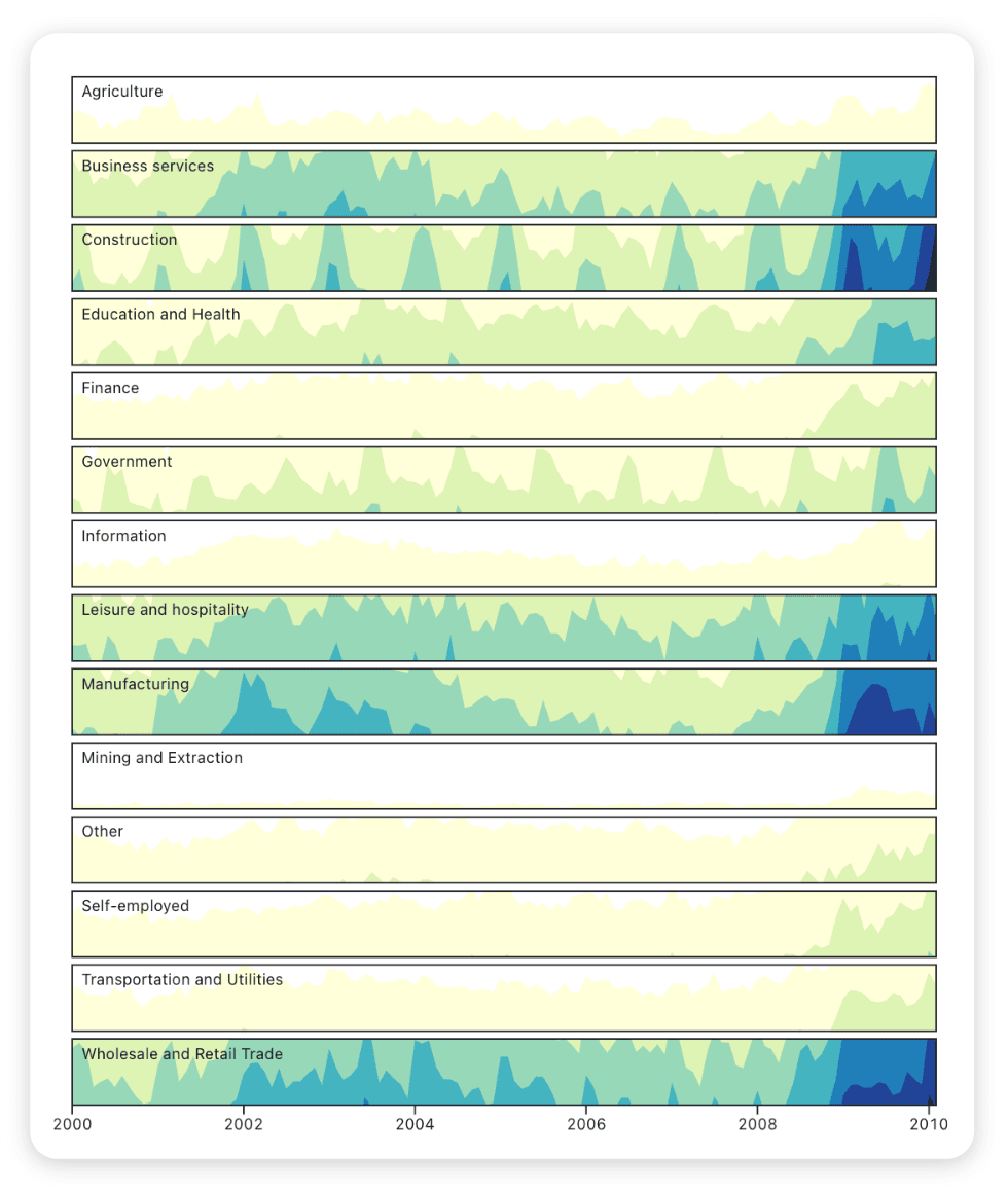
If a stacked bar chart to show proportions by category has left you feeling one dimension short, a mosaic plot might help. Mosaic plots (also called Marimekko or Mekko charts) visualize proportions along two dimensions. They are often used to visually represent values in a contingency table.
In the mosaic plot below, proportions of sales by segment (Delicious-n-new, Carrots-n-more, etc.) are shown on the y-axis, with markets along the x-axis. This looks very similar to a standard stacked bar chart (with city on the x-axis), with one major difference: instead of each bar having the same width, the bar width is variable based on market size.
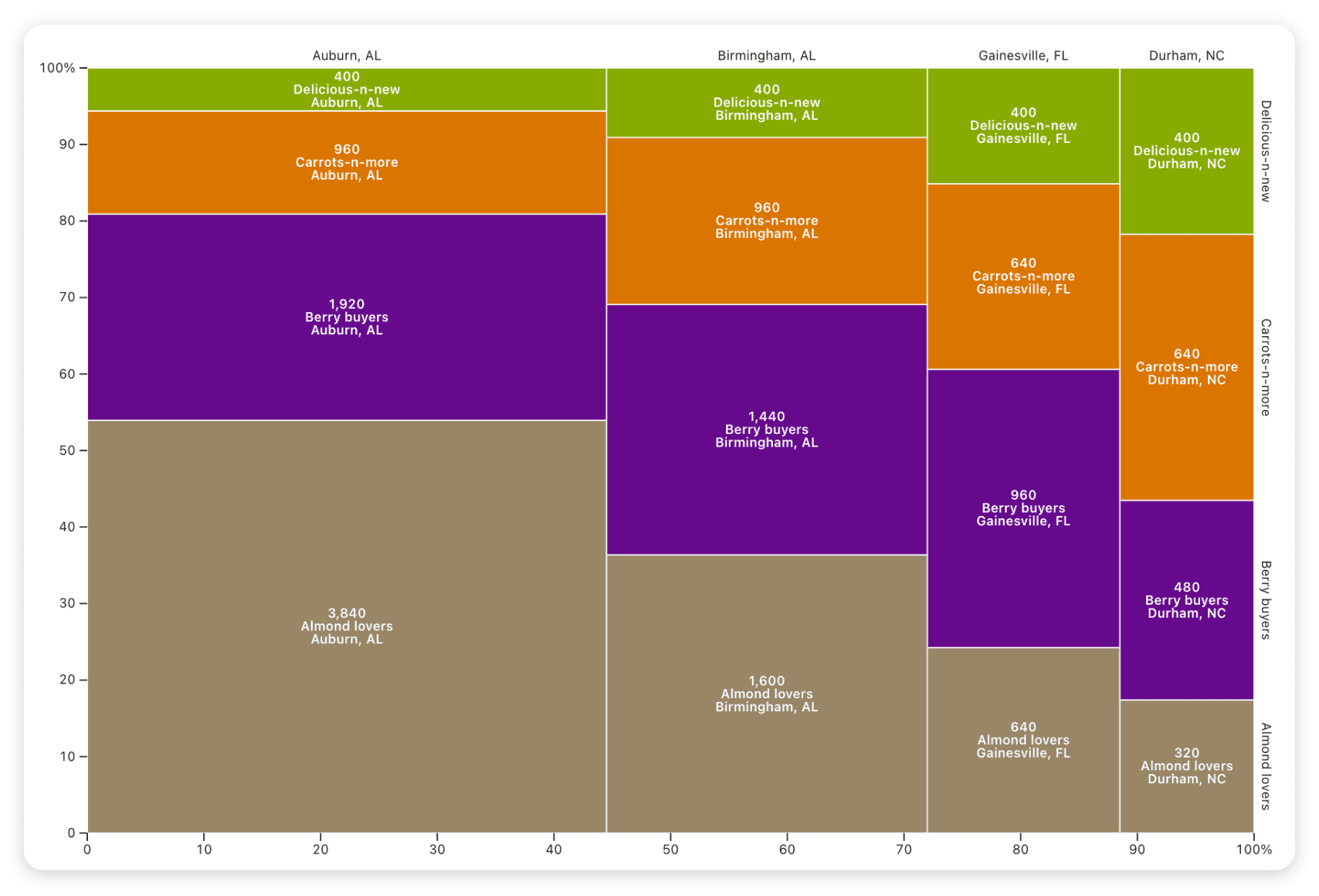
See the code to create this mosaic chart with Plot.
The variable width along both axes allows a viewer to consider parts of a whole based on two variables. We can see, for example, that Auburn, AL is the largest of the four markets (occupying the greatest width). Within that market, Almond lovers accounts for the most sales (the highest proportion on the y-axis). The area of the Auburn, AL / Almond lovers rectangle in the bottom left is larger than all other rectangles in the chart, indicating that it accounts for the greatest sales overall.
With more segments and smaller rectangles, it may not be feasible to label each part of a mosaic plot. In that case, you may want to limit labels to only highlight major or notable values. For example, in the faceted mosaic chart below (using the same market data as above, but split over three decades), only the largest rectangles are directly labeled. Interactive tooltips let a viewer explore values for smaller rectangles, while avoiding clutter and overlapping text.
A mosaic plot can also be useful to:
Compare budget allocated by city and department
Visualize electricity usage by building and source (e.g. solar and natural gas)
Explore support for a bill (yes / no) based on age brackets (e.g. 18 to 30 years, 31 to 50 years, 51 to 70 years, etc.) using data from a poll of likely voters for a region
But use mosaic charts with care — they can be difficult for viewers to interpret because the different aspect ratios of rectangles make it hard to compare areas, especially when the areas are similar. You can help viewers by adding text annotation to highlight the main takeaways, and including the actual values for each area either on the chart or with interactive tooltips that reveal values on hover.
Track how you’re keeping up with burndown charts
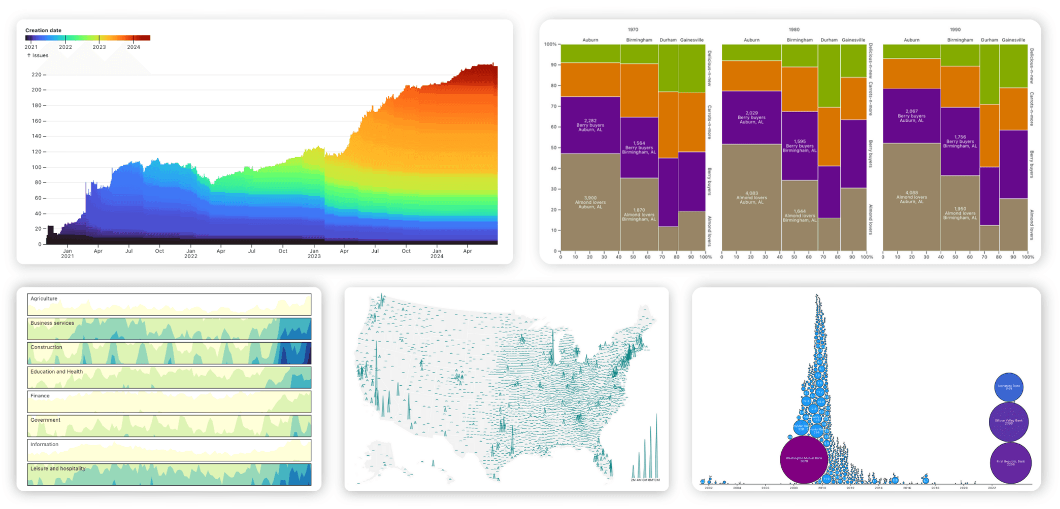
Often, teams want to track user requests and understand how efficiently they are resolved. A burndown chart shows the number of outstanding issues over time. The issue creation date can be mapped onto a color scale, revealing how quickly issues are resolved.
The example below by Tom MacWright is a burndown chart of GitHub issues filed in the Observable Plot repo:
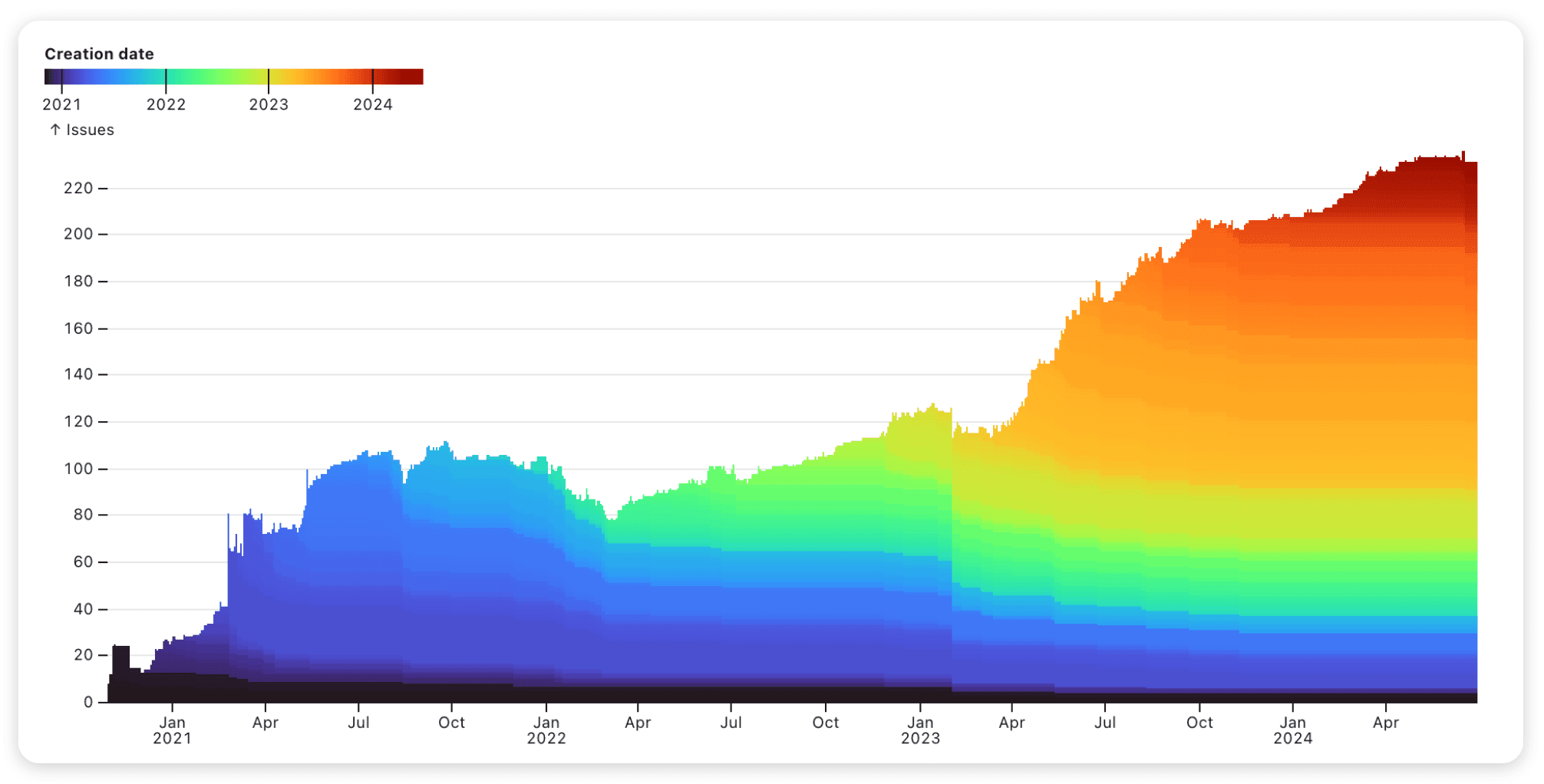
In the burndown chart above, the total height of the chart area indicates the number of open issues at any time. Color is used to represent the date an issue was opened. The color channel is useful because it allows a viewer to track the “lifetime” of open issues based on the general time window when they were filed. For example, a spike in issues from about April 2023 to October 2023 is captured by an “orange cohort”. The relatively constant scale of that band indicates that most of these issues remain open. Compare that to the “blue cohort” of issues created between March and July 2022, which have steadily reduced over time.
Open repo issues are a common burndown chart use case for software developers, but this type of chart can also be used to track things like outstanding customer support tickets, incomplete project tasks, or unanswered emails. If you want to visualize both how many to-dos are still open at any point and how quickly things get resolved, a burndown chart is a useful option.
Start building richer dashboards
Here, we’ve highlighted lesser-used charts that can help dashboard users get deeper insights from data than they might from more commonly used graphics. When you build charts and dashboards with code, for example using Observable Plot (our open-source library for exploratory data visualization used in many of the examples above) and Observable Framework (our open-source static site generator for final data apps), you can fully customize your data displays for more useful and engaging dashboards that keep users coming back.
Start building richer dashboards today:
Visit the Plot gallery for more chart ideas, inspiration, and reusable examples
Learn more about Observable Framework for building fast, custom data apps and dashboards