Bar charts, unlike pie charts, are the uncontroversial workhorse of data visualization. They fit many different kinds of data, and are the easiest to interpret when you need to read small differences in numbers with a high degree of precision.
In this post, we’ll look at how bar charts work and a few typical uses. In a follow-up post, we’ll then go a bit further into more unusual use cases.
Categorical data: the basic bar chart
At its most basic, a bar chart shows a numeric value broken down by a category. This might be sales broken down by department, average yearly cheese consumption by age group, or the number of sunny days per year for different cities.
Note that there are two different sources for the bar length here: it can be a numeric column in the data set (like sales or cheese consumption) or based on the number of records with a particular value (number of days tagged with “sunny”). This number determines the length of the bars.
The other (usually horizontal) axis is categorical, which means that there is no inherent ordering – or, if there is an inherent order, it’s less important than the numbers shown by the bars. The categorical axis just breaks the data down into individual subsets that we care about. Take this distribution of letter frequencies in an English-language corpus, for example:
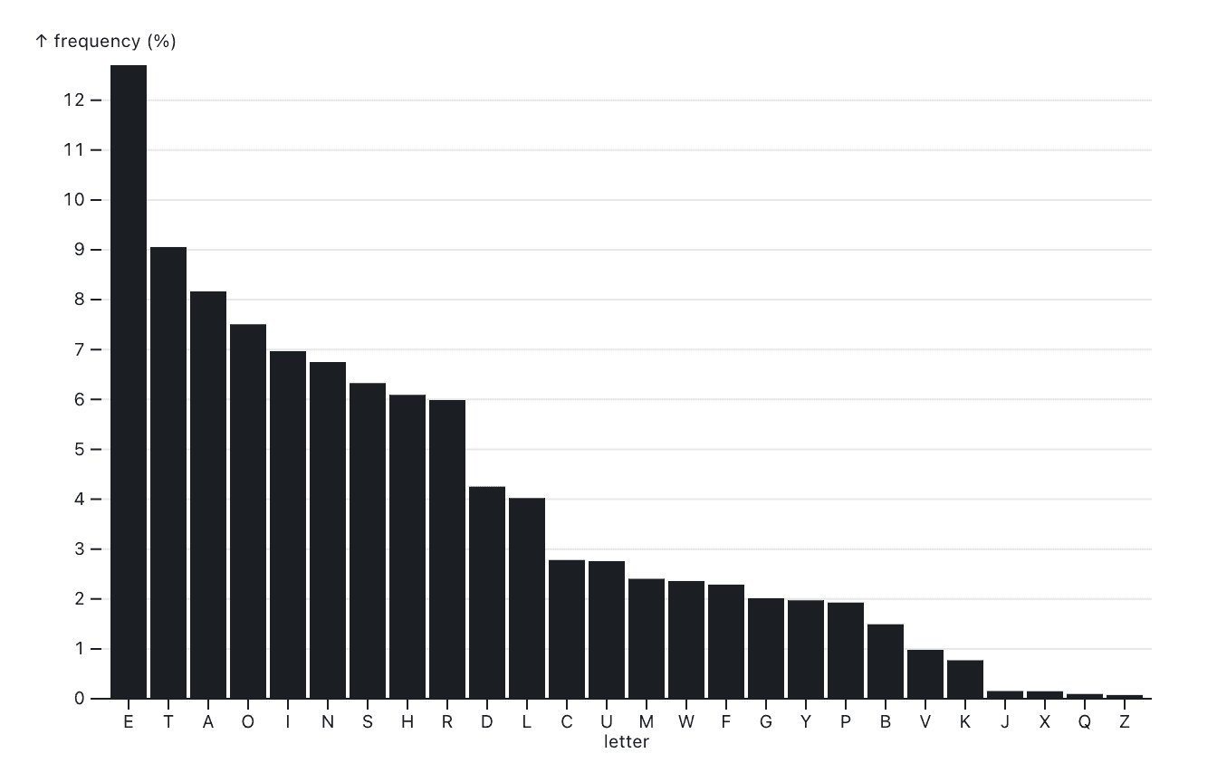
If we want to know the most frequent letters, sorting by frequency (on the vertical axis) makes the most sense. We can easily find the most and least common letters, the third-common, etc.
But what if we’re interested in a particular letter? Or if we want to see if there are any obvious dependencies between neighboring letters in the alphabet? Then we can use this chart, with letters arranged alphabetically (instead of ordered by count):
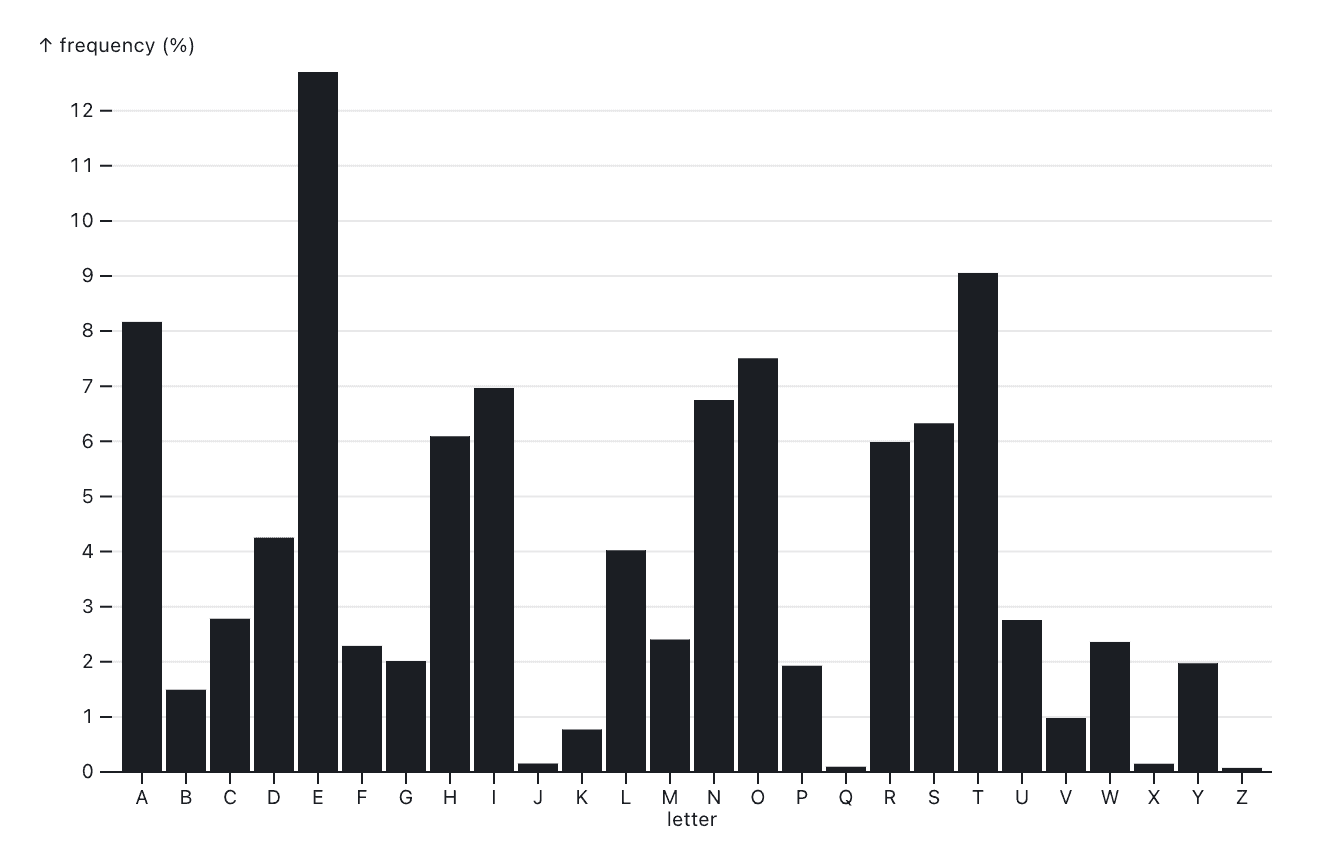
Bars are independent from each other, so no matter how we order them, they always look the same. This is very different from a line chart, where the slope between two points can change dramatically depending on how far apart they are, and how the values differ.
The fact that we can do this with bar charts is important, because it allows us to reorder bars in whatever arrangement we think will be most useful to the viewer. This is not something we would be able to do if the horizontal axis were time, for example (but stay tuned for the next post that will discuss bars on time axes).
Building bar charts is straightforward in most data visualization tools and libraries. For example, here’s how to do it in Observable Plot, which makes the mappings from data to visual features easy to see. The bar mark contains the dataset, alphabet, which has two columns here: letter and frequency. We map one to the x axis (position) and one to y (length).
Plot.plot({
  marks: [
    Plot.barY(alphabet, {
      x: "letter",
      y: "frequency"
    }),
    Plot.ruleY([0])
  ]
})
If we want to sort the bars by their length, we can insert a sort option into the bar definition:
sort: {x: "y", reverse: true}Comparison: two-sided bar charts
Technically, bar charts with vertical bars are called column charts, but people who insist on this distinction tend to not be much fun at parties. Bars can be horizontal too though, like in this example showing population growth for each state in the U.S. between 2010 and 2019:
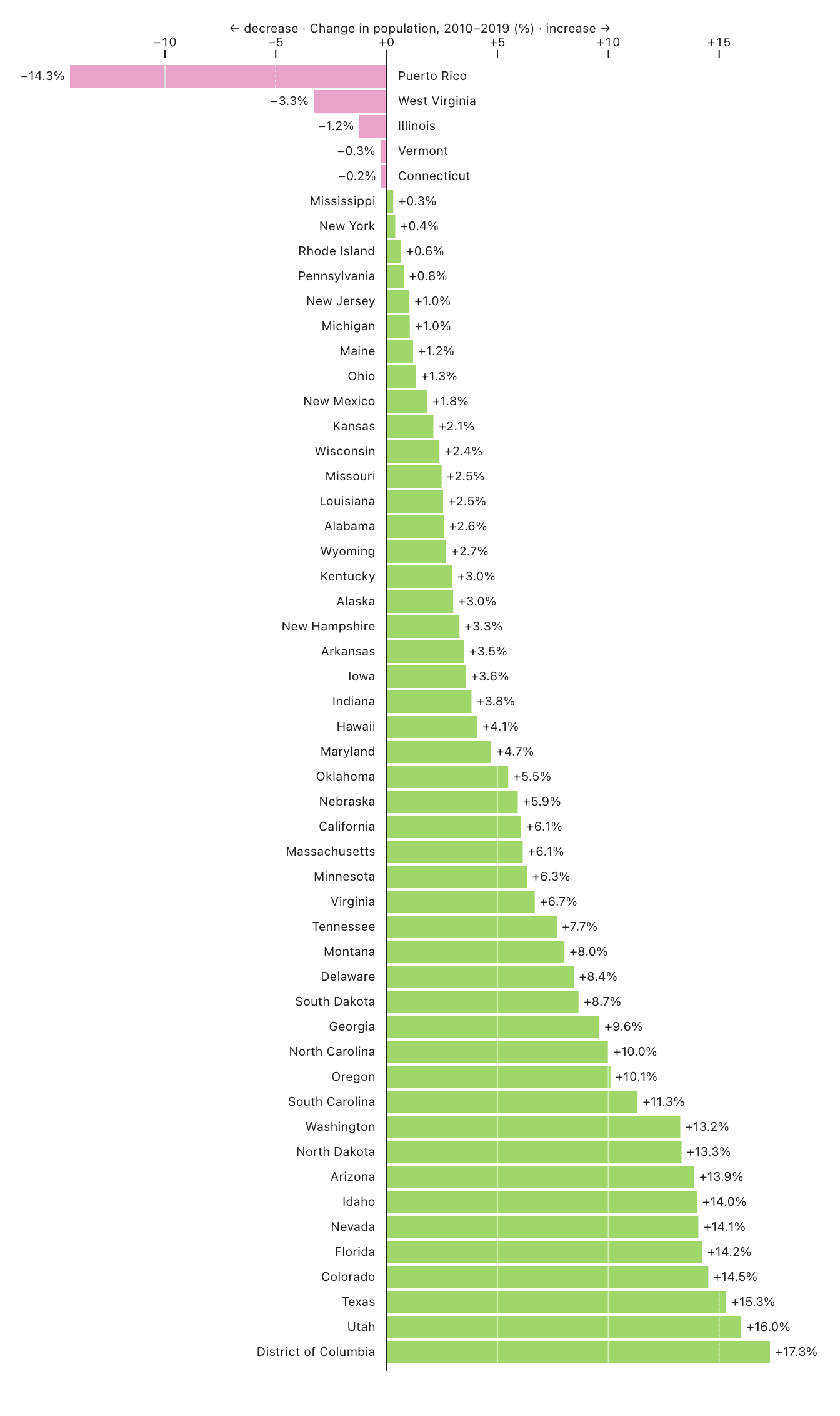
It’s really just another bar chart, but the horizontal bars lend themselves to annotation (names of the states and percent of change), and the vertical line reinforces the difference between states that decreased or increased in population. This is brought out even more by the color, which is magenta for negative values, and green for positive.
The entire definition of this chart using Observable Plot is a little involved (you can see it here), but the key part is just this barX mark (the X indicating it is a horizontal bar chart). The fill property contains a function in this case, which changes the color of the bar depending on whether its value is positive or negative. The bars are also sorted from smaller to larger numbers, which puts the largest decrease at the top, and the largest increase at the bottom.
  marks: [
    Plot.barX(statepop, {
      x: "value",
      y: "State",
      fill: (d) => d.value > 0,
      sort: { y: "x" }
    }),
Despite its simplicity, a bar chart can be dressed up to be more interesting to explore, and also more informative.
Histograms: the one-dimensional bar chart
I mentioned earlier that a bar’s length can be based on how often a category is found in the data. But what if the data isn’t even categorical? Then we can bin the values into ranges, and count those to make a histogram.
What is a histogram? A histogram is a type of bar chart that shows the distribution of a set of continuous numerical data, where data is grouped into bins that display how many data points fall into each bin. They are both extremely simple and useful, but also unfamiliar enough to be confusing to many people.
What makes them simple is that they’re really just one-dimensional: one axis is a value, while the other is created from the dataset itself by counting how many values fall into each range of values. Since the value is usually continuous, what is counted is not individual values, which might all be different, but how often values occur within each range, or bin.
Plot.plot({
marks: [
Plot.rectY(olympians, Plot.binX({y: "count"}, {x: "weight"})),
Plot.ruleY([0])
]
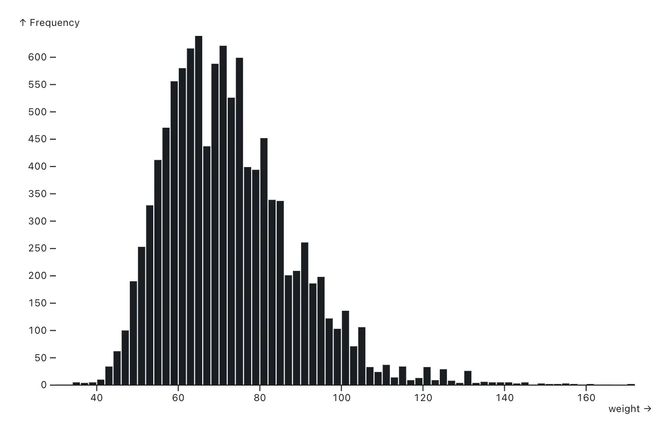
})Take a look at this example of the weights of Olympic athletes, for example. The bins here are 2kg wide. The height of each bar is how many athletes have a recorded weight within that bin.
Here’s the Observable Plot code that created this chart. Note the binX transform that performs the binning, which both quantizes the values for the x axis, and counts them for the y. The result then goes into the rectY mark to create the bars.
Histograms are useful to judge the distribution of values, which means they’re read more as a shape than individual bars. In this case, we can see a fairly typical normal distribution with an interesting skew to the left (lower values). The general population would look more symmetrical, and also presumably shifted to the right a fair bit. This dataset contains weights for top-of-their-game athletes, most of whom are probably competing in sports where being lighter is an advantage.
One important issue with histograms is that the bin size can dramatically change their appearance. In the example above, we didn’t define the bin width ourselves, so Plot chose a bin size of 2kg. If we instead specify 1kg or 5kg, we get a spikier or smoother histogram.
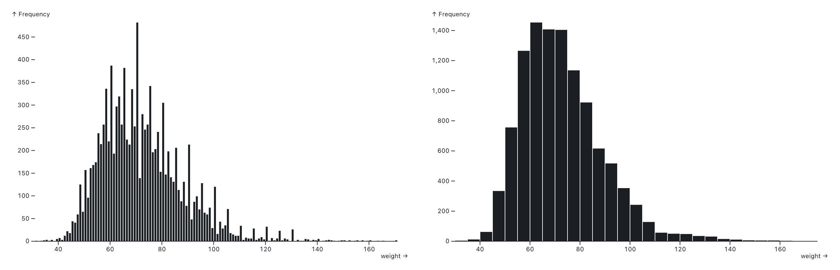
What’s more, shifting the starting point of the bins left or right can change the histogram too, especially when there are many bins. It is therefore important not to read too much into individual bars, and usually better to use a larger bin size. A common recommendation for picking the right bin size is Scott’s Rule, which is used in many statistical and chart libraries (including Plot) to pick bin sizes by default.
Histograms are a special type of bar chart where we can’t just change the order (since it depends on the value on the axis). They’re useful to see how values are distributed, what the shape of the distribution is, and if there are outliers (especially unknown and null values).
Building a bar chart with Observable Plot
You can easily build a bar chart with Observable. Check out the below example code for visualizing data with a bar chart using Observable Plot. Simply copy the code into a new Observable Notebook or select “bar chart” from the new cell menu, then update the data and variable name to visualize your data sorted by y-value in descending order.
Plot.plot({
  marks: [
    Plot.barY(dataset_name, {
      x: "categorical_var",
      y: "quantitative_var",
      sort: { x: "y", reverse: true }
    })
  ]
})
Conclusion
Charts don't have to be fancy to be useful, the humble bar chart is perhaps the best illustration of that. Despite its simplicity, it is useful in many contexts, whether showing data values directly, aggregated numbers, or counts in a histogram.
Bar charts and histograms hit a sweet spot of working well for the kinds of data that happens to often be of interest in data analysis and data exploration. While there are many other chart types, none can match the ubiquity and usefulness of bar charts.
Discover more tips and tricks to building effective data visualizations on the Observable blog.