You’ve heard the jokes about them, you’ve been told not to use them, maybe you’ve been made fun of for using one anyway: pie charts! They’re as popular with the masses as they’re hated by some. So what are pie charts good for, when should you use one, and what do you tell the know-it-all who keeps insisting that they’re always the wrong choice?
In this post, I will walk you through what pie charts are good for, how donut charts work, and finally take a look at what the research says (such as it is).
Why should you trust me? I worked in visualization research for a while and have run studies on pie charts (I’m linking to a few of my studies at the end of this blog post). In fact, I might be the person who has run the most studies on them specifically.
It’s okay to dislike pie charts
Let’s get this out of the way first, though: I’m not here to sell you pie charts. If you don’t like them, don’t use them. What I am taking issue with, however, is that opinions and aesthetic judgments get passed around as facts.
It might surprise you how little we actually know about pie charts, given how ubiquitous they are and how long they’ve been around. In fact, pie charts are among the oldest statistical charts that we recognize as charts. William Playfair is generally credited with their invention, in his Statistical Breviary published in 1801.
People seem to have disliked them for nearly as long. Willard Brinton, for example, stated in his 1914 book, Graphic Methods for Presenting Facts, that “[the] circle with sectors is not as desirable an arrangement as the horizontal bar [chart].” And the list goes on.
Pie charts aren’t always the right choice for the data or the question being asked. However, many of the claims people like to make about them are either wrong, or there’s no evidence for them. My goal here is to present what we know about pie charts (and what we don’t know!), so we can decide to like or dislike them on their actual merits.
Part-whole comparison
No chart is good for everything, it always depends on what your data looks like and what task you have in mind. Bar charts are great for comparing values to each other, such as returns from different investments, or the mileage you get with different cars. Direct comparison of values is a common task, so bar charts are often a good choice.
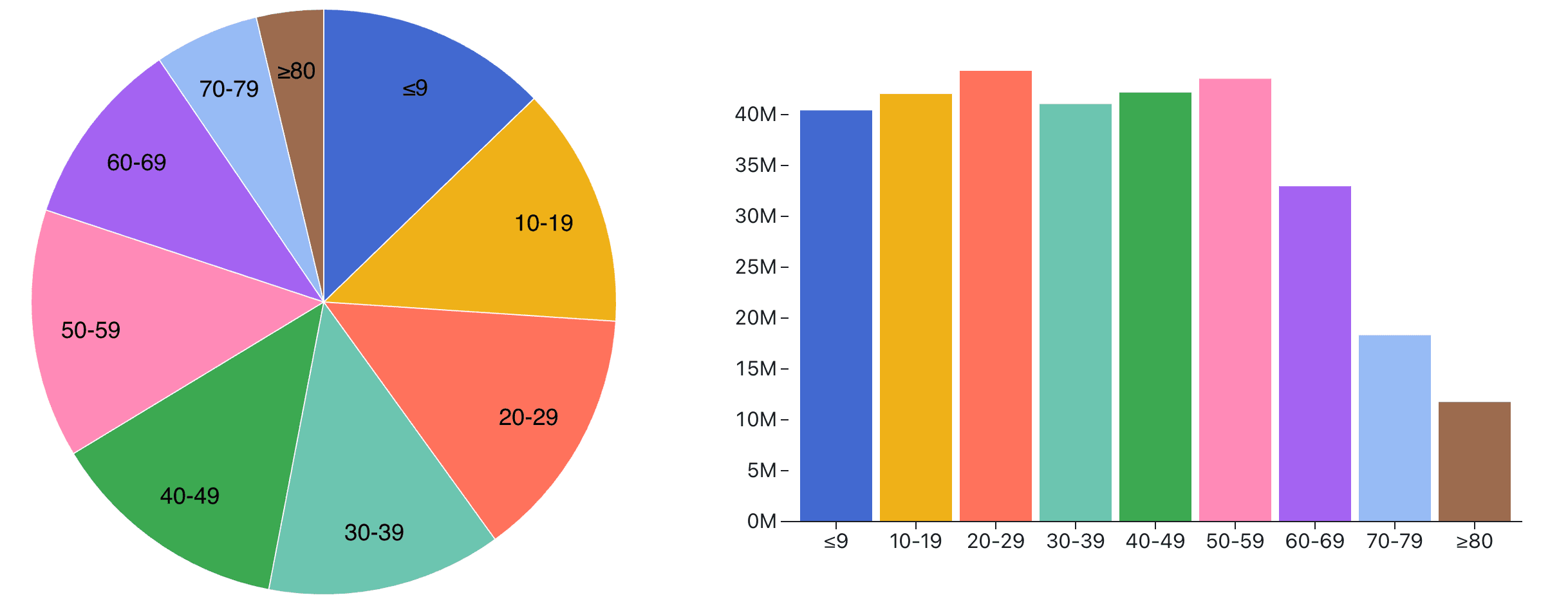
But not always! Sometimes, the question is not comparison between values, but between the numbers and the sum of all the numbers. This is called part-to-whole comparison, and it’s what pie charts are good at. Examples include the contributions of different departments to the total sales of a corporation, or the breakdown of the U.S.’s 2015 population into ten-year age groups in the charts below.
As you can see in the image, if you’re looking for direct comparison between values (e.g., which age group is the largest?), the bar chart is the way to go. But try to figure out what fraction 50-59-year-olds constitute, and you’ll have a much easier time doing that with the pie chart.
This kind of comparison is often taken to show that bars are superior, but that’s only true if all you care about is direct comparison of values — then by all means, use a bar chart or a table. There are many ways to compare values to each other directly.
It’s also important to ensure that your numbers add up to 100%. If there are missing categories, or things can be counted in multiple places, the pie chart no longer works. A reason many people dislike pie charts is because they’re often used for data that doesn’t fit the chart’s underlying metaphor.
There aren’t many other charts that allow a part-to-whole comparison in the same way the pie chart does. Two that come to mind are treemaps and stacked bars. Neither of which has been shown to be better than the pie chart in studies (see below), though — and the stacked bar chart is actually consistently worse.
Accuracy
One of the few pie-related things we have some data for, viewers' ability to accurately interpret and compare values shown on pie charts. A classic study in data visualization, Cleveland and McGill’s 1984 Graphical Perception: Theory, Experimentation, and Application to the Development of Graphical Methods, found that viewers were less accurate when comparing values in pie charts than when comparing bars located next to each other. However, when the bars were stacked or not placed directly next to each other, pie charts did as well or even better.
Data visualization is rarely about precise comparison, however, and when exact numbers are called for, a table is usually the better choice anyway. For other tasks, such as getting a quick but rough idea of how much a department contributes to a company’s sales, pie charts are perfectly adequate. The difference in accuracy is usually less important than the mismatch between chart and task when using a bar chart for that same purpose.
This is especially true when the values are different enough from each other that they are easy to tell apart (even if not with perfect accuracy). When the values are close enough that they can’t be distinguished from each other, this becomes a larger issue. This is usually not under the visualization designer’s control, unfortunately.
Pies and donuts
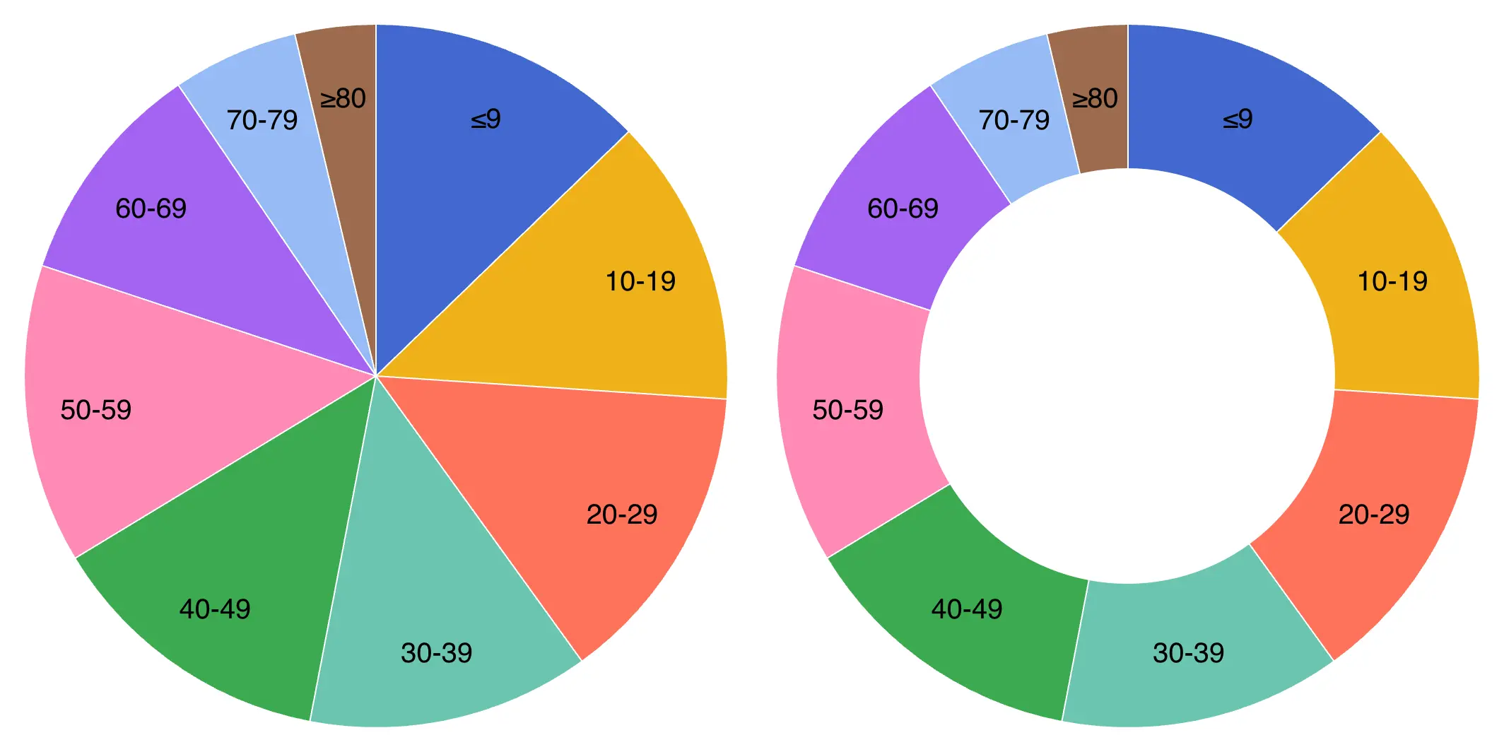
One of the common misconceptions about pie and donut charts is that donuts are worse than pies. This is based on the idea that we read pie charts by the angle in the center of the chart, and since donuts are missing the center, clearly they have to be worse!
But as I describe in the research section below, no study I’m aware of has shown either of these two common assumptions to be true. Pie and donut charts aren’t read by angle (at least not alone), and donut charts don’t do worse in studies than pies.
Donut charts aren’t very common when there are multiple categories, but they are often used to show how two numbers relate to each other, like in how close sales are to a goal or similar. That is also where it is often useful to see the exact number, which is then placed inside the donut hole.
What does actual research say?
First, it’s important to understand that most information about pie charts that is circulating online (and even in books) isn’t actually informed by research, but rather based on opinions and aesthetic judgments.
That even includes the basic mechanism of how we read pie charts. When you draw a pie chart, you typically do so by angle: you divide the circle according to the values you want to show. If you’re dealing with percentages that add up to 100%, you can multiply each value by 3.6 (360º for 100%) and draw each circle segment accordingly.
That leads to the assumption that we also read the chart like that, but there is no actual evidence for that. The problem is that pie charts use at least three different visual cues at the same time: angle, area, and arc length (as well as a few other lesser-known circle-related measurements). But which one do we use?
While it seems that we should know how pie charts work, the truth is we don’t. The usual story about how pie charts are read by angle isn’t based on any studies. Walter Crosby Eells’ 1926 paper The Relative Merits of Circles and Bars for Representing Component Parts, is often cited as the source, but it doesn’t actually say that. Methodological issues aside (it uses self-reported cues, which are very unreliable), it finds that area is the most likely visual cue used for pie charts.
In 2016, Drew Skau and I published a paper that reported on a pair of studies that tried to suss out how we actually read pie charts, which nobody in the 90 years between Eells and our study had bothered to do. What we found was that people were less accurate at comparing values when given just angles, and did much better with area or arc.
We also found that donut charts did no worse than pie charts in terms of accuracy when reading values, which makes sense if angle isn’t used to read them (or just not important). I later re-analyzed the results from an older study whose purpose was to test something else, but where we also had used pie and donut charts as control conditions. It turned out that in that study, donuts also did exactly as well as pie charts (and stacked bars did worse).
In a later study, I even used 3D pie charts to try to separate area and arc length from each other. The results were again consistent with angle not being important, but there ultimately wasn’t a clear winner between arc and area. It seems possible that we use a combination of both visual cues, or that we switch between them depending on the size of the slice.
Between the consistent donut chart results and the isolated cues, I am confident to say that we’re not reading pie charts purely by angle, however.
When to use pie and donut charts
Pie charts have their place in part-to-whole comparisons when the number of slices is small and the categories cover the entire space (i.e., they sum up to 100%). Donut charts work well to show goal achievement, resource utilization, etc., especially when they’re only comparing a single value to the total. They’re certainly no worse than pie charts.
Pies are popular, they’re attractive, and for most purposes they’re accurate enough. Whether you use them or not is a matter of personal preference, not based on some supposed shortcoming. While there isn’t much research in this space, we should at least be aware of what’s out there and what it says.


