Most data analysts cut their teeth on a familiar set of chart types when learning data visualization skills — among them, the bar chart, the line chart, the pie chart, and the scatter plot. These standard charts are widely understood, easy to build, and dependable for many common analyses. They come pre-built in most business intelligence or AI for analysis tools, and are often the first chart types that data teams use for exploring trends and patterns in a dataset.
So it follows that when a request comes across an analyst’s desk, they’ll often reach for one of these standard charts. But in some cases, they may not be the best fit for the data, and a more sophisticated chart could add more value or uncover more insight. For example:
A bar chart can compare aggregate values by category, but it may hide patterns within those observations.
A line chart can show change over time, but noise and overlapping lines might make it difficult to decipher.
A pie chart can show parts of a whole, but it can make proportions hard to compare.
A scatter plot can reveal relationships between two variables, but dense observations can obscure the broader pattern.
In this post, we take a closer look at some advanced chart types that you should consider adding to your data visualization toolkit. You’ll learn when to consider these charts, and we include Observable Plot code that you can use to quickly spin up working prototypes.
The charts below do not fit every situation and are not one-for-one replacements for standard chart types. When choosing a chart type, consider the structure of the data you’re trying to visualize. Second, look for a chart that clearly conveys an insight or pattern without adding unnecessary clutter or noise. Finally, select a chart that provides enough detail to give that insight useful context.
Read on to learn about 6 effective, advanced data visualizations that are easy to build with Plot:
Bar chart alternatives
Barcode chart
A barcode chart plots individual values as thin marks along a single axis. Instead of binning values into bars or reducing them to a summary statistic, it lets readers see the distribution of values so they can observe clusters, gaps, outliers, and spread.
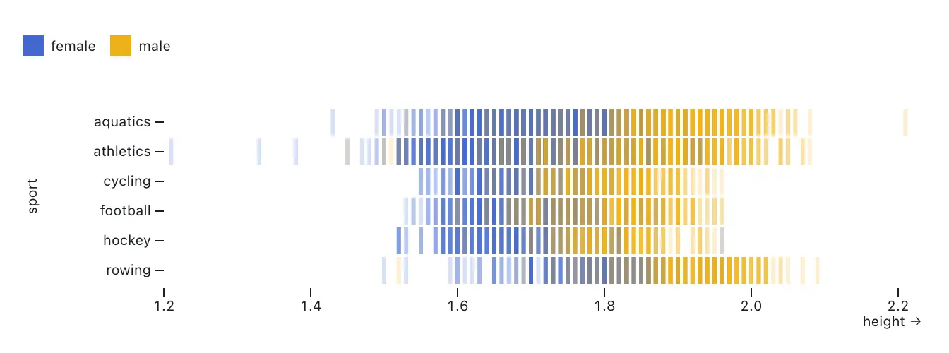
Barcode charts are especially useful when the shape of the data matters more than a summary count. They work well for exploratory analysis and for datasets such as page load times, prices, durations, or event timing. If it’s valuable to see the distribution of individual observations, a barcode chart may be a better fit than a bar chart or histogram. This chart type works well with smaller datasets, because plotting too many values can make a barcode chart visually dense.
You can build a barcode chart in Observable Plot using tick marks.
Plot.plot({
  x: {domain: [1.2, 2.2]},
  color: {legend: true},
  marginLeft: 100,
  marks: [
    Plot.ruleX([0]),
    Plot.tickX(olympians, {x: "height", y: "sport", opacity: 0.2, strokeWidth: 3, stroke: "sex"})
  ]
})
Line chart alternatives
Streamgraph
A streamgraph is a type of a stacked area chart that shows how categories change over time compared to a central baseline. Readers can easily understand the direction and magnitude of change over time for different groups of data by following the thickness of each stacked layer.
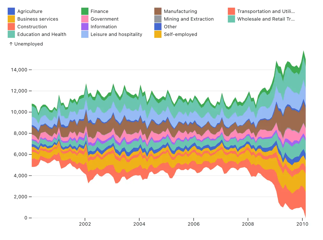
Streamgraphs are often used to display time-series data, such as website traffic or sales. While line or bar charts can show individual values more precisely, a streamgraph may be a more expressive choice for visualizing the trend and flow of categorical data through its smoothed curves.
You can build streamgraphs using Observable Plot using stacked areas with a wiggle or center offset. Plot also offers other anchoring options to change stacked layer baselines, including null and normalize.
Plot.plot({
  y: { grid: true, label: "Unemployed" },
  marginLeft: 50,
  color: { legend: true, columns: 4, width: 600 },
  marks: [
    Plot.areaY(industries, {y: "unemployed", x: "date", fill: "industry", interval: "month", offset: "wiggle"
    })
  ]
})
Ridgeline plot
Ridgeline plots display multiple distributions as a series or overlapping density curves. This helps readers compare the shape and spread of observations across grouped distributions.
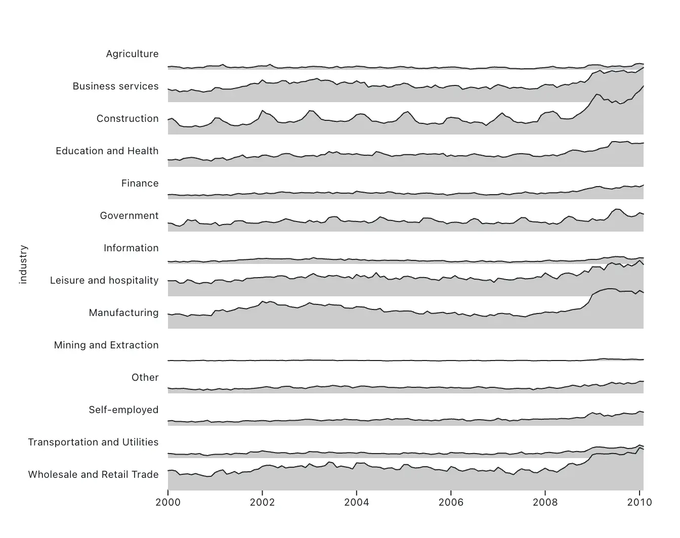
A ridgeline plot can be a more compact or elegant choice instead of a series of histograms for revealing broader patterns or general shape of distributions. For example, radio signals, seasonal temperature patterns, or street traffic data are well-served by ridgeline plots. However, the shape of one distribution may occlude another, so a ridgeline may not be the best chart for precise comparisons across groups. Consider a horizon chart for a similar compressed view that avoids overlap.
The snippet below creates a ridgeline plot in Observable Plot using the line and area marks in combination.
Plot.plot({
  y: {axis: null, range: [50, 2]},
  height: 500,
  marginLeft: 150,
  marks: [
    Plot.areaY(industries, {x: "date", y: "unemployed", z: "industry", fy: "industry", fill: "#ccc"}),
    Plot.lineY(industries, {x: "date", y: "unemployed", z: "industry", fy: "industry", strokeWidth: 1})
  ]
})
Pie chart alternatives
Waffle chart
A waffle chart shows parts of a whole using a grid of equally sized units. Instead of comparing slices in a pie chart, or sections of a stacked bar chart, the reader can easily compare exact quantities and proportions. This can be especially useful when you want to show the composition of a dataset in a way that feels intuitive at a glance. Survey results, market share, and categorical breakdowns are all strong use cases for waffle charts.
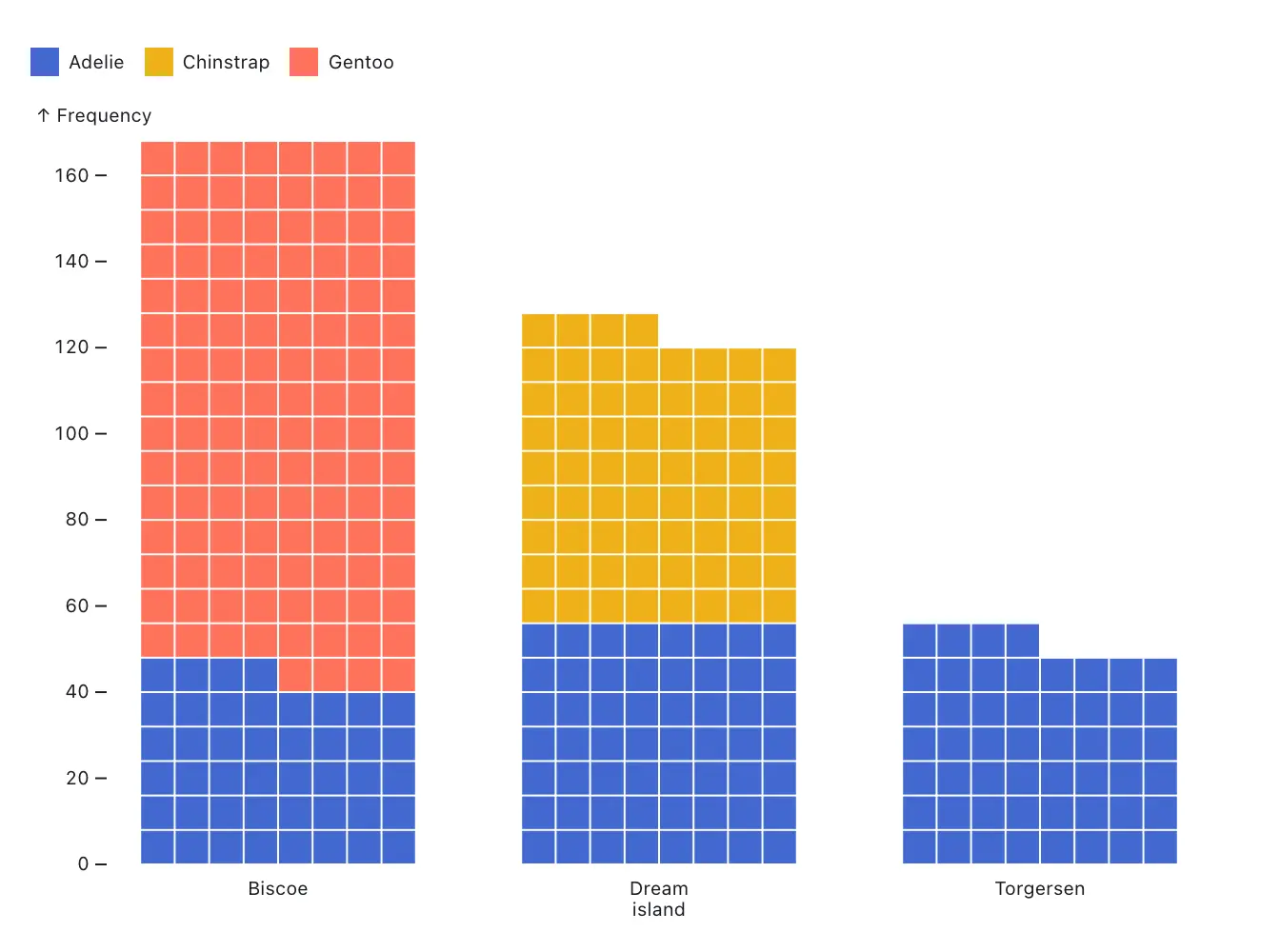
One thing to note is that waffle charts are not ideal for precise comparisons across a large number of groups, or when the total quantity does not break cleanly into simple units. But if you’re comparing a small number of categories, and want to help the reader compare exact amount or proportion, waffle charts may be a better fit than a pie or bar chart.
You can build a waffle chart in Observable Plot using the waffle mark. Like a bar chart, a waffle chart can be stacked using the stack transform.
Plot.waffleY(penguins, Plot.groupZ({y: "count"}, {fill: "species", sort: "sex", fx: "island", unit: 1})).plot({color: {legend: true}})Scatter plot alternatives
Hexbin heatmap
A hexbin heatmap groups continuous datasets into discrete hexagonal bins, and encodes the summary statistics (such as count, average, or proportion) through the hexagon’s color. This makes it a valuable tool for visualizing dense quantitative or temporal data in two dimensions where a scatter plot would be too crowded to parse.
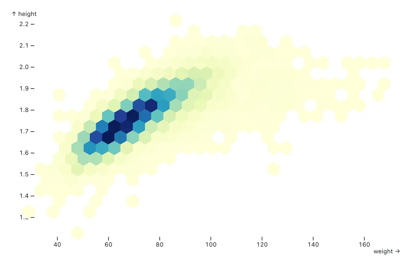
Hexbin heatmaps aggregate the data, so you lose visibility into individual observations. Bin size also matters: if the hexagons are too large, it can be difficult to uncover a trend or pattern. If the bins are too small, the chart can become noisy. But if your goal is to give readers a sense of the overall density of the data, hexbin heatmaps are a good candidate.
You can build hexbin heatmaps in Observable Plot using hexbin transforms.
Plot.plot({
  color: {
    scheme: "ylgnbu"
  },
  marks: [
    Plot.hexagon(olympians, Plot.hexbin({fill: "sum"}, {x: "weight", y: "height"}))
  ]
})
Density chart
A density chart visualizes concentrations of data points instead of individual observations. Like the hexbin heatmap, density charts are useful for crowded, dense datasets, or when you want to illustrate clustering, hot spots, or distributions in two dimensions.
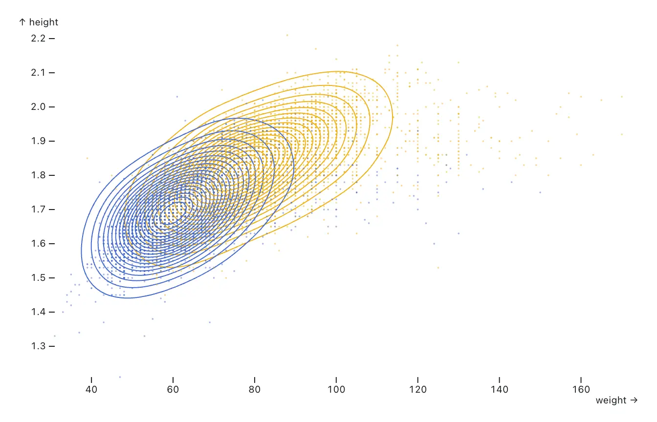
Density charts work well for continuous variables where the overall pattern matters more than any single observation. When a scatter plot would appear crowded or noisy, a density chart might be a better fit for the data.
Observable Plot’s density mark makes it easy to build several variations on this chart type.
Plot.plot({
  marks: [
  Plot.density(olympians, {x: "weight", y: "height", stroke: "sex"}),
  Plot.dot(olympians, {x: "weight", y: "height", r: .1, stroke: "sex", opacity: .5})
    ]
})
Plot also supports density visualization to visualize geospatial data. Here’s an example of a visualization using the density mark to plot Walmart stores on an equal-area projection of the U.S.
Conclusion
Bar charts, line charts, pie charts, and scatter plots remain essential tools in data visualization. But, it’s worth building out your data visualization toolkit and exploring more advanced options that may unlock unseen insights, or help you visualize different aspects of your data.
There are many chart types to explore, along with other data visualization elements such as chart annotations that can direct a reader’s attention, and animations that can help a reader follow along with changes over time.
As you experiment with new ways to visualize data, explore the Observable Plot gallery for examples, templates, and ideas you can adapt for your own work.