Note: This is our third post in a series highlighting the work, experiences, and perspectives of leaders in data visualization.
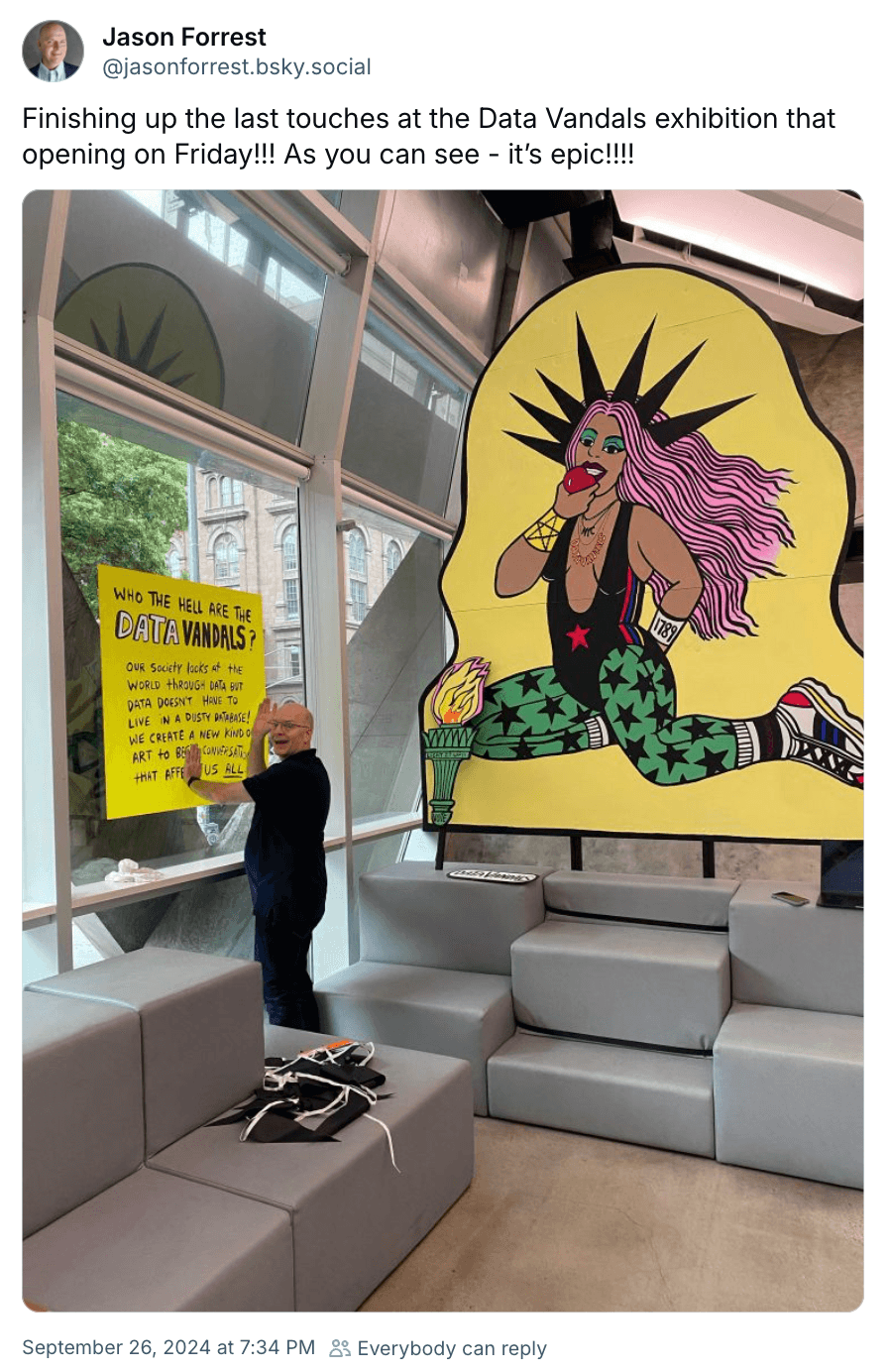
It’s late September when we first reach out to Jason Forrest about an interview, and he’s neck deep in putting the final touches on a new exhibit, Hello from the Data Vandals, which opens days later at Cooper Union in New York City. The show — a joint effort by Jason and artist Jen Ray, the duo behind The Data Vandals — explores data on housing, environmental issues, food, and demographics in the East Village neighborhood through art, data visualization, film, workshops, and panel discussions.
He sends along a short video of the exhibit space, filmed on his phone while walking past bold pop art, hand-painted statistics, and data viz projected onto a back wall. The final seconds of the clip zoom in on a large yellow poster with “WHO THE HELL ARE THE DATA VANDALS?” painted in all caps across the top.
A brief description follows: “Our society looks at the world through data, but data doesn’t have to live in a dusty database! We create a new kind of art to begin conversations that affect us all.”
When we meet with Jason the week after the show, we quickly learn that beginning conversations isn’t just a Data Vandals tagline — it’s core to Jason’s work and worldview, and not only as a data visualization designer. Whether through art, music, publishing, photography, or data viz, Jason’s on a mission to give people something to talk about.
“That's where the art is,” he says. “It’s in the dialogue and the discourse.”
It’s the dialogue, stupid
These days, Jason Forrest is a big name in data visualization. He led data viz efforts at McKinsey & Company — one of the largest consulting firms in the world — as a designer, analyst, and ultimately Director of the McKinsey Data Visualization Lab. In 2019 he co-founded Nightingale, the Journal of the Data Visualization Society, for which he still serves as editor-in-chief. He established the biannual print spinoff, Nightingale Magazine, in 2022. And, earlier this year, he founded the Jason Forrest Agency to build tools that help clients “explore data for better, faster decisions.”
But Jason has been doing work that inspires conversations since long before he got into data visualization, even if he didn’t realize it at the time.
“I've always been interested in bringing people together to enjoy some shared sense of community about something we're interested in,” he reflects when we ask what ties his creative and professional experiences together. “That could be data viz, that could be skateboarding, that could be music, that could be history. But it’s only been in the last five years that I realized the throughline was the dialogue.”
Jason’s unconventional path into data viz includes formal training in photography, a five year span as an artist and art critic, and a nearly two-decade-long stretch spent producing and performing electronic music that is described on the Jason Forrest Wikipedia page as “noisy experimental electronica and breakcore”.
It was his music career — the tail end of which overlaps with his foray into UX design — that put Jason on a collision course with data visualization.
“Through my years in music, I realized that all of your creations and your creativity are a dialogue with the works that you've been inspired by, and also a dialogue with the people who consume and discuss your work. That's why I really fell in love with data visualization. It has all of the elements of creativity, community, and technical complexity that I found in music and art and design. They were all there in data viz.”
Jason Forrest
If dialogue was a side effect of his past creative work, it’s front of mind for Jason today. In fact, he’s made dialogue the point of his current professional and creative work.
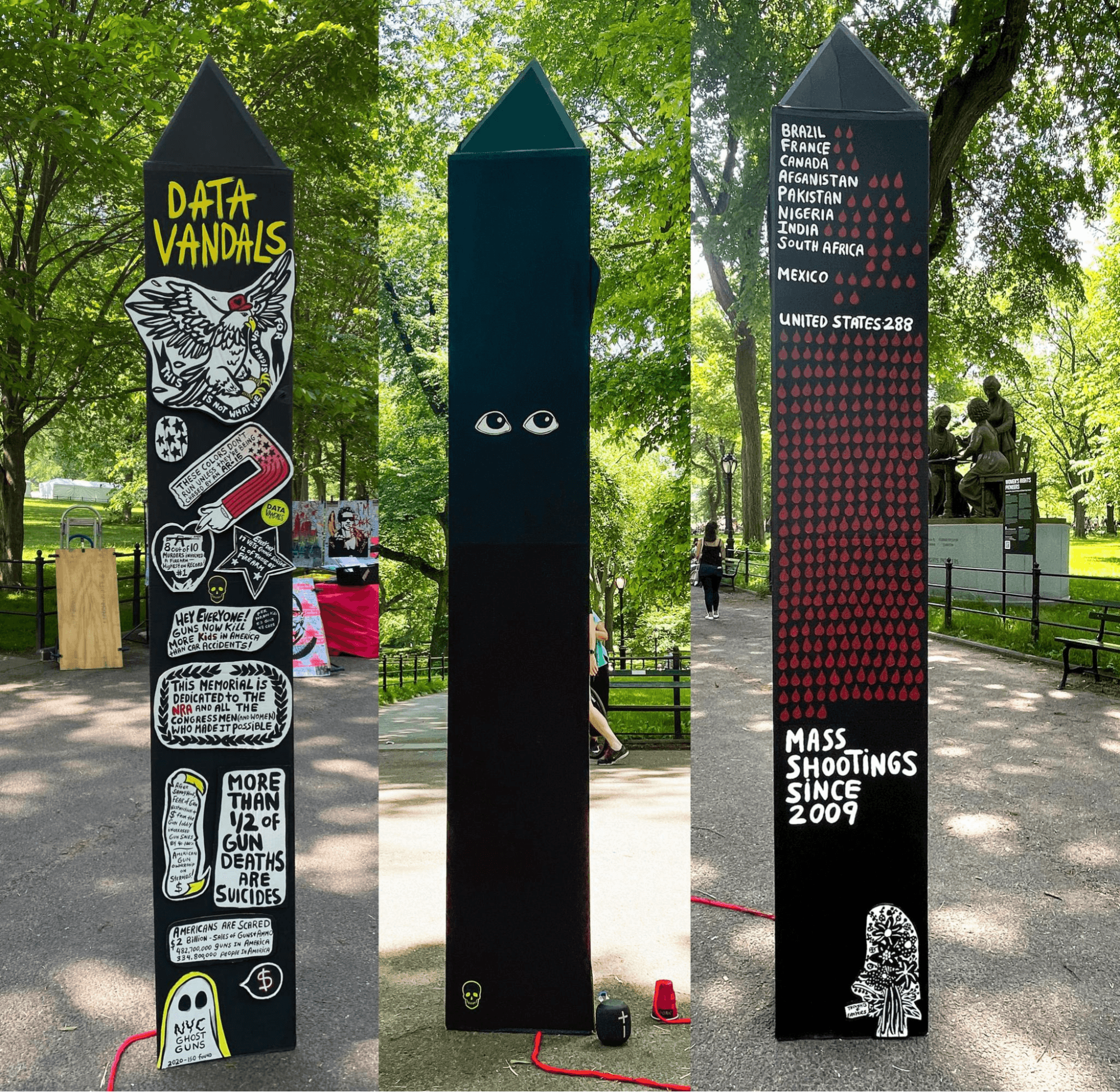
He shares another story, this one from a 2022 Data Vandals project on gun violence.
“It was in Central Park. We had put up all these horrible statistics on gun violence, and it was right after the Uvalde, Texas mass shooting. We went out there thinking that we would get people yelling at us because, you know, America — it’s a crazy place. Instead, everybody just wanted to talk. We learned once again that the conversation was the art.”
It’s a lesson he has carried forward in his dataviz work, through Data Vandals and beyond. “Ever since that point, we've tried to structure everything we do around data as a way to welcome people in, and see themselves in the data. It’s fascinating to see how many people, when you open the door and say ‘Come on into the conversation,’ will join you.”
Empathy, excellence, and tuning the hi‑hat
Designing empathetic visuals and user experiences that open a door into the data is a recurring theme in our chat. So, we were surprised to learn that empathy wasn’t always a priority in Jason’s data viz approach.
In fact, early on he viewed data work as a way to remove human biases and emotions from decision-making — and he was determined to make viewers stick to the cold, hard, data-driven facts. “I wanted to get involved with data viz because misinformation was on the rise, and I thought the only way to combat misinformation was with the idea of statistical truth,” he recalls, before adding (with a knowing smile): “You can't argue with the numbers, right?”
He quickly accepted the futility of trying to human-proof data visualizations.
“Of course, we all know you can argue with the numbers. So, trying to fight misinformation meant that I actually had to learn more about how people connect with data, instead of trying to separate them from it.”
Jason Forrest
For Jason, connecting people with content requires first understanding the audience. He takes us back to his DJing days in Berlin, circa 2003: “When I used to put on rave parties, you had to put posters on the right street corners at the right time to get the right audience to see it. If you did it an hour before, then it would be seen by business people — not the people that would come to your concert. If you did it two hours later, other people would put their posters over yours. So you really had to get the timing right, and make it very customized to the audience.”
The takeaway: whether you’re promoting a techno show or coding up a chart, you’ll miss opportunities to connect with viewers if you don’t design with them in mind from square one. And when it comes to designing engaging and impactful visuals, Jason doesn’t think any detail is too small to warrant attention.
“Back when I was a musician, I used to call that ‘tuning the hi-hat’,” he shares, describing the practice of tweaking the finest details even beyond what a casual viewer might notice. (For context, the hi-hat is the tall double cymbal common in many drum sets.) “You're literally trying to find a pitch that matches the tonality of the hi-hat, which is largely atonal. The point is, you're doing something that no one's really going to see. You’re fussing around with the language of a footnote, or the formatting of a table that’s hidden in a deep link.”
Where others might see this as attention wasted on barely-there details, Jason sees it as an essential part of data viz development. ”The catch is, that’s where the magic is. That’s how we reach toward excellence — by tuning the hi-hat.”
And tune, they do.
The attention to detail and user experience is obvious throughout Jason’s data viz portfolio, including in Streets to Stability, a recent report built with Observable Framework that explores cycles of homelessness in San Francisco.
There’s no one thing that makes Streets to Stability impressive. Stunning charts are presented alongside hand-drawn illustrations that humanize complex data. Interactive charts pair with bite-sized anecdotes that ground the data in possible real-world outcomes for unhoused individuals in the city. And scrollytelling draws in the viewer, then shepherds them through the piece.
An overarching strategy that makes it so effective, Jason shares, is the careful integration of creative and technical elements.
“The illustrations help to empathize with and contextualize your work. The data helps to provide that statistical truth and authenticity that underlies the story and the conversation. It's really the pairing of the two contexts that fulfills the story.”
Jason Forrest
Data visualization as a team sport
The pairing of creative and technical content is so powerful that Jason has built it into his data viz development process.
“What I've done with my teams over the last few years is to pair someone who has more of a design specialization with someone that has more of a specialization in the tech. That could be a UX designer and a data scientist, or a data viz designer and a coder, or a subject matter expert and someone who's a data engineer. That way there's someone who can penetrate into the technology and the data, and there’s someone who can penetrate into the story and the concept.”
And even if someone can do it all, Jason prefers collaborative work to solo efforts.
“Yes, there are unicorns out there that can do both. But to be honest with you, everything works better as a team sport. In the act of talking to people, you learn new things, and then you can create something that's going to be inherently more communicative — and that's the only thing that matters.”
Jason Forrest
He shares his screen to show us a visual overview of the methodology he’s developed to get data visualization projects from a highly uncertain exploratory phase, to a more certain(ish) final product. Unsurprisingly, it’s titled Our methodology is based on collaboration.
Jason walks through the schematic, quickly touching on the exploratory, design, and building phases (“at some point you just have to focus on doing the damn thing”). Then, he spends a bit more time mulling on what he refers to as the “last phase of data visualization” — handing off the final product.
It’s a step, he says, that’s critical to a project’s success, but too often overlooked.
“One thing that's super important, and frankly almost a total blind spot in software development, is the documentation and training phase. There's a whole phase where you’re just handing off what you’ve made to the people who are going to maintain or market the piece. Training is equally important, and very few teams take the time to ensure their audience has been trained to use their work.”
Jason talks about the audience (he takes care to use “audience” here, instead of “end users,” adding “we don’t really use data viz, we read data viz”) as equal collaborators in the data viz pipeline, almost as if they’re an extension of his own team.
Explaining why he’s so invested in this final handoff, he brings us back to throughline spanning all of his creative and professional work: fostering dialogue.
“If no one can use your work, it means no one will be aware of it. And if they’re not aware of it, then it's not generating a conversation. And then…what good is it?”
We’re sincerely grateful to Jason Forrest for sharing his time, perspective, experiences, and expertise with us. To learn more about Jason, visit jasonforrestftw.com.
Learn how Observable can help your team build and share custom, interactive data visualizations and data apps: observablehq.com.


