Data is getting bigger, viewers are increasingly data-literate, and developers — empowered by code-based tools — are creating richer, faster, interactive graphics. At the same time, the spaces in which viewers interact with data visualizations (including on mobile devices, or as part of dense dashboards) are shrinking.
When you build with limited screen space in mind, or when you need to embed new content in an existing data app, it can be challenging to design visualizations that retain their richness while still delivering the best user experience. In this post, we share chart types and strategies that help you do more with small spaces, while letting viewers dig deeper into the data.
Choosing information-dense chart types for more insightful data visualizations
Some chart types and data visualizations are purpose-built to give viewers more information in less space.
Here are some chart types that pack more data into fewer pixels:
Show trends for multiple categories with sparklines
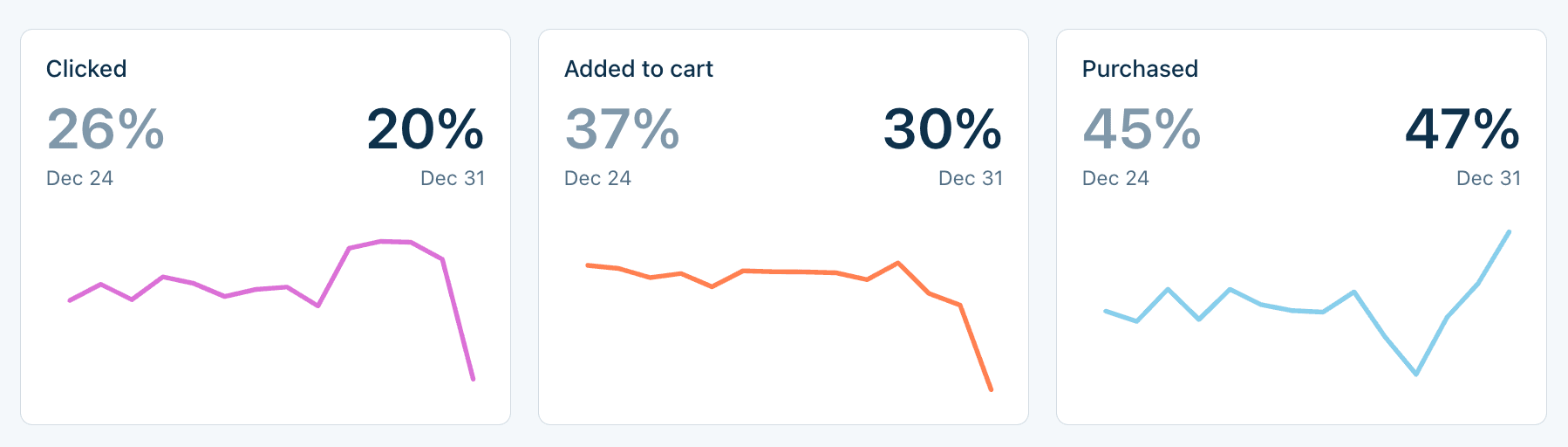
Sparklines — miniature and often minimalistic line charts — are a useful option to show trends for multiple categories in a very small space. Because sparklines commonly minimize or omit axes and labels, they are best suited for cases where you want viewers to focus on major patterns (e.g. increasing or decreasing), and not exact values or minor fluctuations.
Their small size and simplicity make sparklines a good candidate for additions to big number boxes, tables, and even in text.
For example, sparklines added to the big number boxes below allow a user to see general trends in (mock) product purchases data, alongside highlighted values:
And, because they’re so compact, sparklines can even add visual interest and meaning right in text paragraphs:

While lines are most commonly used in spark charts, others marks like bars, areas, and cells — really, any other mark you think you can shrink! — are possible. See example code to create sparkline, sparkbar, and sparkheat charts in Observable Plot.
Use horizon charts for trends across groups
Horizon charts transform data into overlapping layered bands to reduce the space needed to visualize trends across groups, without the overlap sometimes seen in ridgeline charts and in a smaller area than a faceted area or line chart. (See our recent post on underused chart types for richer data apps to see how horizon charts are constructed.)
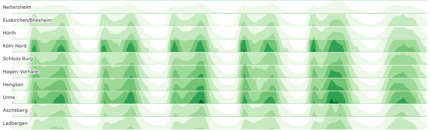
Horizon charts are a good option when you want to compactly show general trends over time and across multiple categories, as shown for traffic data above. See the code and explore the full version in this notebook.
Be aware that there is a tradeoff when presenting horizon charts. Overlapping bands are useful for compactly showing the data while avoiding overlap, but make it difficult for viewers to determine actual values. That makes horizon charts a good option when you want users to focus on general patterns across groups, rather than exact values in the data.
Visualize categorical data with treemaps
Treemaps can compactly visualize amounts and proportions by category for hierarchical data. With color to encode discrete categories and labels for some or all segments, treemaps can reveal patterns in data (e.g. “What sectors are the biggest greenhouse gas contributors?”) in a compressed format.
For example, the treemap below visualizes file sizes for the Flare data visualization library, revealing contents of the vis (gray), util (brown), and animate (orange) directories as the largest contributors to overall library size.
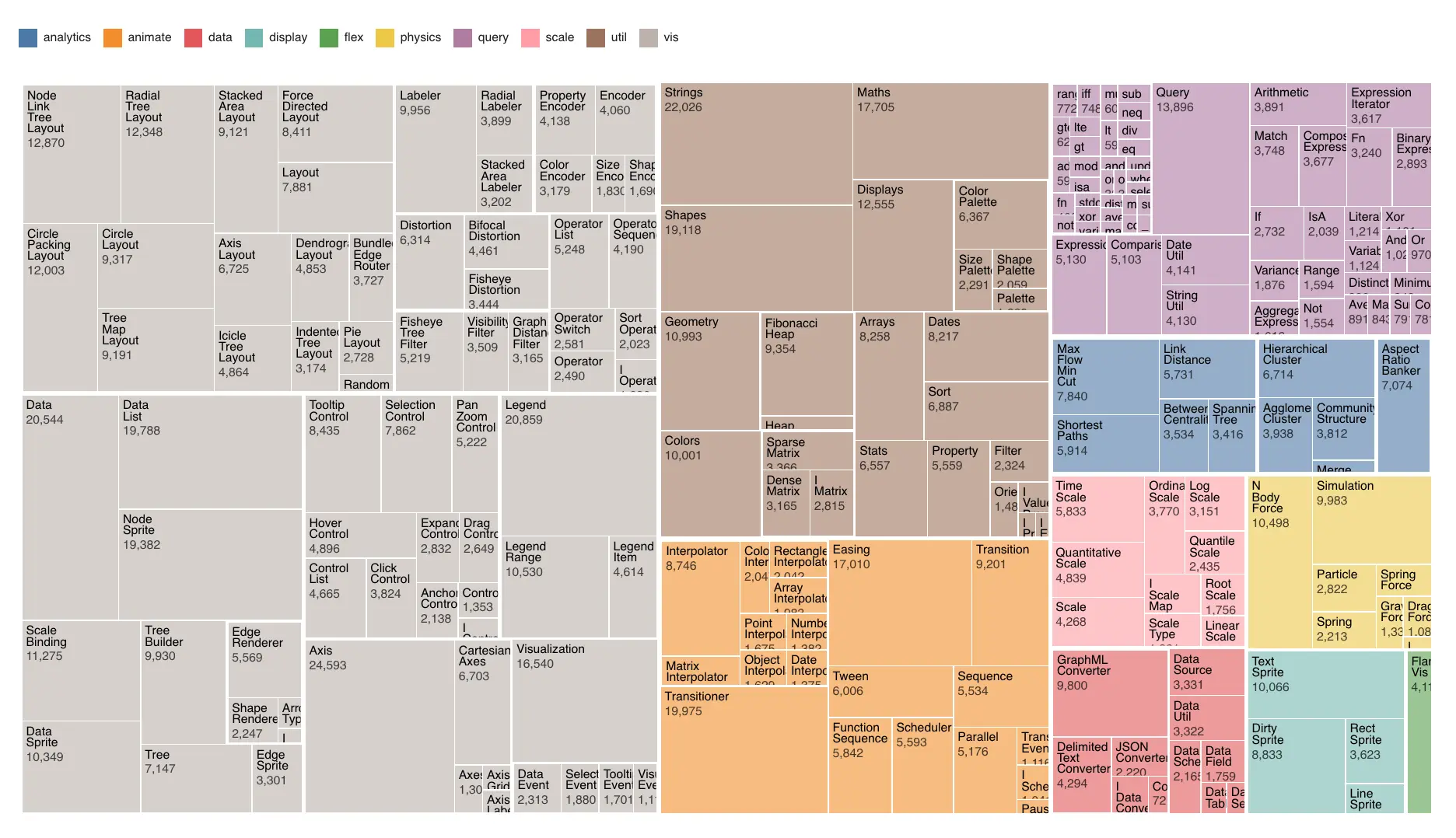
Using a treemap doesn’t guarantee a small chart. While they do capture a lot of data compactly, treemaps can still require a large area if you have a lot of categories (and, depending on whether everything needs a readable label, like in the chart above). But, with fewer groups and flexible aspect ratios, treemaps can help your next data visualization by squeezing a lot of information into a little space.
Explore treemaps made with D3, including cascaded and nested variants, and see other compact options for visualizing hierarchies (like circle packing and dendrograms) in the D3 graph gallery.
Using radial and circular charts for more data-dense visualizations
Sometimes, you just need a chart that works well in a little square space. Whether you want to visualize scores by category, show proportions of a whole, or highlight linkages or hierarchies, radial charts can be versatile, effective, and work well in a tight spot.
Below are four types of radial charts: tidy trees (hierarchy), sunburst (proportions + hierarchy), radar (value or rank by category), and chord (connections/flows).

Radial and circular charts like tidy trees (top left), sunburst (top right), radar (bottom left), and chord diagrams (bottom right) can be useful in a tight spot.
Circular charts are quite versatile, with options to visualize continuous values (like in this radial area chart), networked data (see the entire networks section in the D3 graph gallery), and much more. And, they’re often overlooked, perhaps due to strong opinions about the usefulness of the most famous (and most misunderstood?) of radial charts — the pie chart.
Use interactivity to enable users to explore data
Interactivity is useful when — for space reasons, or to limit viewer focus — you don’t want to show everything, everywhere, all at once. When you design an interactive chart, you’re expecting a user to choose the scenario(s) they want to explore. That can help you save valuable app space.
Here are a few ways that interactive filtering, tooltips, and zooming can help you build small but mighty graphics.
Filtering
Filtering to show just a slice of the overall data based on a user selection (e.g., by clicking a radio button or choosing from a dropdown menu) is perhaps the most common type of interaction in data visualizations.
For example, the hotel bookings dashboard below gives viewers the option to explore data for all reservations, or for specific subsets by booking type (corporate, groups, travel agent, etc.):
(Note: sometimes you do want viewers to directly compare static data slices side-by-side. See the section below on small multiples.)
Tooltips
Legends — especially those with a large number of categories — can take up a lot of screen space. They can also take up a lot of brain space, requiring viewers to look back and forth to align series (or groups) of a chart with legend values.
In many cases, directly labeling values is preferable. But issues can arise when you want to directly label visualizations and you’re building for small spaces, which can result in crowded or overlapping text.
Tooltips allow viewers to see labels and other information on hover, saving space lost to bulky legends and letting users explore values in more detail. For example, the mosaic plot below avoids cramped text by combining static labels on the largest groups with interactive tooltips that reveal values for any segment on hover. (Tooltips or no, Mosaic plots can be a great option to compactly visualize proportions. Learn more in our recent post.)
Zooming
Here, zooming means expanding a smaller or collapsed part of a chart to enable deeper data exploration. Zooming makes it possible to show an overview chart, while letting a user dig into more detail when they want to, and without expanding the total chart area.
Panning is a type of interactive zoom that allows a user to choose the range of values visible in a chart. Panning is particularly useful when you have a large number of dense data points, or frequent values recorded over time, because it allows a viewer to see the whole picture with the option to investigate specific regions or periods of interest more closely. For example, this zoomable area chart allows a user to expand or contract the x-axis scale, and pan across time:
To visualize hierarchical data in limited space, you can allow a different flavor of zooming — one that allows viewers to dive deeper into nested data. For example, the zoomable icicle chart below shows the top three levels in a hierarchical dataset. Clicking on an area zooms to only show data within that level, letting a viewer increase or decrease what subset of the total data remains visible.
Other options that let viewers dig into hierarchical data include zoomable circle packing, zoomable sunburst charts, and collapsible trees.
Designing data visualizations for the small screen
Small multiples
Interactivity gives users one way to compare scenarios (e.g. visit our Framework examples to toggle between hotel booking categories or see shifts in U.S. electricity demand over time). But in some cases, viewers benefit from seeing different scenarios side-by-side and on screen at the same time.
Small multiples are a compact way to visualize data for different categories or times using faceting. For example, the radar charts of car characteristics below packs a lot of information into a small area, while allowing viewers to directly compare car types.
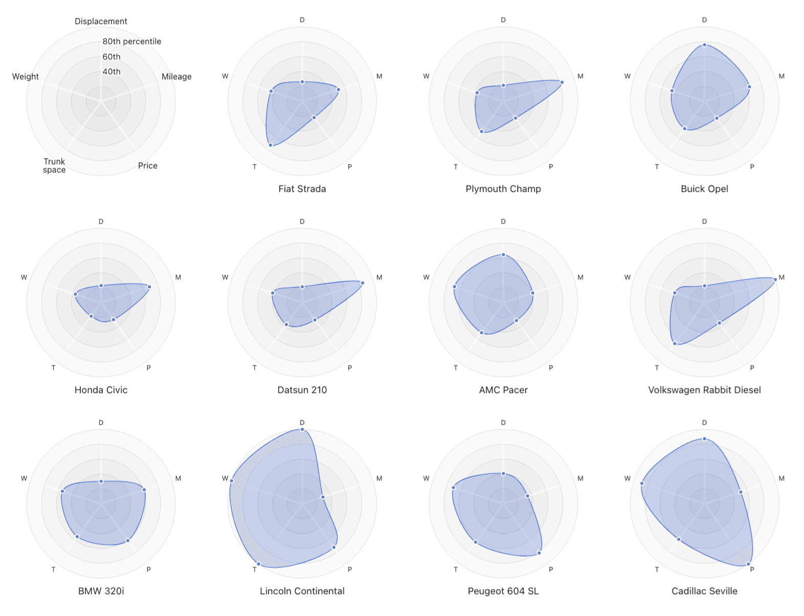
Small multiples, like in the faceted radar chart of car characteristics above, allow for direct comparisons (e.g. by category or time) and can pack a lot of information into limited space.
And, you’re not limited by chart or faceting variable type! For example, the small multiples below bin a quantitative variable (year) to visualize new store locations by decade, using Observable Plot’s geo mark:

Using responsive charts and grids
Adding to the challenge of designing visuals for small areas is variability: individual charts and entire displays need to adjust for different screen and window sizes. When a user narrows a browser window or opens your app on their phone, visuals should smoothly adapt while maintaining chart clarity and overall app usability. (See our recent post on how Observable makes building data apps faster and easier to learn more.)
That’s why we designed Observable Framework’s responsive grid class and resize helper to make it easy to build flexible data apps and dashboards that adapt to any screen.
The resize helper function automatically re-renders charts to div dimensions, and our grid class is automatically responsive, adjusting column numbers to best fit a user’s screen. Below, notice how chart dimensions are initially updated, then the content is rearranged into fewer columns once a breakpoint for better viewing on a narrow screen:
Building visual displays of data that fit any screen
Want to try making these small but mighty data visualizations today? Sign up for Observable to explore examples or fork from thousands of public Observable Notebooks (including those linked above), then customize with your own data. Learn more about adding interactivity to your charts and dashboards with these tips for better chart annotations.
Sign up at observablehq.com
Explore and fork from thousands of charts made in D3, Plot, or created by the Observable community
Follow along with our Getting started guide to create your first Framework data app