When talking with data visualization developer Kelsey Nanan, one thing quickly becomes clear: her path into this field wasn’t a traditional, carefully charted route. Instead, it began with a single elective class during her master’s program in Urban Science that sparked what she calls “an almost obsessive interest in web mapping” and eventually led her to work on complex, socially impactful projects. Hers is a story of how a single moment of discovery can reorient an entire career.
“I took this one specific class during my master’s,” says Kelsey. “It was basically an intro to front-end development for people who were not technical at all. I just fell in love, and I became obsessed.” That obsession led her first into web mapping, which became the gateway into what she really loves: custom data visualization.
“In data viz development, anything you can imagine, you can create,” she explains. “I really enjoy that. It gives you a lot of flexibility and creativity.”

Kelsey Nanan
It’s a mindset that has carried her through a variety of roles and projects. Early on, she “weaseled” her way into her first data visualization role where she used D3 to rebuild and customize charts at a startup, and that experience led her to later work at McKinsey’s Data Visualization Lab. More recently, she’s been bringing complex stories to life as a freelance data visualization developer. Throughout it all, Kelsey has continued learning, experimenting, and adapting — an ethos that shines through in the projects she highlights and the advice she shares.
Evolving ideas with data
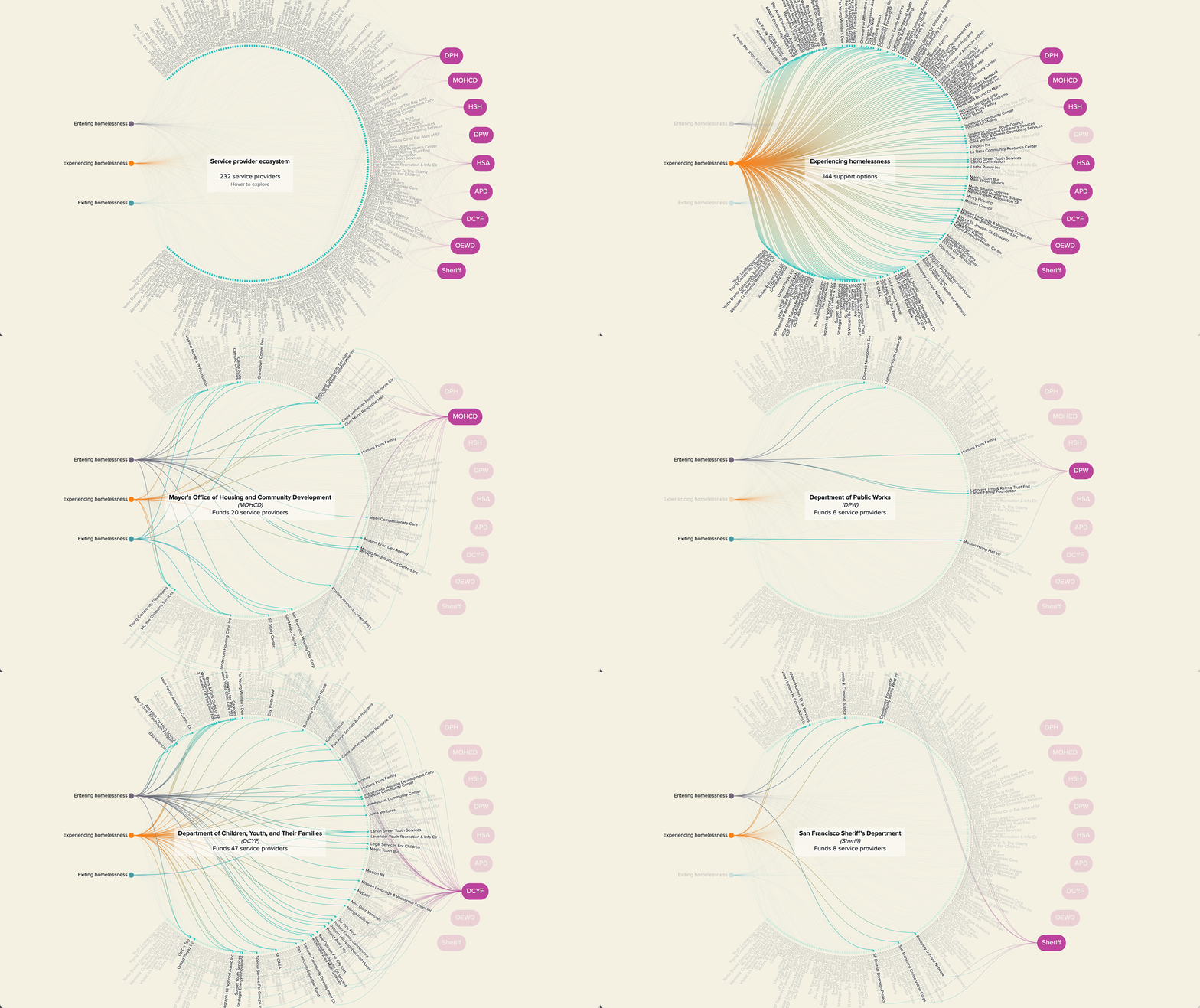
One of Kelsey’s core philosophies is to let the data speak and shape the story, rather than forcing a predetermined narrative. This principle formed the foundation for a project she worked on called: Streets to Stability that explores the ecosystem of homelessness services in San Francisco.
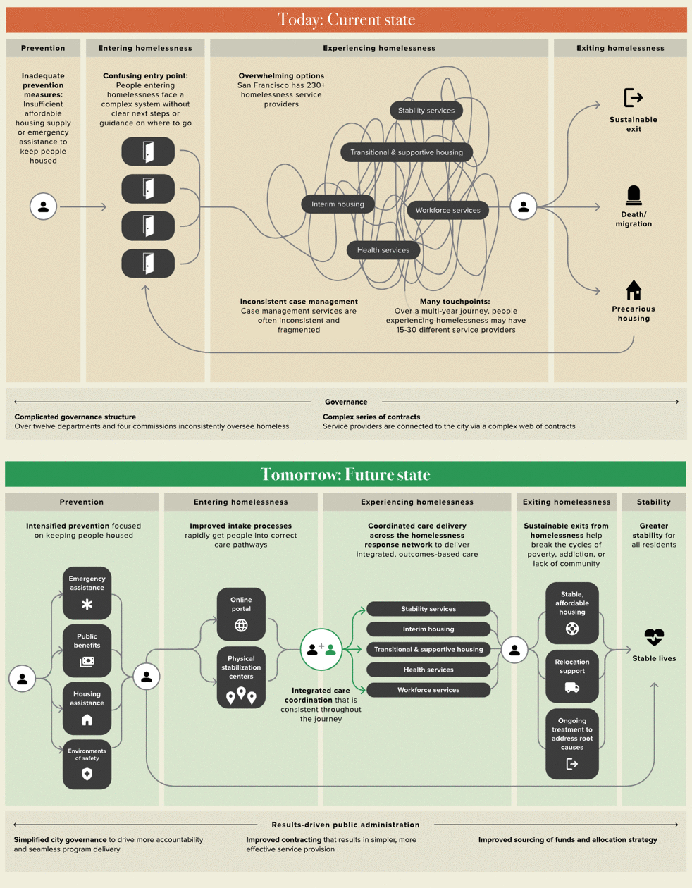
What initially started as a request for a visualization that mapped service providers to different stages of homelessness rapidly revealed the daunting complexity of San Francisco’s support system. The system, designed to aid individuals experiencing homelessness, is convoluted: more than 230 providers receive public funding to offer healthcare, housing access, behavioral health, and social support, but these services frequently overlap. This leads to a tangled web of resources in which someone may have to navigate 15 to 30 different service providers to get the help they need.
Kelsey describes it as the kind of work that began with one idea and evolved into something far more expansive and impactful than anyone had anticipated. “What it was initially conceptualized as was so different from what the end product ended up being,” she notes.
The shift happened organically as the team dug into the data, revealing bigger stories about policies, barriers, and opportunities for change that were beyond the original scope of the project. “We first started sketching out the complex network of homelessness service providers and seeing what a mess it was,” Kelsey says. “Then we started asking questions: how can we fix this? Why is it like this? The research and data ended up shaping the direction of the whole project.”
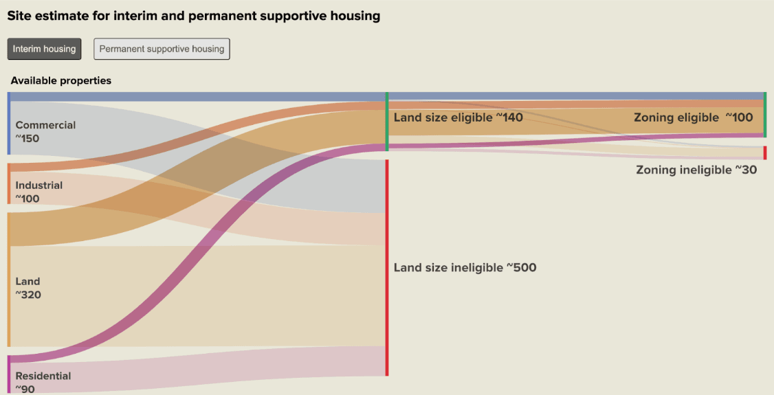
In the end, Streets to Stability became more than just a visualization. The final report offers policy recommendations and a fresh look at a complicated, human-centered issue. It proves that when you let the data guide the narrative, the resulting story can be richer and more impactful.
Behind the scenes: An array of tools and team efforts
On the technical side, projects like Streets to Stability are far from one-tool affairs. Kelsey and her team combined a range of methods and platforms, from design tools like Figma and Flourish to front-end developer tools like Observable Framework, D3, and even features in vanilla JavaScript. She also discovered new chart types along the way, such as parallel sets, which she found through Observable’s D3 gallery.
The result is a deeply collaborative process. Designers and developers iterated back and forth, sometimes finalizing charts directly in Figma, then integrating them into the code. That cross-disciplinary workflow helped the team stay nimble, especially when last-minute requests — a new splash page, additional introductory scrollytelling sections — arrived just days before launch. “You think it’s too good to be true when you have a whole week left to wrap up a project — and it usually is,” she says, laughing now about the eleventh-hour time crunch that ultimately led to crucial new storytelling components.
Remembering the audience: Accessibility and clarity
Kelsey’s approach to data visualization isn’t just about creating beautiful visualizations from complex information. She’s also keenly aware of the importance of audience, accessibility, and context, citing a project with the Perkins School for the Blind as a formative experience. The goal was to present research on Cortical Visual Impairment (CVI) in a way that would be understandable and navigable by people with varying degrees of vision impairment, including those who rely entirely on screen readers.
This challenge required rethinking how data-driven pages are structured. “If we were just creating this for another client, it might have been standard maps and hover tooltips,” she says. But for Perkins, the team had to include fully accessible tables of the underlying data, ensure keyboard navigation was fully supported, and provide narrative text descriptions of patterns on the maps. “Visually impaired people might need a description of what’s on the map,” says Kelsey, “and that also helps people who may not be very data savvy.” In other words, focusing on accessibility improves clarity for everyone.
Advice on learning and growth
For those intrigued by data visualization, Kelsey’s journey offers a few lessons. She’s the first to admit that her road to mastering D3 and other tools was nonlinear. “I kind of weaseled my way into my first data viz development job,” she says with a smile. “I had taken a course in D3, so I felt like I had a basic foundation, but I wasn’t sure it measured up to what the job really required.” But diving in headfirst taught her valuable skills like hover interactions, text wrapping, and dynamic scales, and gave her the confidence to try new things.
As for learning new tools, Kelsey encourages people to find the method that works best for them. “I wish I had known a little more about the theory behind D3 earlier,” she admits. “But I’m the type of person who doesn’t stick with courses or tutorials for long. I learn best if I have something concrete I want to build.” Her recommendation? Understand your learning style. Project-based learning, trial and error, and following your curiosity all have a place.
Equally important is understanding that what you think you want to do might change once you see your data. She warns against falling into the trap of deciding on a chart type or design before completing a full data exploration. By staying flexible and letting the data guide you, you create more meaningful work. “Maybe your data isn’t a map. Maybe it’s a scatterplot or a beeswarm chart,” she says. Pen and paper sketches help her stay open-minded: “I’m not good at drawing, but I do it every time.”
Infusing delight and staying inspired
Kelsey measures success in data visualization by how much it sparks curiosity, encourages exploration, and leaves viewers genuinely excited to see more. She approaches her work with a simple litmus test: if she can’t stop playing with her own prototypes, there’s a good chance her audience will find them engaging, too. In her view, every interaction should spark curiosity rather than feel like a chore. “People have short attention spans, myself included,” Kelsey admits. “If I have to click around a lot, sometimes I don’t want to be on that page anymore.” By embracing smooth hover interactions, intuitive layouts, and non-traditional chart types, like parallel sets instead of waterfall charts 😉, she keeps the door open to discovery and learning.
What emerges is a cycle of motivation and growth. The joy Kelsey infuses into her own work keeps audiences engaged, and the inspiration she draws from others encourages her to test new mediums, forms, and technologies. In this iterative process, data visualization evolves from a technical discipline into a playful, human-centered art form — one that nudges viewers to linger, learn, and ultimately see the world in a new way.
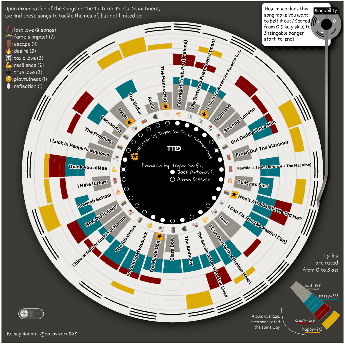
As a perfect example of this, she mapped the lyrical themes and “singability” of each track on Taylor Swift’s The Tortured Poets Department onto a vinyl-inspired radial chart.
By anchoring on data, delight, and the human connections behind every project, Kelsey demonstrates the profound impact that thoughtful, well-crafted visualizations can have. It’s a reminder that data isn’t just numbers — it’s stories, people, and possibilities waiting to unfold.
For a closer look at Kelsey’s collaborative approach, watch her talk from Observable’s Insight 2024 conference. In it, she shows how building bridges between designers, developers, and stakeholders leads to more engaging, effective visualizations that resonate with audiences and drive meaningful outcomes.


