Open source is at the core of Observable. Tanner Linsley, creator of the TanStack (over 20M monthly downloads between all libraries), is no stranger to open source. In addition to being an experienced open source contributor and Observable community member, Linsley is co-founder and VP of UI / UX at Nozzle, an enterprise SEO monitoring tool.
When Linsley needed a JavaScript library for building visualizations of various data models in Nozzle, from keyword management to analytical dashboard design, his tool of choice was Observable Plot.
One of many examples: giving users a simple way to visualize their keyword configurations
For this particular example, Linsley’s question was a simple one, but not so simple to solve: How can he give Nozzle users a powerful way to visualize their unique keyword phrase permutations in Nozzle’s keyword manager?
Before using Plot, Linsley was limited to imperative visualizations libraries that he said, "offered pretty, but ultimately unwieldy visualizations," that required manual intervention or simply resulted in bad data density and user experience. Not only did these libraries incur a less-than-optimal developer experience, but the resulting visualizations were confusing or overwhelming to Nozzle users.
Using Plot to explore complex, real-time data
Built on top of D3, Observable Plot is a best-in-class JavaScript library for exploratory data visualization. According to Linsley, “Plot allowed us to take data of any granularity and quickly create meaningful visualizations that give the user the information they need to understand their keyword configurations.”
At the enterprise level, these keyword configurations can get quite complex. They’re driven by multiple sources like phrases, locations, languages, templates, devices, and location. When thousands of these keywords are generated, it can be difficult to discern how each configuration is contributing to the overall generation.
Linsley explains, “With Plot’s ability to drastically change visual output from surprisingly minimal changes to code, we were able to explore the data efficiently and arrive at the right final visualization for each of the configurations we needed. The example below, while still simple, breaks down keyword sources by various facets so our clients can more easily manage which keyword configurations are contributing the most to their usage.”
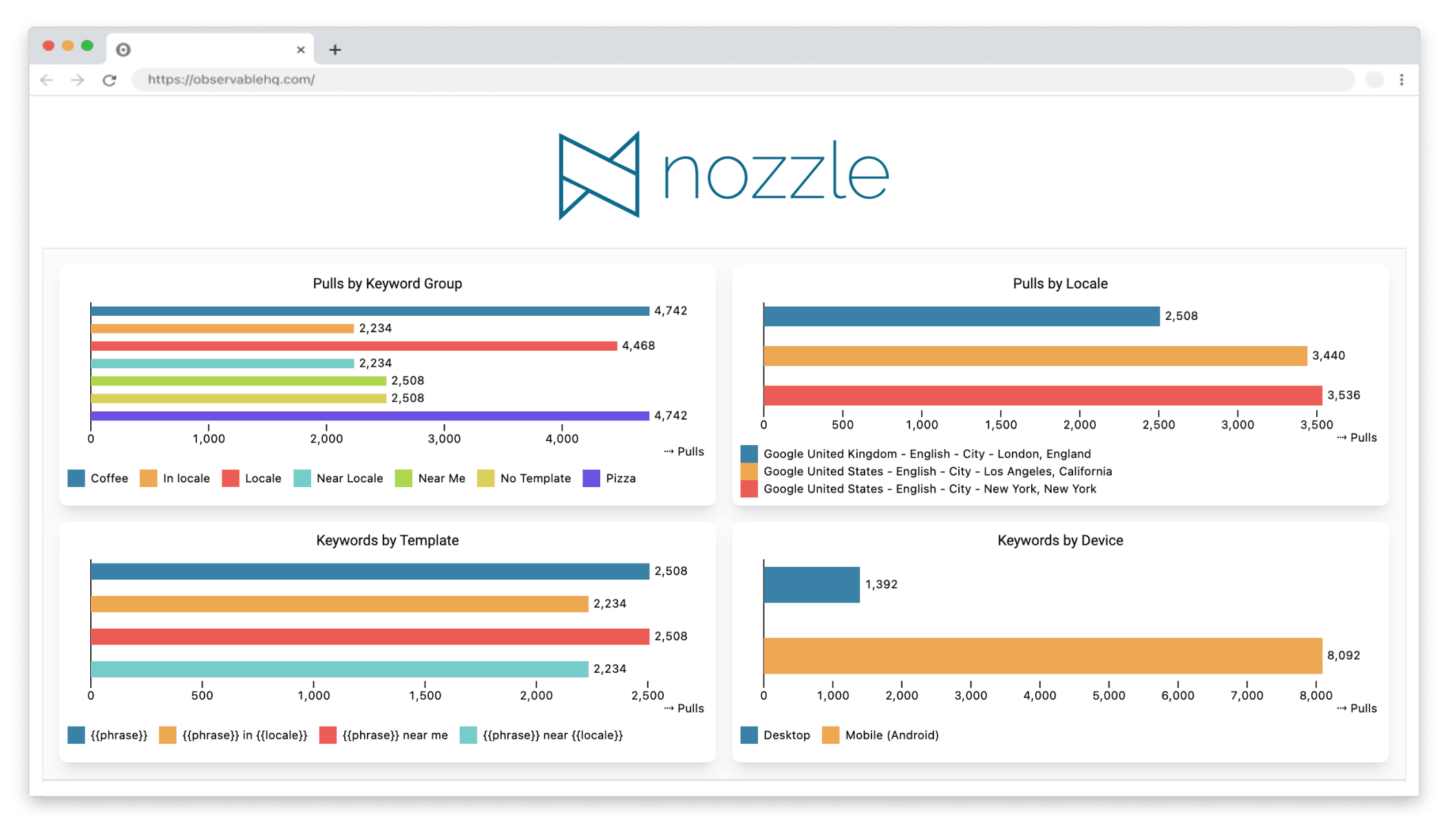
Observable Plot allowed Linsley to create a dash that allowed clients to more easily manage which keyword configurations contribute the most to their usage.
The outcome: simple, expressive data viz that’s easy to tweak
Since picking up D3 almost a decade ago, Linsley said, “Plot is easily the simplest, most powerful data visualization tool I’ve used since I started using D3.”
He emphasized both ease of implementation, as well as an ability to build a better product for Nozzle users, saying, “The entire library frees us of implementation details while still affording extreme granularity when required. At the bottom line, it has directly increased our speed and ability to provide our users with better information concerning every aspect of our product.”
With Plot’s ability to drastically change visual output from surprisingly minimal changes to code, we were able to explore the data efficiently and arrive at the right final visualization for each of the configurations we needed.
- Tanner Linsley, Co-founder and VP of UI / UX at Nozzle
An intuitive grammar of graphics
Linsley had tried using different visualization libraries but found that they slowed down his analysis and were needlessly complex. “Many higher-level visualization libraries claim ‘declarative’ configuration, but fail to implement grammar of graphics properly. This means that you eventually end up writing a lot of declarative, but unnecessary, implementation details to achieve the visual output you want,” explained Linsley.
He continued, "It slows you down and makes it difficult to build solutions that can be as dynamic as the data you want to explore. In the end, you may not arrive at the right solution because of a time constraint or simply due to the pain of implementation details.”
Plot is purpose-built to be an intuitive tool for beginners and data viz experts alike. “Plot is the first tool I've used that implements grammar of graphics in a way that allows me to explore data efficiently with the right level of abstraction and customization,” said Linsley. He continued, "TypeScript support makes it so much more enjoyable and things are apparently only going to get better!”
Interested in learning more about Observable Plot?
There are several free resources to jumpstart your learning of Observable Plot. Check out Learning Observable, or watch a video. We also offer full courses - learn more by connecting with other data viz creators on Slack and Mastadon. Or, ask your questions on the Observable forum.