Sometimes breakthroughs happen where you least expect them — like during a morning row between a data scientist and an oncologist.
Out on the water one morning, Dr. Philip Bogden listened as his rowing partner, a friend and practicing oncologist, described the research project he was working on with some colleagues. The research explored how uncertainty shapes cancer patients’ outlooks, testing the idea that patients with poor prognoses find hope in uncertainty, while those with favorable ones respond to it with fear and anxiety.
To test their hypothesis, the team had sent out a 30-question survey to collect data from hundreds of patients. Over two hundred responses later, the team found themselves struggling to make sense of the survey data, which was dispersed across a number of Excel spreadsheets.
“The data had become too complex, and they had no infrastructure for analyzing or visualizing any of it. No Power BI, no Tableau — just very basic tools in their survey software, REDCap, which weren’t built for exploration,” Dr. Bogden said.
That conversation led to an unexpected collaboration and a breakthrough that would change how the oncologists approached their medical research. Dr. Bogden believed that interactive visualization would enable real exploration, streamline communication across the remote team, and spark more meaningful discussions.
“My goal with any visualization project is to facilitate the ability to communicate ideas. I wanted to keep it simple and make sure it worked so that the oncologists could explore their data and identify patterns and relationships more easily.”
What began as a simple favor for a friend became a model for using data visualization to reshape medical and scientific collaboration.
Facilitating exploration with an interactive data app
Before he could start building, Dr. Bogden had to make sure the data was ready to work with. Patient health information is extremely sensitive and protected by HIPAA, so the team made sure to mask all personally identifiable information before granting Dr. Bogden access. From there, he tidied the data and got it into a usable format.
When it came to tooling, he chose Observable Framework for app development, Observable Plot to create interactive visualizations, and GitHub Pages to publicly host the project so collaborators could access it with a simple link.
Dr. Bogden developed a public-facing data app to share the visualizations with oncology researchers.
Dr. Bogden described the benefit of using Observable with a cross-functional co-working group:
“Data scientists live in Jupyter notebooks, web developers work from the command line, and oncologists use Excel. These communities each have their own tooling, which often prevents them from collaborating. But Observable cuts through all of that and removes the barriers that make it hard for these groups to work together.”
With the ability to prototype quickly with Observable, Dr. Bogden was able to get real-time feedback and bridge communication gaps that the group was facing. Framework handled the technical infrastructure needed to build and publish a data app so he could focus on the data and design details. Plot’s concise API made it easy to fine-tune visual elements like axes, labels, and tooltips without getting bogged down in code. He even found time savings from reading through Observable’s documentation, which he described as “outstanding.”
All told, that meant he was able to spend less time on app development and debugging, leaving more time for productive discussions about the data.
“Together, these tools made the process faster, smoother, and more collaborative. The technologies that Observable offers are genuine game changers.”
Iteration in action: Building a shared visual language
Once he decided on tooling, Dr. Bogden began prototyping. It took plenty of iterations and lots of feedback before the dashboard finally clicked for the researchers — which Dr. Bogden explains is not only common, but critical, to data projects.
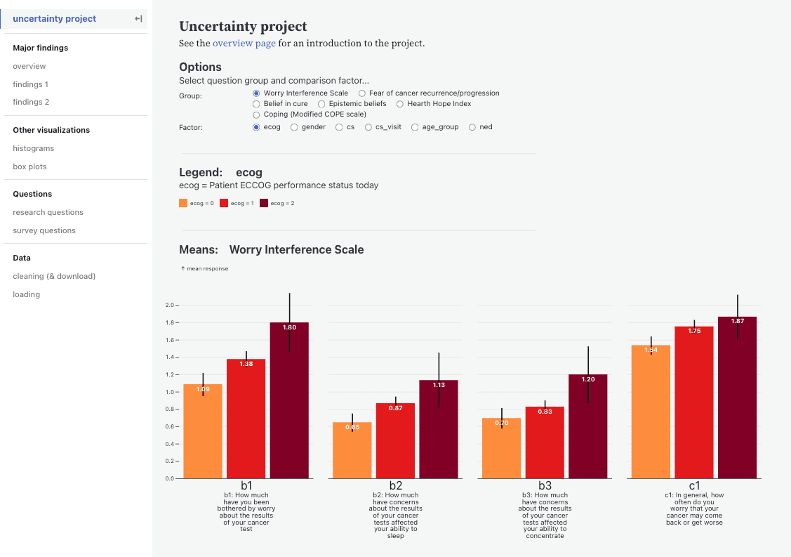
In the beginning, the researchers told Dr. Bogden that they wanted to “see correlations” in the data. This led him to initially create scatterplots, a common chart type used to show correlation. But Dr. Bogden quickly realized that chart type wasn’t going to work. “The language they were using was throwing me off at first. It quickly dawned on me that what they really wanted was to see patterns in the data, not correlation.” He then tried displaying survey responses as faceted histograms. Several iterations later, the researchers decided they preferred summary statistics with grouped bar charts, along with the ability to quickly change question groupings and a few key demographic and diagnostic factors.
The team also included a pre-med intern whose involvement helped bridge the data and medical worlds. The static charts she prototyped provided inspiration for Dr. Bogden’s interactive visualizations.
“The best insights come from showing something, reacting, and improving on it together.”
Reflecting on the power of the technology that enabled their iterative process, he said, “That’s the magic of Observable — it makes iterating really fast and easy. What might’ve taken days of back-and-forth is now a live feedback loop.”

Faceted histograms vs. grouped bar charts: Feedback and iteration helped the team land on the visualization they found most useful.
But it wasn’t until the oncologists started using the app on their own, exploring and interacting with it independently, that he realized he was onto something truly useful for them.
“The difference was when they started diving into the data themselves. That’s when they were able to penetrate the complexity of their own dataset, ask better questions, and start understanding what was going on in the data."
Redefining scientific collaboration
Dr. Bogden recalled how the researchers were “amazed” throughout the project — not just by the findings and deliverables, but by the experience of exploring and collaborating through an interactive, HIPAA-compliant visualization tool.
“They weren’t used to this level of flexibility — being able to change things, explore, and see the data from different angles. They’d never used an interactive web application like this before, and the fact that it could be public and still HIPAA-compliant really blew them away. It completely changed how they discussed their data.”
The team believes that making this, and similar, research accessible to the broader medical and scientific community will have significant positive implications, accelerating new ideas and discoveries. The team is currently drafting a paper about this project and its methods for publication in a top medical journal.
For Dr. Bogden, the project reinforced a key belief: “Data visualization is a means to an end. The end is enabling science.”
As for the study itself, while some initial findings started to surface, the original hypothesis hasn’t been supported or disproven quite yet. The visualizations have opened the door for pursuing a larger, phase 2 study.
What began as a casual conversation between two rowers became an example of how data visualization can bridge disciplines and move science forward, one chart at a time.
You can visit Dr. Bogden’s creation for The Uncertainty Project here.