Start poking around Observable — on the platform, in the codebase, in user support, across our data visualization galleries — and you’ll find Philippe Rivière’s fingerprints everywhere.
Fil (as we know him) is a Data Visualization Engineer at Observable, and a core contributor to our open-source software including Observable Plot, D3, and Observable Framework. His avatar (cropped from an illustration by Mad Meg, which Fil describes as “a character sitting in a corner watching the horror of the world with a lot of angst”), appears atop many of our most popular chart examples and alongside countless responses in notebooks and discussion boards:

Fil has had an especially outsized impact when it comes to helping people to make better maps, including as the primary developer of Plot’s geo mark. So it wasn’t a surprise when I reached out to Fil about doing an interview that his response was simply: “We can always talk about maps.”
Read on to hear, in Fil’s own words, about his path into data visualization, what he likes in a map, what he’s excited about next, and why — despite developing tools that help us all make maps faster — he’s wondering if we need a “slow cartography movement.”
Q: How did you get into data visualization?
A: I used to be a journalist. When I was just getting started in journalism, I was responsible for building and maintaining the paper’s website. I worked at that same newspaper for almost twenty years. I eventually got fed up and decided I wanted to try something new. At the same time, my friend and colleague Philippe Rekacewicz (who was a cartographer at the same newspaper) had decided to leave. I loved what Reka — as everyone calls him — was doing with maps, so I started learning cartography with him.
Reka likes to draw maps by hand. He goes through datasets line-by-line, checks everything, makes sense of what it means, then draws a map with pastel crayons. This seemed to me like a tedious process, because I was used to programming. So, I started learning from Reka while trying to contribute to the work. I wanted to see how we could automate making maps for the web.
That’s really how I stumbled onto D3. Finding D3 was so exciting. I started off making a lot of data visualizations and freelanced as a data visualization developer for six or seven years. Now I work full-time at Observable. So, I guess my path into data visualization was through discovering something that was exciting to me and trying to learn it.
Q: What about maps do you find exciting or impactful?
A: I like seeing the relationships between things — the movements. A map that describes trade, for example, is more exciting than a map that shows places. I don’t really care for GIS (Geographic Information Systems). I’m not interested in placing things precisely on a map. I’m way more interested in drawing networks and flows and differences between one region and another than I am in marking locations.
Several data visualizations that I find really striking are in William Bunge’s Nuclear War Atlas, which is a collection of maps about nuclear armaments. One of the maps that I find most impressive shows how a radioactive plume from a nuclear explosion travels day-by-day. You can see that any country that drops a nuclear bomb anywhere in the northern hemisphere is basically just nuking itself.
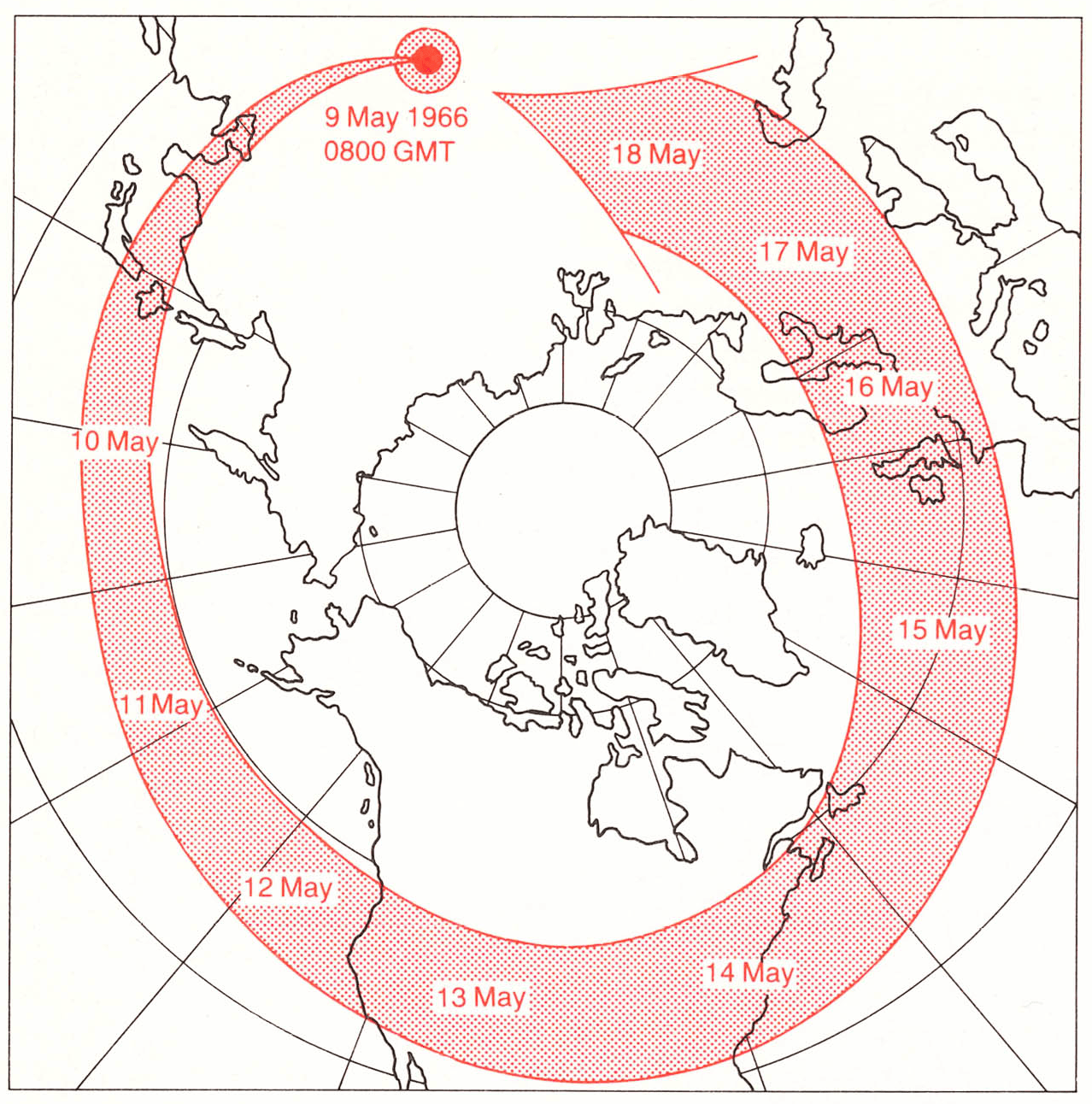
The path of a radioactive plume, circumnavigating the world and reaching the original explosion site in just over one week, from Nuclear War Atlas by William Bunge.
Here’s another map from the same book, showing the national boundaries between the Soviet Union and the United States if considered by their nuclear power and reach (in 1988, when the book was published). Basically, it shows that the U.S. nuclear weapons are everywhere and can reach any place on the planet. And, the Soviet Union has the same power. Basically, the national boundaries have dissolved.
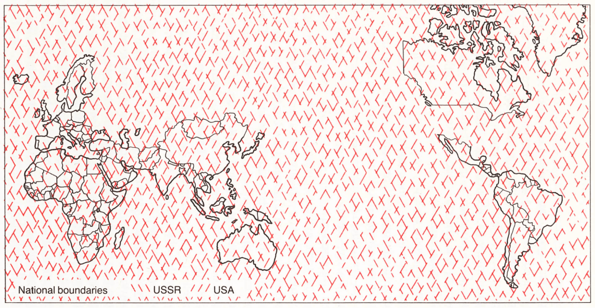
From Nuclear War Atlas by William Bunge.
These are maps that have a story, have a purpose, and are very striking. For me, these are the types of maps that really amaze me and teach me something.
As another example, I worked on maps for Sonia Shah’s book The Next Great Migration: The Beauty and Terror of Life on the Move. Here’s one showing how the Pacific was populated in prehistoric times. I like making these types of maps because they are evocative. They try to distill the current knowledge about how people have moved.
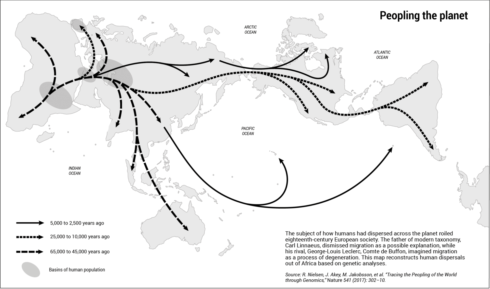
A map of human dispersion across the globe, by visionscarto (2020), for Sonia Shah. Read more in Sonia’s article Migration is the earth’s connective tissue. This map features the first published use case of IMAGO, a projection recently added in D3 by Fil and collaborators.
In some cases, you have to share things that aren’t meta-geographic and that do require GIS. But there is a continuum between GIS, which focuses on precisely describing where things are, and these types of maps that help to explain how or why something happened. In between, there are a lot of stories you can tell.
With Reka and other friends, we created a collective called visionscarto where we share articles, usually related to maps and representation. I like the types of maps we tend to share in visionscarto because their authors are careful not only about what they describe, but also about how they describe it.
Q: Can you describe some cartography projects you’re particularly proud of?
A: One of the first things I wanted to do for Reka was to automate the Bertin projection, which is used a lot by the French school of cartography. It’s a nice projection because it preserves almost all of earth’s surfaces without distorting continents too terribly, with more distortion pushed to the oceans. It was created by Jacques Bertin in 1953, but (in 2013) there was still no formula to describe it. It only existed as a drawing, with people passing around copies of a base map in Adobe FreeHand.
When I was first starting this project, I contacted Anne Le Fur (a student of Bertin) who explained to me how Bertin had drawn the projection by hand, with a globe and a light source. Then, I started to study D3 in depth to understand the incredible d3-geo module that Mike Bostock and Jason Davies had created a few years before.
I thought that automating the Bertin projection by computer code would be a weekend project. It took me around 4 years. Finally, we were able to describe the projection mathematically and implement it in D3 in 2017.
A map of earth made with the Bertin projection from visionscarto. Learn more about Fil's work to automate the Bertin projection.
Another project I really loved was the 30-day map challenge of November 2021, because every day I was playing with a new approach or algorithm. Some were things that had been on my mind for a long time, and I wanted to publish something about each of them in a single day. Others I really did just develop during that month. I did not sleep much.
One of the 30-day map challenge pieces I’m very proud of is an isodemographic map of where I live. In this map, each cell represents the same number of inhabitants.
Usually the way you do this is by deforming shapes using a tool such as ScapeToad (a Java app that grows or shrinks regions so the area matches the size you want to represent). If you look at those maps, they’re based on a grid that gets morphed, and the result is visually unappealing. The concept however is nice: you want to present something that is proportional to the population, or the economy, or whatever.
This map uses a different algorithm called sliced optimal transport, which I learned about the preceding year in a workshop organized by French researchers, including Julie Delon and David Coeurjolly. I learned a bit about the theory, the tools, and the algorithm. The image it produces is also organic, but very nice-looking.
I don’t think the method had ever been used in cartography before. I don’t know why I didn’t make a whole atlas of these.
(Explore Fil’s entire 30-day map challenge collection on Observable.)
Q: What’s the hardest part about making maps and data visualizations?
A: Everything is hard. That’s the thing with data visualization. You have to understand the data. You have to understand the context. You have to understand the technique. You have to be an artist. You have to understand composition and color theory. All of these are really hard in a practical way, and in a theoretical way.
Often you see a map and say “Oh it’s nice, I can do that.” An old boss of mine used to look at Reka’s maps and say, “This is a drawing. My nephew could do that.” But everything about maps and data visualization is hard.
Q: What’s a “hidden gem” in Observable Plot?
A: I’m very proud of spatial interpolators in Plot. Especially the random walk interpolator. The walk-on-spheres technique is so beautiful. It was made popular recently by Rohan Sawhney and Keenan Crane, who showed how it can approximate computations that are hard to do otherwise. It’s a good Monte Carlo approach to interpolation problems. And it’s fast!
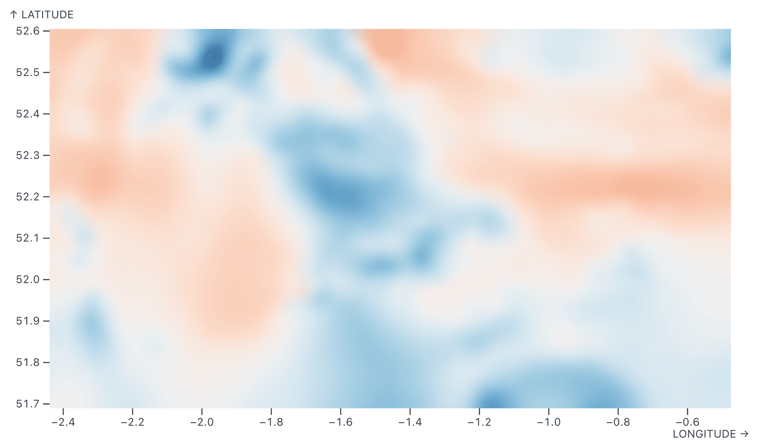
A map of the strength of earth’s magnetic field, created with Observable Plot’s raster mark using the built-in random walk interpolator.
You can even mix or blend categorical values, which might be surprising. Usually, when people think about interpolation, they think of something like taking an average of numeric values, weighted by distance, to interpolate a value for a new location. The beautiful thing is that the random walk interpolator also works for categorical data. And you can blur them afterwards.
For example, here we have the iris dataset, and we have three different species. It wouldn’t make sense to do a quantitative interpolation (the “average species”). But you can use random walk to select a species, and that gives you a good idea of the zone of influence of each species, and the noise in the image is also helpful to visualize uncertainty.
I think spatial interpolation in Plot is a gem, in a sense, because it’s not available in any other graphic library that I know of.
(To learn more, read this short paper by Fil and Mike Bostock: Spatial interpolators in Plot.)
Q: What’s something you’re excited about?
A: This is something I’ve been excited about for the last decade: using the cartographic metaphor to make a map of something that is not geographic by nature. Basically, being able to make a map of anything, and leveraging people’s intuitions (of how to read a map) to make the data easier to understand.
A great example is making a map that visualizes patterns in a bunch of text. This is something Ian Johnson is working on with Latent Interfaces. With sentence transformers and embeddings and so on, you can project any type of data to a space where things that are similar or have a similar meaning are closer than things that are different.
It’s the complement to Waldo Tobler’s first law of geography: things that are closer in space have similar characteristics than things further apart in space. You can take it very literally and do mathematical things like spatial autocorrelation. But, you can also do this very metaphorically and invert the proposition: if two things are similar, put them in the same neighborhood, and if they’re very very similar, on the same street. If they’re somewhat similar, then they are in the same city, and if they are very different they are in different countries.
Then, you can name the clusters and show connections between places. For example, if the text is about scientific fields, you might have clusters for biology to chemistry and you could see the subjects along the way connecting them. You could apply it to knowledge, any type of textual data, even art — there’s no real limit. And while the idea of mapping non-geographic data isn’t new (indeed, we can trace it all the way back to Carte du Tendre), it is still exciting to think about new approaches and applications.
We have algorithms that you can apply to abstract points, and still get something that looks like a map. For example, I worked on a project with researcher Dario Rodighiero to visualize a network of 8,000 student theses from the École Polytechnique Fédérale de Lausanne, based on a lexical distance. This map uses the Urquhart graph, which evokes a road network very well, even though it’s purely a topological computation.
A network visualization of student theses from École Polytechnique Fédérale de Lausanne to explore similarities and trends over time, using the Urquhart graph (source: dariorodighiero.com). See an example of the Urquhart graph implemented in an Observable notebook.
A map of non-geographic data doesn’t necessarily make more sense than any other abstract way of seeing the data, but it makes sense to use the cartographic metaphor since people already know how to read maps. We need this familiarity, otherwise all these charts are just too hard to grasp.
Q: How has your perspective on making maps evolved?
A: When I started making maps, I thought that automation would be a good idea. I wanted to make a “machine” that would save Reka a lot of time. I’ve since realized that there is a lot of value in making maps slowly.
When you’re making a map, there are all these challenges happening at the same time. The technical challenges, the cognitive challenge of understanding what the data represents, using the right form, the right colors, the right projection, and so on. Strangely, it feels like older maps were better at solving these challenges, probably because they required so much manual effort and time. People would spend months making a single map. They had time to think about it.
Now, we want to make maps quickly, and we have tools that are imposing their form. That means we’re assembling maps from existing parts, but the parts are more rigid. Newer maps are obviously richer in some ways, because you can add things like zooming and brushing that you can’t just do with paper and pencils and ink. But, at the same time, the shorter production time means you spend less time with the data, and that means you might oversee or exclude something important.
For example, sometimes I see maps using a dataset as the source of truth. If a point is missing in the dataset, then it’s often excluded from the map, and people will just say, “Oh, there’s no data.” But that’s not true. It’s not that there’s no data, there’s just no data in this dataset.
Take a statistical indicator of literacy by country. That value is likely not changing much from year to year for any given country, so we may be able to infer literacy data from another recent year. But, we tend to not do that research anymore. We don’t say “Oh, that’s an interesting question, I have to call someone to find the answer,” or try to interpolate or extrapolate values from existing data.
We probably need a slow cartography movement, similar to the slow food movement. And there are still people who are doing the work very slowly, even though it’s much easier to make quick maps that have gaps. Taking the time to go through everything carefully, and asking questions when something isn’t obvious, is really important.
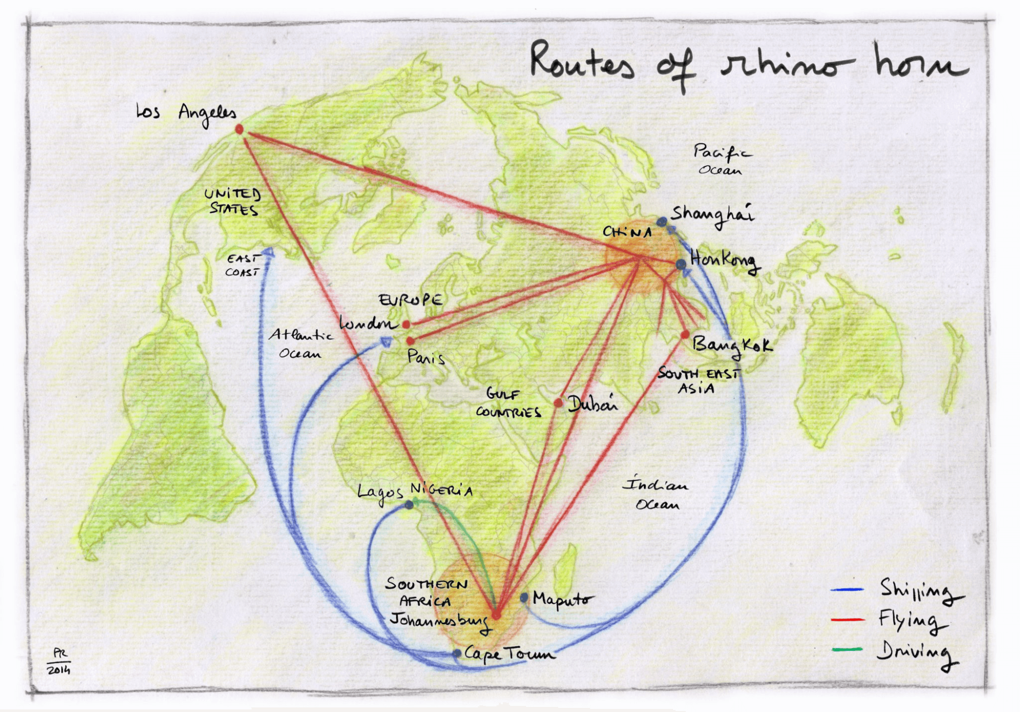
A hand-drawn map by Philippe Rekacewicz (using the Bertin projection) shows routes of rhino horn trade, with data from the Oxpeckers Center for Investigative Environmental Journalists. Source: Routes of rhino horn by Fiona Macleod, on visionscarto.
Fil Rivière is a Data Visualization Engineer at Observable. See more of his work on Observable, and at visionscarto.net.