So you’re building a dashboard, but are wondering what to build or how to make it even better. Perhaps you’re not sure about how to lay things out, which charts to include, or which pitfalls to avoid. This post offers seven ideas and guidelines to help you make the right decisions to build better dashboards.
A good dashboard serves multiple purposes. First, it gives a quick overview of the key numbers at a glance. The goal is to make it easy to see if things are as expected or if action needs to be taken. If things are going well, the viewer might just move on and not even look at the rest of the dashboard – that’s a good thing, you want that!
But when things aren’t as expected, your users need to be able to dig deeper. That is where additional views and filters come in to allow them to answer questions. The dashboard needs to be organized in a way that makes it easy to get around, even when a lot of information is being shown. It needs to be powerful without being overwhelming.
The rest of this post will discuss visual hierarchy, the use of big numbers, coordinated views, and interaction, and how to use colors. This all bookended by broader points about asking the right questions upfront, and keeping an eye on usage to make sure your dashboard is meeting your users’ needs. By following these tips, you’ll be better equipped to design dashboards that are not only visually appealing but also user-friendly, informative, and effective.
Asking the right questions to design the right dashboard
The first step in building a dashboard is to make sure you know exactly what to build, and whom you’re building it for.
It helps to ask a few questions up front to design the most effective dashboard possible, and avoid dashboard rot:
Why are you making this dashboard?
What does your audience want to see?
What do they know about the data, what do they expect?
What are the 3-4 key numbers or bits of data they need?
How can they dive deeper into the data?
Building a dashboard is a balancing act between adding enough information and cluttering it up with too many charts and filters. Often, the easier solution is to just add more views, thinking that they’ll be useful to somebody – but they end up creating clutter for everybody. Asking questions helps make decisions about where to draw the line, which otherwise end up being arbitrary.
Part of this step is also to figure out if you’re building one dashboard or if it needs to be split up into multiple dashboards or pages. It’s not uncommon to try to please many different stakeholders by adding many options to an existing dashboard, when breaking it up into multiple, simpler and more focused dashboards would be better.
Designing dashboard layouts with a clear visual hierarchy
Overview first, zoom and filter, then details-on-demand
– Ben Shneiderman
When building the dashboard, the first question is how to structure its overall layout. Ben Shneiderman’s “visual information-seeking mantra” (published in a 1996 paper) can serve as a high-level guideline here. Its intent was to guide people building data visualization applications, before they were known as dashboards.
To guide the user through the different stages of overview and details, the dashboard needs to be structured to make it clear where they’re supposed to look first.
In this example dashboard showing electricity generation and consumption in the U.S., the map stands out. This is the first item users will look at. It provides an overview of the data, as well as the main control (the time slider). Maps are common anchors on dashboards, though they need to be used with care. Is the geographical aspect of the data really important, or is the map just a nice way to visualize data?
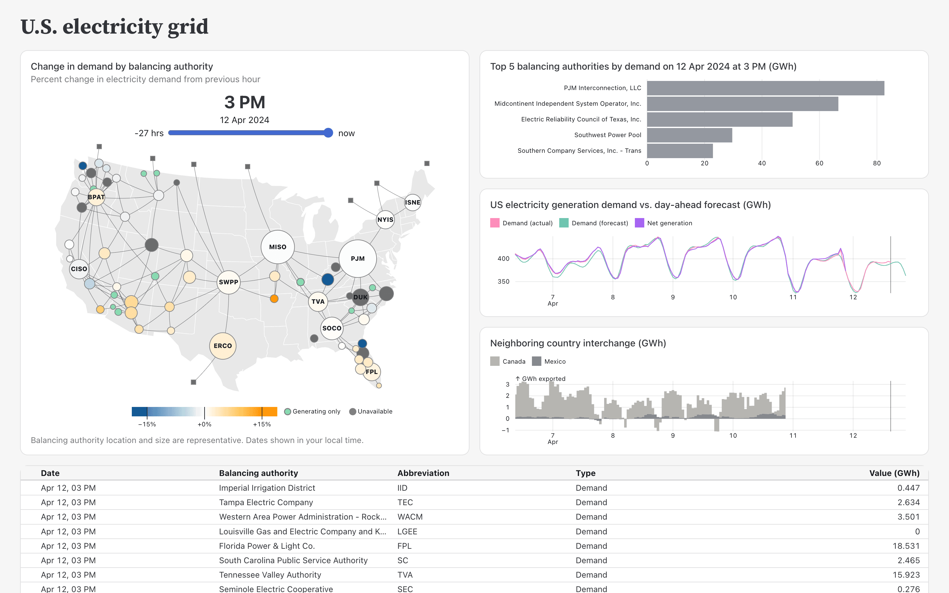
Other anchors are big numbers (see below), or big charts. Color and shading can also be used to draw attention to the key items, as can larger font size. The trick is to decide what is more important, and what is secondary or tertiary. Trying to make everything big and colorful will only create chaos and overwhelm the viewer.
A well-designed dashboard doesn’t yell at its users, but subtly helps them read and navigate the information through a clear visual hierarchy, and leads to faster insights and decision-making.
Include big, important numbers when building dashboards
When your viewers want numbers, give them numbers! We tend to want to show as much data as possible on a dashboard, so naturally we’re thinking of charts and data visualizations. But simple numbers are important and can make a dashboard much more usable by making key values available at a glance.
Big numbers also help with the visual hierarchy. They say, look here first! Your users probably know their key metrics, and have a solid frame of reference to know what numbers to expect (and which ones would be bad). Showing those at the top is a great way to give your users the most important information as quickly as possible.
Take our Plot example dashboard, for example. It uses big numbers to highlight Observable Plot metrics from GitHub, like the latest release, stars, daily downloads, and total npm downloads.
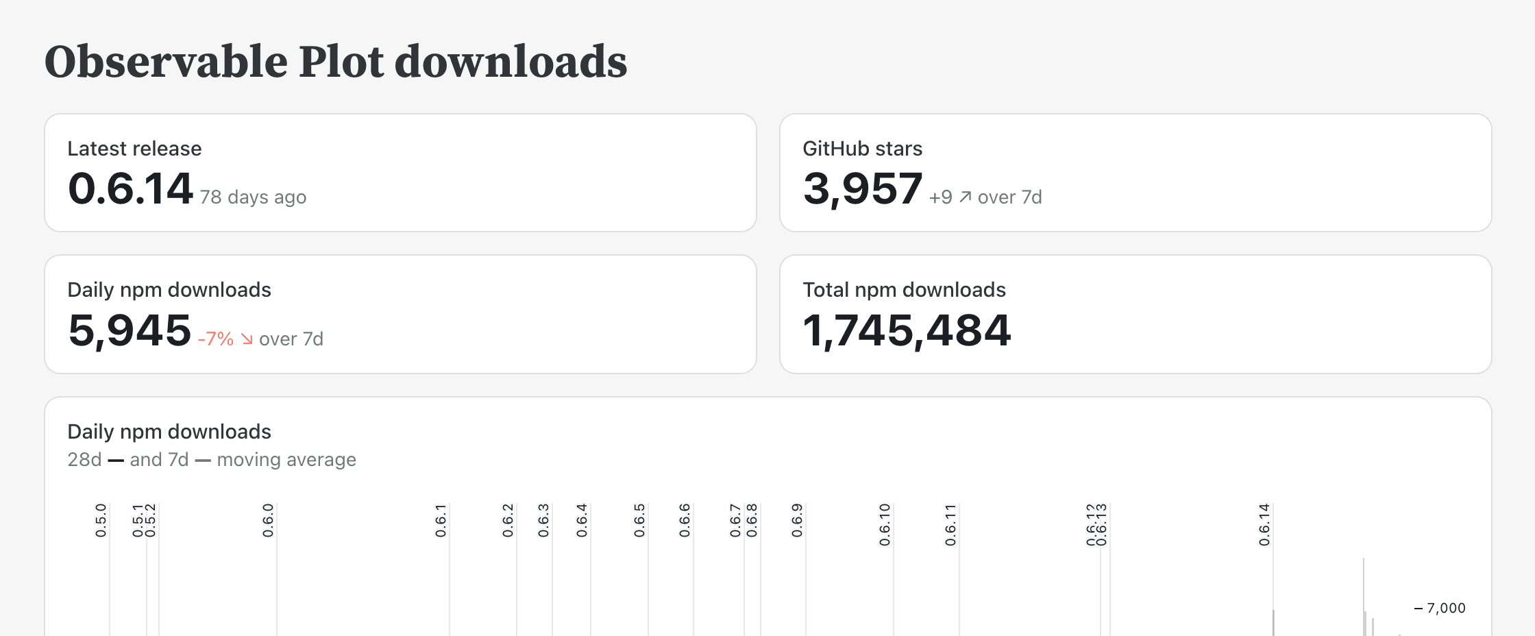
These numbers are of course reinforced by additional charts on the dashboard that reveal more detail and let viewers dig deeper. But without the highlighted numbers, users would have to spend more time figuring out if things are going well or not.
Include coordinated views when building dashboards
Dashboards are useful because they let viewers see information that needs to be considered together, all in one place. This can mean different aspects of the same (or related) data, say sales numbers and orders, or bookings and the weather. Another approach is to show overview and detail charts, where the overview indicates what part of the data is shown in the detail chart.
This is illustrated very nicely in our primary mortgage rates dashboard example. The bottom data visualization shows a long time period, from 1971 to 2024. The shaded area is shown in more detail in the top view. When the dashboard loads, it shows the last 12 months of data. The user can then drag the shaded area to see other 12-month periods in detail. But they can also resize the box to see a larger or smaller time period.
Coordination is also important when filtering views, as we’ll discuss in the next section. When more views respond to interaction, especially when they show different data, users can get more information from the dashboard. As they drill into the data, users want to see as many of the views respond to show their selected subset of the data. Static views are still useful for overviews and as reference, but most views should respond to interactions such as filtering.
Add filters for more interactive dashboards
The most common interaction on dashboards are filters. Filters allow users to flip between different aspects of the data, or drill into subsets they’re interested in.
Take our hotel bookings dashboard, for example. It opens by showing all bookings. But at the very top, there is a filter control that lets the user pick subsets of the data: direct, corporate, online travel agent, offline travel agent, and groups.
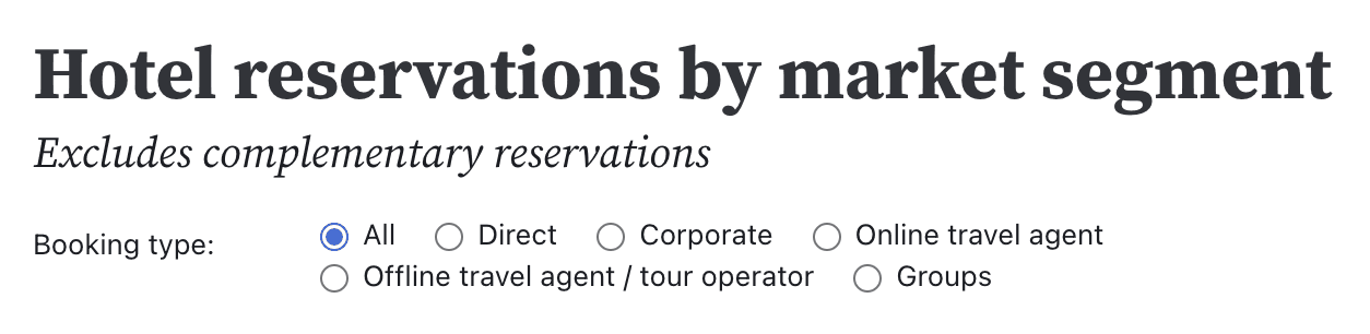
The overall overview is a good starting point, but most users want to see more fine-grained data. Filters let them pick the parts of the data they want to see.
The key here is to find the right balance between giving users control and not overloading the dashboard with too many filters. Knowing your audience and their needs is important here. Simply adding any filter you can think of to a dashboard, or doing the same for every user request, might seem helpful, but usually leads to worse dashboards. When too many filters start weighing a dashboard down, it’s often better to break it up into multiple pages to serve the different users better.
Another consideration here is the speed of interaction. If users have to wait too long for their actions to have an effect, they lose focus and won’t be able, or have the desire, to ask more questions. Making dashboards fast is therefore crucial. Static site generators like Observable Framework have an advantage over traditional BI tools here, because they don’t require database access at load or when the user interacts.
Coordinate colors for more intuitive dashboards
Having multiple views on a dashboard is great, but it’s important to not overwhelm the audience or cause confusion. One common mistake that can lead to misunderstandings is the re-use of colors between different views.
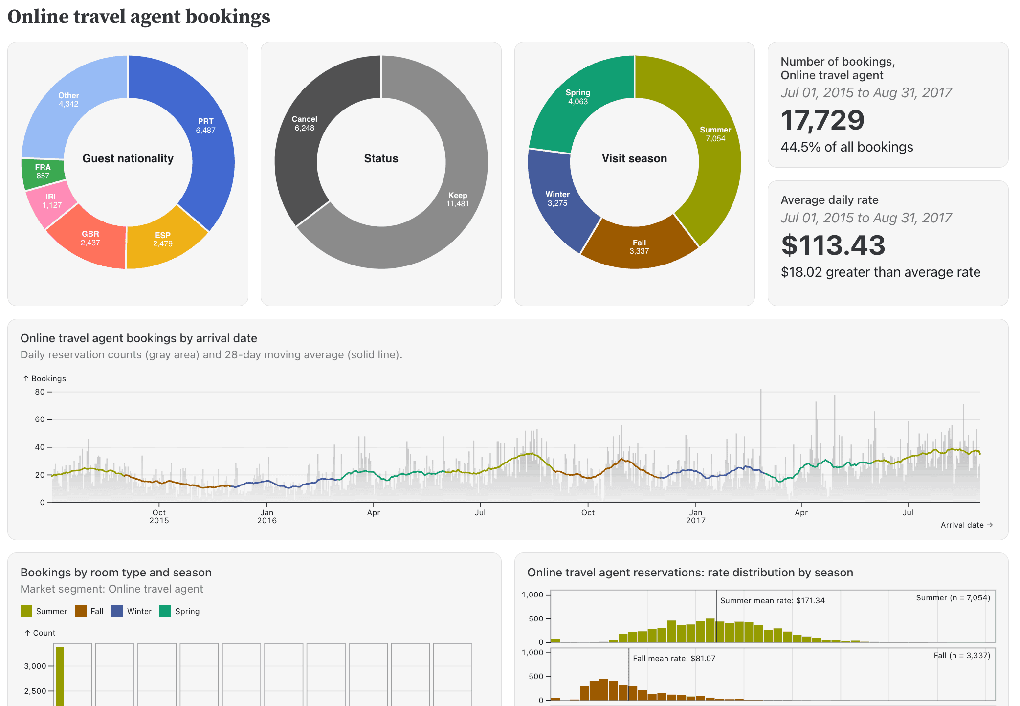
As a general rule, if a color is used in multiple data visualizations, it should mean the same thing. On the hotel bookings dashboard, for example, the grass green color stands for summer, and the brown color represents fall. This is the same in the donut chart at the top, and the bar charts across time further down.
Color is a powerful visual cue, and it needs to be used with care. While the same color used for different things will lead to confusion, color used wisely to connect different charts will help viewers understand what is shown much more quickly.
A common issue with colors is that we can only really differentiate a small number of them, around 10 different hues (we have a blog post on how we designed our own set of colors). This limits the amount of different items that can be shown on a dashboard. The answer is not to reuse colors or use too many, but either to break up a dashboard into multiple pages, or use shades of colors within charts.
Monitor and improve your dashboard
As much as we might hope to be done once the dashboard is built, it’s really just the first version. A dashboard often needs some iteration with its users, after they’ve had a chance to use it, to get to its final state.
It’s important to make sure your users know about the dashboard, and that you can tell if they’re actually using it. Use analytics to track usage, and if you’re not seeing your intended users actually use your dashboard, find out why. This goes back to the initial point about asking questions, only now the answers will be more specific because your users have a point of reference.
Once users actually get to use a dashboard themselves, they will see what they can do with it and what’s missing, have additional questions they want to ask, and perhaps realize that they need something quite different. How you deal with that information is of course up to you, but the goal is to provide value to your users, even if they don’t always know what exactly it is they’re looking for.
Conclusion: Helping users understand data through well-designed dashboards
Dashboards are powerful tools for showing and understanding data. Some simple considerations can go a long way to making dashboards and data visualizations more useful and effective for your users.
Picking a good layout, using color correctly, adding interaction and coordinated views, as well as big numbers, all might seem like simple steps, but when done right, they end up being more than the sum of their parts. This is especially true if you’ve asked the right questions up front and continue to monitor and ask questions to make sure you’re building the right dashboard for your users.
At the end of the day, the goal of a dashboard is to help your users understand the data and make the right decisions based on that data. Whether you're building dashboards for internal teams or external clients, following these principles will help you create dashboards that are not only visually appealing but also functional, intuitive, and effective. Our static site generator, Observable Framework, can help your team build and deploy data apps dashboards that load instantly — the first time, and every time.
Learn more about building your first Framework data app with this step-by-step tutorial.