When creating a chart, one of the decisions you have to make is what range of values to show. A common visualization rule says that you’re supposed to start the vertical (Y) axis at 0, at least with bar charts. Check out this pair of example bar charts:
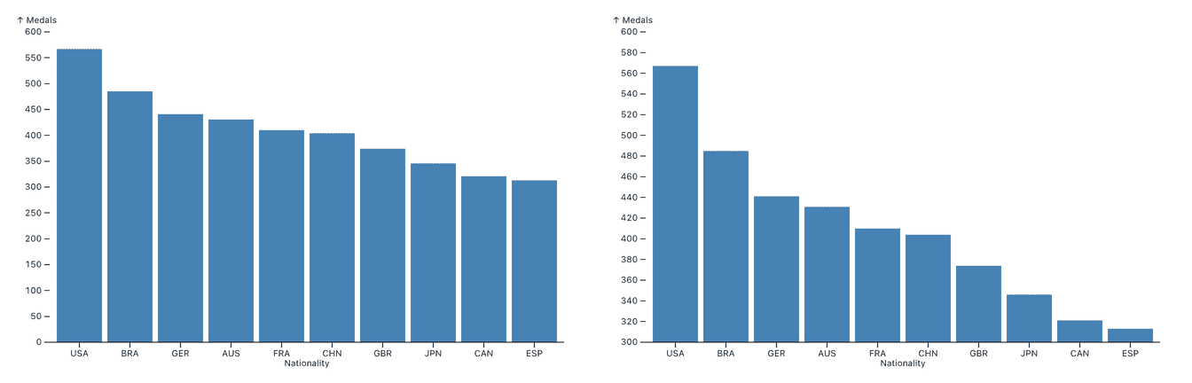
Both charts in this image show the same data about the number of medals by country in a past Olympic Games. The left chart, however, starts at zero, while the one on the right cuts off all numbers below 300.
It’s easy to see that the chart on the right exaggerates the difference between countries. The top-ranked U.S. has about twice as many medals as Spain (ESP) in tenth place, not 20 times as many as the chart on the right might have you believe.
The risk here is that people looking at this chart will miss that it’s cut off, misread the values, and potentially base an important decision on a misunderstanding. This isn’t just a theoretical problem, studies have shown that this is indeed something people reliably get wrong. We’ll talk about one such study below.
This has led to the general rule to never start a bar chart at a value other than zero. In fact, many visualization tools and charting libraries make it difficult or even impossible to create bar charts with a non-zero baseline.
Theory vs. practice: the line chart
Now this is all good and well with bar charts, since we read bar charts by length. But what about line charts? We supposedly read line charts by position of the points, so they should be immune to having their vertical axis cropped. See for yourself in this chart of Apple’s stock price over about 2 years, starting at 0 on the left and about 90 on the right.
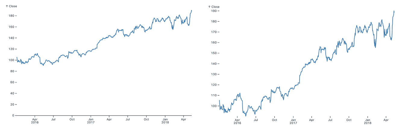
These charts clearly look different, the vertical change from one end of the chart to the other is about twice as much in the chart with the cropped axis. While we might read line charts by position, we often care more about the slope of the chart, which is impacted by the range of values on the vertical axis.
This is not a new observation. In his famous 1954 book, How to Lie with Statistics, Darrell Huff uses a line chart to illustrate what he calls a “gee-whiz graph.” He creates it by taking a line chart that originally starts its vertical axis at 0, cropping it, and then rescaling the chart back to the same size (the person in the background is there to indicate the amount of cropping and distortion).
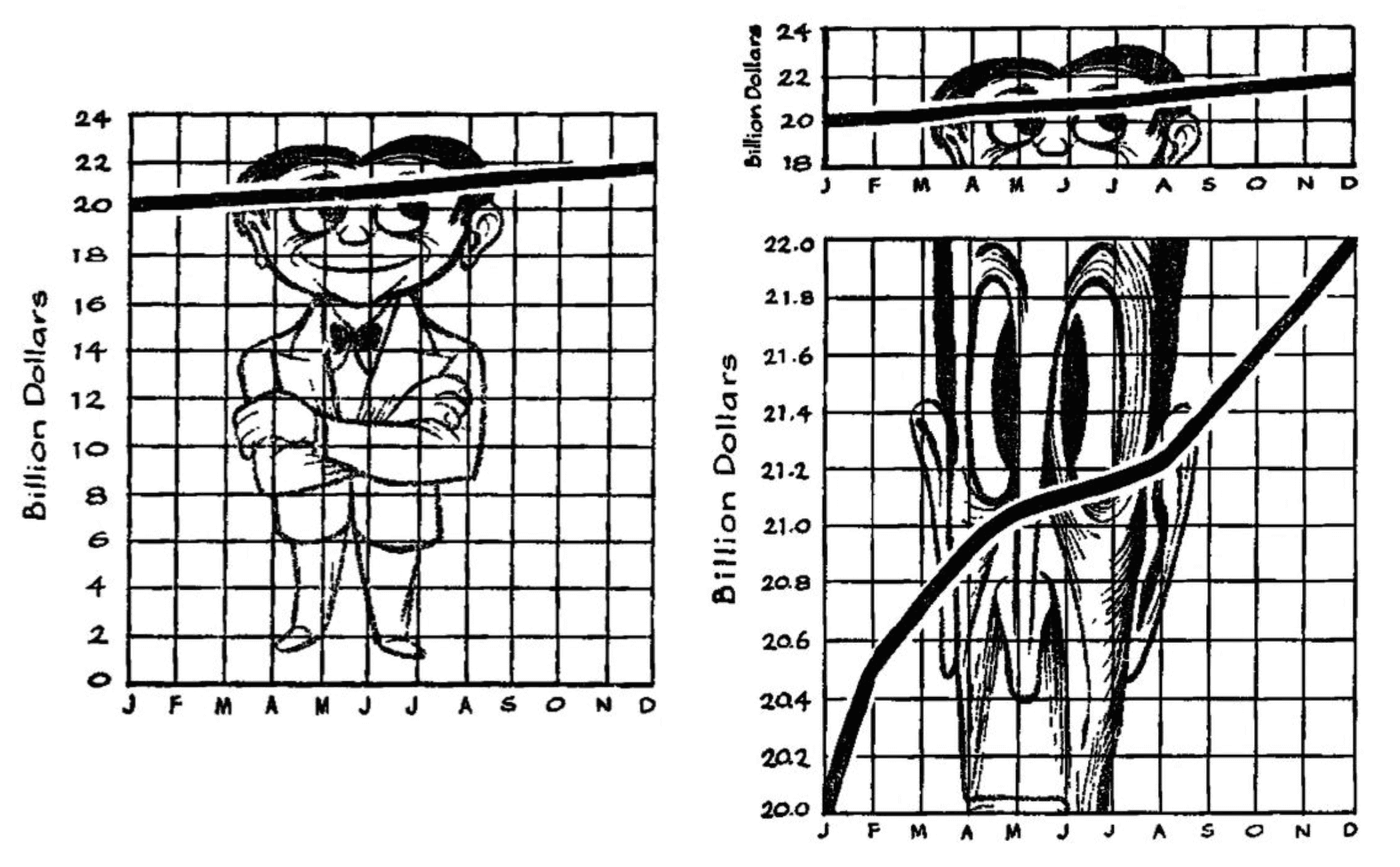
The chart on the left has its vertical axis extended all the way to zero. On the top right, it has been cropped, but is otherwise the same slope. Huff argues that this is a distortion, because it makes it seem as if the numbers increased by 100% over the course of the year. The bottom right chart stretches a very small vertical range across the same vertical area as the original graph. Clearly an exaggeration!
This example is interesting because it somewhat goes against Huff’s intended point. The first chart takes up a lot of space, making it impossible to see any pattern like the bottom right chart is showing. The inclusion of the zero doesn’t actually seem to be very meaningful for interpreting the data, or helping to read the chart.
But either way, the choice to cut off the axis or include zero makes a big difference. The question is, are people able to understand what they’re looking at?
What the research says
In a paper with the great title, Truncating the Y-Axis: Threat or Menace, Michael Correll, Enrico Bertini, and Steve Franconeri report on a set of studies where they tested the effect of cropping the y axis. They look into ways of indicating that the axis was cropped, as well as any differences in how bar and line charts would be affected.
In short, they find that there really is no difference between bar and line charts. People misread both kinds of charts, even when there are prominent indicators that the vertical axis has been truncated.
In a way, that is what we want: the chart is supposed to work as a graphical representation, and not require us to do mental math with the numbers on the axes. But it also means that we need to be very careful when designing charts and data visualizations, and can’t rely on people being able to spot a cropped axis.
This might mean that Huff was right, and all charts really should start at 0 – but the authors of this paper reject that. Instead, they think that it comes down to a judgment call: “The designer of the visualization, by selecting a y-axis starting point, has control over the subjective importance of the resulting differences.”
If zero is in the neighborhood…
This all might be a little unsatisfactory and not very helpful in practice. There is light at the end of the tunnel, though!
Famous statistician and blogger Andrew Gelman has come up with a pithy rule of thumb, “if zero is in the neighborhood, invite it in!” – and has illustrated it with a simple example.
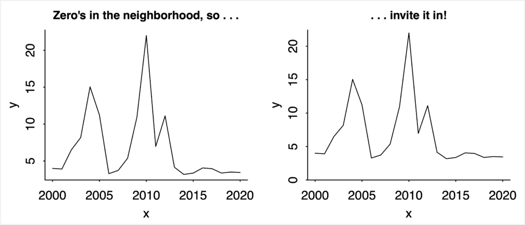
What this means is that when your range of values bottoms out close to zero, relative to the range of values, extend it down to zero. This doesn’t compress the chart too much, and helps avoid misunderstandings. If the values are in a range nowhere near zero, leave it out!
Going back to the example from Lying with Statistics, zero is nowhere near the values being shown, and should therefore not be included. In fact, including zero there compresses the line to the point where it no longer shows useful information.
Conclusion
Gelman’s rule is helpful for line charts, and while it does leave some wiggle room, it is quite straightforward and easy to follow. It does doesn't entirely take the decision out of the hands of the data visualization creator, and that’s a good thing. Data visualization is not an exact science, so taste and judgment are still important for good results.
Bar charts should always start at zero, however. This is also supported by the Threat or Menace paper I mentioned above, and remains a good, general rule.
Beyond bar and line charts, this question is usually less problematic. Area charts, when the area is of interest (rather than just for aesthetics), should start at 0, just like bar charts. The axes on scatterplots are usually scaled purely by the range of the values shown, since these really are read as position (unlike line charts, where slope is often more important).
For more on building better charts and dashboards, check out our other blog posts: