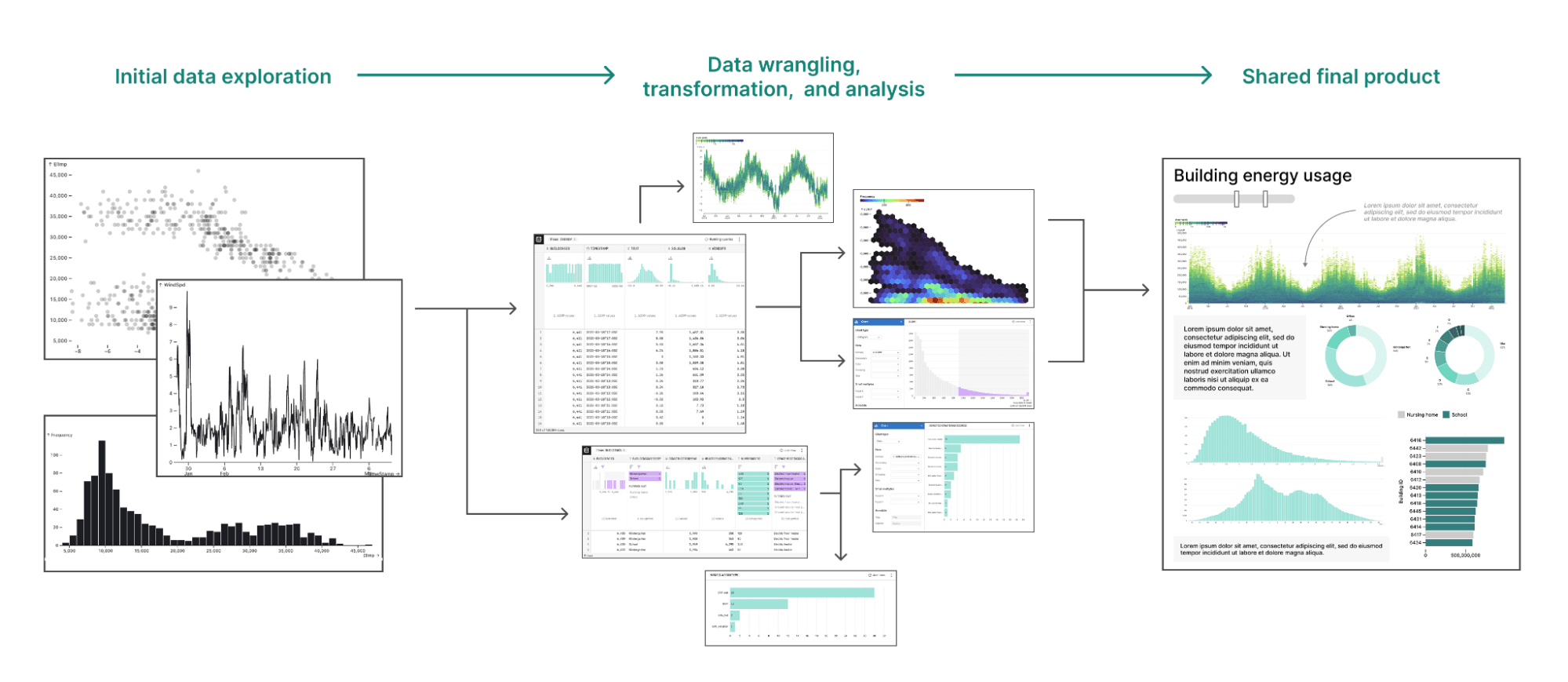
Data practitioners know that a critical first step in data analysis is taking a careful look at their data in exploratory charts and tables. They also realize the value of building clear, compelling visuals for end products like dashboards and reports. So when it comes to keeping a close eye on their data, analysts have the bookends covered.
But something unfortunate often happens in the in-between, when analysts are heads-down in data cleaning, wrangling, modeling, troubleshooting, and iterating: data visualization falls by the wayside.
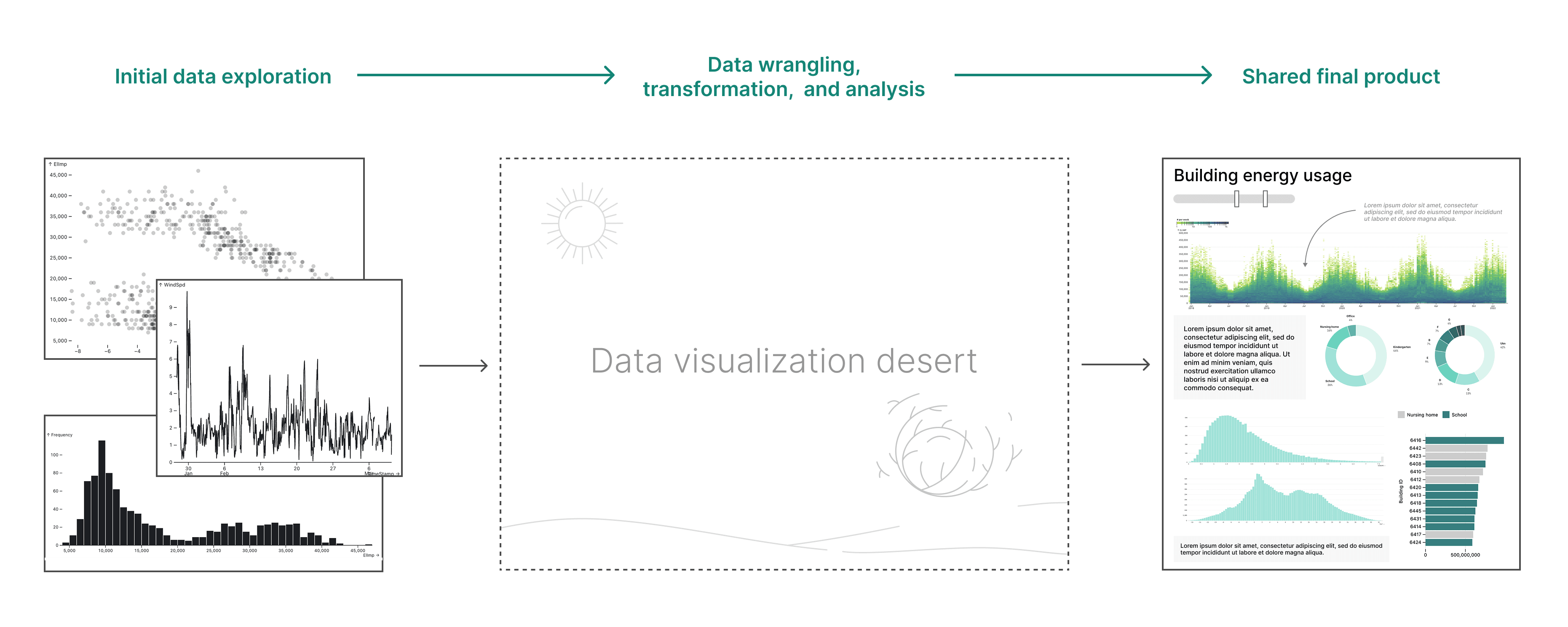
Visual data analysis merges data visualization and analysis, helping viewers to explore and answer questions about complex data through charts, tables, and graphics. That’s valuable throughout the entire analysis process, not just at the endpoints.
Here, we share how end-to-end visual data analysis creates more opportunities for discovery, supports cross-functional collaboration, and reveals mistakes before too much damage is done.
Create opportunities for on-the-fly discovery
In the messy middle of data analysis, new patterns and anomalies can be revealed as you wrangle, aggregate, and analyze data in different ways. This can inspire questions and exploration paths that you hadn’t previously considered. If you’re not visualizing the data at each step, however, those discoveries can remain hidden in overwhelming tables, or worse — entirely unviewable, only existing ephemerally within an intermediate line of code.
Manually building visualizations to explore the output of each data processing step can be prohibitively time consuming. Hence, the data visualization desert. A good alternative is to use tools that display or generate visual summaries at each step by default. AI is an increasingly powerful option to draft fast, exploratory charts, and can drastically cut the time and effort required to keep data visible throughout your data analysis.
Improve accessibility and interpretability
The data analysis process is often inaccessible to cross-functional collaborators like business and product managers who may lack familiarity with the programming languages or analysis tools used by your data team. And working openly, for example by sharing your code on GitHub, is a far cry from really empowering them to participate in your work.
Nowadays, most people have at least a basic level of visual data literacy. They’re constantly exposed to data visualizations in the news, through fitness tracking apps, while digging into unexpectedly high electricity bills, and more. Visualization has become somewhat of a universal language that allows many people — regardless of technical knowledge or skills — to make sense of data.
This makes visual data analysis an accessible way to help non-coding collaborators review and interpret analyses, and give high quality feedback. When collaborators visually follow how data is transformed throughout analysis, they can confidently interpret what they’re viewing at any point.
Notice mistakes and anomalies early on
In business analytics, mistakes are both inevitable and potentially costly.
Unit conversions get fumbled. Whole groups inadvertently disappear with the smallest typo (was it == “blueWhale”, or == “bluewhale”?). Oh, and that zip code? Yeah…at some point that got converted to a number, when it should have been treated as a nominal variable in your model.
The types of mistakes described above won’t show up as error messages in the console, since code doesn’t know (or care) if what you’re asking it to do with the data is actually correct. If you’re lucky, they’ll be caught in code review by an eagle-eyed colleague, or while diagnosing obviously wrong outputs. Unfortunately, data processing mistakes don’t always reveal themselves so easily.
Visualizing data throughout analysis is an additional way that you and your collaborators can catch mistakes. With more eyes on the data the whole way through, you’re more likely to identify issues with how it’s processed. And, since your team can visually track changes to the data at each step, it’s easier to determine exactly where in the analysis things went wrong.
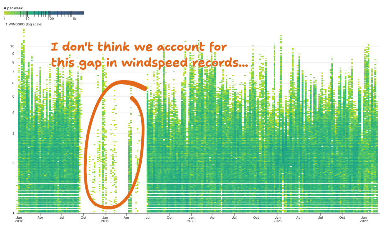
Visualizing data throughout your analysis increases the likelihood of finding mistakes and noticing anomalies (like missing data, as shown above) earlier in the process.
Finding mistakes may sound like a bad thing. But, if it happens early enough in the process, it’s a gift. Visual data analysis can increase the likelihood of catching mistakes and revealing red flags, before it’s too late.
Don’t let data out of your sight
Manually building exploratory charts at each step in data analysis can be prohibitively time consuming, which means it often falls by the wayside. The result is a data visualization desert that keeps costly mistakes and valuable insights in the dark.
End-to-end visual data analysis helps you to keep eyes on the data throughout your analysis, ensuring that surprises — whether exciting, or concerning — don’t go unnoticed. By using tools that make it quick and easy to see your data throughout the analysis process, instead of just at the bookends, you can maximize visibility without slowing down for more accurate and interpretable insights.
Want to learn more about best practices for modern data exploration and analysis? Check out other recent posts on the Observable blog, and sign up for our newsletter to see new resources as they come out: