Newsrooms have long been at the forefront of data visualization, turning messy datasets into clear, powerful stories that resonate with broad audiences. On December 4th, leading data journalists, Jared Whalen (Polygraph/The Pudding), Ben Welsh (Reuters), and Kavya Beheraj (Axios), gave us a peek behind the curtain on their process. The hour-long discussion covered topics like knowing if there’s a story worth telling in the data, collaborating with others, and tips for communicating with clarity, urgency, and impact for the broader data visualization community.
Here’s our recap of our webinar, “Storytelling with data: From raw data to reader impact.”
Showcasing real-life stories that made an impact
We kicked off the conversation with a “show-and-tell” with each panelist sharing a data visualization they worked on that they felt was impactful. As they walked us through the background and process, they also reflected on key learnings.
Skip to 3:29 to listen to this segment.
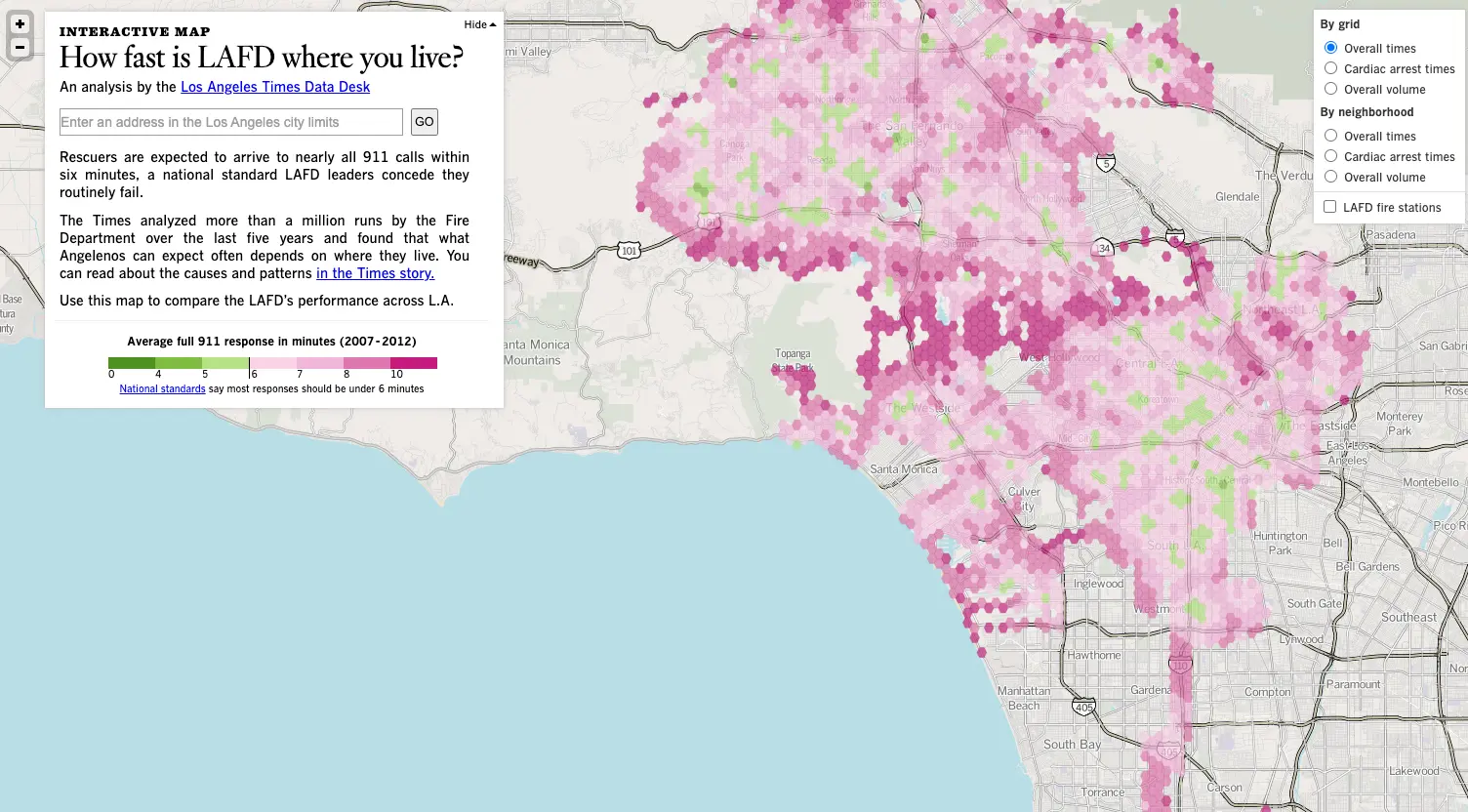
Ben Welsh: Visualizing Los Angeles Fire Department response times
Ben shared a map of Los Angeles Fire Department (LAFD) response times he created for The Los Angeles Times after a mayoral candidate in 2012 publicly questioned the speed of 911 responses. To fact-check the candidate’s claims, the team conducted their own analysis with millions of 911 call records. They then used national response-time standards as an external benchmark to objectively evaluate performance.
“In any data visualization, if you wanna get more investigative, [it’s important to] have that outside standard or something to measure up against that isn't just like ‘according to you’ or according to its standard deviation in the distribution, but some real benchmark.”

Ben Welsh, News Applications Editor, Reuters
The map surfaced two major issues: extremely slow response times in wealthy hillside neighborhoods and widespread delays near the city’s borders where fire stations were less accessible. Further analysis uncovered that the longest delays weren’t due to travel time but due to the early call-taking and triage process. The data visualization and accompanying reporting highlighted new findings and sparked significant reforms, such as revamped call-taking procedures and the creation of an internal statistical analysis unit at the LAFD.
Jared Whalen: Examining reporting on trans issues
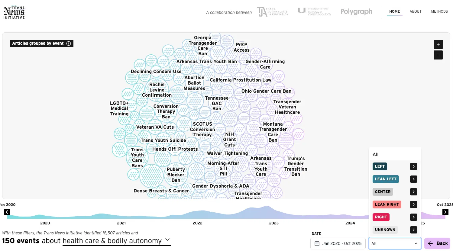
Jared shared a recent Polygraph project built in partnership with the Trans Journalists Association to “audit” how the news industry covers issues related to transpeople, such as healthcare and state legislation. Using the Media Cloud API, the team assembled hundreds of thousands of relevant articles over the past five years.
Using a large language model (LLM) classifier, they then sorted coverage into themes. For instance, the dataset surfaced roughly 18,000 healthcare-related articles, which the LLM further clustered into about 150 discrete news events. This helped reveal which stories dominated coverage.
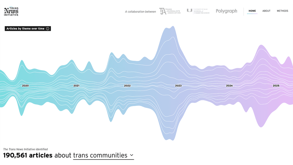
The goal, Jared explained, was accountability: giving journalists and readers a way to understand how newsrooms talk about trans-related topics. The resulting interactive let users drill into individual articles, compare coverage by publication and political leaning, and see how attention surges over time through beeswarm visualizations and time-series views.
One of the most crucial parts of the project, according to Jared, involved weaving in community feedback on how coverage should be framed. Because it’s built to run continuously, the dataset updates each month while the team periodically audits and retrains the model.
Kavya Beheraj: Localizing wildfire-smoke data
Kavya walked through a wildfire-smoke visualization she built after the East Coast’s unprecedented orange-sky summer in 2023. The goal was to explain what made that season’s smoke so extreme and what it signals about our “new normal” in air-quality exposure.
A key feature of the piece was a localized dashboard that let readers search their metro area and compare recent pollution levels against a decade of historical data. Because Axios has more than 30 local bureaus, the team wanted a way to turn a massive national story into something personally relevant for readers in each city.
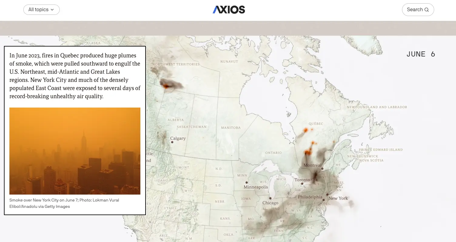
The visual design showed the most recent readings, how they compared to long-term averages, and whether conditions were considered healthy under federal standards. The team also included practical guidance on protecting yourself from wildfire smoke.
By investing in cleaning and preparing the data for local markets, Axios was able to repurpose the information and extend the story’s impact far beyond its initial publication.
Finding the story in messy, imperfect data
We asked our panelists: “When you're handling a messy dataset, what is your first step in figuring out if there is a story worth telling?”
Skip to 25:14 to listen to this segment.
Jared’s take was to ask why the dataset exists in the first place and understand how it’s used. He continued on to add that referring to documentation or talking with the data manager to get that context should be the first step when you encounter a new dataset.
“It's very tempting to dive right into it and inject your interpretation of what it could tell you…But what can often end up happening is you spend a lot of time getting the data to what you think it should look like, only to find it doesn't actually tell you what you think.”

Jared Whalen, Senior Journalist/Engineer, Polygraph/The Pudding
Ben cautioned that even a small misunderstanding of a row or column can skew your entire analysis. He advised our audience to go back to the fundamentals of the table itself, slowing down to ask what a row even represents.
“What is a row? And I mean that in the most philosophical and Socratic sense. What does each row represent? What is it recording? What does each column indicate?”
Ben Welsh, News Applications Editor, Reuters
Kavya followed up to reinforce the importance of understanding the data at basic level and adding, “Trust your gut. If something is confusing to you, then it's probably going to be confusing to other people.”
A peek under the hood: Process and workflows
When it comes to how visual stories actually get made, the panelists agreed on one thing: there is no single newsroom workflow. Each team blends tools, roles, and processes differently, depending on the story, the deadline, and the people involved.
Skip to 46:55 to listen to this segment.
Ben noted that newsrooms rarely operate like traditional product teams with a clear division of labor. Instead, they rely on a flexible mix of practices and tooling. Most custom visual stories are ultimately built with some combination of static-site tooling and templating systems (“Frankenstein” stacks, as he put it).
Jared emphasized that deciding whether to design in Figma or directly in code is always case-by-case. Data-heavy stories often need to be shaped by the data itself, making early mockups risky. In other cases, having clean design prototypes upfront can dramatically speed up development. Bespoke visuals rarely follow a predictable formula.
Kavya added that even within a single newsroom, workflows can vary by person. One teammate might explore data in R, and another in a spreadsheet, but they “all end up in the same place.” She continued to describe that a lot of the processes are “cobbled together” and reflect what they personally think is the best approach at the moment.
Cross-disciplinary lessons from data journalism
We tackled how principles of data journalism can apply to business and product teams. Kavya recalled previous experiences building dashboards that she’s “not sure anyone actually used or saw.” She highlighted a key challenge — the assumption that all of the data points matter — and encouraged our audience to instead take a step back and consider the users of the dashboard, how it will be used, and how it will be maintained.
Skip to 30:07 to listen to this segment.
When the subject collaboration was introduced, the panelists shared two insightful takeaways: let the story be the north star and remember to let others contribute and shine.
“It helps to let the story steer the ship…Every person who's contributing to this story is supporting the whole. The visual has to work with the words, it has to work with the style, and it has to work with the social strategy. Our mission is to produce the best story possible and to tell a specific narrative. It is humbling and also helpful to have that to fall back on…”

Kavya Beheraj, Associate Editor of Data Visualization, Axios
How technology and AI are reshaping data storytelling
The panelists agreed that the landscape for data visualization tooling has never been more accessible. Over the past decade, the rise of open-source tools, cloud-based workflows, and even data visualization communities has dramatically lowered the barrier to building bespoke visual stories. Tools like Observable make it easier to explore data, build prototypes, and ship polished visuals.
As is expected, AI is beginning to reshape the data workflow. Ben shared how Reuters now uses an internal chatbot capable of generating Datawrapper charts on command, while Kavya described Axios’ experiments with AI-assisted data triage to help reporters assess whether a dataset is clean or meaningful enough to visualize. Across the board, the panel emphasized that AI excels at the “monkey tasks,” while human judgment still governs narrative decisions.
Closing thoughts
At the end of the hour, our audience got an insightful peek behind the scenes at how data journalists work: grounding stories in rigorous analysis, localizing national issues to make them meaningful, and collaborating with others. They shared how technology and AI are reshaping the craft and how each team adapts their workflows to the needs of the project.
Want to hear more from our guests? Watch the full webinar recording here. Explore additional work by these panelists at their website or on Observable: Jared Whalen (website, Observable), Ben Welsh (website, Observable), and Kavya Beheraj (website, Observable).