Data visualization sits at a crossroads: part analytical discipline, part creative craft. On Nov 11, we hosted Art + science: Blending creativity and analysis in data visualization, a webinar on how three data visualization leaders — Kelsey Nanan, Tanya Shapiro, and Shirley Wu — strike that balance in their work.
What transpired was an engaging discussion covering fundamentals, such as chart choices and collaboration, and the more abstract, such as how personal backgrounds influence data visualization work, creative risk-taking, and even the future of AI in data visualization.
Here’s what stood out from the discussion.
Starting a project: design or analysis first?
When asked whether they approach new visualization projects as designers or analysts first, all three panelists gave the quintessential data practitioner answer: “It depends.”
Skip to 4:23 to listen to this segment.
For Kelsey, personal projects start through a design lens, but on client projects she leans more analytical, focusing on technical constraints and feasibility from the get-go. Tanya, who often wears both hats at different points in a data visualization project, thinks of herself as an analyst while uncovering the message behind the data, then moves into design mode to translate it into the right visual for her audience. Shirley lightheartedly shared a key lesson with our attendees: “Do not start with code first.” Now, she begins with light data exploration, and then fluidly moves back and forth between analysis and design throughout the project.
What I learned from my projects is I can come up with the funnest design, but when I plug the data in, the shape of the data just doesn't fit very well.

Shirley Wu
Choosing the “right” chart
A key part of a data visualization designer’s job is deciding on the “best” type of chart to accurately and effectively represent the data. When asked how they make these types of decisions, our guests agreed that the audience’s data literacy is a major influencing factor.
Skip to 9:35 to listen to this segment.
I've got to be cognizant of the data literacy level of my audience and meet them with the right graphic vernacular to convey that story. A box plot might be a ‘standard’ chart type for me, but someone working in insurance might not understand it right off the bat. I have to meet them where they're comfortable.

Tanya Shapiro
Experimentation, speed, and iteration also emerged as themes. Kelsey referenced her use of low-code tools like RAWGraphs and Flourish to quickly see what the data might look like as different chart types, while Shirley mentioned Observable Plot and even hand sketching as part of her approach.
Working collaboratively with others
When asked about working with clients, all panelists agreed that bringing more voices into a data visualization project can yield better results in the end — but isn’t without its challenges. They each shared practical advice for working collaboratively: iterate and get drafts out quickly, don’t be precious about your ideas, be thoughtful in choosing who you work with, and always have mutual respect and trust for one another.
Skip to 35:57 to listen to this segment.
Get things out quick and iterate. Don't try to aim for perfection. Oftentimes, I feel like most people know what they don't want versus what they do want. When you put things out in front of them, you're creating conversations.
Tanya Shapiro
Personal background as creative inspiration
Our panelists all spoke to the role that their individual backgrounds shape their work and each shared a data visualization that is representative of their evolving data visualization journeys.
Skip to 16:29 to listen to this segment.
Kelsey shared a playful holiday card mimicking the ups and downs of an emotional year marked by a torn ACL and months of surgery. She created a ski-slope-themed chart that, according to her, “breaks all the rules,” intentionally incorporating “chart junk” like vertical text and even an animated stick figure collapsing at the bottom.
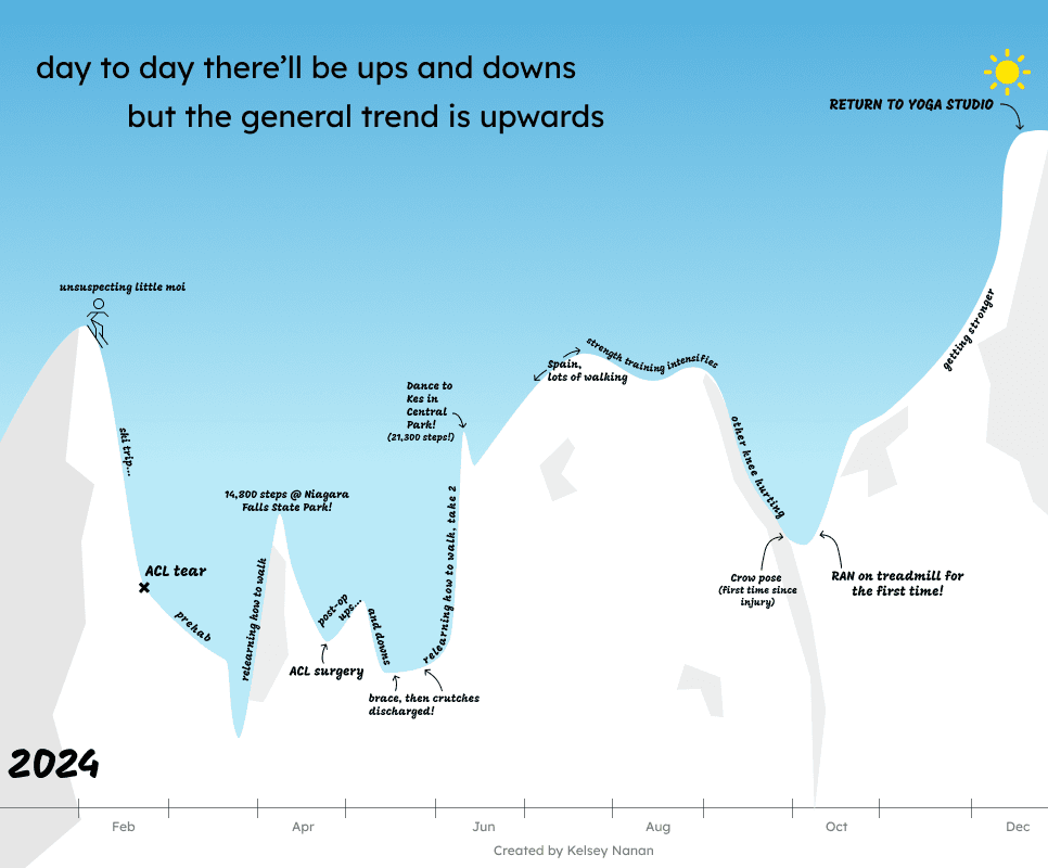
Data viz was such a great way to memorialize 2024, and I think breaking the rules just helped me get across what a meaningful journey this was.

Kelsey Nanan
Shirley then shared two deeply personal data “physicalization” pieces: a dripping-ink performance of her monthly cycle and a piece representing home, belonging, and immigration using tree rings and dissolving paper.
Tanya explained that at a young age, she found a creative outlet in music. Learning guitar by studying song covers, then remixing ideas into her own, shaped how she now approaches data visualization: through experimentation and borrowing inspiration from others. Her NBA beeswarm chart was the outcome of learning D3 and exploring examples from the Observable community.
Perspectives on AI
Our panelists all use AI in their work — with guardrails. They emphasized its ability to generate beautiful charts, but recognized its shortcomings in comprehension, critical reasoning, context, and lived experience. Tanya suggested using AI “as a stencil,” while Shirley spoke about the exciting potential of using AI in analyzing qualitative data.
Skip to 48:23 to listen to this segment.
Lightning round: advice for early-career practitioners
We closed the webinar by asking our panelists to share one piece of advice they wish they had known early in their data viz careers. For Tanya, it was about finding community to accelerate growth. Kelsey spoke on using low-code tools to speed early exploration, and Shirley cautioned against trying to do everything alone.
Want to hear more from our guests? Watch the full webinar recording and explore their work on Observable: