What if you could take a map, ignore all the messy borders, and turn it into a clean, tile-based layout — without losing its geographic meaning? That’s the idea behind grid cartograms, an engaging and powerful way to visualize spatial data. Instead of using traditional map shapes, grid cartograms represent regions like states or countries with uniform geometric tiles, arranged in a roughly geographic layout.
This design makes it easy to spot patterns, compare regions side by side, and gives small areas equal visual weight next to larger ones. It’s a favorite among data journalists, policy analysts, and visualization developers alike. In this post, we’ll explore what grid cartograms are, why they’re useful (and when they’re not), how they compare to other types of cartograms, and how you can start building them in Observable.
What is a grid cartogram?
A grid cartogram is a type of map that represents subregions using tiles of the same shape, arranged to reflect their general geographic locations while avoiding overlap. The most common tile shapes are squares and hexagons. For example, the grid cartogram below by Joe Davies of Eurostat visualizes GDP for European countries using hexagonal tiles. Visit the Observable Notebook to see the code, and to toggle between hexagonal and square tiles.
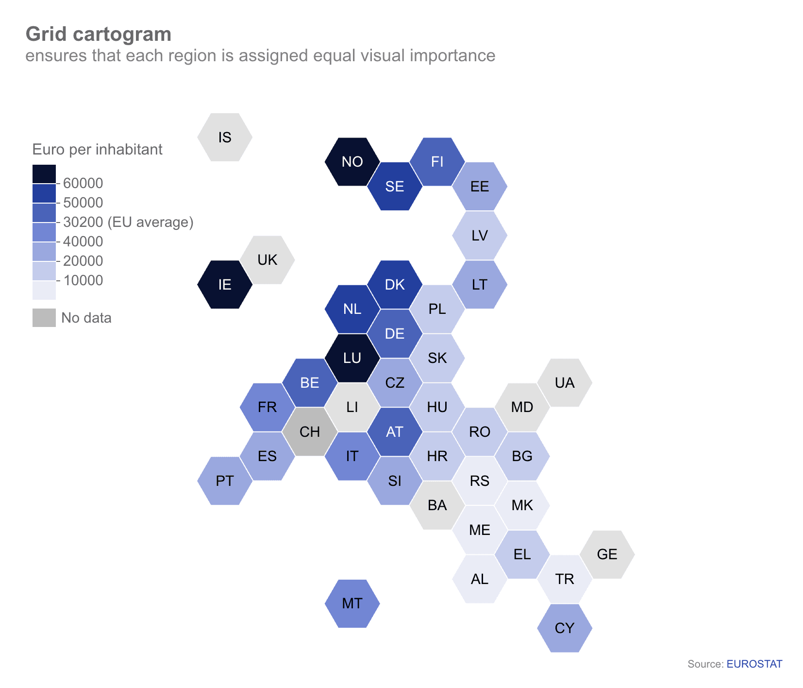
In the grid cartogram above, each country is represented by a single tile, with color used to indicate GDP. This gives smaller countries like Liechtenstein (LI) and Cyprus (CY) — which would be nearly invisible if scaled to their true land area — equal visual representation alongside larger European countries.
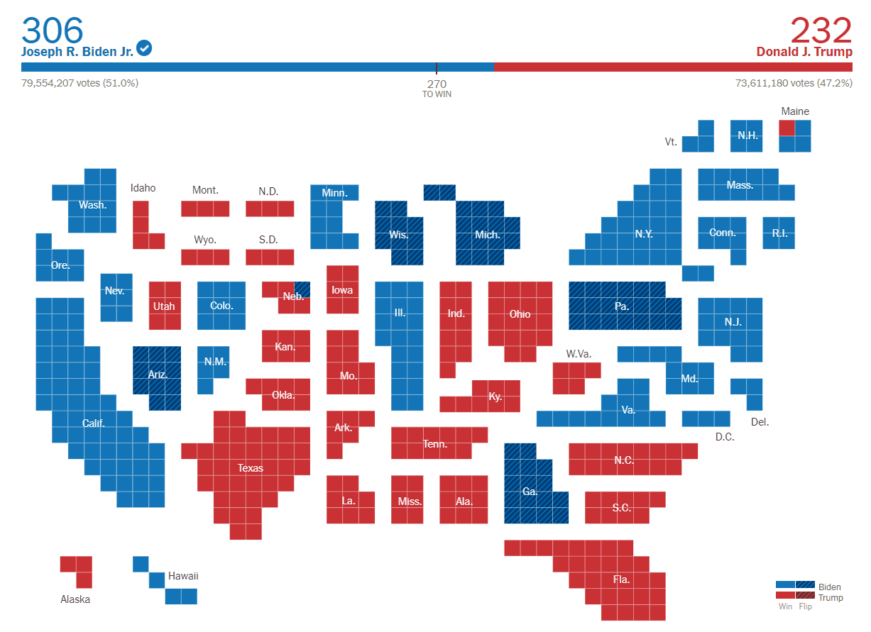
An alternate approach to grid cartograms sticks to the grid layout, but each tile represents a unit of measurement (for example, one tile for every 1000 people) instead of the “one tile per region” approach shown above. The non-contiguous grid cartogram below from the New York Times’ Learning Network shows outcomes for the 2020 U.S. presidential election, with each square representing a single electoral college vote:
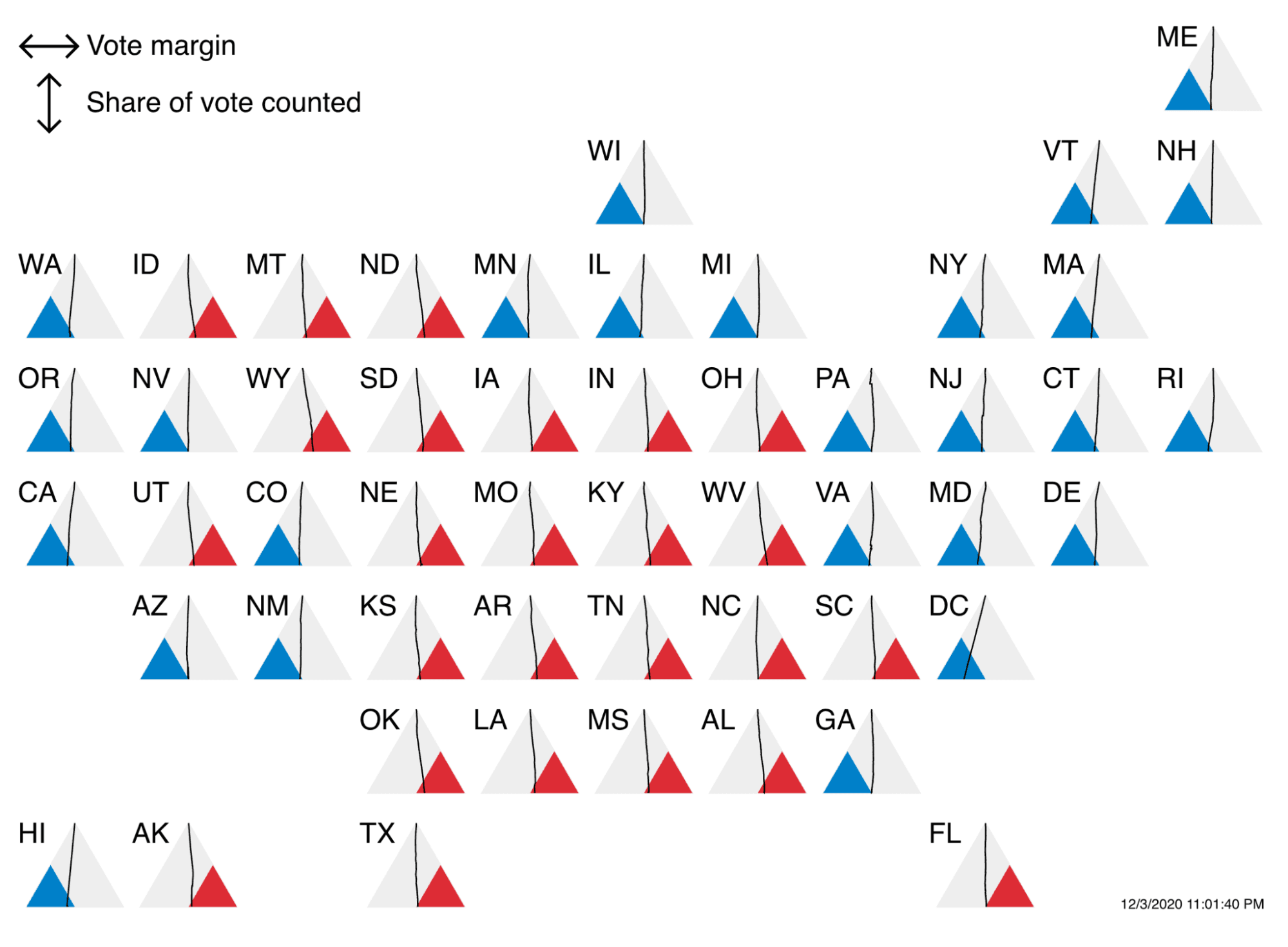
While the grid layout may seem like a constraint, you actually have quite a bit of flexibility regarding tile shapes and content. The grid cartogram below, by Observable Software Engineer Toph Tucker, uses a unique triangular tile subdivided to show election outcomes by state for the 2020 U.S. election. A line extending from the top point of each triangle veers left (Biden) or right (Trump) as votes are returned, with the final vote margin intersecting the triangle base.
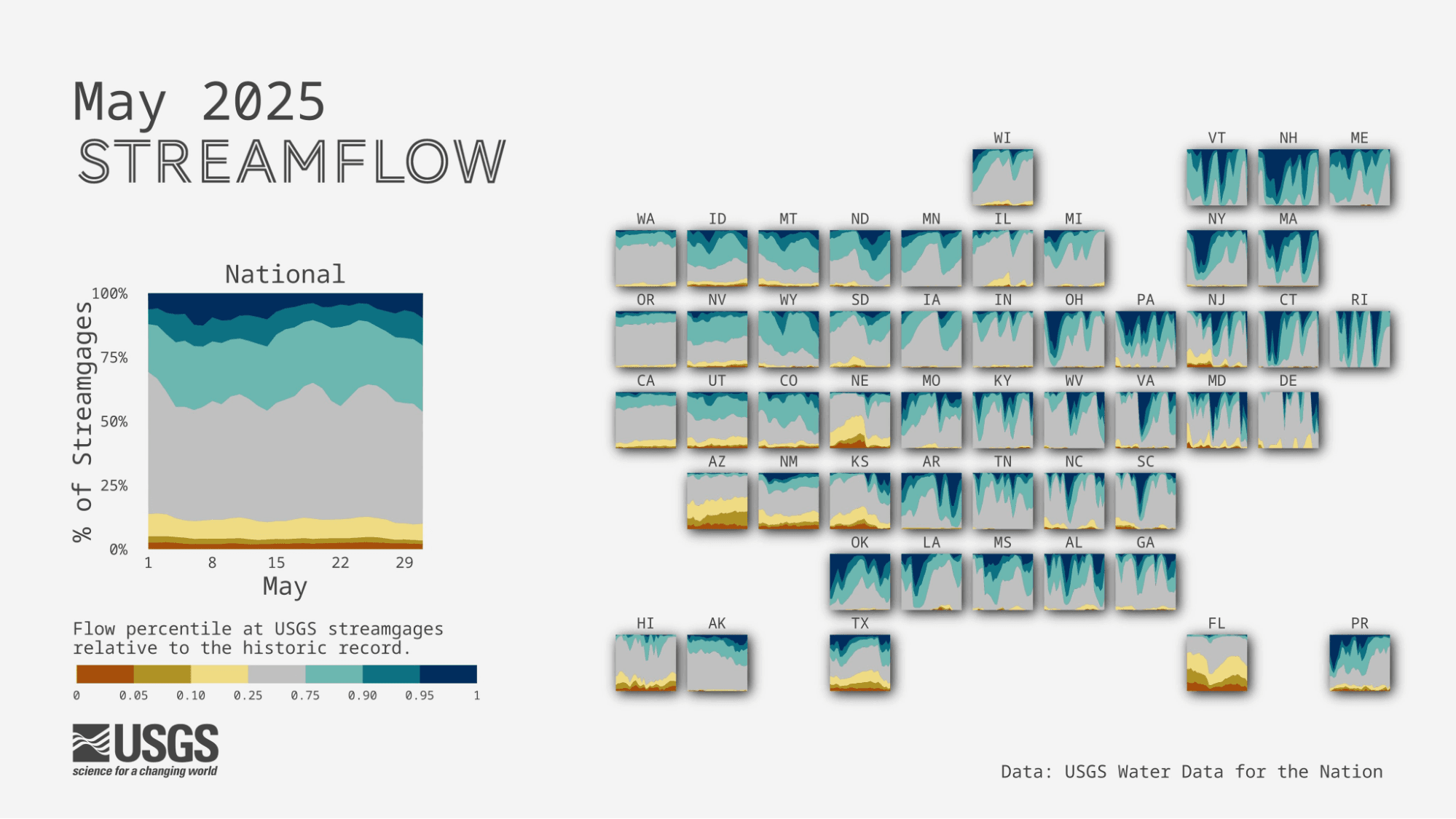
Each tile in a grid cartogram can even house an entire additional chart to display small multiples in a meaningful spatial layout. For example, the USGS Vizlab team creates stunning grid cartograms to visualize streamflow by state, relative to historic records:
What are some of the pros and cons of grid cartograms?
Grid cartograms might be a good option for your thematic maps for a number of reasons:
They simplify complex spatial data into a clear, digestible grid that helps a viewer focus on comparing values between regions, rather than on extraneous details of state or country boundaries.
Each region is the same size and shape, it puts smaller regions that can be overlooked or underrepresented on a more even playing field alongside larger ones.
Grid cartograms can add a meaningful spatial dimension to faceted charts or small multiples, as seen in the USGS stream gauge chart above.
The overarching drawback of grid cartograms is geographical inaccuracy. Because grid cartograms represent regions using simplified geometric tiles, information about the true (and relative) size and shape of each region is sacrificed. And, because tiles are snapped to a grid, their relative locations are imperfect: regions that share a border in reality can appear at a distance from each other in a grid cartogram, and vice versa. When recognizable boundaries and exact locations are eschewed for a simpler display of gridded tiles, it can be difficult for viewers to understand what they’re looking at and quickly recognize regions of interest.
What are some common alternatives to grid cartograms?
Depending on what you want to emphasize in your visualization, you might choose other cartogram variations. Here are some common alternatives:
Dorling cartogram
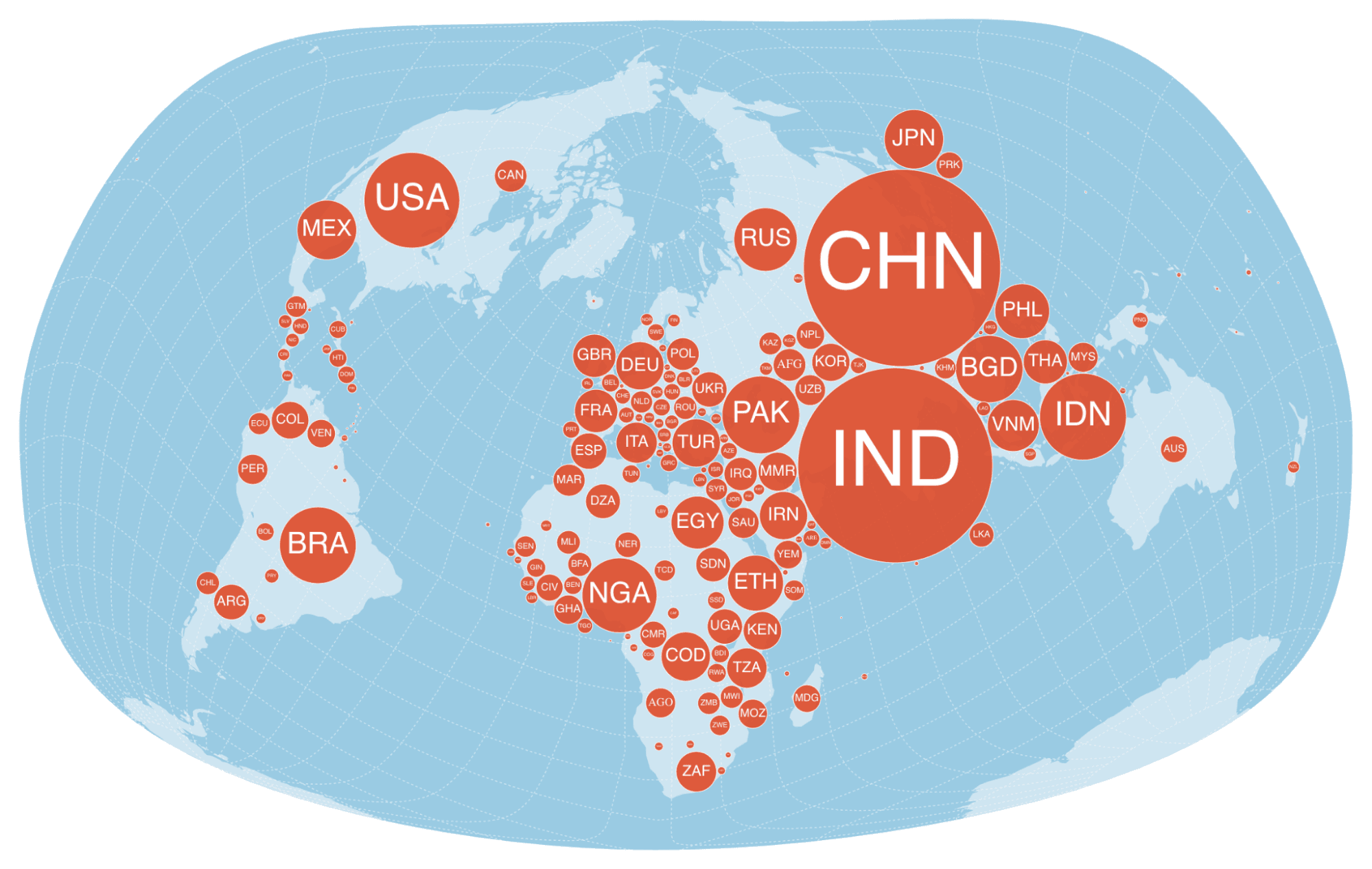
A Dorling cartogram, like a grid cartogram, represents all regions using the same simplified geometric shape. They differ from a grid cartogram because tiles are scaled based on the value of interest. The Dorling cartogram below, created by Observable Ambassador Nicolas Lambert, represents each country as a circle, with circle surface areas proportional to each country’s population in 2019. Note that in a Dorling cartogram, tiles aren’t aligned to a grid. Here, they are first placed at each country’s centroid, then nudged to avoid occlusion. Visit Nicolas’ notebook to explore the code.
Contiguous cartogram
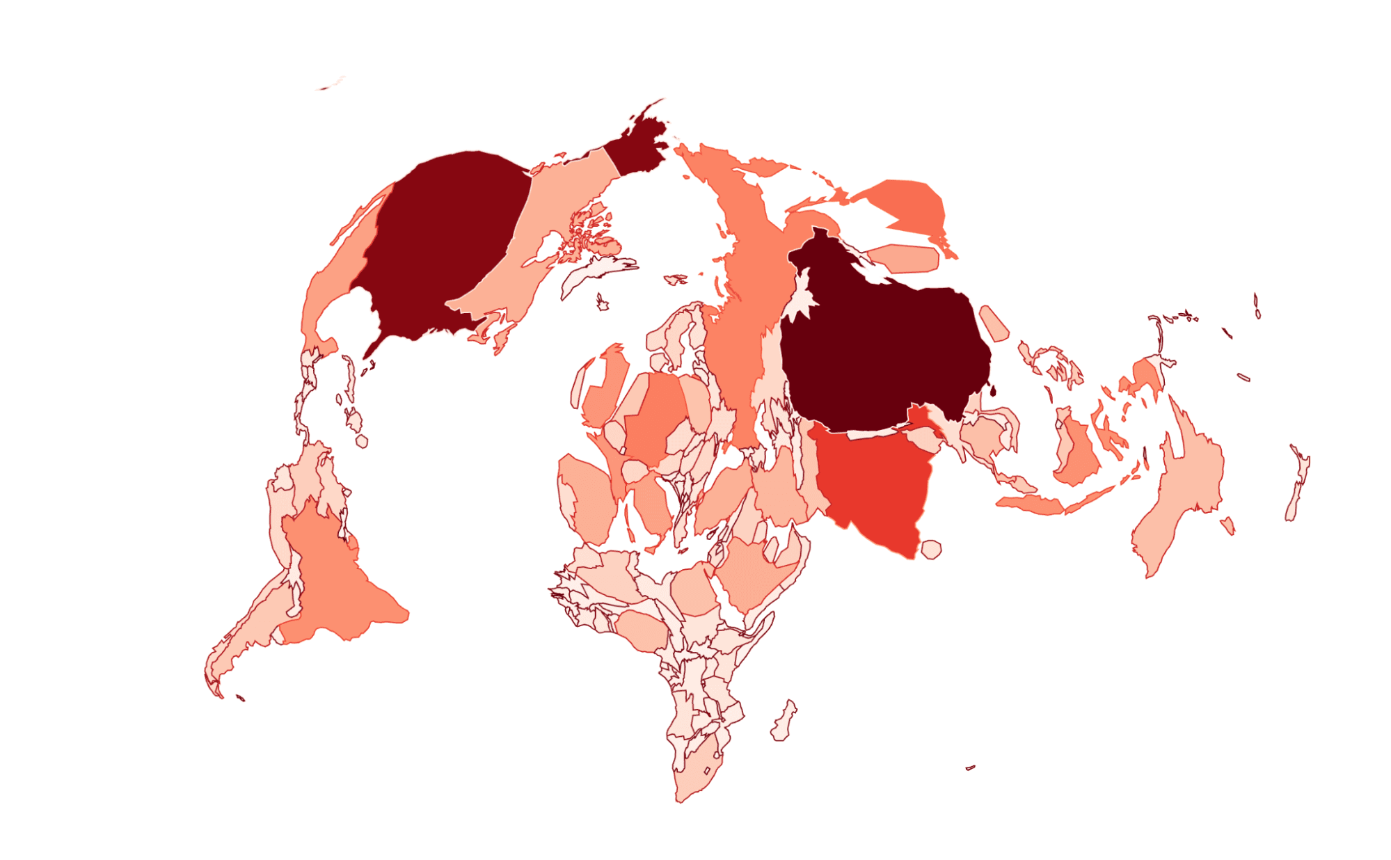
If you just see “cartogram” on its own, that often means a contiguous cartogram, sometimes called a value-by-area map. In contiguous cartograms, regions are warped such that contiguity between adjacent regions is maintained, but the area of each reflects a quantitative value (like population, GDP, or carbon dioxide emissions) rather than the land area.
Below is a contiguous cartogram, made by Nicolas Lambert and Observable Software Engineer Fil Rivière, showing GDP by country. Explore their notebook to see the code, toggle between quantitative variables, and to see how the map changes with different levels of exaggeration.
Non-contiguous cartogram
One issue with contiguous cartograms like the one shown above is that, in order to maintain contiguity, regional shapes can get so warped that they become unrecognizable. In some cases, it might be worth it to trade contiguity for more accurate shapes.
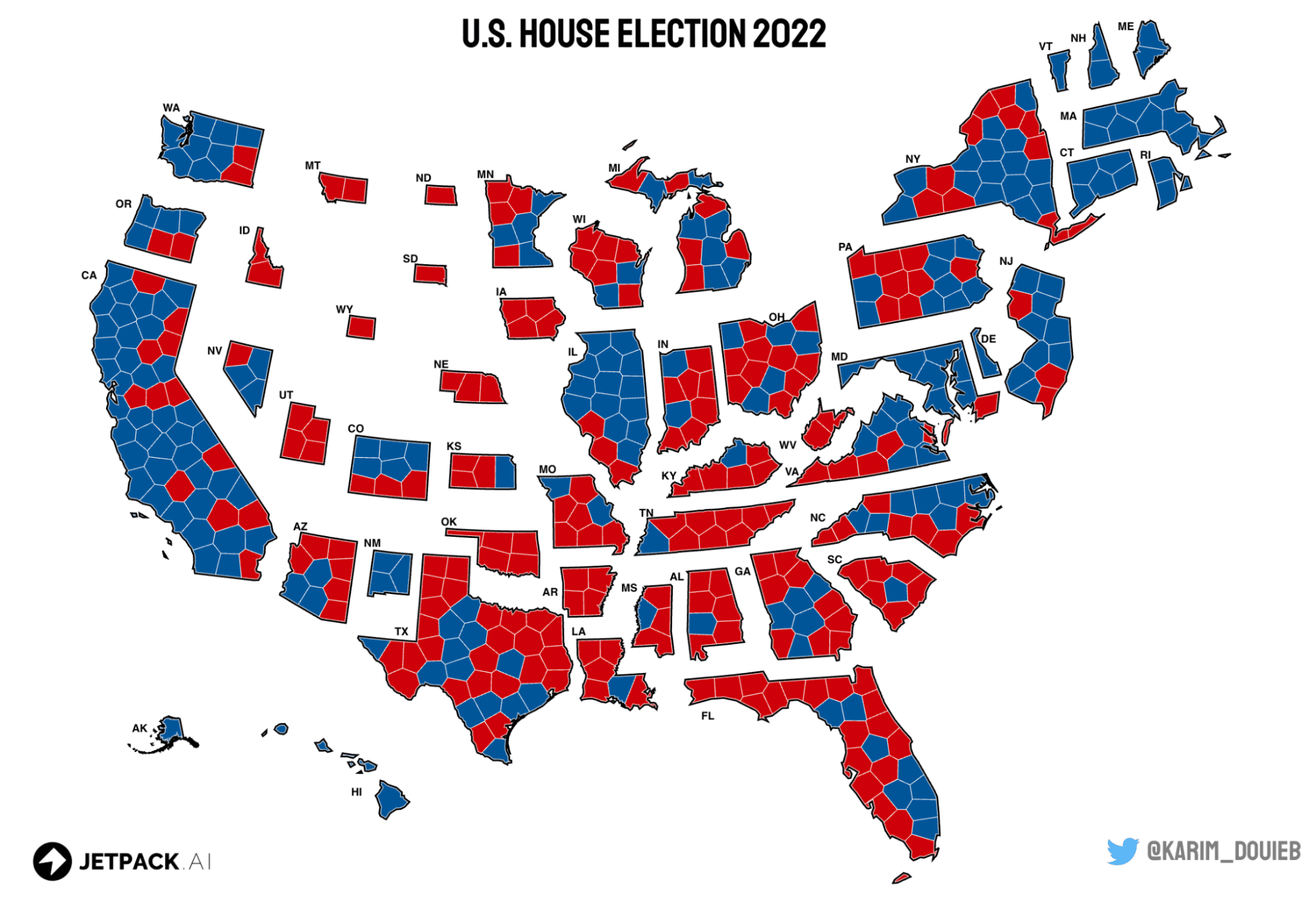
Non-contiguous cartograms avoid the distortion issue because they don’t try to keep adjacent regions connected, so you can show regions that are geographically accurate, while still representing a value using size.
For example, the cartogram below by Karim Douieb, data scientist and co-founder of Jetpack.ai visualizes results of the 2022 U.S. House election, with size scaled proportionally based on the number of districts in each state. See Karim’s notebook for a thoughtful explanation of this approach, and to toggle between a traditional (contiguous) map and the non-contiguous cartogram. You can also learn more about the process of building and iterating on this spatial data visualization by watching Karim’s talk during our annual virtual event, Observable Insight, on Rethinking Election Maps.
Start building grid cartograms with Observable
If you’re interested in creating grid cartograms for your own spatial data visualization, here are some great resources to explore as you get started:
Observable Ambassador Sylvain Lesage has created an excellent overview notebook describing grid cartograms with a plethora of examples, useful resources, and considerations
See Observable Ambassador Nicolas Lambert’s fantastic collection of cartogram examples, with reusable code to make the following in D3:
Value-by-area map (or Dougenik cartogram)
Explore and reuse the non-contiguous cartogram template from the D3 graph gallery