For years, data analysts have struggled with inflexible linear workflows commonly encountered in legacy business intelligence (BI) tools. These promised organizations greater accessibility to their most important data to inform more strategic decision making. But in reality, legacy BI tools fell short:
Linear workflows stymie new exploration, leaving valuable insights in the dark
Dashboards are hard to build and maintain, so they often rot
Legacy BI tools offer limited customization and interactivity, making bespoke or advanced visualizations difficult to generate
Most importantly, legacy tools do nothing to bridge the knowledge gap between analysts and their stakeholders. Legacy BI tools can be helpful for static reporting and dashboard development at the tail end of a project, but they weren’t built for the messy, collaborative, and iterative nature of modern data analysis workflows.
That’s why leading data teams are switching to Observable Canvases: it’s built for cross-functional collaboration, powered by AI, and backed by a global community of data practitioners.
A new kind of data tool
Observable Canvases are collaborative whiteboards designed for modern data analysis workflows. Instead of splitting your time between SQL editors, visualization and dashboarding tools, and siloed communication platforms, you can do it all in one workspace — helping you quickly and seamlessly explore, analyze, and your most important data.
Why legacy BI tools fall short
Data analysis is a cross-functional process, and legacy BI tools don't support cross-functional teams or workflows. These tools assume that analysts and stakeholders all know exactly what’s in a data warehouse, and how it’s structured.
In reality, data is messy, business and stakeholder requests are constantly shifting, and analysts spend most of their time buried in repetitive prep work that is hindered by restrictive linear workflows. Querying data happens with one tool, wrangling and analysis in another, and visualization and dashboard development in yet another tool.
BI tools work well for what they were designed for: simple dashboard creation, with relatively simple data. But they’re too rigid for the exploratory, collaborative nature and complexity of modern data work.
Generic charts only surface shallow insights
When legacy BI tools force every question into the same handful of chart types, such as standard bar graphs, pie charts, and line graphs, nuances get flattened and patterns stay hidden. Complex datasets, or datasets with high-cardinality fields, outliers, or non-linear relationships can be particularly challenging for legacy solutions. Overlaying multiple metrics, utilizing dual axes, or adding interactive elements requires workarounds or custom codes in legacy tools, slowing down BI analyst workflows.
BI tools fail to bridge the knowledge gap between analysts and stakeholders
While analysts understand the data and stakeholders understand the business, legacy BI tools make it difficult for these cross-functional teams to collaborate effectively. Stakeholders often make urgent requests without the full context of the data they’re seeking to understand, leading to incomplete analyses.
By the time a stakeholder reviews the chart or dashboard, the context of how the data was processed and analyzed is lost, eroding trust through endless back-and-forth feedback cycles, out-of-band communication, and excessive iteration. Analysts become order-takers rather than strategic partners, forced into brittle workflows that discourage iteration and slow down decision-making.
BI tools lack robust AI features
Pasting prompts into a separate chatbot isn’t the same as integrated AI that has the full context of the task at hand. When legacy BI tools offer AI features, they don’t offer transparency into the AI’s reasoning. As a result, AI outputs are erroneous or misleading, eroding institutional trust in those bolted-on AI features. In the end, the AI functionality in legacy BI tools is simply not used.
Why data analysts turn to Observable for BI
Observable Canvases are the connective tissue between data teams and stakeholders, facilitating seamless cross-functional collaboration. While data teams are comfortable with technical interfaces, Canvases ensure that their analysis is consumable and interpretable by non-technical audiences.
This collaborative environment frees data analysts from repetitive tasks, allowing them to focus on discovering and sharing insights, and enables faster iteration and more efficient delivery of interactive charts than with siloed legacy tools. Both data teams and stakeholders can immediately see data sources and track transformations, improving interpretability and trust. Furthermore, the AI's operations and outputs are verifiable directly on-canvas, allowing analysts and collaborators to ensure accuracy.
Build visualizations and discover insights, faster
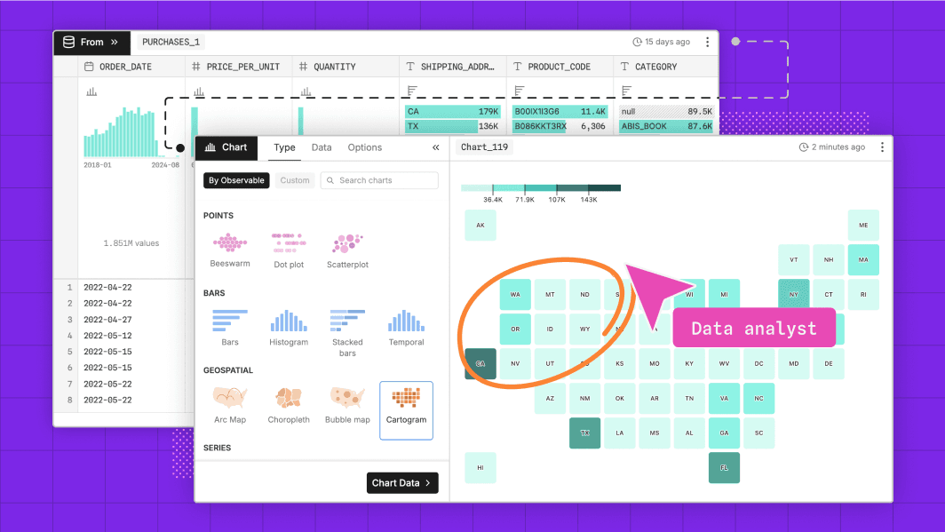
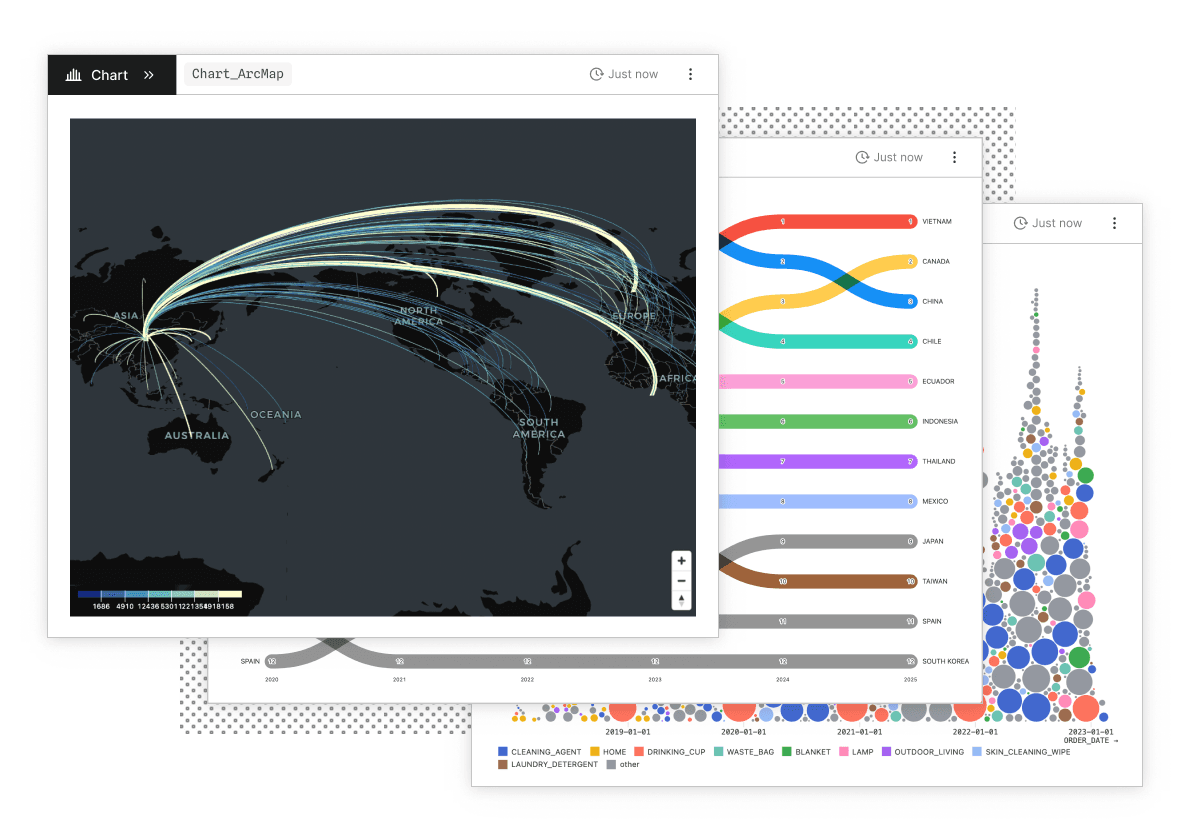
Create expressive, interactive data visualizations in seconds. Chart creation is lightweight and easy in Observable Canvases, meaning there’s a low barrier to entry to exploring multiple different views or slices of data, leading to more meaningful takeaways in less time. From basic charts like scatterplots and histograms, to advanced options like Sankey diagrams, beeswarms, and arc maps, our built-in charts automatically and thoughtfully handle tricky edge cases including high cardinality data, outliers, spiky distributions.
Shared context by default
Every canvas is a living record of the work: queries, joins, filters, annotations, and discussion live alongside data visualizations. Stakeholders see not just the “what,” but the “how” and “why,” which improves interpretability and shortens the path to decisions.
Frictionless workflows
Instead of switching between siloed tools that break flow and context, canvases deliver a fluid workflow for data analysis. Query your data warehouse, explore and filter tables, generate charts, collaborate with stakeholders, and share dashboards, all within the same platform. Analysts are free to explore and uncover trends and patterns, instead of getting bogged down by tool switching, and can move between point-and-click UI, code, and AI tools depending on the task.
Fully integrated and interpretable AI
Our AI helps you turn natural language into SQL, find tables, profile data, build visualizations, and summarize results. It works directly on the canvas, instead of in a black box. This gives our AI more context across the tables, charts, and queries to better understand the goal of the query. Analysts and viewers can inspect and verify its reasoning, make tweaks and changes, and clearly understand the outputs.
Dashboarding done right
In BI tools, dashboards are static artifacts that can lose their resonance among the stakeholders they were designed for (otherwise known as “dashboard rot”). In Observable Canvases, charts and dashboards are created as a natural extension of your analysis. They’re interactive, always up to date, and presentation-ready in just a few clicks using our UI-based dashboard builder. You can also embed charts in internal BI apps directly to get visualizations in front of stakeholders.
Backed by a global community of data practitioners
Observable is the global leader in data visualization, and has the backing of a global community of data scientists, data visualization developers, data journalists, analysts, and BI professionals. We continue to support open-source projects including D3 and Observable Plot. With Observable, analysts can trust that they’re not starting from a blank slate, but leveraging the collective wisdom of countless practitioners who prioritize clarity, design, and accuracy in their data visualizations.
“It's been such an eye opening and exciting process because we're often quite used to spreadsheeting for internal purposes and manually visualizing data. But canvases really help us optimize our analysis and visualization process, saving us time.”
Clarence Kitt, InWithForward
Observable Canvases vs. legacy BI tools: A side-by-side look
Use case | Observable Canvases | Legacy BI Tools |
|---|---|---|
Exploratory data analysis (EDA) | Query, filter, and visualize data in one place. | Requires heavy SQL upfront; visualizations only come after data prep. |
Flexibility | Choose your mode: AI, no-code UI, or SQL. Analysts keep control while speeding up rote work. | Rigid, linear self-serve UI or code required. |
AI assistance | Observable’s AI works directly on the canvas for fully transparent and verifiable operations, reasoning, and outputs. | Non-native tools lack context, and deliver results that are difficult to verify. |
Data visualizations | Visualizations are easy to build, and are designed to be performant and interactive by default, even with large data sets. Advanced developers can fully customize their visualizations with code. | Basic charts only offer surface-level insight. Large datasets and advanced charts can crash legacy tools. What you see is what you get — legacy BI tools are not extensible in any way. |
Cross-functional collaboration | Work together live on a canvas. Add annotations, highlight insights, and evolve ideas into dashboards. | Limited collaboration features result in async feedback and followup meetings. |
Dashboards and sharing | Build responsive, performant, and interactive dashboards that stakeholders will come back to again and again. | Legacy BI workflows require tool-switching, and offer limited customization and interactivity, resulting in shallow insights from generic charts. |
Conclusion
Legacy BI tools aren’t going away any time soon, but data analysts are increasingly being tasked with more requests to analyze bigger and more disparate datasets.