The rate and resolution at which organizations collect and access data — like customer sign-ups, product usage, purchases, etc. — often differ from the scales of business decisions. A company might track website traffic minute-by-minute, but make decisions about site content and marketing campaigns based on trends observed over several weeks or months. Dashboards built to update at the speed of their raw data, instead of considering the scales of business decisions, can unnecessarily sacrifice performance and lose viewers in the weeds, leading to dashboard rot.
In this post, we share strategies to help your organization build more effective data apps and dashboards that align with and clarify the requirements of business decisions. As a result, when stakeholders view your data visualizations, they can focus on changes that actually matter to their organization.
Use scheduled builds for timely analytics
Real-time analytics in data apps allow decision makers to track metrics on the fly as new data comes in. There are cases where real-time analytics are required, for example if your team is monitoring wind speed and direction during a wildfire event to inform evacuation alerts. But real-time data analytics can come with costs for app performance and clarity.
First, real-time analytics require data to be queried, transformed, and analyzed when a page is opened or refreshed. With big data and complex queries, that means users can find themselves watching a spinning wheel, waiting for charts to load while data is processed on the client. Waiting disincentivizes return viewers, reducing the long term use and value of your dashboard.
Second, real-time analytics can — perhaps counterintuitively — make dashboards less useful for decision-makers. As Observable founder and CEO Mike Bostock recently shared:
Business decisions often take time to effect. And in that case, it’s usually detrimental to make a business decision based on fast-moving data. If it’ll take 3–6 months to execute a new business strategy, you don’t want to base that decision on data that changes every minute!

Mike Bostock
This means that when dashboards pull in real-time data at a much higher frequency than the time scales of business decisions, the dashboards can become unnecessarily slow. This can lead viewers to focus on short term noise in the data instead of on meaningful longer term trends. So, in cases where real-time data access is not required, we recommend scheduling updates to keep your dashboards up-to-date enough to meet viewers’ needs.
With scheduled updates, you can automatically rebuild and redeploy your data app at a set time interval. (Learn how to set up continuous deployment using automated builds with Observable Framework.) For example, our internal BI dashboard updates daily, which is frequent enough for our team to consider metrics like customer sign-ups, page traffic, and product usage. For other organizations, that might mean rebuilding every 30 minutes, hourly, weekly, quarterly, or another custom interval.
There are two benefits of scheduled builds. First, because you’re not pulling in live data, you can push slow data processing to build time (e.g. with Framework’s data loaders), which means faster page loads for viewers. Second, scheduled updates can help viewers consider patterns over time scales more relevant to business decisions, with less focus on just the most recent observations.
Design charts and dashboards to align with scales of business decisions
Effective dashboards are opinionated, meaning that they are designed — ideally, with input from domain experts and expected users — to quickly guide viewers to the most important insights. The opposite is a dashboard that allows for (or even encourages) undirected data exploration, which can leave viewers wandering through myriad data scenarios and struggling to focus on the most important changes or comparisons. Below, we share tips and strategies to create opinionated charts that align with scales of business decisions by smoothing, binning, and putting data in context.
Tip #1: Smoothing can help viewers focus on trends, instead of noise
We’ve described how scheduled builds can help viewers focus on meaningful trends, instead of randomness in their data. Similarly, when displaying time series data, moving averages smooth patterns in the data, which can help to deemphasize outliers and noise.
Adding a moving average is opinionated, because it guides a viewer to focus on a smoothed signal instead of noise in the raw data. Data visualization developers should opine further by choosing properties like the window size, alignment (e.g. if the window is centered or trailing), and which statistic is calculated for values in the window (e.g. a mean, median, or otherwise) for optimal smoothing. What “optimal” looks like will be data- and case-dependent, and likely requires input from stakeholders and domain experts.
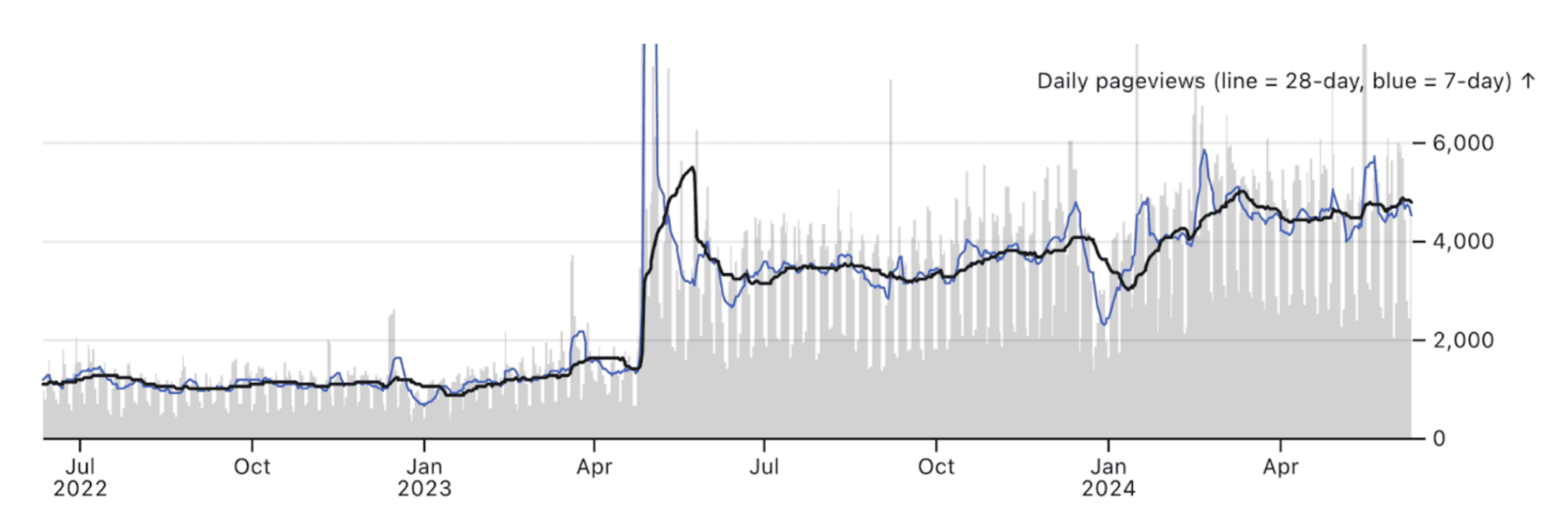
While moving averages are a form of aggregation, including them doesn’t require sacrificing richness in your data visualizations. For example, in our internal BI charts (created using a window transform in Observable Plot), we include raw data as background (gray bars), while highlighting smoothed trends using both a 7- and 28-day moving average (blue and black lines, respectively). This layered approach helps a user focus on the forest, while still letting them see the trees.
Tip #2: Bin, facet, or aggregate to match the scales of business decisions
Often, an organization’s data exists at a higher resolution than what’s needed for informed decision making. For example, an input form might gather data for customer age using their date of birth (i.e., age can actually be determined in days), but messaging is crafted to target broader age bins (e.g. [20 - 29 years], [30 - 39 years], [40 - 49 years]).
Presenting data at a much higher resolution than the scale of business decisions creates more work for viewers, because it adds an intermediate step between seeing a chart and deciding what (if anything) should happen in response. Put another way, the chart should lead directly to actionable insight, instead of requiring viewers to make the cognitive leap from the chart into determining how things fit into bins and then determining any insights.
As a simple example, let’s consider country-level GDP and life expectancy data for 2022 from the World Bank. The scatterplot below explores relationships between country GDP and life expectancy, with the “Income group” variable mapped to fill color:
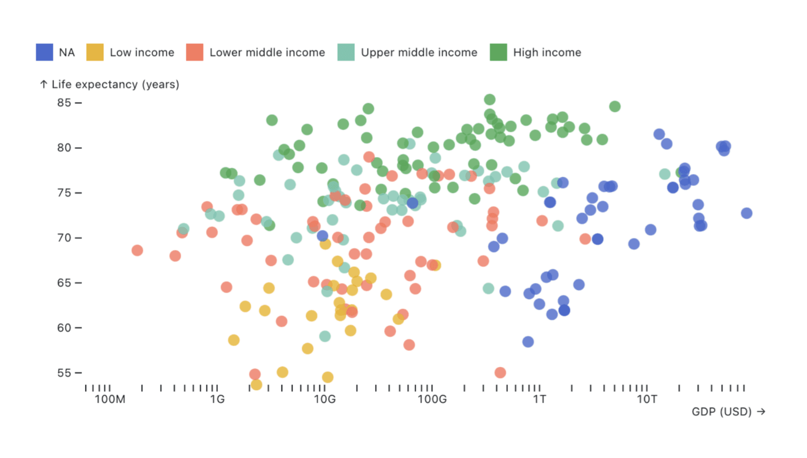
There’s nothing inherently wrong with the chart above. But what if you know that the target dashboard viewers use the ordinal Income group variable, not continuous GDP, in their decision making? Does the chart above make it easy to compare life expectancy across Income groups?
Consider the alternative below, which facets observations by Income group, and adds a horizontal rule at the mean life expectancy for each:

The second chart shows the same data as the first, with each country represented by a dot. But in this version, faceting and the additional summary statistic help a viewer more quickly compare life expectancies across Income groups. Just as we can guide users to interpret their data at meaningful time scales using scheduled updates and smoothing as described above, we can thoughtfully bin, aggregate, and facet data to help users focus on patterns that are most essential for their business decisions. In all cases, by customizing dashboards to align with scales most useful for the intended audience, we can cut the time and cognitive load they need to get from chart to decision.
There are certainly times when you want to avoid any aggregation and maintain the maximum data resolution. For example, we were only able to detect some patterns in our web traffic because we could quickly plot over 7 million individual API requests, as described in our Analyzing web logs example.
Tip #3: Show scales relevant for business decisions directly
Business decisions are often made based on comparisons, for example with quarterly goals (e.g. “our sign-ups are currently at 78% of our Q2 goal”), or with a previous period (e.g. “revenue has increased by 21% this year, compared to 9% over the same period last year”). To help viewers interpret changes, dashboards should present data with context that clarifies the scale needed to make an informed decision.
Consider the chart below, with mock data for email open rates for the current year (in green). Context is added in two ways: first, by adding a target open rate (yellow dashed line), and second, by showing values for the same time period from the previous year (gray line). The magnitude of the target open rate immediately helps a viewer to understand the scale on which they should consider the 2024 data. It is quick to see, for example, that despite recent declines, the 2024 open rate is still over the target, and just slightly below the rates recorded for the same dates in 2023.
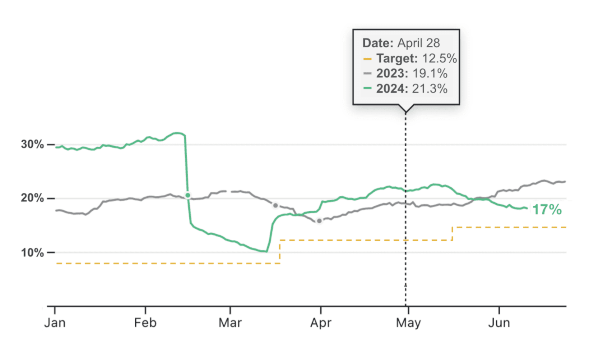
Well-designed dashboards avoid, whenever possible, making viewers look in multiple places to find the information they need to responsibly interpret data. By adding context (e.g. with meaningful thresholds, showing data for previous periods, and annotations) directly to a chart, viewers can quickly understand the scale on which they should consider their most recent data, with all relevant information in one place.
Start building better dashboards today with Observable Framework
By customizing dashboards and charts to align with the scales of business decisions, you can guide users to focus on changes that actually matter for their organization, so that they can make informed decisions, faster.
When working in Observable Framework, everything is built with code. That means you can tailor each piece of a dashboard for your target viewers to put them on the fastest path from data to decisions. Create rich, fully customizable data visualizations using D3, Observable Plot, or any other JavaScript library.
If you’re new to Observable Framework, here are some resources to help you get started:
Check out our examples to see what’s possible
Follow along with our Getting started tutorial
Learn how to build the data visualizations described above, and much more, with Observable Plot