There are many chart types to choose from when visualizing data, from the common and somewhat boring bar and line charts to more uncommon chart types like treemaps and Sankey diagrams. Some of them (like bar charts) work for almost any kind of data, while others (like treemaps and Sankeys) can work well for specific types of data and use cases, such as hierarchies or flows.
Wandering through the data visualization zoo, we can also spot some lesser-known chart types that might seem like a good idea for specific kinds of data but are really never a good choice. Among this group, we find the radar chart. In this post, we walk through what you need to know about radar charts and why you should always avoid using them when visualizing data.
What are radar charts?
A radar chart (or radar plot, also sometimes called spider chart because it can resemble a spider web) is a polar line chart. A number of axes are drawn out from the center, each representing a data dimension or column. For each data item, the value for each column is drawn onto those axes as a point, and the points are then connected with lines.
Here’s an example of a radar chart showing the results of a 2014 survey of smartphone buyers about Nokia phones.
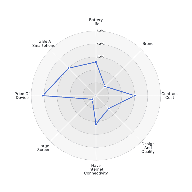
A radar chart showing the results of a survey of smartphone buyers.
Since the axes are difficult to label individually, radar charts are easier to draw when all axes share a scale. That makes them popular for surveys and personality tests, where the responses are all on the same scale, or when a percent score can be computed from the responses, such as in the phone survey example chart shown here.
Radar charts are often shown as multiples
Radar charts rarely come alone; they’re usually shown as multiples for comparison. Here is a version with two more phone manufacturers, and the areas are filled in.
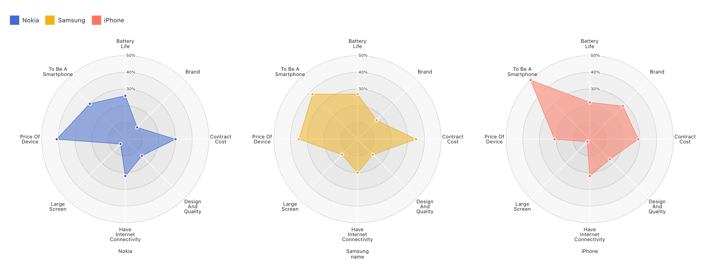
The supposed strength of these charts is that they allow comparison and show outliers. While this may be true, depending on how many and which dimensions are different from the others, it comes with some very serious caveats.
The problem with radar charts
While they’re seemingly straightforward and useful, radar charts have at least two big drawbacks.
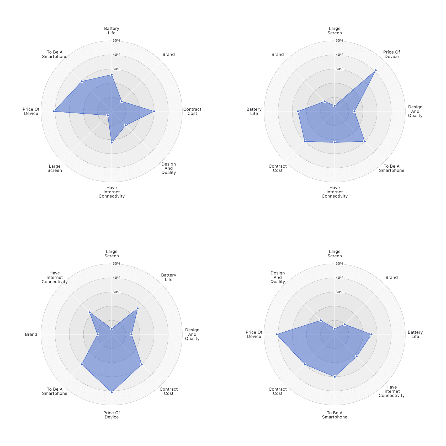
First, the order of data dimensions around the circle matters. One order might create a smooth and symmetrical shape, while another will produce something irregular and spiky.
To demonstrate this, here is the exact same data shown four times, with only the order of the axes different between them.
The second problem is that radar charts use lines to represent categorical data, which means that the lines connecting the points between the axes are inherently meaningless. If that sounds familiar, I talked about this problem in our previous post on bar charts vs. line charts.
A radar chart is really just the polar-coordinates version of a line chart (or area chart, if we fill it in). We could show the same data as above in a linear chart:
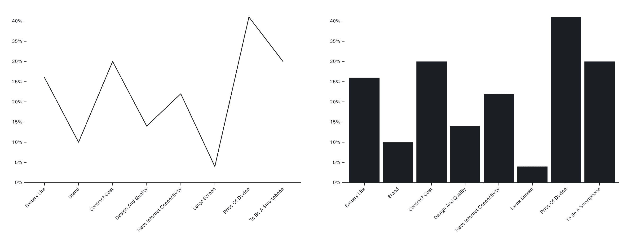
The line chart is meaningless here, and it will change shape as dramatically as the radar charts above when the order of categories changes. The bar representation, whether linear or in polar coordinates, is the better way to show this data. Plus, the bar representation doesn’t create the same visual noise.
Not all charts are useful for data analysis
Having so many charts to choose from is great, and it can be very entertaining to wander through the visualization zoo. But when it comes to making meaningful charts that provide information to people, we need to look at them with a more critical eye.
Radar charts look interesting, and it is true that they allow people to spot outliers. But other charts do that too, and in ways that then also allow users to get meaningful information from them without visual clutter. Radar charts create more problems than they solve, and they should be avoided because they don’t convey information as effectively as other chart types.
There are many good alternatives to radar charts, from simple bar charts to faceted charts, and a number of other options like those you'll find in the D3 examples and Observable Plot gallery.