It's generally considered a bad idea to start a bar chart’s vertical axis at a value other than 0, and there’s research to back that up (we covered this in a recent blog post). Doing so distorts the comparison between the bars and exaggerates their differences. There is a useful rule of thumb for deciding when to include zero in line charts, but for bar charts it’s really never a good idea to crop the y-axis.
In this post, I discuss an alternative to truncating the vertical axis and look at a similar issue in maps and scatterplots. But first, I want to dive a little deeper into the mechanics of cropped axes in visualization grammars, in particular Observable Plot.
Cropping axes in a visualization grammar
Visualization grammars can be opinionated about what they support or make easy to accomplish, in particular things that are considered bad practices in visualization. Observable Plot is a good example of a visualization grammar that creates zero-based bars by default, but lets us truncate them if we want to.
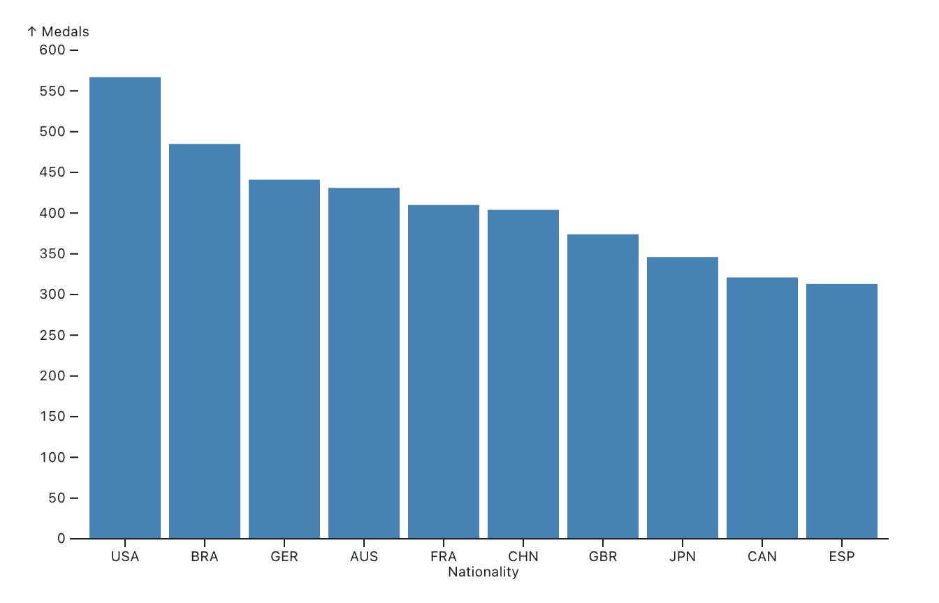
First, let’s make a regular bar chart from a dataset in a variable called medals, which contains medal counts for different countries in a recent Olympic Games. It has two data fields, nationality and count.
To create the chart, we specify a barY mark, map the nationality field to the x axis, and count to the y axis. The code here also specifies a fill color for the bars (steelblue), sorts countries in descending order by medal count, and only shows the first 10.
marks: [
  Plot.barY(d3.sort(medals, (d) => -d.count).slice(0, 10), {
            x: "nationality",
            y: "count",
            fill: "steelblue",
            sort: {x: null}
  }),
  Plot.ruleY([0])
],
This is what the resulting chart looks like:
The full code also contains a definition for the x and y axes, though for the x axis, we’re only specifying the axis label. The y axis also defines the domain, or range of values in the data set, to extend from 0 to 600.
x: {
    label: "Nationality"
  },
  y: {
    domain: [0, 600],
    label: "Medals"
  }
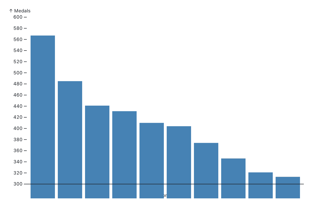
What happens if we change the vertical axis to be cut off, say at 300?
y: {
    domain: [300, 600],
    label: "Medals"
  }
If we don’t make any other changes, the bars now extend below the x axis, because they still start at 0! They are cut off here by the SVG element the chart sits inside of, though.
We can correct that by also setting an additional channel, y1, to 300.
marks: [
  Plot.barY(d3.sort(medals, (d) => -d.count).slice(0, 10), {
            x: "nationality",
            y1: 300,
            y2: "count",
            fill: "steelblue",
            sort: { x: null }}),
  Plot.ruleY([300])
],
By default, y1 is set to 0, since Plot assumes that bars start at 0. This is a reasonable assumption (and, as we discussed last time, the right choice for bar charts), but it can be overridden. And it lets us create the chart we wanted.
So yes, it is possible to crop the y-axis of a bar chart with Plot (and other visualization grammars), but it is of course still a bad idea. Read on below though, for a better alternative!
Relative charts instead of cropping the y-axis
One way to avoid the issue of including zero is to show the difference from a reference. This can be a target value, or simply the mean or median of the data. The bars in your chart then show that difference rather than the absolute numbers. This is similar to an index chart, which shows time series data relative to a chosen value (usually a particular reference date).
The reference needs to be chosen with care, because whether bars point up or down is very visually salient. Bars pointing down should represent a missed target or some other room for improvement, because they will stand out and demand more attention than ones pointing up. The zero can also be “us” versus “others,” in which case bars pointing up are the competition we should be paying attention to.
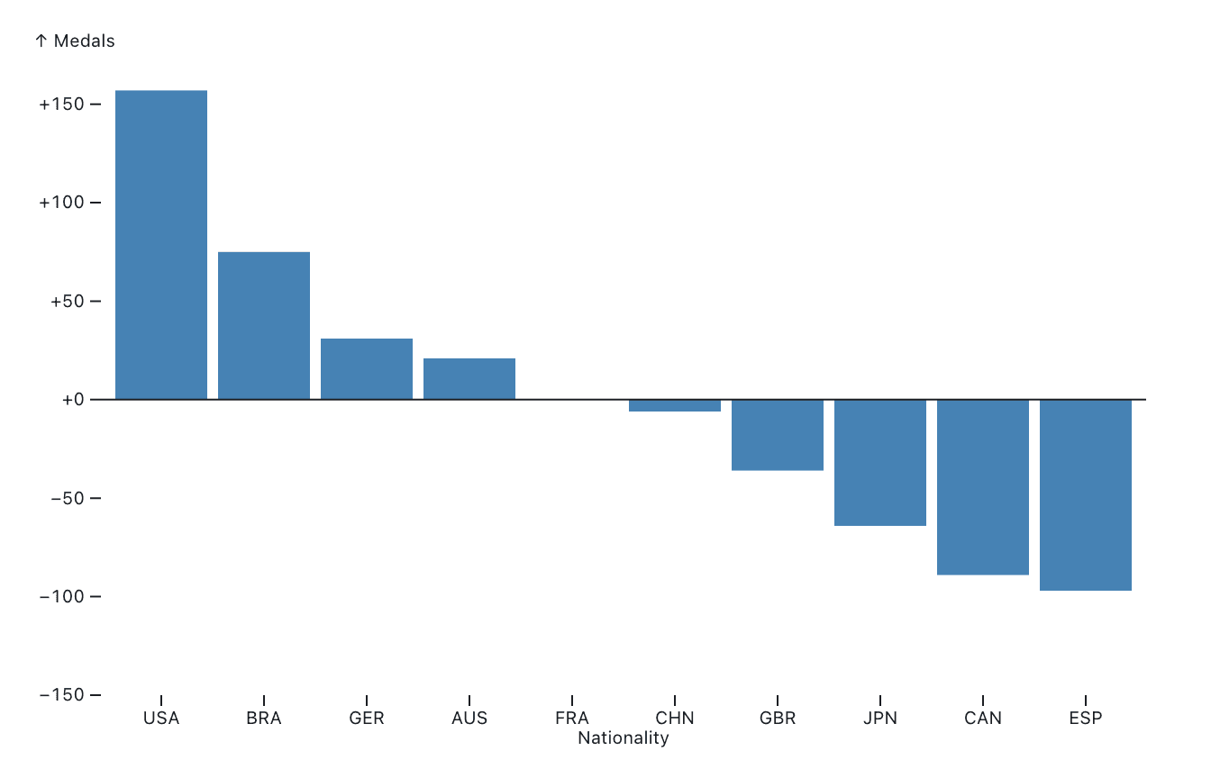
Take our Olympic medals data from earlier as an example. Let’s say we want to look at medals from the perspective of France, with its 410 medals in these particular Games. We can set our reference at 410, and get this chart:
Note how bars pointing up represent countries with more medals than France here, and bars pointing down show countries with fewer.
This chart is easy to make in Observable Plot, which allows us not only to specify column names for fields, but also functions. Here, I’ve added a simple function that subtracts 410 from the count value in the data row (Plot passes each row into this function when creating the chart).
Plot.barY(d3.sort(medals, (d) => -d.count).slice(0, 10), {
          x: "nationality",
          y: d => d.count-410,
          fill: "steelblue",
          sort: {x: null}
}),
Showing relative values means that our bars still start at 0, but since the reference has been shifted, we make better use of the vertical space.
Charts other than bar and line charts
So far, we’ve only looked at bar and line charts (the latter in the previous post). These are two of the most common chart types, and they are often used somewhat interchangeably when showing data over time. And yet, they are quite different, especially when it comes to how they depend on the vertical axis.
There is a related issue in scatterplots and maps that show a value as the area of a dot or other mark. A value of zero would translate into a dot of size zero, but that would not be different from a missing value. Often, data visualization designers want to still show a mark when the value is zero, and it has to be large enough to be visible and recognizable. That introduces a similar offset problem, where values larger than zero need to be represented by marks that are larger than those showing zero, but the size relationships are no longer correct.
The best way to show zero in this case tends to be with a different mark, such as an empty circle if the data is shown with filled circles. This doesn’t entirely solve the problem if the range of values is large, and positive values close to zero have to be shown as well. But it helps avoid the same kinds of confusion as cropping the y-axis on a bar chart.
Area charts are something of an in-between of bar and line charts. They are often used instead of line charts to make a chart have more presence, but technically the area under the chart should be meaningful. An area chart of, say, sales over time will have an area that increases with both time and sales numbers. Cutting it off at a value other than zero means that the area is no longer proportional to the sum of sales, but in this case it underrepresents it instead of exaggerating (like it does with a cropped bar chart). An area chart’s vertical axis should therefore start at zero.
What about negative values?
All of the above discussion assumes that all our values are positive. That is often the case in business data, for example when looking at sales (in dollars or units), customer numbers at different locations, or time spent on support cases.
When the data includes negative values or zero, the vertical axis obviously needs to include 0. But beyond that, one decision to make is whether to simply extend the scale according to the data, or keep it symmetrical around 0. This will depend on what data is being shown, but it can be helpful to see if the data covers the same range on both sides.
As an example, here’s the relative bar chart from above, this time from Great Britain’s perspective. The chart on the left is symmetrical around the x axis, the one on the right is not. The left chart is more neutral, while the one on the right emphasizes the bars that point up.
Whether this is useful for a particular chart depends on the data being shown and the questions it is meant to answer. It is usually easier to find clear-cut rules of what not to do (such as cropping the axis in bar charts), than come up with simple rules of what to do.
Conclusion: it’s complicated!
There is one simple rule here, which is never to truncate the vertical axis in bar charts. Beyond that, things get more complicated and context-dependent. Whether a relative bar chart is possible or meaningful depends on the data and the purpose of the chart. Maps and scatterplots have their own issues when it comes to data including zero (or even negative numbers!).
Rules can only take you so far, however. In the end, the visualization designer needs to decide on the right kind of representation of the data. It helps to take a step back and ask, what am I trying to show here, and what do expect the audience to get from this chart? Data visualization is just as much (if not more) art as science.
To read more about good chart design, take a look at these related blog posts:


