Treemaps are a fairly popular data visualization technique, used to show data that can be broken down into categories. They’re popular in business intelligence dashboards, often serving as overview charts that enable quick comparisons between groups.
While they’re commonly used for business analytics data today, the original purpose and visual design of treemaps was actually quite different. In this blog post, we’ll briefly look at what treemaps are, where they originated, how they’ve changed over time, and how they’re used for BI and data visualization today.
What is a treemap?
A treemap subdivides space to show the proportions of a value as part of the whole. For example, if breaking down sales by department and product, the area of each rectangle would show the amount of sales for each, as a fraction of the total sales shown in the chart.
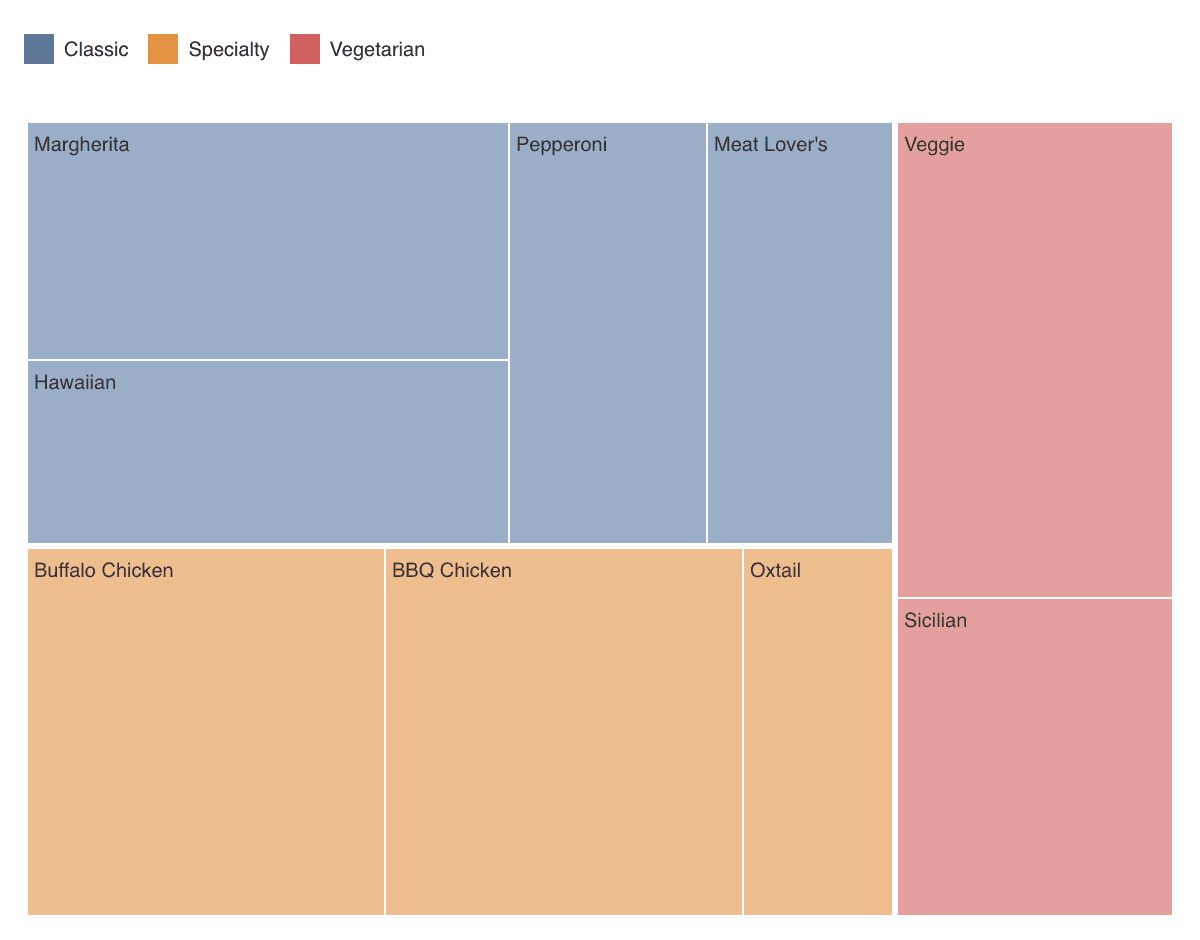
The following example shows the breakdown of orders in our Pizza Paradise demo dataset. Color represents the pizza category, which is also the top level of the hierarchy. Each category is then subdivided by type of pizza, with the rectangles showing the number of orders for each.
This modern use of treemaps is quite different from the historical origin of the treemap, however.
The original tree-map
The idea of the treemap goes back to 1990, when Ben Shneiderman was looking into ways to show who was using how much space on a shared 80MB hard disk at his research lab at the University of Maryland.
He came up with a new way of subdividing space to reflect the relative sizes of files and directories, which he called a tree-map. It shows folders for different years, which contain files of different types. The areas of each rectangle reflects the size of the file or folder it represents. Some of the folders also have subfolders, like 1994 with DQtutorial in the visualization below:
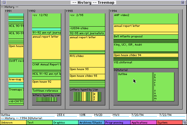
The tree in tree-map is important because it initially was conceived as a way to show hierarchies. In computer science, hierarchies are called trees because they grow from a single root node and branch out into more nodes on each level.
When looking at a file system, the size of each folder (or directory) is the sum of the sizes of the files and folders within it. The tree-map reflects this by allocating an amount of space to each that is the same fraction of the total space as the folder is of its parent.
The strength of the tree-map is that it not only shows the hierarchy, but also the relative sizes of the files and folders. Most other ways of showing trees (like node-link diagrams) don’t show numerical data, and especially don’t reflect the way the numbers sum up when going from the branches of the tree towards the root.
Squaring the treemap
If the tree-map above doesn’t look very familiar, it’s probably for two reasons: it uses the original slice-and-dice layout, and it’s focused on the hierarchy. The more common, modern use of treemaps uses a different layout, and usually only consists of a single level. Even when there are multiple levels, they tend to be de-emphasized.
The more common treemap layout is called squarified, which produces the kind of visualization you probably recognize. By keeping the aspect ratio of all rectangles closer to square, categories are easier to compare, and they don’t turn into thin slivers like some of the ones in the earlier image.
Below is an example of such a treemap, the Map of the Market showing the stocks in the S&P 500 index. The size of each rectangle represents market capitalization for each company, and color is used to visualize the change in stock price.

Note that there is a hierarchy here, with the top level defined by the sector (like Technology, Financial, Consumer Cyclical, etc.), and a level below defined by the industry (inside Technology there’s Consumer Electronics, Semiconductors, Software – Infrastructure, Software – Application, etc.). This helps both locate individual companies and show the size of each of those industries and sectors — but it can also be ignored if you just want to compare individual companies.
Treemaps on BI dashboards
The way treemaps are used on business intelligence dashboards today is more like the map of the market above, or the pizza treemap at the top of this post, than the original file system exploration. Treemaps are often used as an alternative to pie charts, either when there are too many items to show clearly or in the attempt to avoid pie charts.
There’s an interesting leap here that I feel is worth pointing out. We’re used to looking at data like this as a bar chart, or some other way that doesn’t involve a hierarchy. The map of the S&P 500 index, likewise, shows a very different view of the market than the usual way of looking at stock prices, which is to show opening or closing prices as time series.
The way treemaps are used in all these cases is to construct a hierarchy from the data, and it turns out that you can do that whenever your data contains categorical dimensions. In the examples above, it’s still fairly natural, but there’s no reason you can’t use other dimensions (like year of order date and state the pizza was ordered in, for our pizza example) to create the hierarchy you want.
This is quite similar to how cross-tabulations or contingency tables work, in fact. The difference being that cross-tabulations are not hierarchical, but they form the basis for treemaps built from tabular data.
The many uses of treemaps
While today’s treemaps look quite different from the original tree-map, and they’re also used differently, the underlying idea has proven to be incredibly useful. Treemaps can adapt to different sizes and aspect ratios, and allow us to show more categories than the typical pie chart, making treemaps a very effective way to visualize categorical data.
Treemaps add an interesting piece of structure to a BI dashboard and can provide a useful alternative or additional view to time-series and other data. You can get started building treemaps in D3, and explore examples of treemaps in the D3 gallery. They’re also useful to pack information into small spaces, and it’s worth checking out their relative, Mosaic plots.