Fast and fluid data exploration allows analysts to focus on what matters most: answering business questions, and discovering deeper insights. With less time spent on routine tasks, analysts have more capacity to investigate new questions and follow emerging patterns. But, too often, data exploration feels cumbersome and time-consuming. This disincentivizes further exploration and leads to shallow analyses that might miss important insights.
Observable Canvases are collaborative whiteboards designed for fast and fluid data wrangling, exploration, and analysis. We’ve written about major features, like optimized database queries, transparent AI, and advanced built-in charts, that make canvases the best tool for modern business analytics. But we haven’t put a spotlight on the many smaller features that streamline data work in canvases.
Read on to learn about eight canvas tips and tricks that speed up data wrangling, keep momentum in your data exploration, and simplify navigation in complex analyses — leaving more time for high-impact analyses and responding to stakeholder requests.
Fluid data workflows
Data exploration can reveal patterns and anomalies that inspire new questions and exploration paths. When analysts are constrained by linear workflows that make extra exploration feel like a chore, they’re less likely to pursue those questions, which means they could be leaving some useful findings in the dark. In Observable Canvases, we want to make it easy for analysts to dig into interesting discoveries wherever they pop up during exploration. Here are a few features that make branched, nonlinear data exploration feel lightweight.
Duplicate nodes and branches
Data analysts often want to compare different scenarios or slices of their data. Use the option-drag shortcut in a canvas to quickly duplicate one or more nodes. Then, update your new branch to use a different data subset, which you can compare with the original.
Below, a user duplicates a branch with chained nodes exploring Amazon purchases for western states. In the new branch, they switch the selected states to the southeast region for a side-by-side comparison for purchases over time, by region.
Rewire edges
Edges are the dashed lines connecting two canvas nodes, representing data flow from one node to the next. You can update data flows across the canvas by manually disconnecting edges and reconnecting them to different nodes, for a quick way to test alternate data inputs and outputs.
Below, a user drags an edge to switch the chart input from a table containing state-level revenues, to one with regional revenues.
One click to presentation-ready, interactive charts
Getting a closer look at interesting patterns should be an exciting part of data exploration, not a chore. In canvases, when you see something worth digging into in a summary chart of a Table node, it only takes one click to create a large interactive version.
From any column header, select “Create chart” in the dropdown menu to instantly add a large version of the chart downstream on the canvas. Share or embed the new chart as-is, use it as a jumping off point for further exploration, or test different views of the data with other built-in chart types as shown below:
Fast data wrangling in the Table node
Data wrangling still takes up a huge chunk of analysts’ time. We want to reduce the time analysts spend on data prep so they can focus on higher-impact tasks like exploration and analysis.
In canvases, the Table node provides a preview of data table contents, with concise summary charts that provide a quick glimpse of variable distributions. The Table node doesn’t just help you see your data: it is a data wrangling powerhouse where you can manage columns, filter and sort records, update data types, and more.
Here are three Table node features that speed up common data processing tasks.
UI-based column management
We recently upleveled column management in the Table node with UI options to rename, select, deselect, and reorder columns. In the video below, a subset of columns are selected and reordered in the Columns pane of a Table node. Note that when the state column is renamed atop the column, the new name is automatically reflected in the Columns pane.
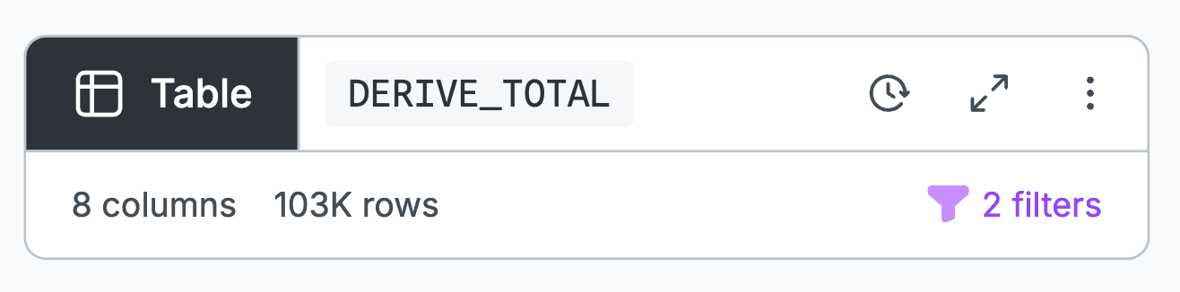
Derive new columns
Analysts commonly need to add a new column based on values in an existing column. For example, you might need to calculate an order total based on quantity purchased and unit price. Unit conversions, aggregating groups, and extracting date components (e.g., to get just the year from a date) are other common cases where you’d derive a new column. In canvases, you can now quickly add a derived column right in the Table node.
Click the plus sign in the left margin to add a new column. Give it a useful name, then add an expression to populate a new column. Below, a new complaint_month column is added, containing the month number extracted from date_received:
Visual filtering in summary charts
The Table node’s summary charts are both concise visual summaries of variable distributions and built-in, interactive visual filters: you can brush over continuous values, or select and deselect categories, for fast visual data filtering right in column headers.
When you filter in summary charts, the distributions shown across other columns in the Table node are automatically updated, so you can quickly see how distributions change for different subsets of the data. Table node filters also carry through to downstream nodes, for a quick way to explore patterns by group or subset throughout a chained analysis.
In the clip below, a user filters data by first brushing over a temporal histogram of orders over time, then selects two age bins, then deselects two education categories. Note how both the other columns in the table, as well as downstream nodes, update to reflect the new subset.
Easy canvas organization and navigation
Fluid data flows and branching paths are great for richer and more thorough data exploration, but can also quickly produce a large network of interconnected nodes that are difficult to keep track of. Here are two features that help you keep things tidy and trackable in canvases.
Navigate with the minimap
We see canvas sprawl as a good thing: it’s a signal that you’re conducting robust visual exploration and testing.
As your analysis grows, use the minimap — a zoomed out view of canvas content — to see and navigate around your work. Selected nodes are highlighted in the minimap, serving as useful waypoints. Below, a user drags the focus area (indicating what’s currently in view) across the minimap to find and return to a specific chart node.
Minimize nodes for a simplified view
In Observable Canvases we aim to keep your eyes on the data at every step. Visual data analysis helps analysts and stakeholders to notice unexpected patterns, catch mistakes sooner, and responsibly interpret analyses.
But we get it: that approach means displaying every node by default, which can be visually distracting.
For a pared-down view, minimize any node by clicking on the minimize icon in the top bar, choosing “Minimize node” in the three dot menu, or using the Command-M shortcut.
So you don’t miss out on important data transformations, we indicate if one or more filters are applied in a minimized node, as shown below:
We’re building fast so you can, too
In this post, we’ve highlighted eight of the many Observable Canvas features that improve data workflows, accelerate data wrangling, and ease canvas navigation.
The table node lets you quickly add, rename, select, and reorder columns — along with interactive filters and the option to pop out instant large charts from any column header. Rewire connections between nodes and duplicate branches for lightweight exploration and testing. As your work expands across the infinite canvas, simplify chained analyses by minimizing nodes and easily navigate content using the minimap.
We’re continuously adding new features and functionality in canvases that improve how analysts and stakeholders can explore, analyze, and display data. To try it out for yourself in a free pilot, request a demo today.