If a dashboard is published and no one looks at it, can it be effective?
The best type of dashboard is one your team actually uses. If you ask your users directly, it might sound like they are frequent visitors of your work, but it's hard to be certain. Maybe they’re supposed to look at your dashboards everyday but they forget. Maybe they’re still using those old Excel spreadsheets. You can’t manage what you can’t measure. If you can’t track how much your dashboard is being used, you can’t know whether it’s effective.
[...Observable enters stage right]
We’re pleased to announce our newest addition to Observable: project analytics. When you deploy a Framework project to Observable, project analytics enables you to see how much a project is being viewed and by whom. It's a great way to understand how effective your dashboard is. Are users checking in once a week or every day? Who are the regulars to certain pages and views? Is my work gaining or losing traction? You no longer need to stay up all night pondering life's great mysteries like “is my boss actually looking at my KPI dashboard??”
When you log into your Observable account, you’ll see a new section in deployed projects showing the daily viewers to your dashboards. This example is from a project that I manage for our internal business intelligence, aptly named Observable BI.
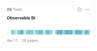
This visualization here is a sparkline-esque snapshot of viewer activity to your project. Each rectangle represents viewer activity for the past 60 days, with the darker blue colors indicating a larger number of viewers and light yellow indicating fewer viewers. This is only a taste of your project analytics, a bite-sized signal that you can scan across projects. To see your project analytics in all its glory, click the gear icon in the top right corner.
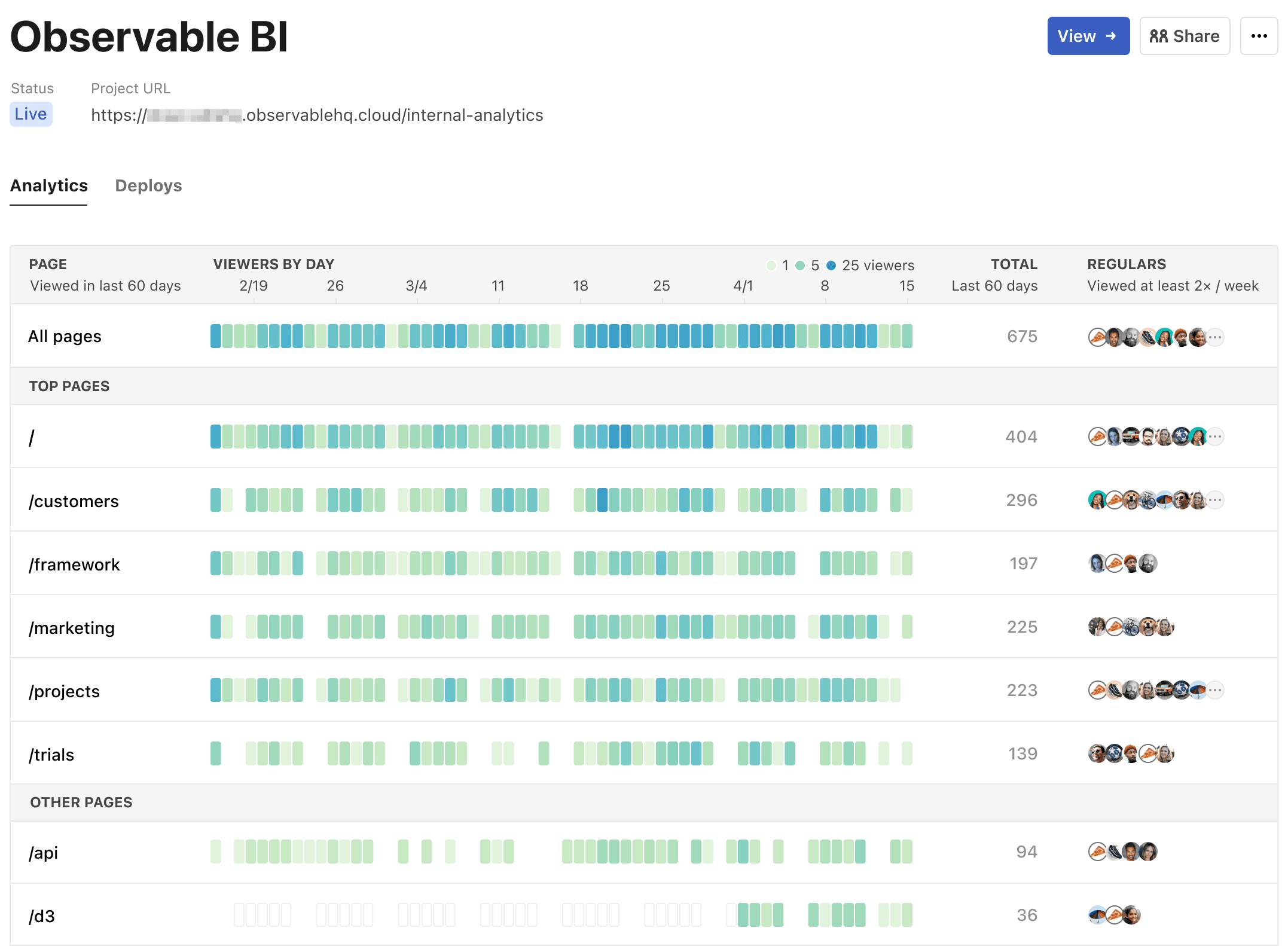
Here we are provided with a richer view of our data. The first row shows viewer stats for all the pages in a project while subsequent rows are for a specific page. The daily viewer numbers (with a helpful x-axis at the top) reveal usage patterns, so I can see things like day-of-week trends (i.e. more viewers during weekdays / fewer on weekends). To the right of these usage pattern visuals, there is a total count of viewers for that specific page over 60 days.
My favorite section in this report is the Regulars column. It shows me anyone on the team who has viewed this page at least two times a week. Here are the results for the marketing dashboard:
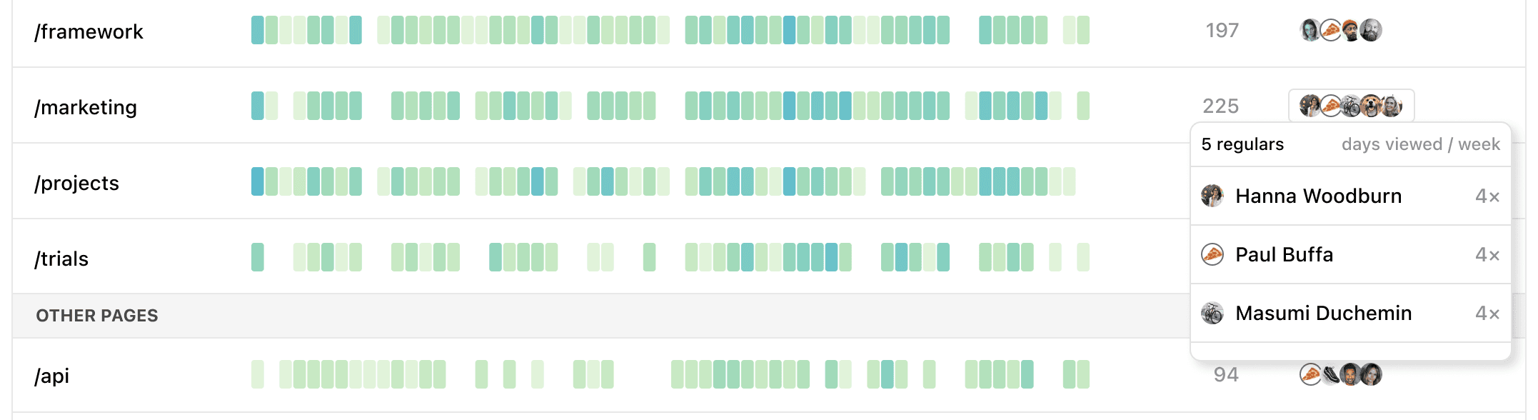
I love seeing that the members of the marketing team are regulars to the marketing dashboard and they check this page, on average, four times a week. (I know what you’re thinking – only four days a week??) Joking aside, it’s really encouraging for me, the creator of these dashboards, to know that the right people are viewing them and doing so regularly.
Seeing the regulars is also a great way to notice when a dashboard is not hitting the mark. I noticed that Hanna, our Head of Marketing, wasn’t a regular visitor to one of the pages I had created for her team. I reached out to her, we had a productive conversation, and I was able to quickly update the dashboard to accommodate her requests. Now I spot her as a regular every week!
Collaboration is key
At Observable, we strongly believe that the best dashboards are built with code, because it’s in the customization where you can craft a story with your data. The dashboard above was achieved through a collaboration with data visualization developers and designers on the team, and that is what makes it so effective. On my own, I would have just built a simple line chart or bar chart showing the daily viewer numbers.
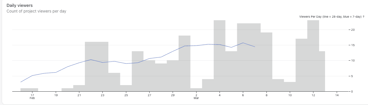
While this data visualization is somewhat interesting, it lacks the nuance that tells a story. One of my favorite such details is the user avatars in the Regulars column so you can quickly scan who the top viewers are across pages. (Yes, I'm the pizza avatar, if you hadn’t already guessed.) I could never see that with a bar chart view.
I used to joke that the only way I knew people were using my dashboards was if people were complaining about them. With project analytics, I now have a much more positive way of knowing how effective my work is.
If you’re an existing Observable user, you can view analytics for all of your projects that are hosted on Observable by logging into your workspace. If you haven’t yet tried Observable Framework (or haven’t yet deployed a project to Observable), what are you waiting for? You can learn more about how to get started in our docs.