The Observable team recently developed six example dashboards with the aim of highlighting what’s possible when you build with code in Observable Framework, our open-source static site generator for data apps.
Compared to traditional development workflows, Observable Framework offered:
Flexibility, which made building with Framework feel familiar — even for new users
Simplified project organization and reusable components
Unlimited customization through building data apps and visualizations with code
By building with Framework, developers can more easily develop fast data apps, custom dashboards, interactive data visualizations. Here’s what our team found when building data apps with Observable Framework:
Takeaway #1: Flexibility makes a new tool feel familiar
There is always a learning curve when adopting a new tool. The shape of that curve depends, in part, on how quickly a user can map their existing knowledge, skills, and practices onto that new tool.
When developing our first showcase examples, we (the Observable team) were early Framework users and testers ourselves — it was brand new to us, too! Framework’s flexibility helped us get started quickly, because we didn’t have to adopt an entirely new suite of tools to start working with this one. Here are a few ways we didn’t have to start from square one.
Working with Observable Framework offers a better developer experience
One reason that Framework felt familiar is because we could each work in our preferred IDE or code editor, so we didn’t have to orient ourselves to a new platform or environment. Most of us worked in Visual Studio Code, some in Zed, and one teammate even tested in Vim. Since each project is just code within a bundle of files, you can work in any editor you choose — which makes it faster and lowers friction to get started.
And, because Framework projects are just files, we could use our existing workflows for versioning, collaboration, and project management (in our case, with git and GitHub).
Observable Framework offers polyglot options for data analysis and visualization
Data loaders let us access, wrangle, and analyze data in any language to prepare data snapshots at build time. The option to work in different languages helped us carry our existing skills (some of us in R, some in JavaScript, some in TypeScript, etc.) into Framework to prep data faster. This polyglot flexibility is captured in data loaders throughout our showcase examples:
In the U.S. dams showcase dashboard, we use an R data loader to access and wrangle records for 91k+ dams in the U.S.
The Plot showcase example uses TypeScript data loaders to pull metrics (like downloads, issues, etc.) for a GitHub repo
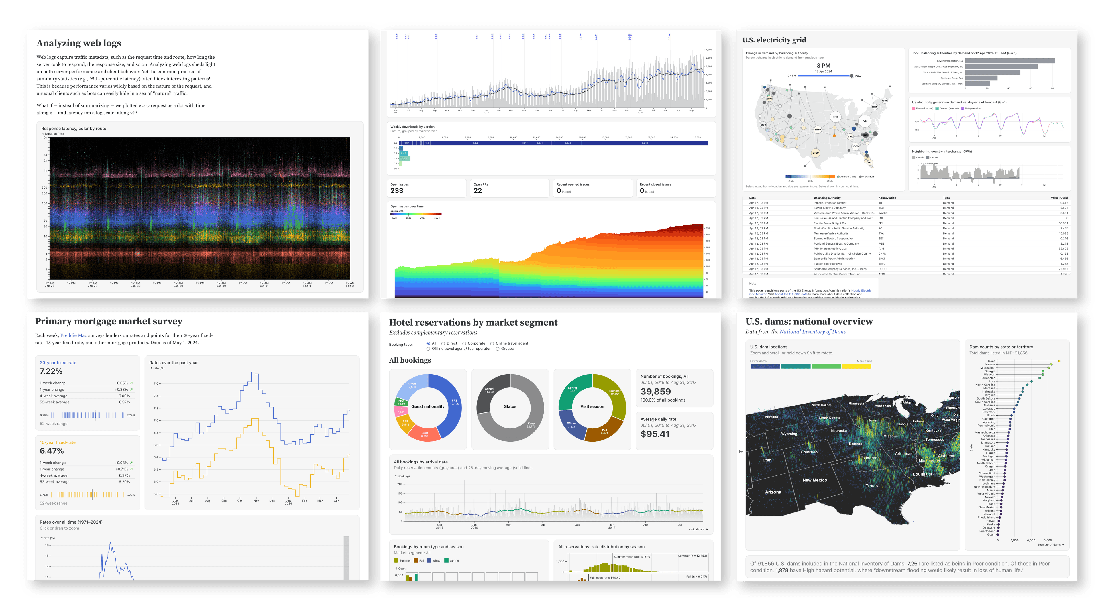
We wrote JavaScript data loaders to access electricity demand and interchange data for the EIA dashboard
To see data loaders in other languages, check out our collection of technique examples.
Choose your own data visualization libraries
Most charts in our showcase examples are built with Observable Plot. For example, the interactive map featured in the EIA dashboard below is built with Plot, while the range slider is created using the range input from Observable Inputs:
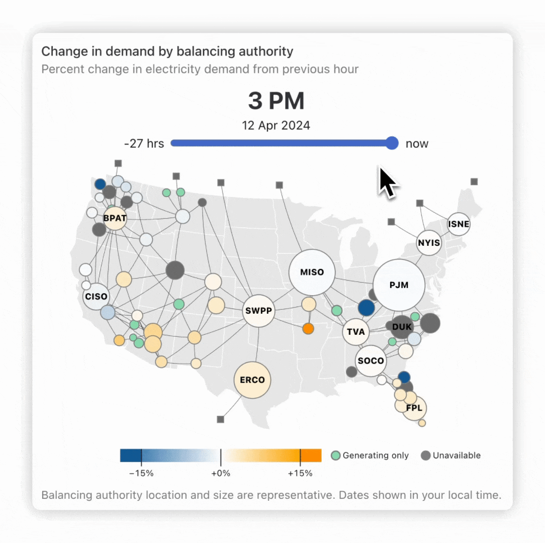
For some charts, however, we needed a different tool. To create the donut charts in our Hotel bookings example, we used D3:
And, to make a zoomable and scrollable map of U.S. dam locations, we decided on deck.gl:
The three data visualization libraries mentioned above (Plot, D3, and deck.gl) are part of the Observable standard library, which means they are available out-of-the-box in Framework. But you’re not restricted to what’s in the standard library: you can import and use any JavaScript library in a project, giving you freedom to build with whatever data visualization tools you prefer.
Computational notebook experience makes building Framework data apps feel familiar
We each had previous experience working in browser- and files-based computational notebooks (most extensively in Observable notebooks, but also in Jupyter Notebooks, R Markdown, and Quarto, among others). That made building pages that combine Markdown, code blocks, and rendered outputs feel like familiar territory.
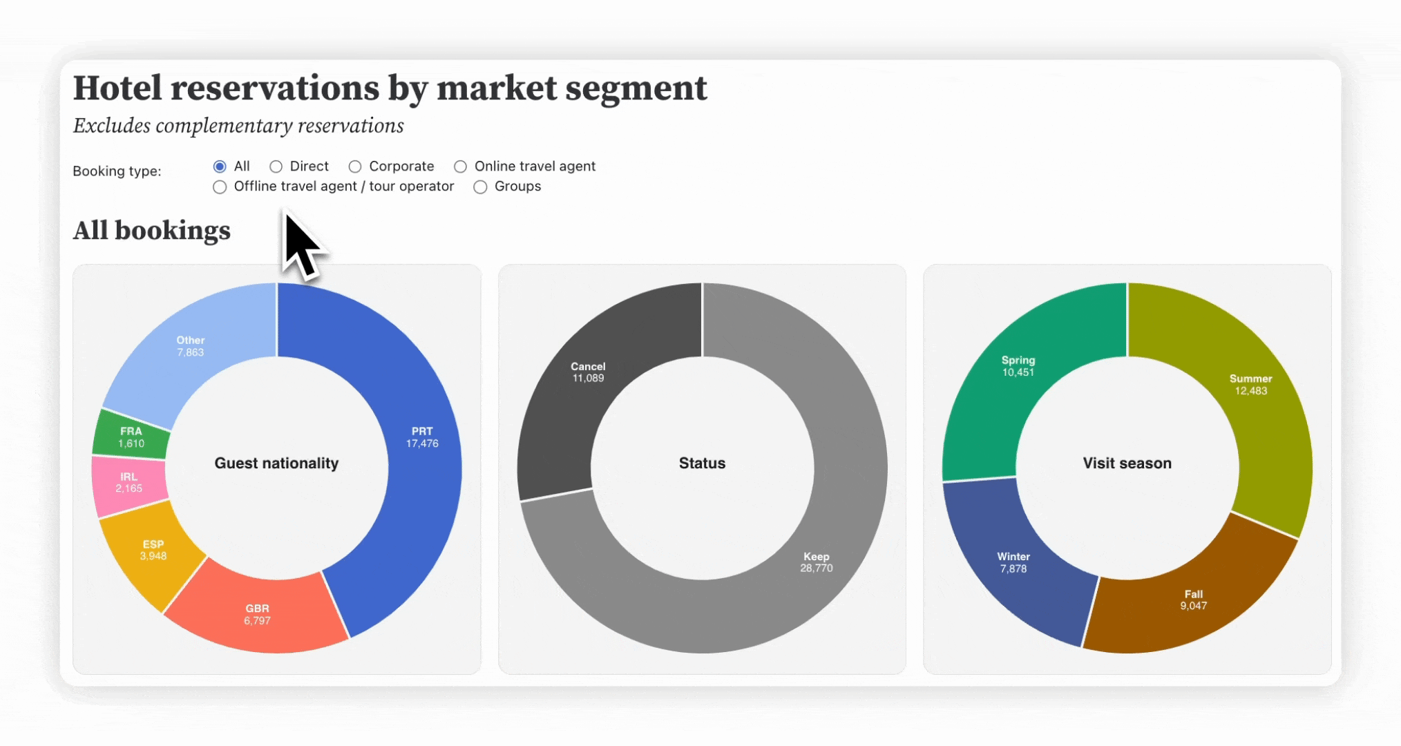
For example, below is the first bit of raw code used to create our Hotel bookings showcase dashboard. As in other computational notebooks, a bit of YAML atop the .md file (bounded by three dashes) sets a number of page options (here, removing a default table of contents and setting the light and dark mode themes). Text added as Markdown is interweaved with JavaScript code blocks to import components and data. See the entire index.md file used to create the page.
Takeaway #2: Using components simplifies project organization
When we first started building our showcase dashboards, we wrote a lot of our code directly in JavaScript code blocks within .md files. That changed as we saw our page source code get long, complex, and sometimes repetitive, which complicated editing and collaboration.
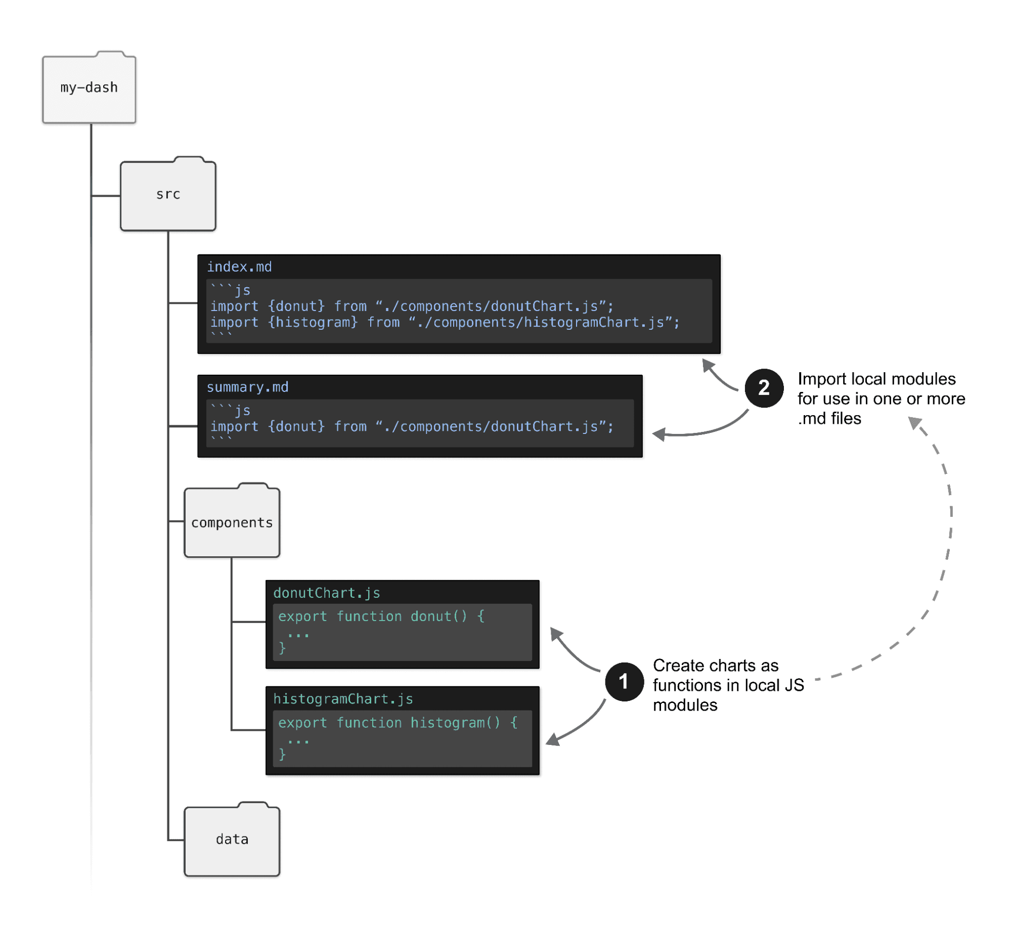
We embraced components — reusable, smaller bits of code that are created as standalone scripts then imported into pages — to modularize an declutter page content. Our showcase examples show how we’ve moved toward componentized projects:
In our Hotel bookings dashboard, we import separate JS components used to create big number boxes (in HTML) and donuts charts (made with D3)
For the EIA dashboard, we export charts created as functions in the charts.js file
The scatterplot and histogram in our API example are created as individual components
We don’t aim to eliminate (or even minimize) all JavaScript code within a markdown file. However, moving big chunks of code (e.g. for charts or tables) into smaller components makes for easier editing, reuse, and content layout. And, because Framework automatically watches local modules during live preview, any changes you make to components are reflected in the preview server.
The schematic below shows one way a user might componentize a project:
While we’ve found components useful, they’re not mandatory. You can write all page content right within your .md, like we have in our Mortgage rates dashboard. Or, you can decide to write some charts as components (e.g. if you know they’ll be reused in multiple places) while others are created right in a page, as we’ve done in the Hotel bookings example.
Takeaway #3: Building data visualizations with code offers unlimited customization
Framework’s built-in classes (e.g. grid and card), helper functions (e.g. resize), and themes helped us quickly create nice first versions of each dashboard. But we wanted to take customization further for our showcase examples. Because everything in Framework is built with code, we could fine-tune without constraints.
The examples below highlight three ways we’ve used code to fully customize our showcase examples.
Combine data in novel ways to unlock insights
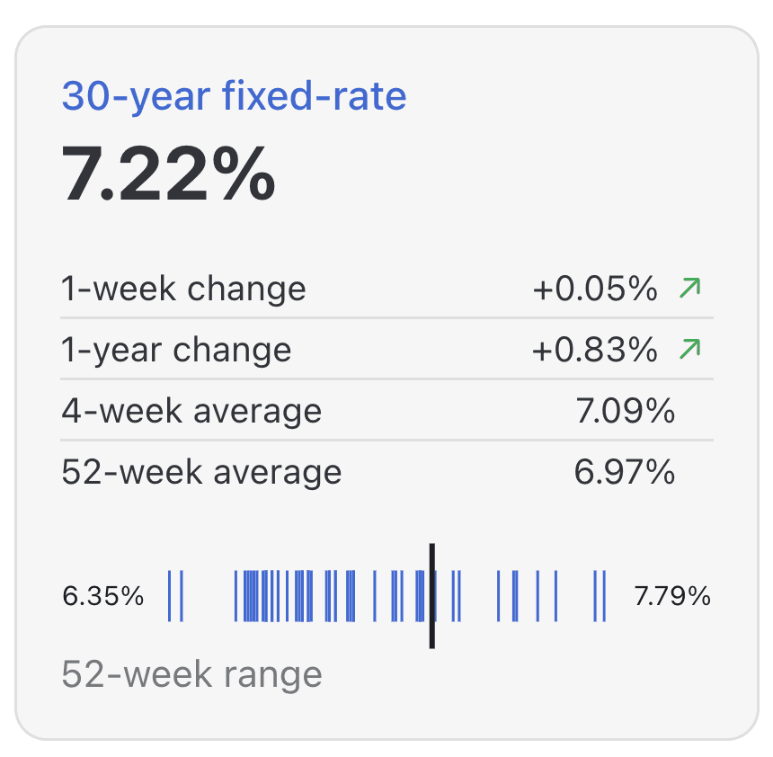
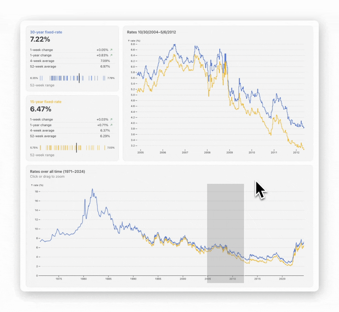
For a number of our showcase dashboards, we wanted unique components that combine charts, text, and/or tables in novel ways. For example, the Mortgage rates dashboard features the custom big number box below, which combines HTML headers and a customized table with a tick chart to concisely show mortgage rate metrics and trends in one place:
(Explore the source code for the component above.)
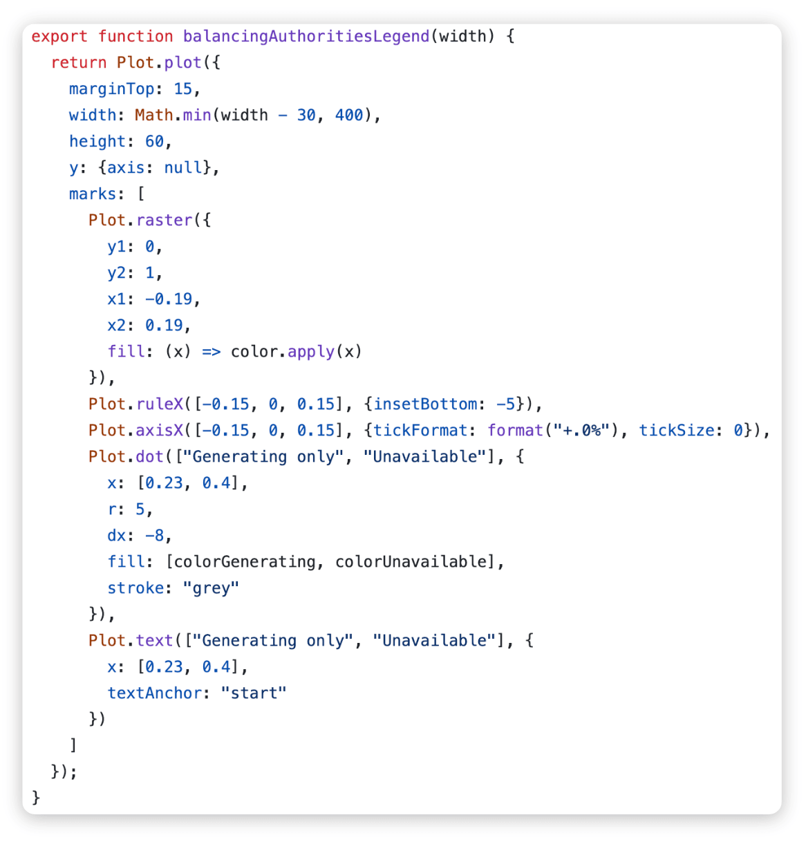
Customize chart legends with code
Sometimes a default legend just doesn’t cut it. That was the case for our EIA showcase example, which requires a legend combining a continuous color scale, custom value formatting (percentages), and discrete categories:

Instead of being locked into an out-of-the-box legend, we were able to code up the one we wanted from scratch in JavaScript using Plot (see the full code for the map and legend):
Framework offers interactivity and animation
Each of our showcase examples features at least one type of interactivity, like radio buttons, searchable tables, value sliders, and custom tooltips. In the Mortgage rates dashboard, we combine Plot and D3 to add brushing so that a user can zoom and drag over the line chart to focus on mortgage rates over a specific time period (see the code).
See what else is possible, and start building custom data apps with code
Developing our showcase examples was a great opportunity for our team to test, learn, and implement strategies for creating custom data apps and dashboards with Framework. Our showcase dashboards and the takeaways above highlight what and how you can build with Framework, capturing the flexibility (with tools, workflow, and organization) and customization possible when you build entirely with code.
Explore the live showcase dashboards and source code to learn more. Then, follow along with our resources to start building your own: