The promise of self-serve analytics is compelling: non-technical business users — with their deep domain expertise — could independently access, analyze, and report on data without waiting for IT or data analysts. This democratization promised faster insights, quicker decisions, and a stronger emphasis on a data-driven strategy. Many viewed self-serve analytics as a significant competitive advantage, prompting organizations to allocate substantial budgets toward tools, infrastructure, and the resources needed to deliver on this vision.
Yet, despite significant investment, the reality has frequently fallen short. While self-serve data analytics has often failed to deliver on the vision, that doesn’t mean that stakeholders need to be exclusively dependent on data teams for their insights. In this post, I explore the gaps left by self-serve analytics and walk through a real-life example of how collaborative analytics helps teams discover insights together.
Why self-serve analytics initiatives fail
Recently, I spoke with a software development company that had invested heavily in a traditional business intelligence (BI) tool. Their data team spent weeks building a comprehensive self-service interface and rolled out the tool at end-user training sessions. Enthusiasm ran high as trainers demonstrated, “Look how easy it is — just drag and drop columns to create custom bar charts instantly. You have over 100 columns to choose from!”
However, only a few months later, adoption was dismal: only five out of a hundred intended users were actively utilizing the tool. Feedback revealed that users found the platform overwhelming, overly generalized, and ultimately inflexible when answering specific domain-related questions.
This example is indicative of what I hear from many companies — whether a data team creates a set of pre-built dashboards that potentially go unused (contributing to dashboard rot) or stakeholders build their own. A significant factor contributing to the failure of self-service analytics initiatives arises when the data team configures the analytics tool, provides basic training, and then instructs users to “go self-serve.”
In reality, stakeholders and non-technical users often struggle to achieve their goals independently. They become confused about which data variables to use, perceive the platform as overly complex, or quickly get stuck on specific questions. As a result, they either abandon the tool or overwhelm the data team with constant support requests. The data team ends up functioning more like a helpdesk, bogged down by a backlog of unclear and often time-consuming queries. This dynamic leads to frustration on both sides, ultimately harming the return on investment.
Common data challenges businesses face
There are underlying challenges that limit the adoption of both self-serve analytics solutions and other data tools. For instance, when businesses don’t have a good data culture, there can be discrepancies between how key business metrics are defined and measured across the organization. Clearly defined terms such as revenue, gross margin, contribution margin, product category, and region are indispensable, as is a comprehensive semantic layer.
Even if metrics are clearly defined, it can be difficult to find the correct data to query and display. When working within the confines of a self-serve BI system, stakeholders are limited to a strict set of data and might not even know what other data is being collected and stored in the data warehouse. Additionally, tool fragmentation and restrictive data governance practices impact broader analytical effectiveness, not just self-service analytics alone.
A new approach to empowering stakeholders to explore their data
The alternative to self-serve analytics is collaborative analytics, which is the practice of working with team members and stakeholders throughout the analysis process from ideation to final data product. As Observable’s co-founder and CEO Mike Bostock put it, “Isolating roles is counterproductive; we should instead bring people together more efficiently.”
Moreover, embedding a data analyst within each business unit significantly enhances analytics effectiveness. While the debate between centralized versus decentralized structures or direct versus dotted-line reporting remains valid, assigning dedicated data analysis resources within business units ensures deeper understanding and alignment with key business strategies. These analysts should actively participate in weekly meetings, contributing directly to strategic goals and success.
Collaborative analytics isn’t just about adopting a new process and creating a shared Slack or Teams channel for data analysts to field questions from stakeholders. For collaborative analytics to truly be effective, it requires a novel way of working with tools that support this new approach.
Next-generation software, including Observable Canvases, has emerged to address the limitations of traditional BI tools. I refer to this as "next-generation" for three primary reasons:
Infinite Canvas: This approach enables users to visually explore and analyze data in an interactive whiteboard equipped with real-time collaboration features. Users can create notes, arrows, annotations, tables, charts, and summaries seamlessly. Even professionals accustomed to code-first environments appreciate the non-linear workflow, which promotes faster and more creative data exploration.
Contextual AI Integration: Unlike conventional tools that bolt-on AI components, next-generation platforms integrate AI deeply from the ground up. Properly implemented AI behaves more intuitively, breaking complex queries down into transparent, verifiable steps that can be visually audited. Whether joining datasets, deriving metrics, grouping information, or building custom data data visualizations, users can leverage AI for guidance and expert-level insights. Stuck? Just ask AI.
Flexible Coding Options: While no-code and low-code capabilities are central advantages, there are instances when users may require greater customization. Modern analytics tools now offer an open system with flexible options such as:
SQL cells for advanced data manipulation
JavaScript cells for custom visualizations
APIs to seamlessly import code from external applications or notebooks
This approach ensures coding is not a prerequisite but instead serves as a powerful tool for those who choose to leverage it. Or put another way, code should not be a requirement, but rather your superpower.
How collaborative analytics works at Observable
To further explain, let’s use a real-world example — me. I’m Observable’s head of sales with decades of experience building go-to-market teams. Tracking and understanding our sales metrics is an essential part of the job, and I’ve learned over the years that the larger you grow, the more you depend on data. At other companies, I’ve had to rely on revenue operations teams to pull reports and the process proved time-consuming and painful at times. But, at Observable, we are all empowered to use our own technology within our roles.
So, with no coding experience, I dove into an Observable Canvas to get an initial sense for what sales metrics (lead sources, pilots, cohort analyses, etc.) I could produce.
I started my data exploration by visually browsing the fields in the summary table, which comes from Attio, our CRM. This table shows me the basics about our lead funnel — where leads are coming from and the attributes of those leads, such as their company size and industry.
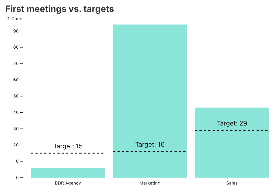
I realized off the bat that we had too many lead sources that needed to be consolidated so I could have a more accurate picture of which sources are driving the most leads. To complete this task, I simply asked AI — right in the canvas! — and after a natural language prompt it created the consolidated column for me. From there, creating a chart was as easy as picking a chart type and the fields to display from the drop-down menu.
However, I wanted to add the “target” values to the chart, so I asked AI to build a line indicating the goal for each lead source using Observable Plot.
Proceeding to more advanced analysis, I wanted to evaluate how our ideal customer profile (ICP) related to these consolidated lead sources. With the user interface, I was able to quickly daisy-chain 4 charts with employee size, annual revenue, industry, and revenue type (new or upsell).
Then, by using the “click to filter” capability on an employee range (see pink below) I could visualize the downstream effect.
This proved very powerful. I could easily swap the lead chart for another category like industry or revenue, as shown below. The results indicated that we could expand our ICP to include different revenue segments.
Next, I wanted to see how our pipeline was performing as we moved opportunities from initial meetings to pilots. This proved more challenging. Typically, CRMs provide point-in-time balance sheet statistics. For instance, accurately tracking how many pilots originated in Q1 isn't as straightforward as examining the pilot "stage," since completed pilots wouldn't be captured. To address this, we introduced an “exited pilot” date field to track pilot completions.
I tried to use AI to combine both opportunities that are active pilots and those that were completed, using the “exited pilot” date, but ran into an error. I sent my data analyst a quick ping and shared a link to my canvas. Because AI in canvases is inspectable, my data analyst could easily identify that the exited pilot stage was a date field that needed to be converted into a string before I could derive the column. With this insight, I asked the AI to convert the column to a string, filter for Q1, and combine the two pilot columns, successfully generating the desired visualization.
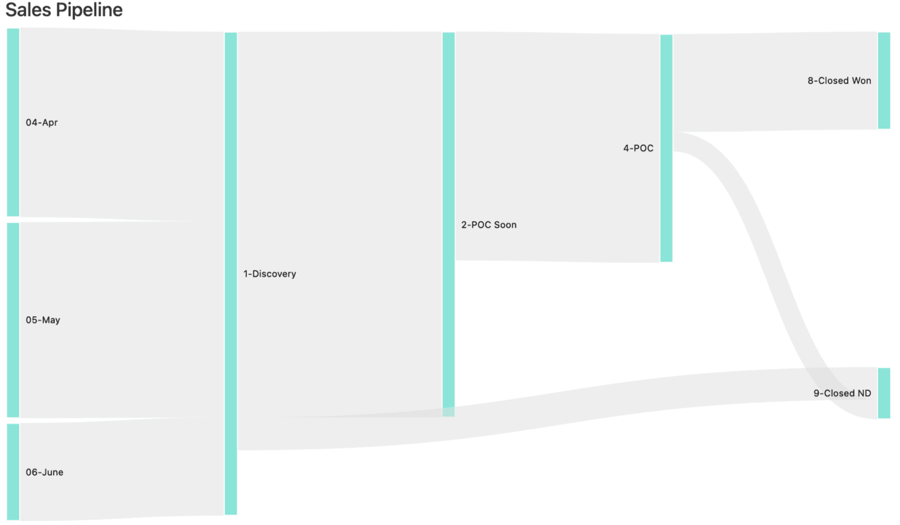
The next task was a more challenging cohort analysis of all stages. While working in the same canvas, my data analyst instructed me to select the Sankey chart and explained the drop down menu variables: Source (first meetings), Target (stage) and Size (# of deals). I shared my work with my engineer and he said, “this would have taken me a day or two to build with code, and you just did this in under 10 minutes!”
How collaborative analytics fulfills the promise of self-serve
The promise of empowering non-technical domain experts to explore and uncover deep insights has finally been realized. The infinite canvas facilitates easy data exploration, collaboration, and sharing. Contextual AI significantly enhances efficiency, far surpassing traditional BI methods. Additionally, when advanced customization is necessary, using the coding expertise of your data analysts becomes invaluable. My own success was enabled by close collaboration with the data team. This next-generation self-service analytics software makes all of this possible.
If you’re interested in learning more, I’d be happy to walk you through Observable Canvases — request a demo with me here.


