When Karim Douieb shares a new data visualization, it gains momentum quickly. Over the past decade he has created a number of compelling data visualizations that have introduced new perspectives and sparked thoughtful conversations.
We sat down with Karim, data visualization designer and co-founder of Jetpack.AI, to dig into the anatomy of an impactful visualization. Here, Karim shares his views on what resonates with audiences, and how he designs for clarity, impact, and emotion.
A visual way of thinking
Growing up, Karim had been searching for a language that made sense to him. Diagnosed with dyslexia, he struggled to express himself with written words. Drawing, creating schemas, and mapping ideas out visually became his preferred way of thinking and communicating.
Early in his career, Karim worked for a company that processed huge amounts of data for advertisers. He found an interest in data analytics, and soon discovered a tool called Protovis — created by Observable founder and co-CEO Mike Bostock — that opened a door to data visualization.
“It blew my mind, and made me want to dig deeper. From then on, data visualization became a second language, and allowed me to express myself easily.”
The anatomy of an impactful visualization: 5 key ingredients
With years of experience creating visualizations in both his personal and professional life, Karim has developed an instinct for what resonates with audiences. He has identified five crucial components that make viewers stop scrolling and start talking about his data visualizations:
Keep it simple
Make it beautiful
Add a revelation
Make it personal
Get a little lucky
1. Keep it simple
For Karim, simplicity is the foundation of every successful data visualization. For a visualization to truly have an impact, he says it has to be easily understood by anyone, even those without a particular background.
“When I design something, I imagine whether my grandmother or kids would understand it. They’re the best test audience. If you want your visualization to resonate with the largest number of people, it has to be simple.”
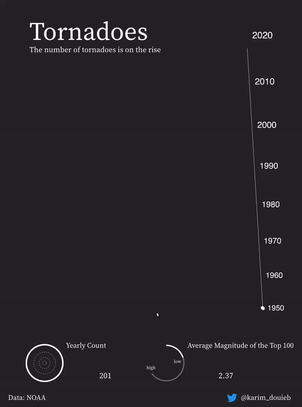
A clever and dynamic animation, this visualization highlights the increase of tornado frequency and magnitude through recent decades.
Getting to “simple” isn’t easy, and often involves a lot of technical effort. Creating more digestible visualizations from complex data requires tools that give you unlimited flexibility. To meet his needs, Karim works with a range of tools like Observable Plot, Observable Framework, and Observable Notebooks, and coding languages like JavaScript and React.
To keep his work fresh (and to satisfy his own curiosity), he’s frequently adding new tools to his toolkit. His All the Passes visualization was created as an experiment using Three.js, a JavaScript library for 3D graphics and animations.
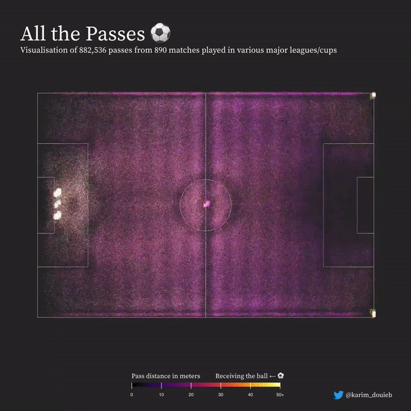
Karim plotted 800,000 passes across 890 major league soccer games played in various major leagues and cups to build a striking animated visualization.
2. Make it beautiful
Better data visualizations connect and resonate with more people, and aesthetics play a big role. According to Karim, “People give more attention to something that looks pretty.”
When Karim posted his glossy, 3D Climate Donut on LinkedIn, commenters came out in droves to praise his creation, calling it “creative,” “yummy,” and “eye-catching.” This visualization was built on Observable Desktop, currently in technology preview.
Design decisions, such as color, composition, and motion all play a role in building aesthetically pleasing data visualizations that accurately reflect the data. A well-chosen color palette improves readability and accessibility, while layout and composition make complex information feel more approachable. Thoughtful animation can help make connections and serve as a visual cue, and adding a variety of chart types to a dashboard not only adds richness and appeal, but also exposes patterns and improves understanding. Hooking viewers with a stunning visual means they’re more likely to stick around for the whole data story.
3. Add a revelation
An effective data visualization has to give the viewer an “aha” moment.
“When a viewer understands something new from a visualization, or when something clicks for them, they’re more likely to share it.”
Karim calls that moment of realization or epiphany an “intellectual revelation,” insisting it’s a key ingredient to creating engagement with his data visualizations. “People want to tell others when they’ve discovered something new.”
How does he help his audience get to that lightbulb moment? Transitions and animation — two techniques that show up frequently in Karim’s work. Karim posits that engaging transitions and animations grab viewer attention, and create a sense of drama and discovery.
One of the clearest examples of this is a visualization he created in response to a 2016 U.S. election map. “Electoral maps are misleading. Acres don’t vote, people do,” he explained. His approach transformed the traditional land-area map into an animated cartogram representing voter results as circles scaled by population.
In just a few seconds, viewers grasped how a different visual treatment of the same data could tell a different story. That type of perspective shift is exactly what Karim strives for in his work.
4. Make it personal
Karim publishes a lot of visualizations about his hometown of Brussels, Belgium. Over the years, he has come to realize the importance of creating data visualizations that have a personal connection with an audience. In his map, Brussels. A Lovely Melting Pot, each colored dot represents a person, and each color a community: blue for citizens of the fifteen European member states, pink for North African residents, and yellow for the Turkish population.
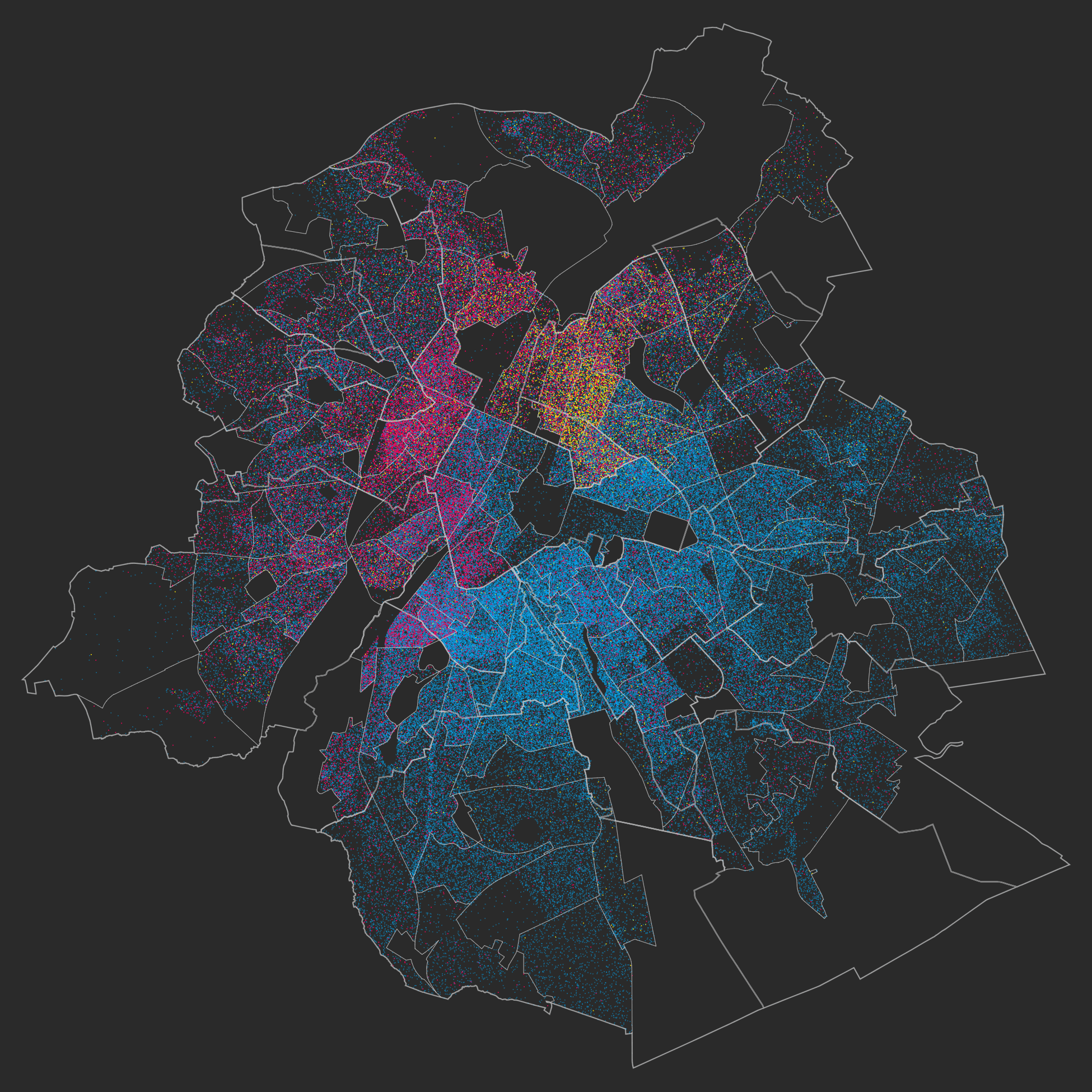
Karim developed a data visualization essay that explores the diverse neighborhoods of his hometown, Brussels.
“What I wanted to highlight here is the fact that although Brussels is super diverse, there is an underlying problem in how divided it is as well. These communities aren’t properly integrated into the fabric of the city — they live side by side, but rarely mix. You can really see it with these types of visuals.”
While the message of social integration may have struck a chord, Karim suspects the real reason it resonated was simply because people saw themselves in the data.
“People saw it as a love letter to the city. They recognized themselves in it — their neighborhoods, their communities — as opposed to a big, abstract statistic that’s hard to relate to. Each dot could be someone they knew, or even themselves.”
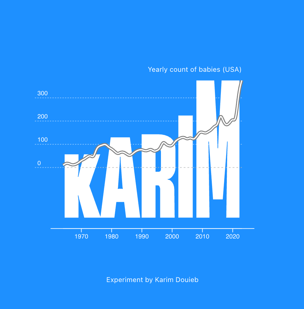
Karim's Baby Names experiment capitalized on the same sense of recognition, with many commenters on LinkedIn sharing screenshots of their own name trending over time.
5. Get a little lucky
Creating a clear, beautiful, and emotionally-resonant data visualization doesn’t always guarantee engagement. Sometimes it just comes down to luck and timing.
Karim recalled one particular visualization he was really proud of — an animation of Olympic rings that transformed in size to represent the number of medals won by continent. It didn’t quite get the reception he expected.

Karim's animated visualization highlights the number of rings won by each continent at the Tokyo 2020 Olympic games.
Even with his many years experience and mastery of the craft, he is still surprised by the public reaction when he releases new work. One of his most unexpected viral hits began as a simple experiment. When learning Blender, a 3D animation software, he became fascinated by its ability to simulate realistic hair and movement. He then decided to seek out a dataset that he could use to test it out with.
“I realized no one had probably ever used hair to display data.”
The result was a humorous rendering of a map of the world by male body hair density. It somehow found a fanbase in a niche community on Reddit.
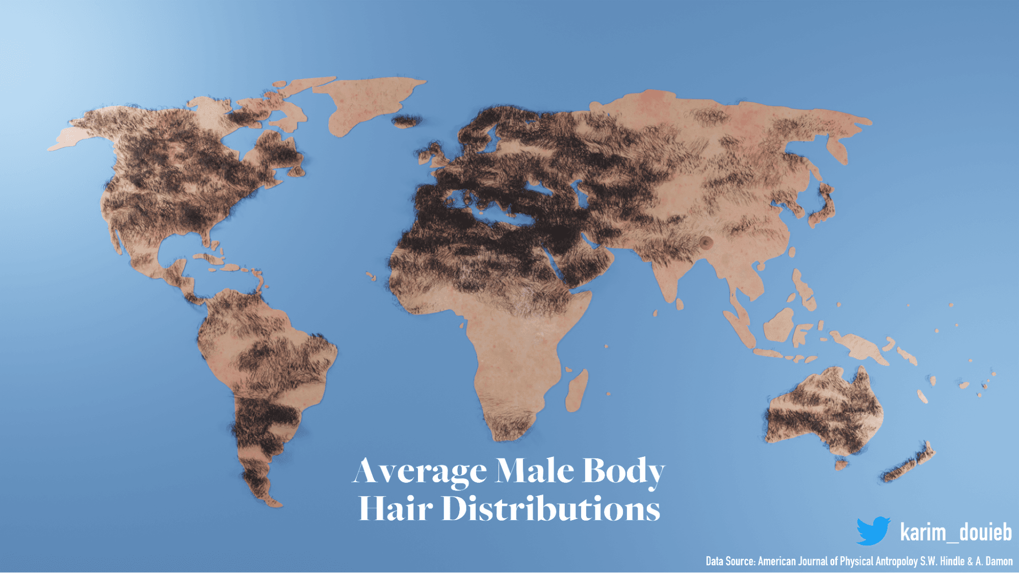
A playful 3D experiment, this visualization of Average Male Body Hair Distribution found unexpected fans on Reddit.
Passion — the final ingredient
Although Karim’s day job is running his data science company, Jetpack.AI, many of his creations are passion projects fueled by his own curiosity. When asked what he believes unites all of his creations, he answers without pause:
“Looking back, I think what really makes a project work is passion. If I’m not genuinely interested in the topic or the process, it shows. It has to come from personal interest, otherwise, it doesn’t work.”
His passion and curiosity push the boundaries of data visualization, which is why he’s known for his striking, creative, often unconventional work. These days, he’s crossing into new territories beyond the digital realm, and exploring sculpture and ceramics as the next frontier. “I’ve been experimenting with ways to make data physical, like using my hands to create sculptures and ceramics,” Karim says. “It’s not directly data-related yet, but I’d love to bring those worlds together. Even if the audience isn’t as enthusiastic as I am yet, it’s a good way for me to express myself.”
See all of Karim’s creations in his portfolio and be sure to follow his public notebooks on Observable.