In data visualization, even small design choices can significantly impact how an audience perceives, experiences, and understands the data presented. Detailed chart customization, however, can come at a cost, as developers and analysts often spend valuable time fiddling with the final design touches. And how many of us have found ourselves deep in those time-consuming customization weeds, only to find out later that a built-in option to do just that thing already exists?
In Observable Plot, there are a lot of chart design options waiting patiently in documentation that make otherwise tedious changes a breeze. In this post, we shine a light on eight underused chart options in Plot.
1. Curves in line charts
In most data visualization libraries (including Plot), the default way records are connected in a line chart is with a straight line from point-to-point. That’s often the best choice for high-frequency time-series data collected at predictable intervals (e.g. hourly or daily data). But for sparse or uneven data where you want to visually indicate stepwise changes, or you’re just looking for a different aesthetic, you might want to change how a line is drawn between points.
You can quickly update how points get connected with Plot’s curve option, which determines how values between points are interpolated to draw a continuous line. There are over twenty curve options in Plot, from natural (a natural cubic spline) to step (a piecewise function where y changes at the midpoint of x). Update your chart to use any of the built-in curves by simply adding curve: "natural" (or another curve name) as an option within your line mark, as shown below:
Plot.plot({
  marks: [
    Plot.lineY(numbers, {curve: "natural"}),
    Plot.dotY(numbers, {x: (d, i) => i})
  ]
})
2. Rounded corners in bar charts
In Plot, bar corners are square (not rounded) by default. If you want to soften the edges a bit to change the feel of your chart and better delineate between different categories (for example in a stacked bar chart), you can do so by setting the corner radius.
In the clip above, all corners are rounded in the same way using the r option — but you can even specify which corners are rounded! For example, the effect below is created using the rx2 option, which applies a corner radius to both the x2-y1 (bottom right) and x2-y2 (top right) corners of the bar. Adding a negative rx1 allows the bars to curve towards the ones they’re stacked on for a more seamless look, as shown below:
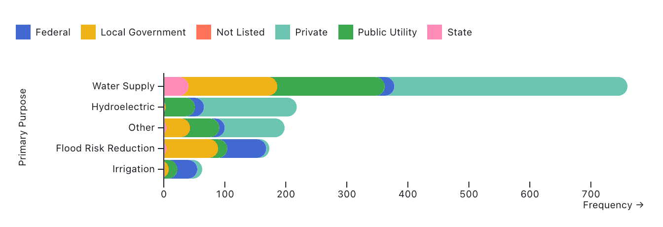
Plot.plot({
  marginLeft: 150,
  color: {legend: true},
  marks: [
    Plot.barX(
      ca_dams,
      Plot.groupY(
        { x: "count" },
        {
          y: "Primary Purpose",
          sort: { y: "x", reverse: true, limit: 5 },
          fill: "Primary Owner Type",
          rx1: -10,
          rx2: 10,
          clip: "frame"
        }
      )
    ),
    Plot.ruleX([0])
  ]
})
These options work with any rect-type mark, so whether you’re building bars, waffles, or heatmaps, you’ve got easy control over your corners.
3. offset: “normalize”
You can use the offset option to rescale stacked data (like stacked bar or area charts). One particularly useful option is offset: “normalize”, which rescales stacked data to a total value of 1, allowing a viewer to more easily compare proportions across groups. Combined with percent: true for the scale, you get percentages in the tick marks.
For example, in the chart below we use offset: "normalize" with percent: true to rescale a stacked bar chart of dam types in the United States, with color mapped to dam ownership:
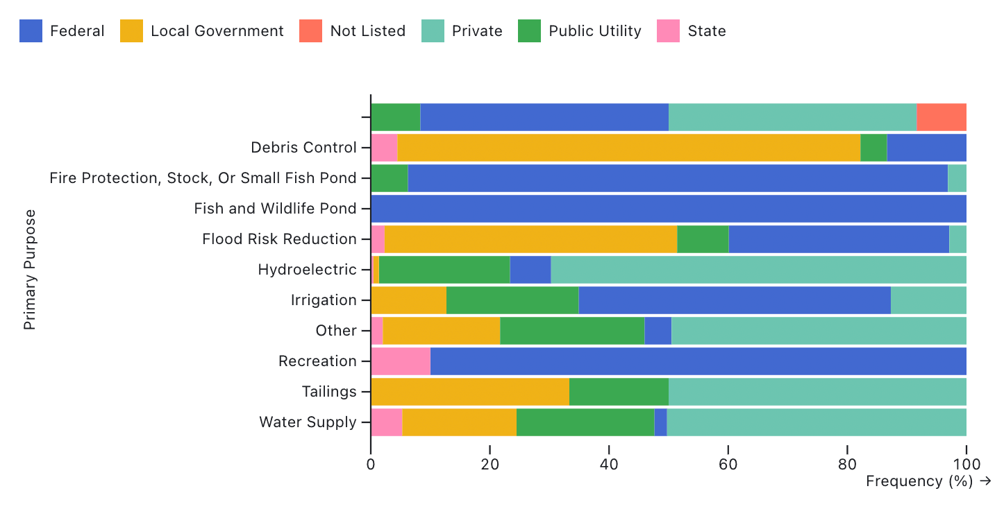
Plot.plot({
  x: {percent: true},
  marginLeft: 230,
  color: {legend: true},
  marks: [
    Plot.barX(
      ca_dams,
      Plot.groupY(
        { x: "count"},
        {
          y: "Primary Purpose",
          fill: "Primary Owner Type",
          offset: "normalize"
        }
      )
    ),
    Plot.ruleX([0])
  ]
})
For a different effect, stacks can also be centered on the axis using the offset: "center" option, or set to offset: "wiggle" to minimize their apparent motion around the axis.
4. Faceting on a continuous quantitative variable
Usually we facet on an ordinal or categorical variable, splitting the data into small multiples based on discrete groups (like industries) or ordinal levels (like age brackets). But you can also facet by a continuous quantitative variable. Doing so just requires an extra step to bin the values into discrete groups.
Luckily, Plot’s interval scale option makes it easy to make those bins right within your Plot code (no need for outside data wrangling). For example, the code below facets a subset of the diamonds dataset to visualize a histogram of diamond size (carats), faceted by price bins (using a $500 interval):
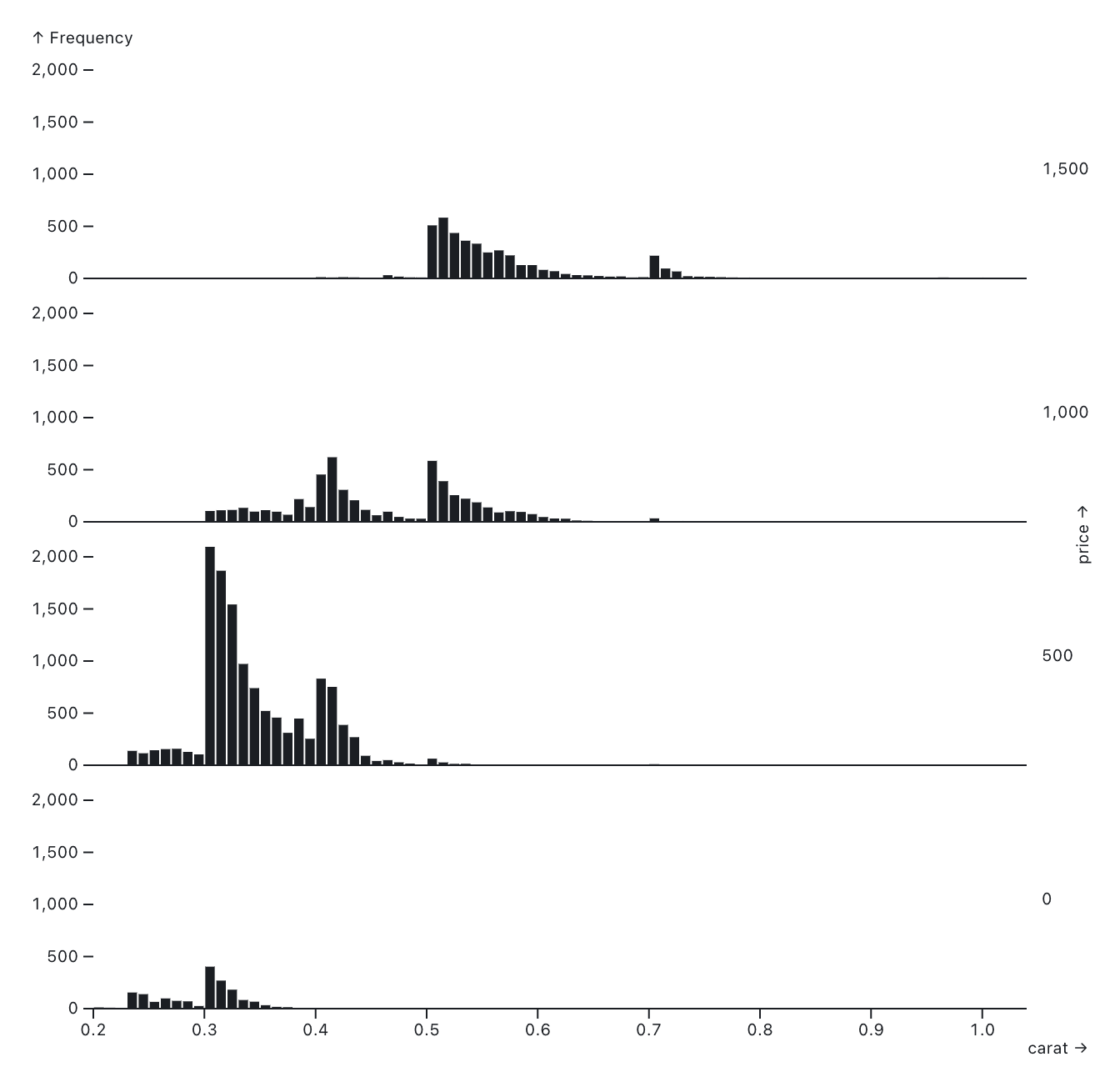
Plot.plot({
  fy: { interval: 500, reverse: true },
  marks: [
    Plot.rectY(
      smallDiamonds,
      Plot.binX({ y: "count" }, { x: "carat", fy: "price" })
    ),
    Plot.ruleY([0])
  ]
})
You can similarly bin continuous dates using Plot’s interval option, for example to facet by decade.
5. Add a symbol legend, get colors for free
When you add symbol and color scales to differentiate categorical groups, it’s nice to have a legend showing both. In other words, if a group is represented by a red triangle in the chart, then it should show up as a red triangle in the legend. This is one of those things that adds nice final polish to charts and data visualizations, but is also easy to forget.
In Plot, the legend for the symbol scale automatically incorporates a color scale. That means when you set legend: true for the symbol scale, you get the colors for free!
For example, the chart below shows how adding symbol: {legend: true} adds a legend with both the appropriate symbol, and the automatically integrated colors mapped to penguin species.
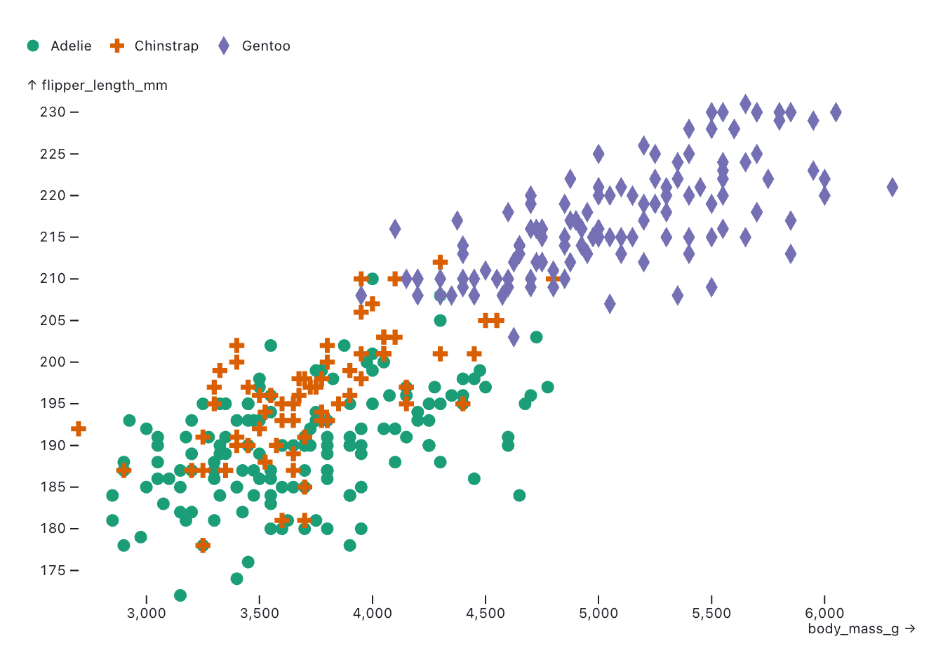
Plot.plot({
  symbol: { legend: true },
  color: {scheme: "Dark2"},
  marks: [
    Plot.dot(penguins, {
      x: "body_mass_g",
      y: "flipper_length_mm",
      fill: "species",
      symbol: "species"
    })
  ]
})
6. Interactive crosshairs
In Plot, you can add instant tooltips using the tip mark. But did you know that there’s also an interactive crosshair mark? Use Plot.crosshair to help users explore coordinates in the context of the x- and y-axis scales, as shown below for AAPL closing stock prices over time:
Plot.plot({
  marginLeft: 50,
  marks: [
    Plot.line(aapl, {x: "Date", y: "Close"}),
    Plot.crosshair(aapl, {x: "Date", y: "Close"})
  ]
})
7. mixBlendMode
We often take for granted how colors appear when chart elements, like dots in a scatterplot, overlap. With Plot’s mixBlendMode option, you can choose from different blend modes to control how colors blend when they overlap, for example to avoid occlusion while still keeping opaque marks. In the code below, overlapping histogram bars are exposed using different blend modes (e.g. by adding mixBlendMode: "multiply" within the bar mark):
Plot.plot({
  y: { grid: true },
  marks: [
    Plot.rectY(
      olympians,
      Plot.binX(
        { y2: "count" },
        { x: "weight", fill: "sex", mixBlendMode: "multiply" }
      )
    ),
    Plot.ruleY([0])
  ]
})
8. Spatial interpolators
That’s right, Observable Plot has spatial interpolators! In Plot’s raster and contour marks, add the interpolate option to fill a raster grid with interpolated values using the built-in nearest, barycentric, or random walk methods. Even better, they work for both quantitative and categorical values!
Below, a user toggles between options to interpolate penguin species values (a categorical variable) over the raster grid:
Plot.plot({
  width: 500,
  color: {legend: true},
  marks: [
    Plot.raster(penguins, {
      x: "body_mass_g",
      y: "flipper_length_mm",
      fill: "species",
      interpolate: "random-walk",
      opacity: 0.5
    }),
    Plot.dot(penguins, {
      x: "body_mass_g",
      y: "flipper_length_mm",
      fill: "species",
      stroke: "white",
      r: 4
    })
  ]
})
Keep customizing charts and visualizations with Observable Plot
We’ve shared eight useful (and underused) examples of Observable Plot’s built-in chart options, but there are many others, including to easily add interactive tooltips and pointers. Keep an eye out for upcoming options to quickly add brushing, zooming, and animation right in Plot!
Explore the Plot documentation and gallery to get inspired, and to discover more ways you can quickly customize the look, feel, and behavior of charts without reinventing the wheel.