What is data exploration?
When working with data, it can be hard to decide on the best way to analyze and visualize a dataset before you’re deeply familiar with it. That’s where data exploration comes in.
Data exploration is the process of examining and understanding a dataset before performing a more formal analysis. Data exploration is an early step of a typical data analysis workflow. It helps analysts get a better understanding of a dataset’s structure, patterns and outliers in the data, and opportunities to uncover insights.
Data exploration, also known as exploratory data analysis (or EDA), is an important step of the analysis process, as it informs how you choose to analyze the data, what questions you will attempt to answer, and what data visualizations you can create to communicate your insights.
In this guide, we share an overview of the data exploration process, the specific steps of data exploration, and some common tools to help you explore and understand your data.
Why is data exploration important?
Data exploration is critical to any rigorous analysis, because it helps you understand your underlying data. While some may be tempted to skip an initial data exploration, and instead dive right into analyzing their data and making beautiful charts, this is usually not advisable.
An initial exploration can help you start to uncover patterns, outliers, and anomalies in your data, and ensure that you’re choosing appropriate methods for data analysis and visualization down the road. You can start to develop hypotheses, ask additional questions about the dataset, and create exploratory charts, all of which can guide more in-depth analysis.
Our data exploration platform, Observable Canvases, includes helpful summary charts across imported tables, and enables you to quickly build data visualizations during your exploration — helping you make sense of your data faster.
Before getting too far into the data analysis weeds, the data exploration phase is a good time to bring in stakeholders for a visual analysis of your exploratory charts and tables. Including stakeholders early on in the data analysis process brings a diversity of opinions and expertise, and lays the groundwork for more informed, useful, and trusted analysis.
How does data exploration fit in the broader data analysis workflow?
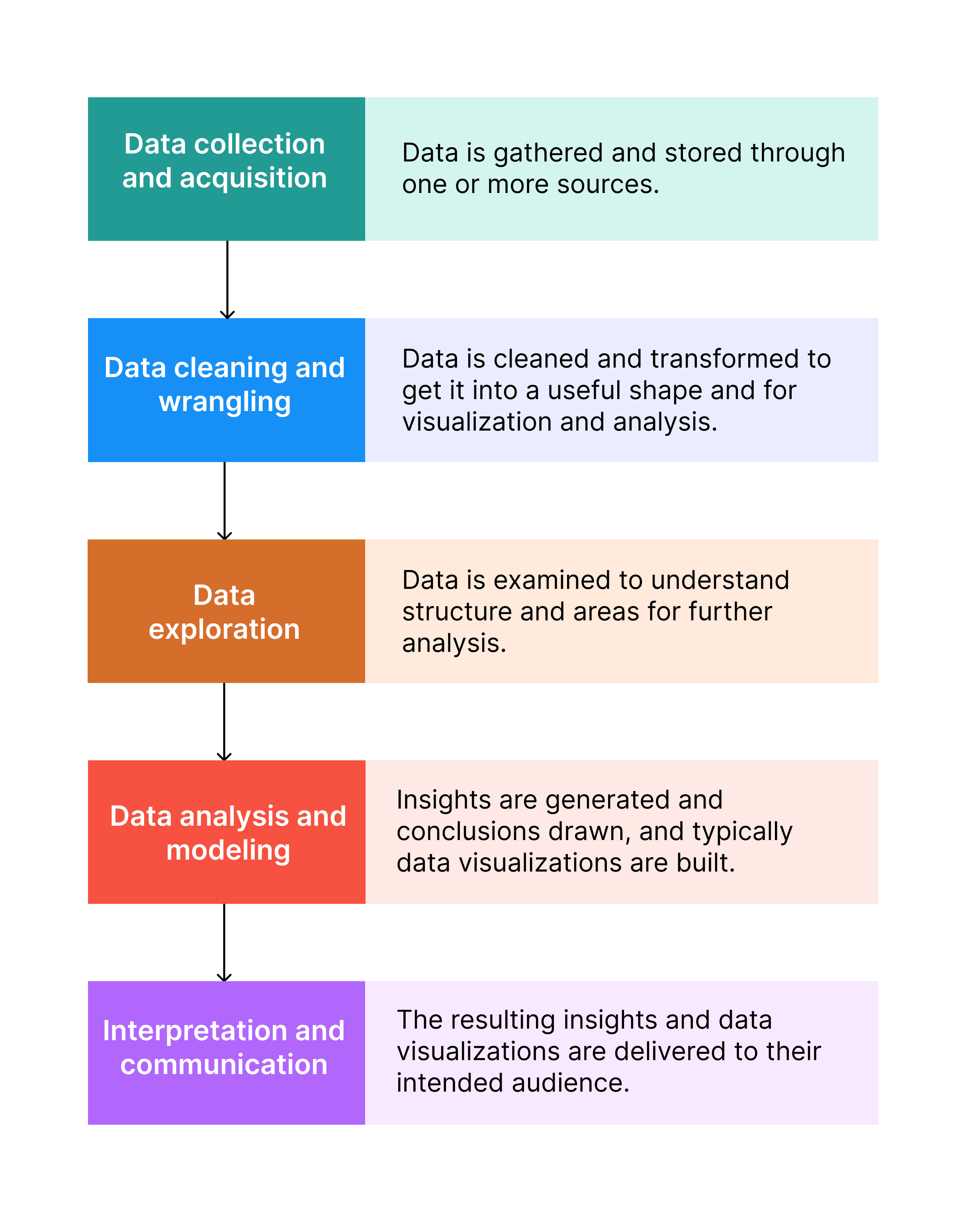
Data exploration plays an important role in the overall data analysis process by taking you from raw data to deeper data analysis. Here’s how it fits into the typical data analysis workflow:
Data collection and acquisition: Data is gathered and stored through one or more sources.
Data cleaning and wrangling: The data is cleaned and transformed to get it into a useful shape and for visualization and analysis.
Data exploration: The data is examined to understand structure and areas for further analysis.
Data analysis and modeling: Insights are generated and conclusions drawn, and typically data visualizations are built.
Interpretation and communication: The resulting insights and data visualizations are delivered to their intended audience.
What are the key steps of data exploration?
Data analysts and business intelligence professionals typically follow a few keys steps when exploring a dataset:
1. Get the big picture
Review the metadata and any accompanying documentation to get to know your data. What was the data’s source and lineage? When was the data collected, and last updated? What do each of the tables and columns represent? What kind of database is the data contained in?
2. Conduct an initial profile
Examine the data types contained within each column and/or row. What is the data’s general shape? What type of data or variables are in each column? What are useful summary statistics for each field? Are there any missing values, duplicates, or glaring errors? Are there any incomplete time periods in columns that contain time series data?
You can build some quick exploratory charts and visuals to help you understand these questions. Some data analysis tools, like Observable Canvases, offer visual summaries of data contained in each column, to help you get a sense of the general shape of the dataset.
If there are missing values, or you uncover data quality or formatting issues that could affect your analysis, you will likely need to go back to the data cleaning and wrangling phase before continuing.
3. Explore individual variables (also known as univariate analysis)
Take a look at each variable in the dataset. The goal of univariate analysis is to understand important characteristics for each variable distribution like range, skew, and variability. Is it heavily skewed or symmetric? Is it strongly peaked, or relatively flat? Are certain values frequently repeated, or are all values unique?
You can use a histogram to better understand the frequency distribution of numeric data, while bar charts can help you better understand categorical data. To explore spread and extreme values in their data, analysts commonly use a box plot (also known as a box-and-whisker plot).
4. Explore relationships between variables (also known as bivariate or multivariate analysis)
Now that you understand the shape or patterns within each individual variable, you can start to look for correlations, patterns, and relationships between two or more variables. Real issues in the world are rarely explained by one factor alone, so it’s important to look at the relationship between different variables.
Are there trends or correlations in the occurrence of one variable or another variable? Are certain values clustered or grouped in some way? Are there confounding variables, or trends that fall away when you account for a third variable? By using scatter plots, line charts, pair plots, or lesser known charts like beeswarm charts and horizon charts, you can start to understand patterns and trends across variables in your dataset.
5. Look for outliers and anomalies
Part of data exploration is looking for outliers or anomalies within your dataset. Unexpected values could skew your analysis, leading to biased results that prevent you from drawing accurate conclusions — so tread carefully.
Dig into outliers and anomalies to determine whether or not these are errors, and should be excluded from further analysis, or something more meaningful. A value being quite different from the others doesn’t necessarily mean it’s an outlier that should be omitted from your analysis! In fact, an unexpected value could lead to your next big insight, or answering a question you didn’t think to ask.
6. Ask initial questions and iterate on your data exploration
As you explore your data, ask yourself what these trends and patterns mean for your business. What would someone else at your organization want to know, based on the data and initial visuals that you’re looking at?
Again, it can be helpful to share your initial data explorations and visualizations directly with your stakeholders and colleagues, as they can add context and detail that you may not know to look for. This can help you move toward collaborative analytics — a method of bringing members of the broader organization into the data analysis process, helping data analysts work more efficiently and reducing feedback cycles.
Armed with these questions, you can move on to the next phase of the data analysis process with a better sense of what to look for, and appropriate modeling and visualization techniques for your data.
What are some common data exploration tools?
There are a vast number of tools available for exploring data, ranging from free solutions for individuals to robust business intelligence software. Here’s a high-level overview of the types of tools used in data exploration:
Spreadsheets: The workhorse of data exploration tools, spreadsheets are a tried and true way for individuals to collect and explore small datasets.
Code-based workflows: SQL is considered essential by many analysts for exploring data stored in databases. Many business intelligence professionals explore datasets programmatically with Python, while R is trusted by data science teams globally for statistical analysis and exploration. Observable Notebooks are another tool used by analysts and developers that prefer a browser-based interactive programming environment. Our live JavaScript notebooks are designed for exploring data visually, and building data visualizations with code.
Interactive software: There are many tools designed specifically to help analysts explore large datasets within a more user-friendly interface, including Tableau, Power BI, Domo, Qlik, and Observable Canvases. These tools are built to accelerate the data exploration process, and to make chart and dashboard development more accessible for analysts and data teams with a range of technical experience.
What are some tips for more effective data exploration?
Start broad, and then zoom in: When kicking off your data exploration, it’s helpful to start with a ten-thousand foot view, and then zoom in on the individual variables and values. This helps you understand the dataset as a whole, including how and why it was collected, and what the specific columns and variables look like.
Don’t skip data cleaning! Getting your data in shape to be analyzed is an essential part of the data analysis process because it ensures data quality, usability, and reliability. If you’ve ignored missing values, duplicates, or errors, your analysis could yield incorrect, biased, or unusable results.
Integrate visualizations into the process: Build exploratory visuals to quickly understand the shape of your data, and spot trends and patterns quickly. Some specialized data analysis tools like Observable Canvases build visual summaries automatically, so you can perform visual data analysis to save time and get insights faster.
Reproducibility matters: It’s important to keep a record of the steps you took to initially explore your data. After all, when you uncover a trend or pattern, you want to be able to reproduce this insight when you dive into the formal data analysis process.
Bring stakeholders into the process early on: Effective data analysis doesn’t happen in a black box. Bringing collaborators along for the data exploration journey can help you find patterns and trends you may have overlooked. And, stakeholders can add context and ask important questions to improve and accelerate your analysis.
Conclusion
Data exploration is a key step in the data analysis process. It helps you understand your data's structure, find trends, collaborate with others, and form hypotheses that lay the groundwork for data-driven business decisions.