Data journalists are tasked with turning messy and complex data into digestible visualizations and engaging stories that can capture attention in the daily scrum of online media.
Data teams may serve a different audience, but they face a similar challenge: turning analysis into something a stakeholder can quickly understand and act on. By adopting some of the practices of data journalism, data teams can deliver more effective analyses, and build visualizations that are clearer and more useful to their stakeholders.
Below, we highlight practical strategies from leading newsrooms that data teams can use in their day-to-day work, based on recent conversations with data journalists from Axios and Reuters.
Consider your audience’s knowledge and goals
When diving into a project, data teams may make the mistake of assuming stakeholders will understand their deliverables entirely. Newsrooms don’t have this luxury, and must fight for each click and view.
Data teams should take a step back to think critically about their audience before diving into analyses. What might they understand (or not understand) about the data? What context would they need to interpret any given insight? What goals do they have, and what challenges are they trying to solve? These questions have a direct impact on the final product, including what form (or forms) a deliverable will take, and how much data is presented.
On our recent webinar, Axios Associate Editor Kavya Beheraj highlighted these important questions as foundational for data work:
At my past job, I had a lot of experience making dashboards that I'm not sure anyone actually used or saw. And I think part of the challenge there is that we're going in assuming that we need a dashboard and that all of the data points that we want to visualize matter. But I think there are more fundamental questions, like, why do we need to visualize all of this in this way? Who is going to be using it, and how? And how is it going to be maintained? Those are principles from data journalism that apply anywhere. Anytime you want to do some sort of visual communication or chart, it is helpful to understand who you are trying to help, to influence, to inform.

Kavya Beheraj, Associate Editor, Axios
Take the time to deeply explore and understand your data
Real-world datasets are rarely dashboard-ready, and may contain missing values, outliers, or mismatched nulls. Data exploration is a critical step in the analysis process, where analysts can familiarize themselves with the data, how it was collected, and start building hypotheses around what insights can be gleaned from it.
During our recent webinar, Ben Welsh, News Applications Editor at Reuters, pointed out that it's important to focus on the fundamentals and ask even the most basic questions of datasets — for example, what does any given row represent? Assuming something as fundamental as all rows equating to a single observation can lead teams down the wrong path, as he discovered while working with tree planting data from the City of Chicago:
There was a column with a very cryptic name — we didn't know what it was and didn't think too much about it — but it was actually the number of trees that had been planted in that row. Each row was not a tree, which is what we were working under the assumption of. Each row was a work order to plant one-to-many trees. So our initial analysis was fundamentally wrong because we didn't understand everything we needed to know about the data. Just slowing down and forcing yourself to walk through that is crucial. What is actually being shown? Maybe it's multiple things at once, maybe there's multiple data sets mixed together that need to be teased apart.

Ben Welsh, News Applications Editor, Reuters
By thinking more like journalists, analysts can interrogate their datasets, and start to better understand it and what stories it can tell: Why does this dataset exist? How were these observations collected? How is it already used or manipulated? Who needs this, and what will they do with it?
From there, as Kavya says, “let the story steer the ship.” Instead of simply jumping into a dashboard builder based on preconceived notions about the data, the data and the insights uncovered within it should inform the analysis and how it’s communicated.
Collaborate for stronger visualizations and deeper insights
Effective collaboration can streamline processes and improve the end result of data analysis, and nowhere is that more apparent than the fast-paced world of online media. Data teams can work more efficiently by practicing collaborative analytics, and bringing stakeholders into the data analysis process directly. Data teams are often most knowledgeable about an organization’s data; stakeholders often have the clearest understanding of an organization’s operations and challenges. Bringing analysts and stakeholders together during data work can reduce tedious feedback cycles, speed up project timelines, and illuminate insights that would otherwise be missed.
When you find yourself in a collaborative environment, you probably shouldn't be the best designer, the best developer, the best data journalist, all these things at once. Learn to be comfortable with putting your ego aside, and let the people who shine at something, shine. Not only will that make for a smoother and better process — and probably better product in the end — it also will allow you to grow into your preferred specialty.
Kavya Beheraj, Associate Editor, Axios
Personalize visualizations to improve engagement
Data journalists often are tasked with telling stories around large, complex, and abstract trends. Localizing these stories is one way to drive audience engagement.
During our conversation, Kavya highlighted one example of a dashboard that allowed readers to see the effects of wildfire smoke in their communities. “We wanted a way to take this really large national story and make it relevant in some way to folks — how it compares to the average, whether what you're experiencing is healthy or unhealthy according to the standards set by the government… The stories got [picked up] a lot, because we took the time to localize it.”
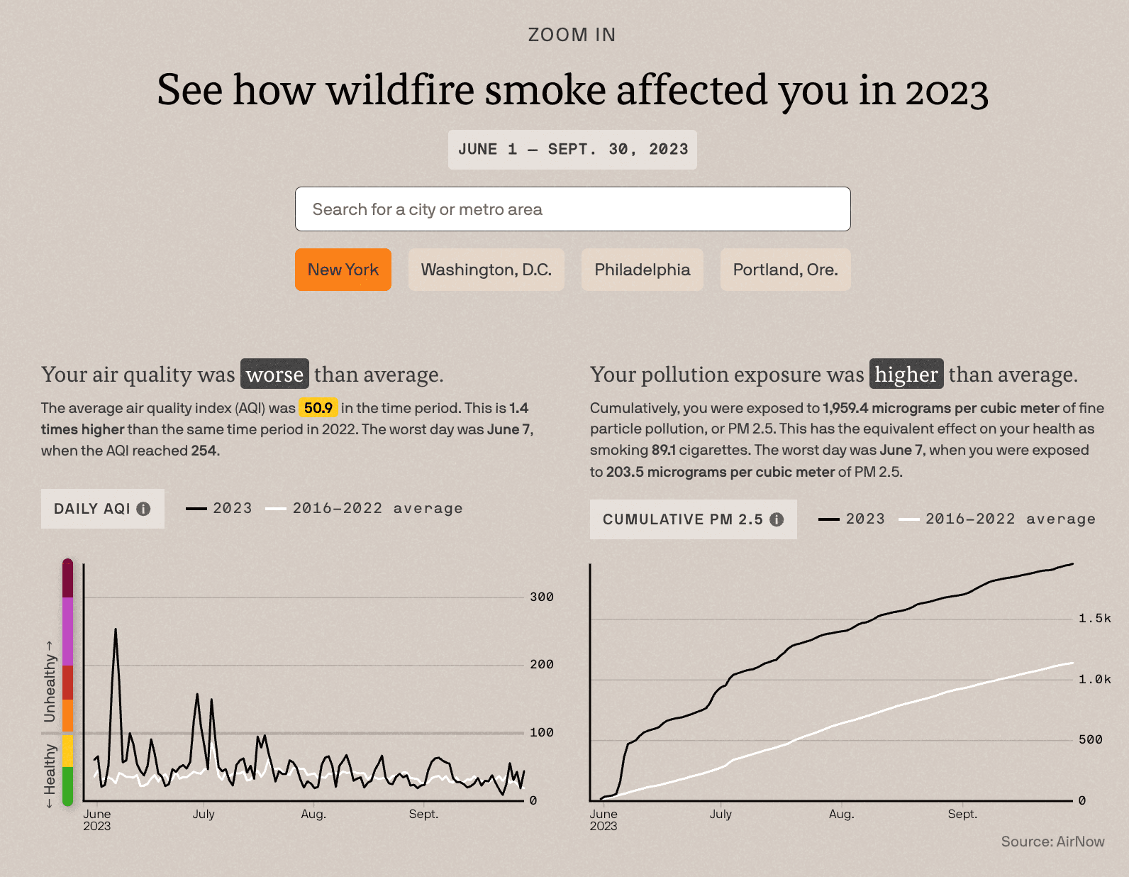
The team at Axios built a dashboard that helped readers understand how wildfire smoke was impacting their community's air quality and pollution exposure.
Data teams can adopt similar practices by delivering more personalized insights, and making reporting more granular. For example, instead of creating a single global sales dashboard, their deliverable could include simple interactivity so sales leaders can easily customize reports to their region or team’s specific metrics.
Design charts for interpretability
Data visualizations should not need a presenter to explain what matters. When telling stories with data, journalists choose the chart that best fits the story and the data, then make careful design decisions so the result is engaging and interpretable. Sometimes that means using a simple chart that clearly communicates a single important point. It could also mean building a more immersive data story that reveals something a standard chart cannot.
Data teams should aim to create visualizations that provide enough context to be understood on their own. When was the data last refreshed? What should the viewer compare it against? Is the result positive or negative? Expected, or unusual? That context can come from annotations, benchmarks, or historical data that shows how recent observations compare with past performance.
As organizations move beyond the dashboard paradigm, stakeholders may expect or look for data visualizations elsewhere, such as in Slack or Microsoft Teams, inside data apps, in documents, or on mobile devices. Data analysts should consider where their charts will be viewed, and adapt their charts to better utilize constrained spaces. A chart that can stand on its own across a wide variety of surfaces is more likely to be understood, reused, and acted on.
Use AI to automate programmable work and increase understanding
Data journalists are often early adopters of new technology, in part because their work constantly exposes them to messy, unpredictable datasets and the tools needed to make sense of them. As Ben Welsh put it in an earlier conversation, "We’re constantly encountering all the different weird things that can happen with data. Being the nerd caught in the middle of that mucky data processing is something that most people who work in data journalism end up liking. But it’s also why any technology that makes it easier for us is really exciting, and is why we tend to be rabid early adopters of weird new data tools."
AI is one of the latest examples. It has shown real value in automating repetitive work, which gives data journalists more time for the part of the job that requires human ingenuity: interpreting data and communicating what it means. In business settings, that same principle applies to recurring data prep and cleaning, dashboard maintenance, and routine QA. By automating these manual, less creative tasks, analysts can spend more time asking questions of their data to uncover the insights that move the needle for their organization.
AI can also help audiences interpret data and stories. As Ben pointed out, “It’s going to increase the accessibility of the type of work we do, by bringing more people into the conversation.” Likewise, data teams can deploy AI tools that enable stakeholders to explore data on their own, without requiring advanced SQL or coding skills.
Conclusion
Data journalists work in an environment where attention is at a premium. They understand that data analysis is only effective when it’s communicated and understood. These processes and data visualization principles, honed in the newsroom, can provide a useful model for analysts who are looking to tell better stories with their data. The result will be more insightful analysis and deeper engagement with stakeholders, who will be better able to understand the findings and use the work to make more informed decisions.