From new open-source software, to inspiring community creations, and an exciting conference, it’s been a big year for Observable. As we look back on 2024, here are 24 insights from the year.
Insight 2024
Our first insight is quite literal: the Observable Insight conference we hosted earlier in December. Over 500 data viz developers, data scientists, analysts, and product managers joined us live for inspiring talks, discussions, demos, and creator spotlights showing what’s possible (and what’s coming!) in data visualization.
If you missed Insight or want to revisit any of the insightful sessions, all recordings are available in our YouTube playlist!
Twelve community insights
Observable community members created many amazingly insightful data visualizations and data apps this year. Picking just a handful to highlight was almost impossible, but here’s a dozen we particularly liked.
Since releasing Observable Framework in February, we’ve been wowed by the dashboards and data apps built with it by the community. Here are a few that caught our eye:
Climate Central’s analysis providing insights into urban heat hot spots (see also the customer story for a look into how their team uses Observable)
Streets to Stability, a very insightful piece on homelessness cycles in San Francisco (all puns aside – see also our recent blog post interviewing Jason Forrest, one of the project’s leads)
Private jet emissions (and why they are bad) provides an interesting view into the flight patterns of the super-rich
Mosaic + Framework makes it possible to visualize very large data sets to gain insights into them
A map inventorying Boston’s buildings to investigate their potential for reducing carbon emissions through retrofitting
A real-time view of the BlueSky firehose, giving an overview of the most popular hashtags on the platform
Our users also created many remarkable notebooks providing insights into a wide variety of topics. Here are a few that we love:
A very insightful presidential election cartogram transition animation, which unlike most preserves geographical relationships
The Tortured Data Viz Department – yes, it’s about Taylor Swift, of course
Great circle vs. rhumb line comparison, showing graphically why geometry on a curved Earth is different from a map
Jo Wood’s 30-day map challenge series, which includes many beautiful, and no less insightful, maps
Movie monster beeswarm plots providing a view into the popularity of different kinds of monster movies (and movie monsters)
No year-end “wrapped” post is complete without some insight into Spotify data. The relentless march to musical oblivion shows how songs become popular and then fade from people’s attention over time.
Ten insights into making better data apps
Helping people gain new insights into their data is a core part of our mission. Going beyond our product releases, we also created blog posts, held webinars, gave external talks, and published a number of videos.
In particular, we wanted to help people create better data visualizations, by discussing why you should never crop the y-axis, and when you still might, showing you how to do it in Observable Plot (and what to do instead), talking about underutilized chart types, how to add annotations to your charts, and how to use animation in your visualizations.
Beyond data visualization, we also dove deeper into how to build better data apps, including why data needs to be updated with care, how code opens up many possibilities for dashboards and data apps, and how a static-site generator works.
Rounding out this section, we also gave talks and workshops at external events, where we shared how Observable's open-source tools help folks create better data visualizations, faster. For example, check out Robert’s talk at DuckCon, A duck for your dashboard: performant data apps in the browser with DuckDB, and Allison’s session at OSA CON on how developers can build faster and overcome the last mile problem.
An insight into our own open-source projects
Finally, we wanted to gain some insight into our own work. Between all our projects and products, we closed over 1,600 tickets this year, and made almost 6,000 commits across all our repos.
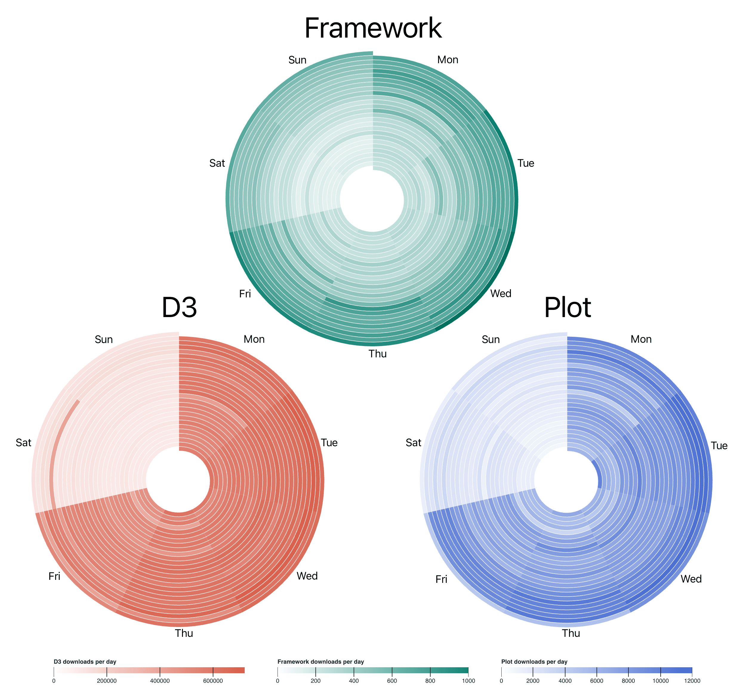
Our open-source projects, including Observable Framework, D3, and Observable Plot, are being used by millions of people across the globe. But we wanted to know if people mostly use them for work, or also for their personal projects. Our open-source analytics project provides download numbers for all our projects, which allowed us to quickly create the visualization below.
It shows download numbers for each project over the last six months on circular heatmaps. These align days of the week (each spiral layer is one week), so it’s easy to see that the numbers are a fair bit lower on the weekends (lighter wedges on Saturday and Sunday) than during the week (generally darker wedges Monday thru Friday).
On to 2025
We hope you had an equally insightful 2024 and wish you a healthy and successful 2025! There will undoubtedly be many more incredible visualizations and data apps built by the Observable community, and we’re looking forward to seeing them. We also have some great new things planned for the next year, so stay tuned!
