

Nodes
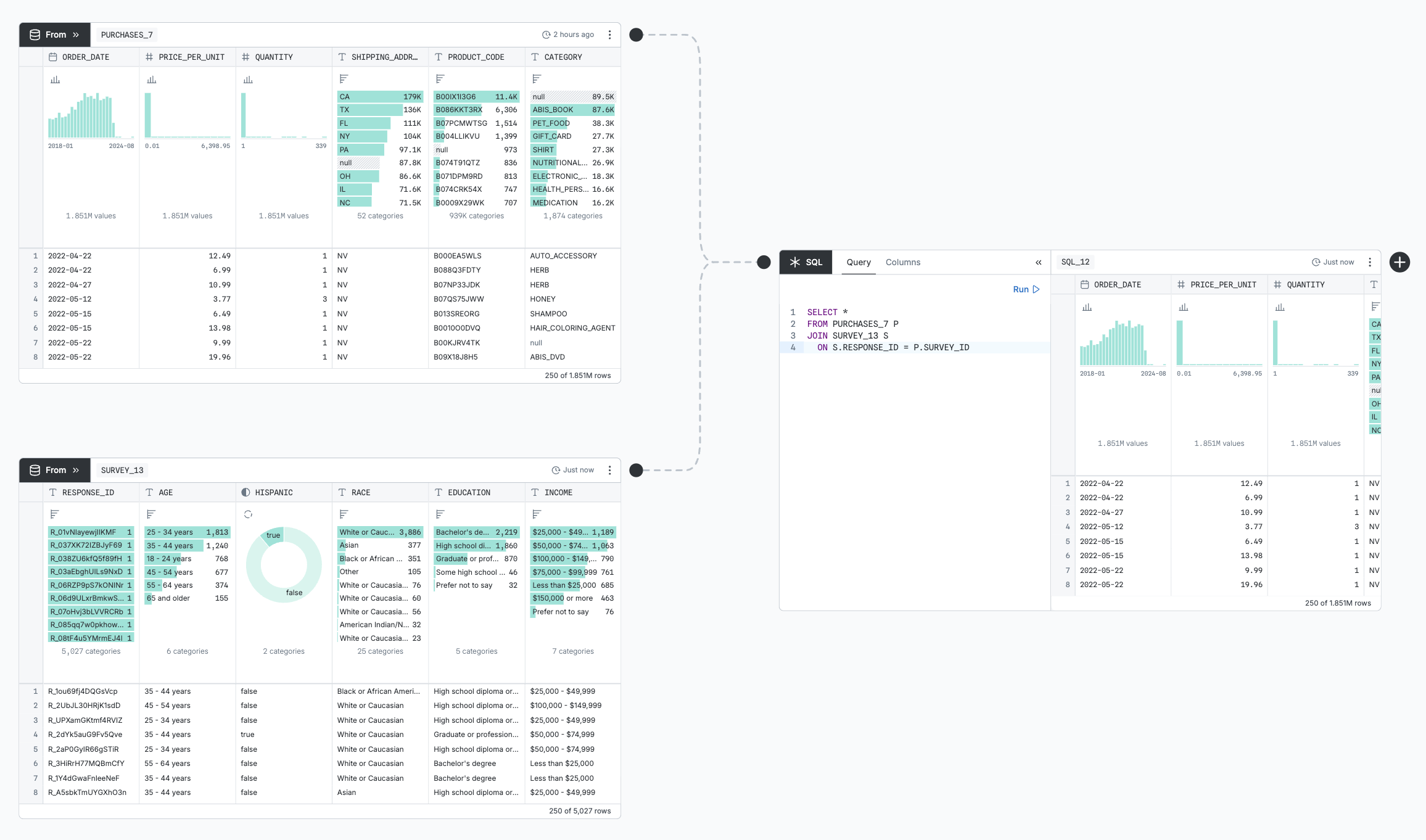
Your Observable canvas is a collection of nodes spread out on a two-dimensional surface. Nodes show your data as interactive tables and charts. Connectors make queries “flow” from one node to another. For example, a SQL node can query your database; you can draw a connector from that to a chart node. When you edit the SQL query, the chart updates.
Nodes have a name that can be referenced by other nodes. For example, you can name one node CLEANED_DATA and then write SELECT * FROM CLEANED_DATA in a SQL node. Names are unique within each page of the canvas.
You can share the work done in nodes by linking to them, embedding them, or exporting them to CSVs or PNGs. You can always see exactly how a node is fetching its data by clicking the node menu (⋮) in the upper right and clicking “Copy SQL”.
Table nodes
These node types query your data and preview the results in a table:
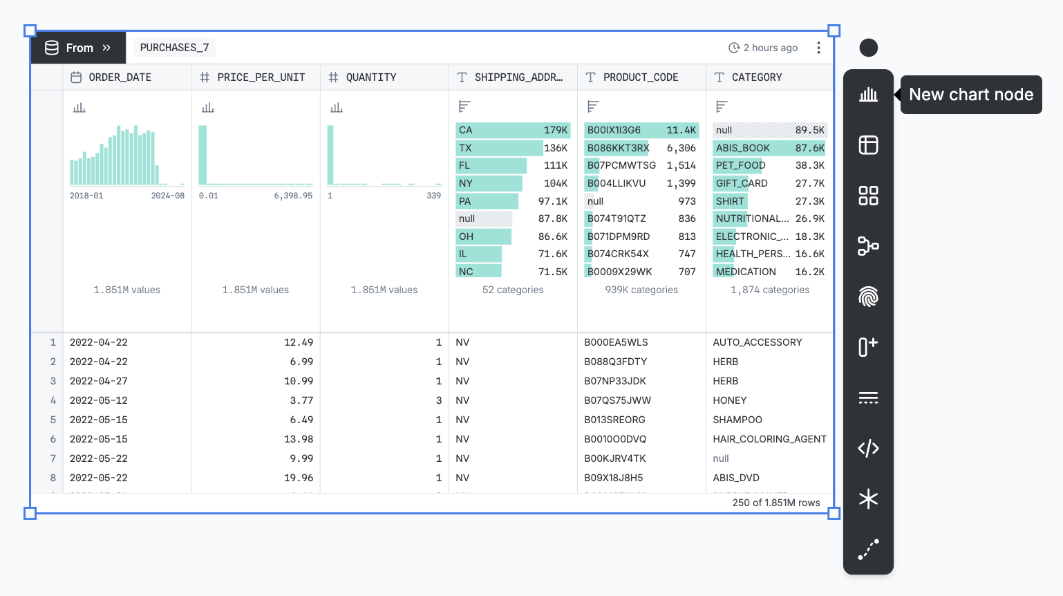
- From nodes pick a table from the database
- SQL nodes query the tables in your database and on the canvas page
- Table nodes just show the common table display
- Distinct nodes remove duplicates for a set of columns
- Group nodes group columns with aggregations over other columns
- Join nodes combine tables where one column equals another
Table nodes (1) take input, (2) query it, (3) refine the query, (4) preview results, and (5) output results:
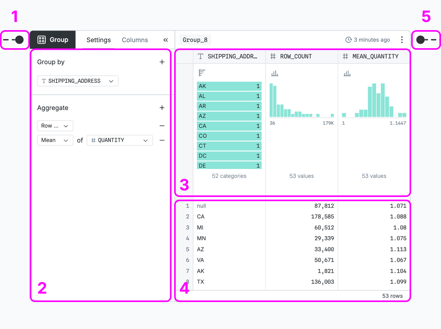
- Take input — Input ports dictate the query the node will operate on; From and SQL nodes have none because they refer to database or canvas tables by name.
- Query it — The base query is configured using form controls that vary by node type.
- Refine the query — Column controls summarize the distribution and add filtering, sorting, etc.
- Preview results — The table shows the first 250 rows of the final query results.
- Output results — The output port sends the final query to other nodes.
Column controls refine the query, changing the output sent to downstream nodes:
- Filter by clicking and dragging on the column summary charts
- Sort from the column menu (click the down-arrow at the bottom of the column summary)
- Rename by clicking the column name, or from the column menu
- Remove columns from the column menu or from the “Columns” tab of the node sidebar
- Reorder columns by clicking “Move to front” or “Pin” in the column menu
Display options don’t affect the output:
- Resize columns by dragging on the border between them
- Hide summary charts from the node menu (⋮) in the upper right
- Hide the whole table from the node menu
Columns can be summarized by one of four charts:
- Donut - the default for boolean columns, and available for string columns
- Bar chart - the default for string columns, and available for boolean columns
- Histogram - the default for number and date columns
- US Choropleth - available for columns whose names include “state” or “address”
To create a full chart node from the summary chart, open the column menu and select “Create chart”.
Chart nodes
Chart nodes visualize their input with a library of more than twenty interactive and customizable chart types. For example, a chart might be a histogram you can brush to filter a downstream table.
Chart nodes (1) take input, (2) choose encodings, (3) visualize them, (4) brush data, and (5) output results:
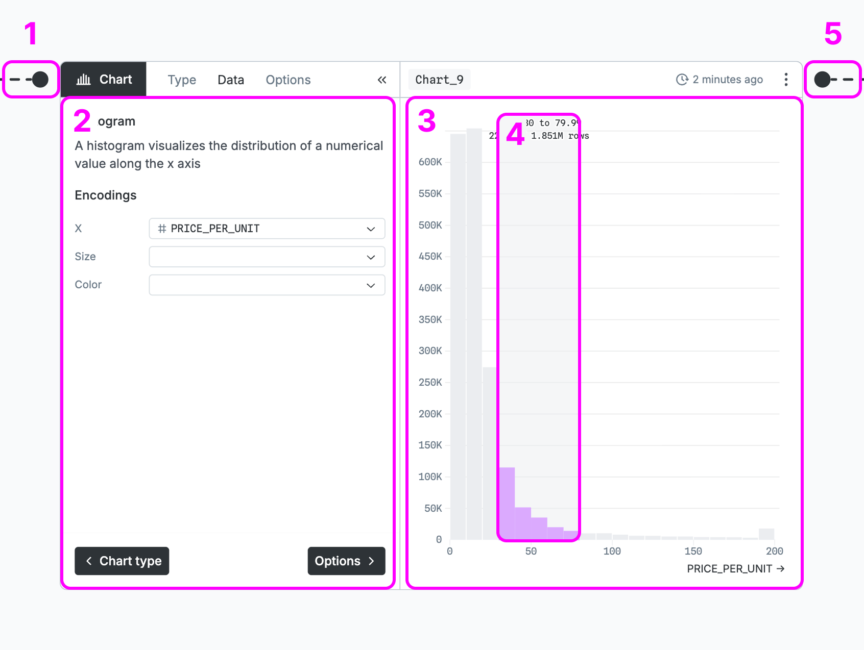
- Take input - One input port dictates what node’s output will be visualized.
- Choose encodings - Charts load only the data needed by the selected encodings.
- Visualize them - Each chart type can visualize data in a totally different way.
- Brush data - Most chart types support brushing or selecting subsets of the data.
- Output results - The output will be filtered by the brushed selection.
Experimental nodes
JavaScript nodes take one input, which is then available in the JavaScript code as input. The node can render an inspector or a DOM element, but has no output; it cannot be connected to any nodes downstream.
Connectors
Connectors let data to flow from one node to another. With a node selected, you can click one of the icons on the node toolbar to add a new downstream node. That new node will automatically be connected, so that changes to the first node affect the second.
Connectors are editable: you can select them and drag either end to a different node to “re-wire” your canvas. If you delete the connector, downstream nodes will lose their input data until re-connected. To add a new connector, either start dragging from a node’s output port or click the connector icon on the canvas toolbar.
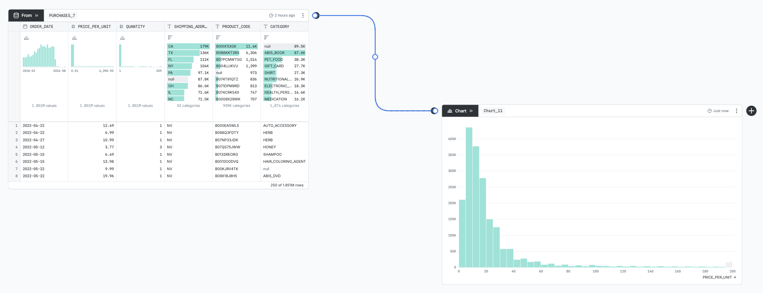
SQL nodes’ inputs are determined by what nodes they reference by name, instead of by what connectors are attached to them. But, similarly, they will re-run if a referenced node changes. To represent that dependency, an uneditable faded-out connector is drawn to any referenced node.
TIP
To replace an input, you have to disconnect the old one before you can connect the new one.
How nodes run
Nodes do not work with the actual data, but instead with abstract queries. All tables and visualizations materialize the subset of the data that is necessary for them — whether it’s a sample, or an aggregation of a few columns. This ensures optimal performance even on huge databases. When a rich chart needs a lot of data, this system ensures that while it loads this information the other charts and tables are not blocked waiting, and can be rendered as soon as their own query has run.
Query results are cached so they only run once, even with multiple people refreshing the same canvas. You can manually refresh the cache by clicking the snapshot timestamp in the upper right of the node. When you re-run a query, all downstream nodes will also re-run.