

Chart nodes
Chart nodes visualize your data using a library of customizable interactive charts. They take one input node. Create a chart node by selecting an existing node and clicking New chart node on the new node toolbar floating to the right.
Configuration
The chart is configured with three tabs:
- Type - choose from among visualizations of bars, series, points, hierarchies, etc.
- Data - choose which columns of data should be mapped to which visual encodings.
- Options - fill in a title and caption and customize the chart type.
Many chart types allow you to select or brush across values. The final query output by the chart node is filtered to reflect those selections.
TIP
The canvas will load only the data necessary to render your chart. For example, a histogram of the ORDER_DATE column only has to load grouped row counts for that column.
SQL equivalent
If you clicked “Copy SQL” in the node menu of the node pictured above, you’d get:
WITH
"p" AS (…)
SELECT
"ORDER_DATE",
"PRICE_PER_UNIT",
"QUANTITY",
"SHIPPING_ADDRESS",
"PRODUCT_CODE",
"CATEGORY",
"SURVEY_ID"
FROM "p"
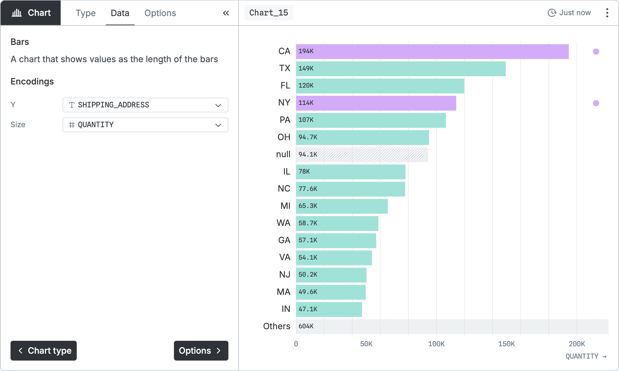
WHERE "SHIPPING_ADDRESS" = 'CA' OR "SHIPPING_ADDRESS" = 'NY'In the real version, … would show the SQL code for the input node. Notice that the selection in the chart (California and New York) has been converted into a WHERE clause.
Chart types
The chart types are divided into several categories. The chart node provides icons, tooltips, and other guidance to help you explore all the options; some selected examples follow.
Bars
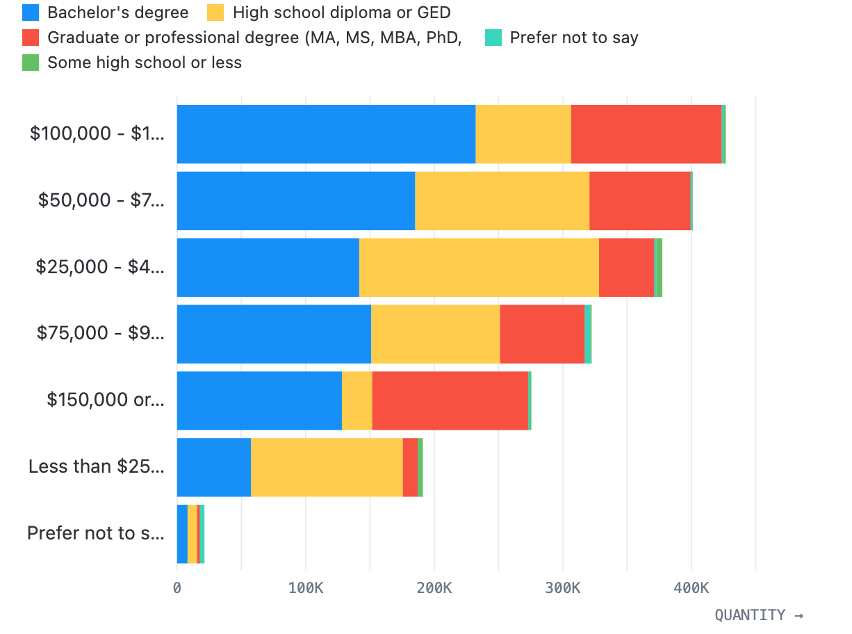
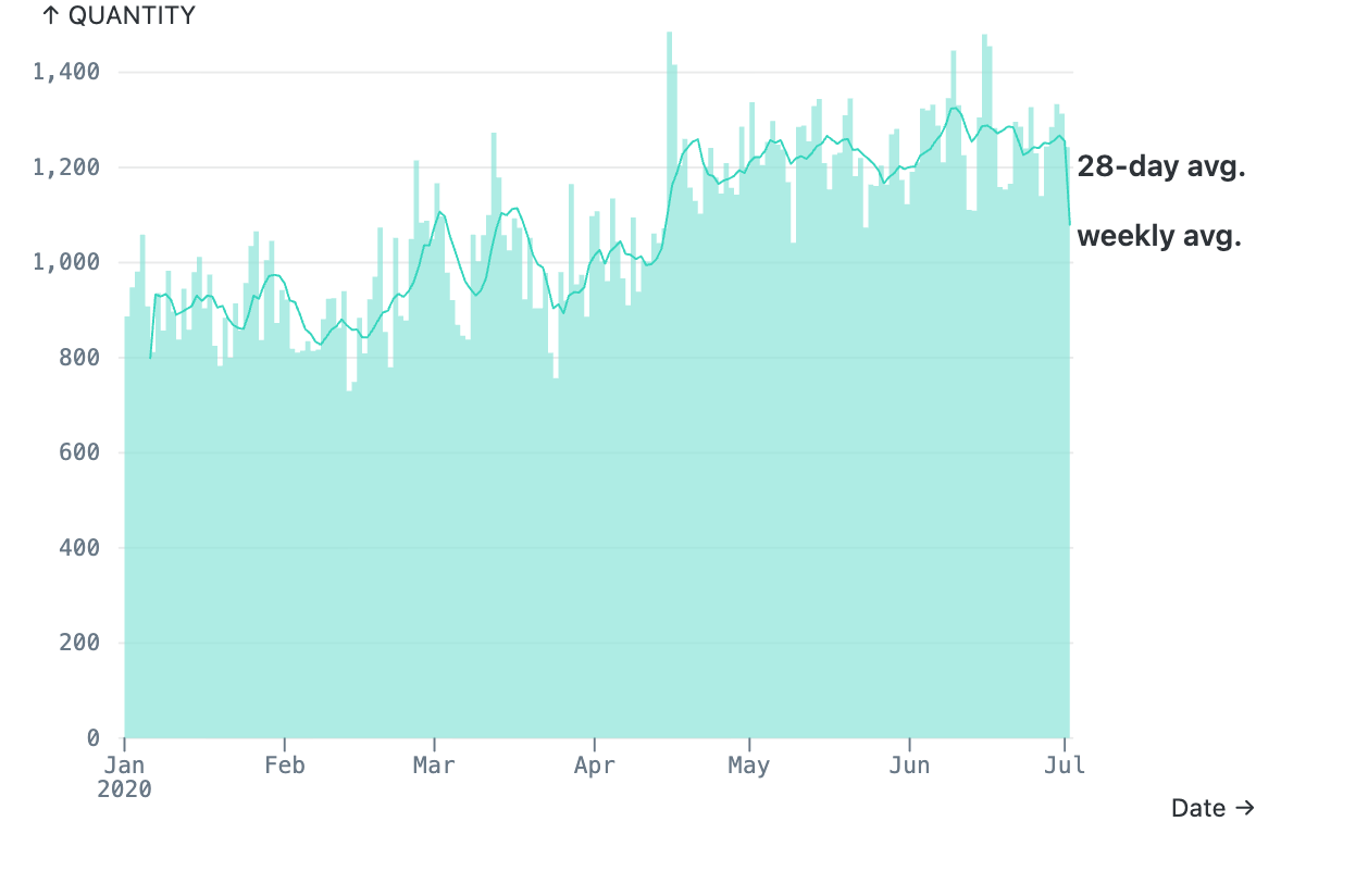
Bar charts generally represent the distribution of some quantity over time, over categories, or over another quantity. Bars and columns have stacked variants for breaking the bars up by color. The temporal type supports rolling average overlays.
Series
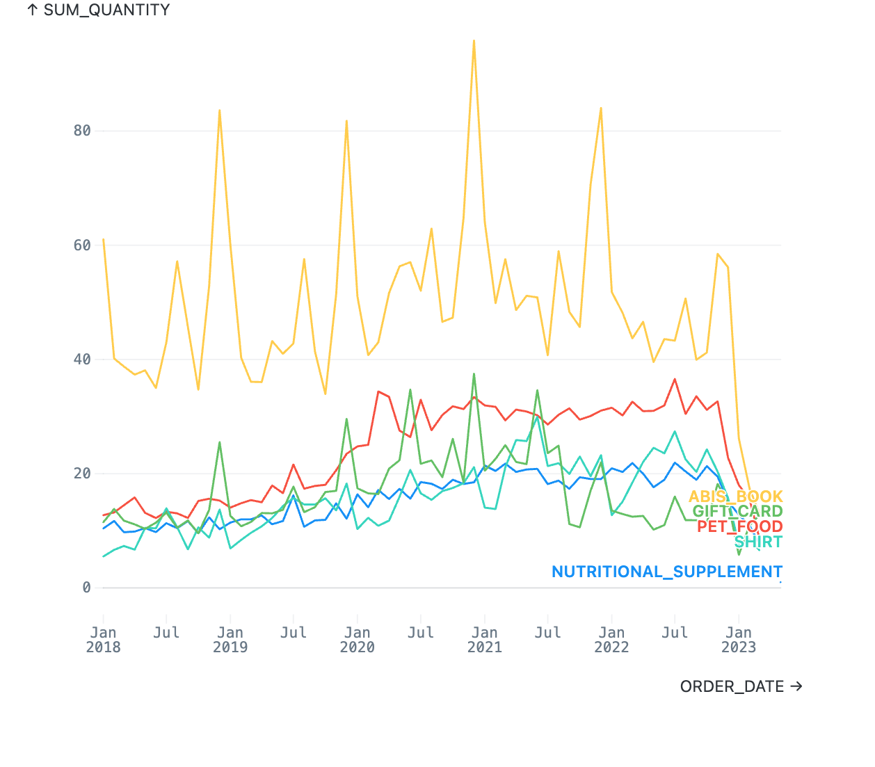
Series charts connect points from one date to the next so you can see trends over time. Area charts and streamgraphs can be broken down into stacked colors so you can see one segment’s contribution to the whole. Bump charts show relative rank on the y axis instead of quantitative values.
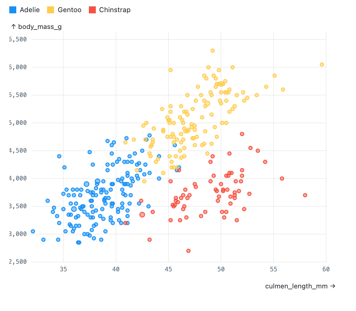
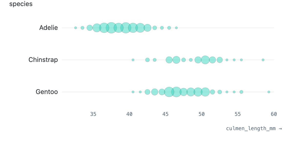
Points
Point charts represent data points by circles positioned and sized proportional to the data. Scatterplots have two numeric axes; dot plots have one numeric and one categorical axis; beeswarms have a numeric x axis and use the y axis just to spread out to prevent occlusion among points.
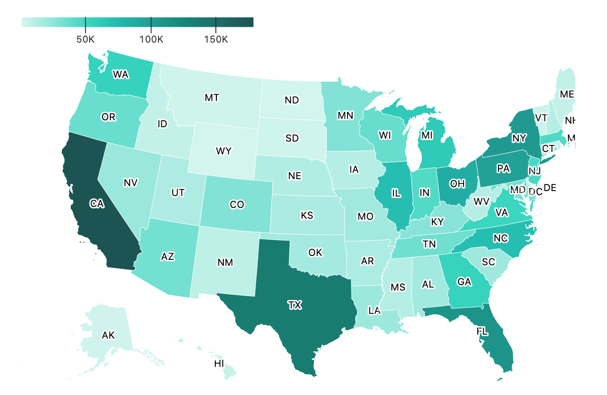
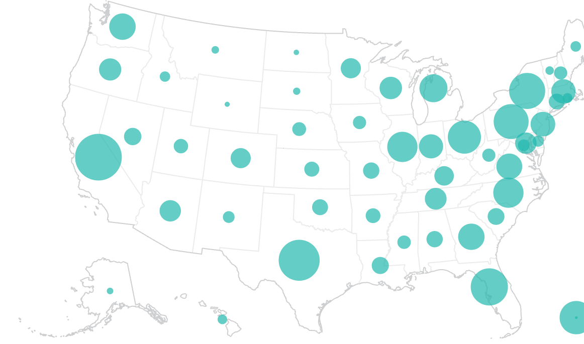
Geospatial
The geospatial category includes various maps. Some support different base maps (e.g. U.S. vs. world maps) and projections.
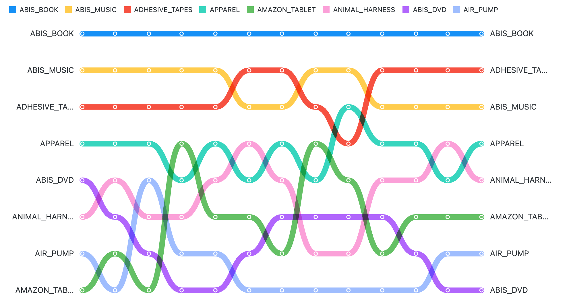
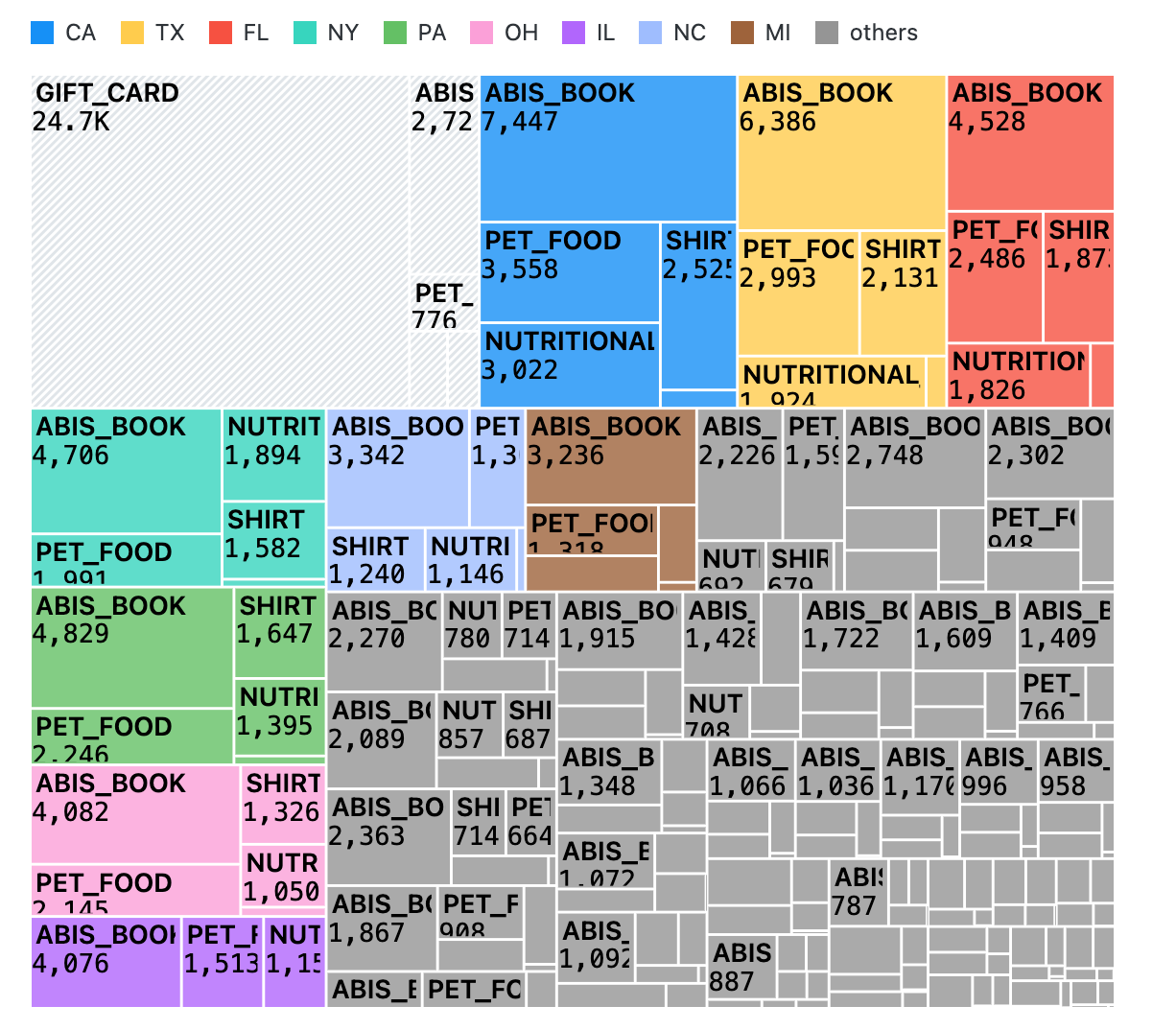
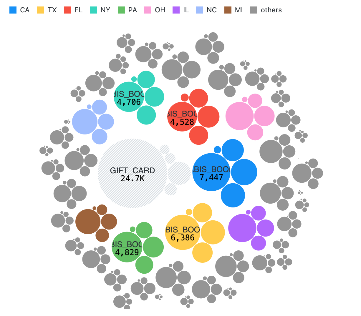
Part of whole & relationship
Donut charts are a simple way to show slices of a whole; treemaps and circle packing allow you to see the hierarchy of those proportions; Sankey diagrams let you see how the proportions change as quantities flow between categories (such as sources of income and sources of expenditures).
Other
Some charts don’t fit neatly into any category, such as just emphasizing a single key number, or representing quantities by repeated icons.
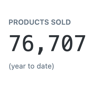
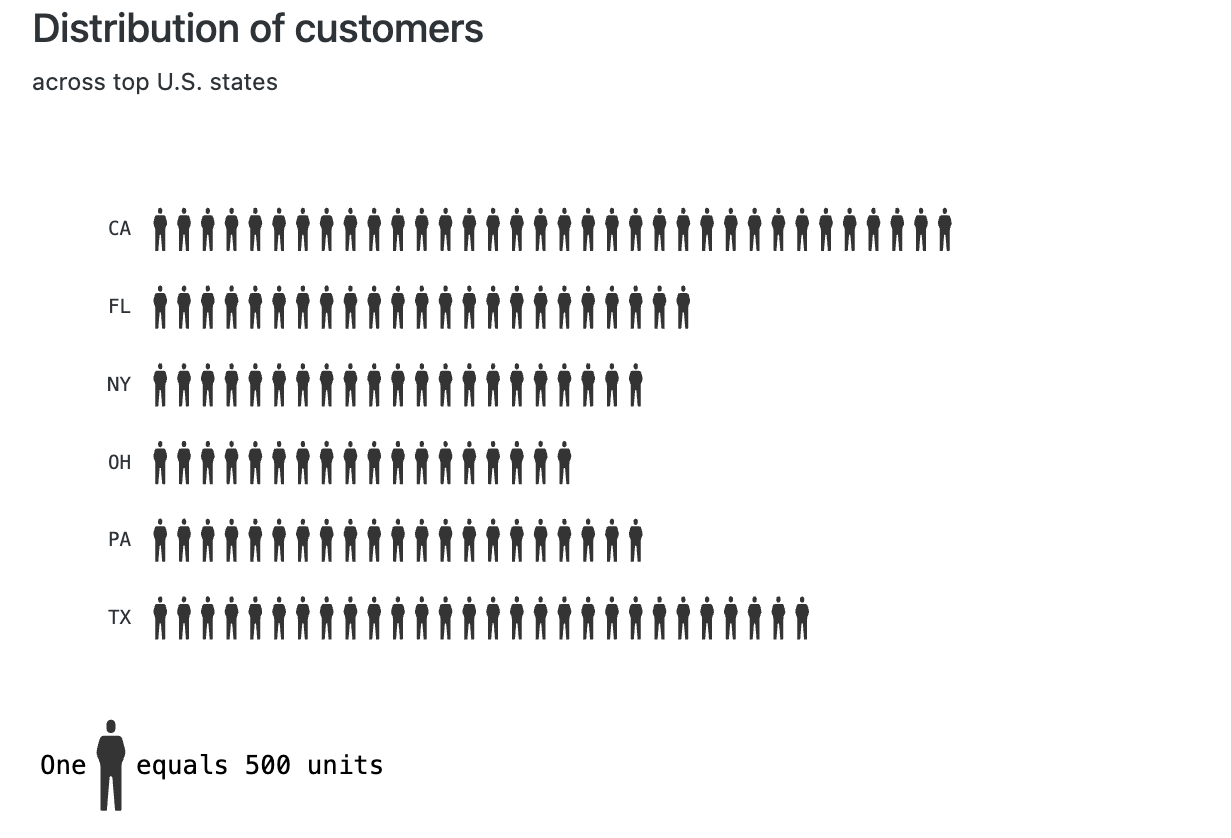
Chart themes
The default styling for chart nodes can be changed in your workspace. This can be used to have chart styling match your company’s brand. To make these changes, navigate to the Canvas section of your workspace and click on Themes, found within Resources. There you can enter custom colors and fonts that will be reflected across all your canvases.
To use a custom font, you must provide the URL to the font file and a size value, such as "80%". For Google Fonts, no URL is required, you only need to enter the font family.