Controls
Controls are form elements, such as sliders and dropdowns, that you can refer to in SQL nodes. They behave similarly to how Observable Inputs behave in notebooks.
Configuration
To create a new control node, click on the control node icon in the toolbar:
All control types allow you to add a Label, then each control has different configuration options. To use a control node, you can reference it in your SQL nodes using ${} notation, like so:
SELECT *
FROM "PURCHASES"
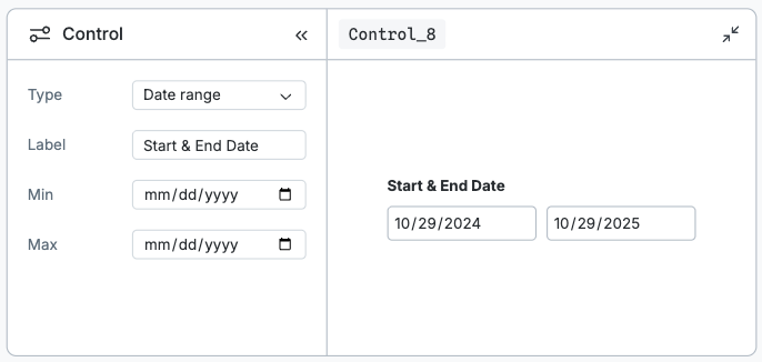
WHERE quantity >= ${Control_1}Some controls provide a range of values, such as the date range input, which has both a min and max value.
SELECT *
  FROM "PURCHASES"
 WHERE purchase_date between ${Control_1.min} and ${Control_1.max}
When you reference a control node in your SQL, you’ll see an edge drawn on the canvas to show the dependency. When you change the value of your control node, it will rerun the dependent query and any downstream nodes.
Control types
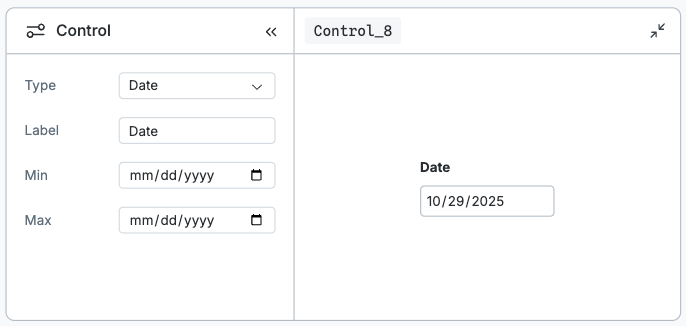
Date
Date inputs allow you to select a single date from a calendar.
Date range
Date range inputs allow you to select two dates from a calendar. When used in a SQL query, you will have access to a min and max value.
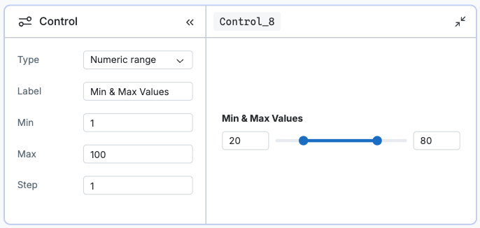
Numeric range
Numeric range inputs allow you to select a two values from range input. When used in a SQL query, you will have access to a min and max value.
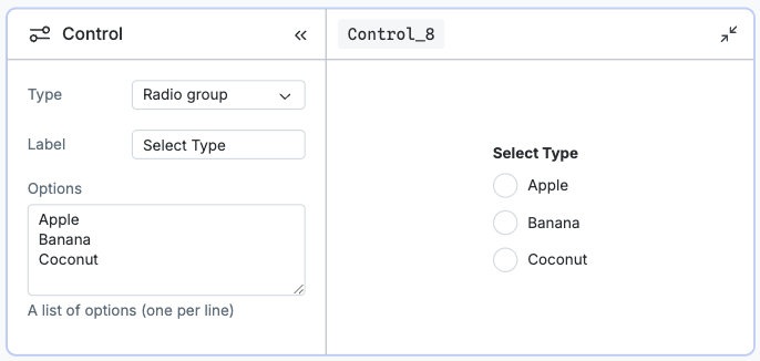
Radio group
Radio group inputs allow you to select a single value from a radio input.
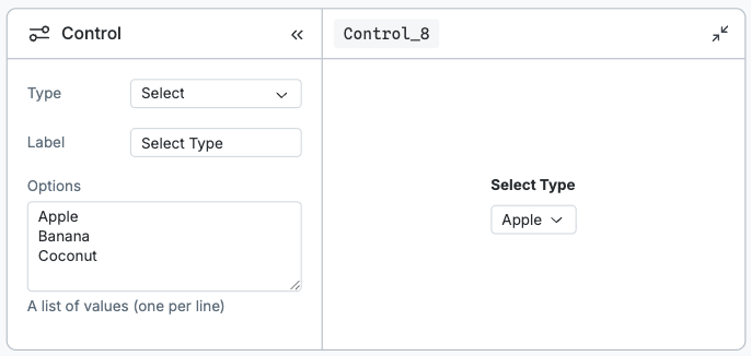
Select
Select inputs allow you to select a single value from a select input.
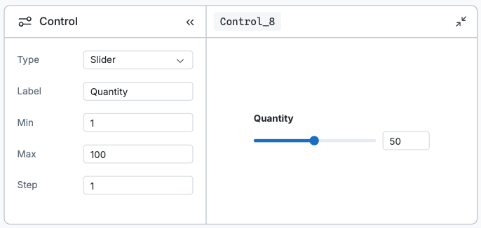
Slider
Slider inputs allow you to select a value from range input.
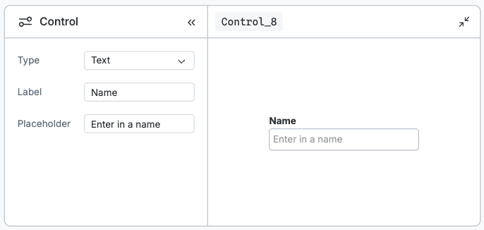
Text
Slider inputs allow you to enter customer text from text input.
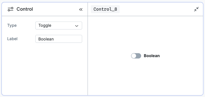
Toggle
Toggle inputs allow you to switch a toggle input between true and false.